Research Report Excerpt #1
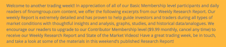
Taking a step back for a moment, recognizing the landscape for 2022 doesn’t inspire a great deal of positive market sentiment, we are better able to see the forest for the trees. Recall that in 2020, with a pandemic-influenced, self-induced economic shutdown, the S&P 500 rose some 18 percent. In 2021, the S&P 500 rose another 28 percent. Those gains are not all erased, but a consolidation of those gains is a normal process investors should appreciate. Why do I say investors should appreciate price consolidation?
A strong 2-year performance, as noted in the 3rd column above, often leads to some degree of price consolidation in the 3rd year. From that point, the following 2-year returns are rather substantial. The average 2-year return, since 1934 and after a consolidation year is 46 percent. This is where I repeat what I offered previously:
Research Report Excerpt #2
The guiding principle of the ERP is that the higher the ERP, the better the equity market tends to perform as investors believe they will capture better growth on each dollar invested in the equity market, relative to what they might get from a Treasury bond. With that in mind, we recognize that during a rate hike regime, Treasury bond yields tend to climb, which subsequently puts pressure on the ERP to the downside.
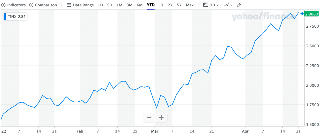
The chart of the 10-year Treasury yield (TNX) above recognizes its year-to-date performance. It’s clear to see that the 10-year Treasury yield has risen sharply, pricing in future rate hikes from the Federal Reserve as well as the unwinding of the Federal Reserves balance sheet. Ergo, when the so-called “riskless” rate climbs, the ERP falls, which it has also done here in 2022.
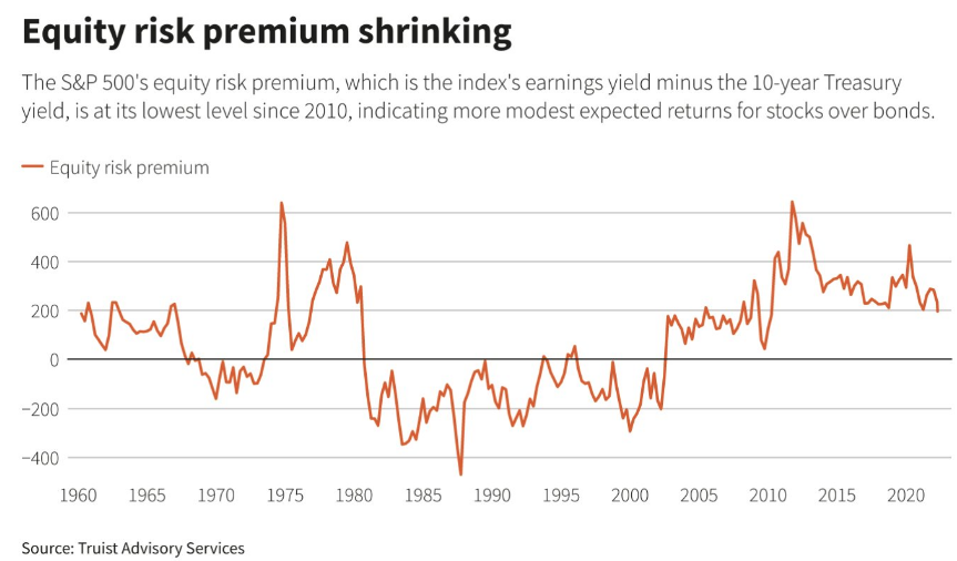
Looking at the chart of the ERP above, we can see the clear downtrend into 2022 and year-to-date. The shrinking or declining ERP reinforces why investors should be in strong companies/stocks; they should own stocks with growth, strong balance sheets, and a proven track record. In an environment where the ERP is lesser than previous years, unprofitable companies or companies that have extremely high valuations are often sold on the slightest concern or underwhelming earnings performance. Why? Again it is a matter of where can the investor capture the greatest return for their dollar invested with respect to the perceived riskless bonds. When the bond yield becomes more appetizing/higher, the high valuation stock that doesn’t deliver the growth it had previously is likely to be disposed of in favor of the riskless bond. Netflix (NFLX) is a perfect example of a HIGH valuation and formerly HIGH growth stock that underperformed investor expectations during a lower ERP cycle and investors disposed of the stock en masse.
Research Report Excerpt #3
Can we validate the causation for the S&P 500’s decline post the Thursday opening bell and chairman Powell’s comments? Yes, I believe we can and by looking at the opposing move higher in the 10-year Treasury yield. (chart below)
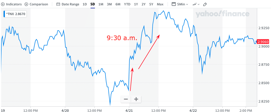
As we can see in the chart of the 10-year Treasury yield above, almost as soon as Jerome Powell fielded questions on rate hikes, the 10-year yield spiked, the ERP fell and the S&P 500 fell accordingly. Knowing the whys of what happened doesn’t change anything, it simply serves to recognize the power of higher rates, how they might plague our quantitative studies going forward, and how quickly markets discount future rate hikes. Secondly, knowing the whys helps to inform that nothing taking place today is a “black swan” event in the making, but rather normal and to-be-expected. ERP moves lower, rates move higher, equities deliver volatility and less robust returns. It’s an environment where the famous Franklin D. Roosevelt adage comes to mind: “Only Thing We Have to Fear Is Fear Itself.”
Research Report Excerpt #4
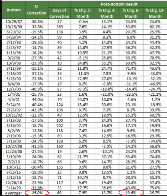
- The only time, the only era we should say that the Nasdaq wasn’t higher 6 months later was during the post Dotcom crash era (2000-2001).
- If we consider the current trough or low point for the Nasdaq bear market of 2022 was 12,555, and suggest that maybe it goes all the way down to 12,159 or the average correction circled in the study above (-25%), then the average return 6 months after the corrective low was 19.6%, does that sound like a dip-buying, compounding capital gain opportunity to the average investor? We think it does.
- Kind of amazing what happens when an investor thinks more geometrically than linearly. All of a sudden, the only thing to fear is…
Research Report Excerpt #5
The Conference Board Leading Economic Index (LEI) increased by 0.3% in March to 119.8 (2016 = 100), following a 0.6 percent increase in February. The LEI increased by 1.9% in the six-month period from September 2021 to March 2022.
“The US LEI rose again in March despite headwinds from the war in Ukraine,” said Ataman Ozyildirim, Senior Director of Economic Research at The Conference Board. “This broad-based improvement signals economic growth is likely to continue through 2022 despite volatile stock prices and weakening business and consumer expectations. The Conference Board projects 3.0 percent year-over-year US GDP growth in 2022, which is slower than the 5.6 percent pace of 2021, but still well above pre-covid trend. This rate also reflects a 0.5 ppt downgrade incorporated in our base case to include the effects of the war in Ukraine compared to before the war (3.5 percent). However, downside risks to the growth outlook remain, associated with intensification of supply chain disruptions and inflation linked to lingering pandemic shutdowns and the war, as well as with tightening monetary policy and persistent labor shortages.”
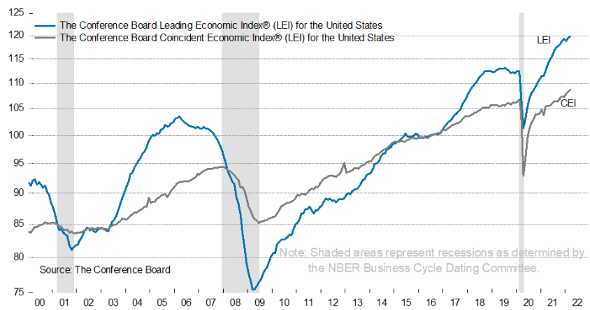
The Conference Board Coincident Economic Index (CEI) also increased by 0.4% in March to 108.7 (2016 = 100), following a 0.4% increase in February. The CEI increased by 2.2% in the six-month period from September 2021 to March 2022.
Research Report Excerpt #6
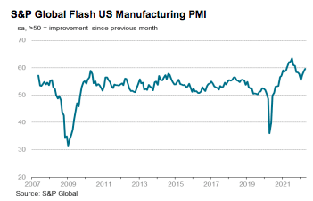
The S&P Global Flash U.S. Manufacturing PMI posted 59.7 in April, up from 58.8 in March, to signal a marked improvement in operating conditions across the manufacturing sector. Overall growth was the strongest for seven months. Contributing to the overall upturn were faster rises in output and new orders during April. Despite another marked deterioration in vendor performance, firms were able to increase production amid stronger client demand and the acquisition of new customers. Total new sales growth was supported by a steep increase in foreign client demand, as new export orders rose at the fastest pace in almost a year.
Research Report Excerpt #7
“Finom Group’s former model anticipated that even though consensus analysts’ estimate was in the 4% to 5% range for EPS during Q1, we’d likely see something in the 6% to 7% realized EPS range. But… we may have been to conservative even in this above average EPS estimate. **Based on the consistency in consumer spending, inflation rate and wage gains, we think Q1 EPS could come in expressing 9-12% YoY growth.”
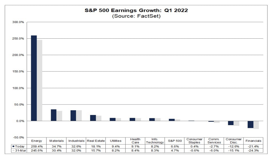
Overall, 20% of the companies in the S&P 500 have reported actual results for Q1 2022 to date. Of these companies, 79% have reported actual EPS above estimates, which is above the 5-year average of 77%. In aggregate, companies are reporting earnings that are 8.1% above estimates, which is below the 5-year average of 8.9 percent. The blended net profit margin for the S&P 500 for Q1 2022 is 12.3%, which is above the 5-year average of 11.2%, but below the year-ago net profit margin of 12.8% and below the previous quarter’s net profit margin of 12.4 percent. Now, let’s look ahead at the projected EPS estimates for the remainder and full year, according to FactSet.
Research Report Excerpt #8
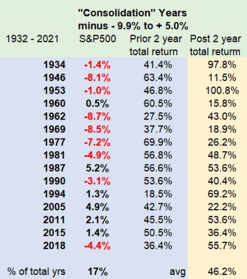
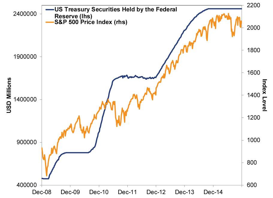
In early 2016, folks tortured data to make the Fed’s balance sheet look identical to the S&P 500’s rise since 2008, implying tough times once the Fed started shrinking its portfolio. Now they are at it again! Last week, Fed meeting minutes revealed plans to start letting the balance sheet shrink at a fast clip in May. Queue another fast-circulating chart claiming the Fed’s balance sheet and stocks are highly correlated, setting stocks up to fall once the Fed starts shedding assets.
Exhibit 1: A Misleading QE Chart Through 2015
Research Report Excerpt #9
Pundits across social and financial media have used this chart to argue the S&P 500 and the Fed’s balance sheet are highly correlated. But that misunderstands correlation, which isn’t about whether 2 lines look roughly similar. Correlation refers to the frequency at which 2 series “actually move together”. That means you can’t just take the correlation between 2 data series levels, such as the Fed’s total balance sheet and the S&P 500 Index price level. You have to measure the correlation between the changes in each over set intervals. When we measure correlations, we think using the weekly change is most accurate, as it doesn’t gloss over volatility. Conveniently, the Fed also reports its balance sheet weekly.
When using this methodology to measure the correlation between the Fed’s balance sheet and S&P 500 since quantitative easing began in January 2009, we get a correlation coefficient of 0.036. What does that mean? Well, a correlation of 1.00 implies the 2 variables move in lockstep, -1.00 implies they move in opposite directions always, and 0 implies no relationship. A correlation of 0.036 is about as close to zero as you can get. That means there is basically no relationship between changes in the Fed’s balance sheet and the S&P 500. Don’t like the weekly frequency? Even calculated monthly, the correlation is just 0.12—not statistically significant. This should come as no surprise, considering the last time the Fed stopped increasing (and eventually shrank) its balance sheet, stocks went up anyway. Exhibit 3 shows this in a properly constructed way, with the Fed’s balance sheet and S&P 500 index price level indexed to 100 at October 13, 2014, which is when the Fed stopped its post-financial crisis quantitative easing (QE) program. We take it through the end of 2019, after the Fed stopped reducing its balance sheet in August 2019 and before COVID lockdowns caused wild swings in both stocks and the Fed’s balance sheet. The y-axis starts at 60 to give you a more zoomed-in look. As you will see, one of these lines is not like the other.
Exhibit 3: A True-to-Scale Look at Stocks and the Fed After QE