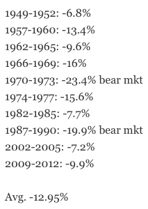
Research Report Excerpt #1
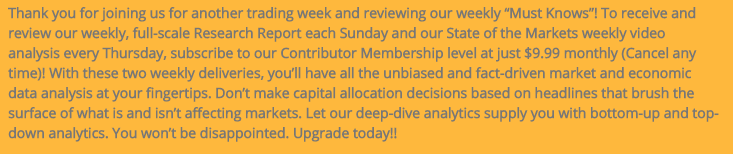
A perfect depiction of setup years is recognizable in the table below, which we’ve offered in past reporting:
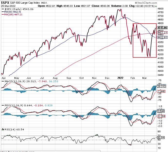
At its “closing” lows on March 14th, the S&P 500 (SPX) was down 12.4% before the renewed strength. It’s been the 4th worst start to a year since 1928. As the table above clearly outlines, the worst starts to a year offer strong returns for the balance of the year, even if not rising in a straight line: 7 of previous 9 worst starts to a calendar year had strong gains the rest of the year. The average returns = 24.57% in fact. This is just one of the main reasons we refer to such years, which do often coincide with midterm election years, as “SETUP YEARS“!
Research Report Excerpt #2
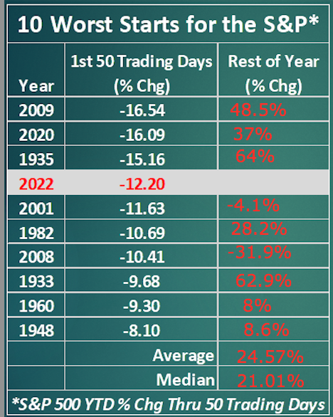
The Morgan Stanley team offered the table below, which identifies how strong Utilities tend to perform during an “Above Trend & Falling” Inflation Regime (1-yr return 13%).
Research Report Excerpt #3
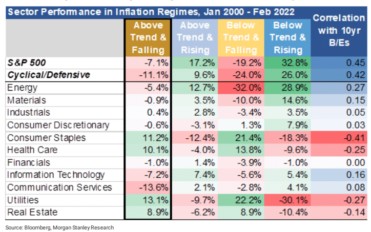
I think what would prove most useful, given that the market at its trough was down ~12.5% before the recent rally, is to understand what the maximum drawdowns in year 3 of a bull market had been historically.
The table above leaves the Year 3 (Next Year %) Max Decline line questionable, so we have done the homework for Finom Group investors/traders. When we review the following data, it is important to respect the fact that we don’t know whether or not we will achieve the average maximum drawdown, something better, or something far worse.
Research Report Excerpt #4
Research Report Excerpt #5
Research Report Excerpt #6
As the chart from Bill McBride offers, the months of supply increased in February to 6.3 months from 6.1 months in January. The all-time record high was 12.1 months of supply in January 2009. The all-time record low was 3.5 months, most recently in October 2020. This is above the top of the normal range (about 4 to 6 months of supply is normal). But here is the thing about New Home inventory, as McBride details:
“A house is considered for sale when a permit to build has been issued in permit-issuing places or work has begun on the footings or foundation in nonpermit areas and a sales contract has not been signed nor a deposit accepted.”
Starting in 1973 the Census Bureau broke this down into three categories: Not Started, Under Construction, and Completed. The graph below shows the 3 categories of inventory starting in 1973.
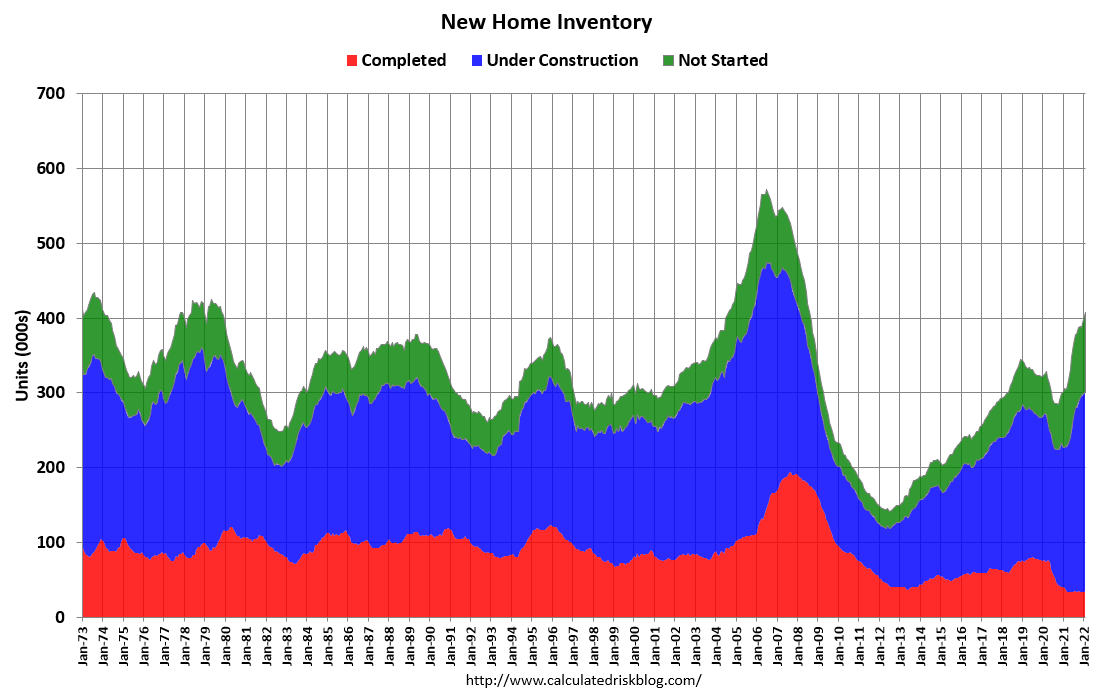
The inventory of completed homes for sale, at 35 thousand, is up from the record low of 33 thousand in 2021. This is about half the normal level of completed homes for sale. The inventory of homes under construction at 266 thousand is the highest since 2007. The inventory of homes not started is at a record 106 thousand. So while the headline inventory level seems normal, the problem is the fact that the inventory of completed homes is still near record lows.
Research Report Excerpt #7
This wasn’t the first time housing prices have risen at the same time as mortgage rates. In fact, every prolonged rising rate environment over the past 50 years saw housing prices grow when mortgage rates went up.
Here are some data points from the latest Redfin housing market update:
- The U.S. median home sale price surged 7% during the four-week period ending March 13. That’s 7% in 4 weeks!
- With mortgage rates now above 4% and prices skyrocketing, the average monthly payment on the median home sale price is now $2,120. That’s $530 more a month than pre-pandemic levels.
- Nearly 60% of houses that went under contract had an offer accepted within the first two weeks after it was listed. Almost half of all homes had an offer accepted within a week. That’s an all-time high.
- 48% of all houses sold went for more than the listing price.
Research Report Excerpt #8
The following commentary is directly from our March 3, 2022 weekly State of the Market:
Wall Street analysts have been cutting their Q1 2022 earnings estimates over the last month even though Q4 earnings season was very good. Here are the Street’s aggregate S&P 500 earnings per share estimates over the last 5 weeks:
- January 28: $51.82/share
- February 4: $52.06/share (Peak)
- February 11: $51.90/share
- February 18th: $51.86/share
- February 25th: $51.64/share
Now, let’s fast-forward to the present and latest revisions to the FactSet EPS estimates as follows:
- EPS estimates evolution Week of March 18
- March 18: Q1 $51.91, Q2 $55.84
- March 11: Q1 $51.79, Q2 $55.59
- March 4: Q1 $51.64, Q2 55.54
- February 25: $51.64, Q2 $55.39
- February 18: Q1 $51.86, Q2 $55.44
- Q1 2022 estimate+0.5% vs. 3 weeks ago
- Q2 2022 estimate+0.8% vs 3 weeks ago
This is why we offer to remain flexible and with an unbiased approach. The data is not constant, but ever-changing.
Research Report Excerpt #9
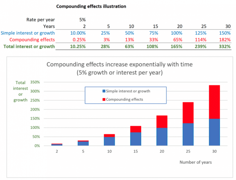
Compounding is a difficult concept to employ for most humans, and obviously investors/traders. What is compounding? In order to best explain the effects of investment compounding, first let’s admit to ourselves, as investors/traders, we’re are mostly focused on losses, not gains. People hate losses much more than they love gains (prospect theory). As a result, we spend far more time thinking about downside surprises (market crashes) than upside surprises (extraordinary growth). We make these kinds of mental errors, especially when it comes to investing, because we don’t have a great grasp of compounding. We don’t understand geometric growth as well as we understand linear growth, because it’s just not that intuitive.