Research Report Excerpt #1
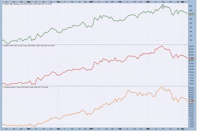
At the industry level, since the end of March, here is what the healthy rotation has looked like:
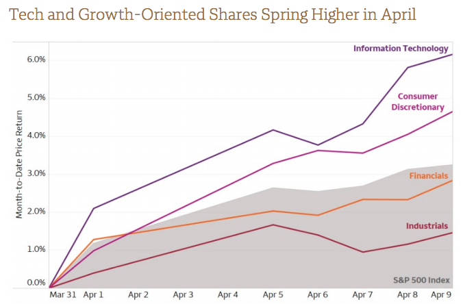
If there has been a lesson the market has aimed to teach and inform newer investors since the election period last year it is that rotations are the sign of a healthy bull market. The underperformance in Growth/Tech vs. Value/Cyclicals is still in place, but the gap in performance has been reduced over the last 3 weeks. For all the noise that developed around Growth/Tech since the onset of the New Year, it has proved to be just that, noise. This is yet another lesson the market has taught us since the March 2020 period and no better outlined than in the following graphic in my opinion:

Research Report Excerpt #2
Going all the way back to 1988, investing at all-time highs has proven a better day to allocate capital than any other day (Review #2).
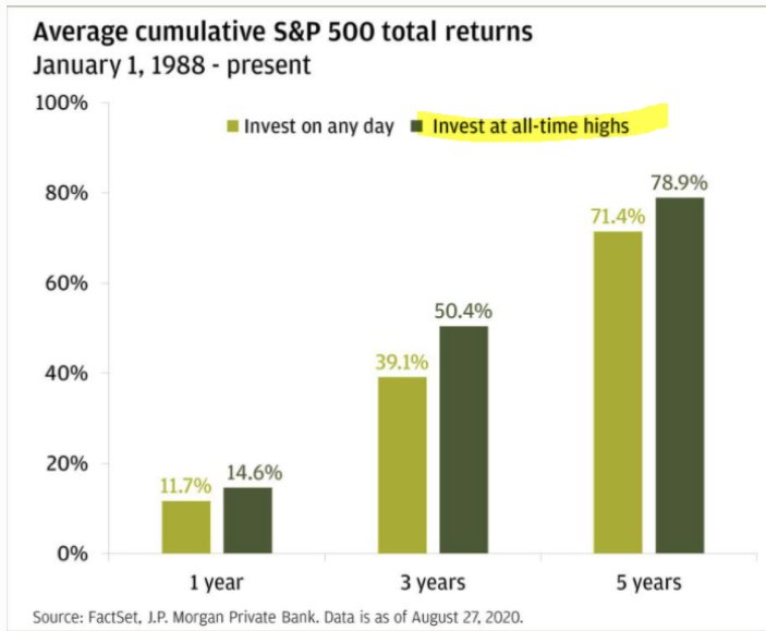
If it seems counterintuitive I get it, because the financial and social media noise is always promoting the idea of a market pullback post all-time highs. So the question becomes why not wait for a pullback to allocate capital? The data is the data though folks, it’s fact-based and if you want to argue with the data… I could think of a million better battles to choose. But speaking of all-time highs and pullbacks, let’s definitely get straight to the charts and studies.
Research Report Excerpt #3
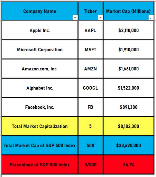
To review, I am anticipating more new highs for the S&P 500 in 2021. Finom Group’s price target of 4,325 is consistent with our earnings and macro-outlook, as well as the historic data we’ve compiled and analyzed to this point in the New Year. All the breadth indicators and/or technical analysis offered above suggests the 9.92% YTD gain has executed in a healthy fashion and with healthy rotations from large-cap to small and mid-cap, and lately even reversing that trend. (small, mid, micro-cap relative to larg-cap/SPX chart below).
Research Report Excerpt #4
Something that has largely gone under the radar from this past week was the latest update to the global economic outlook. The International Monetary Fund on Tuesday raised its global economic outlook, citing a much brighter picture for the U.S. economy.
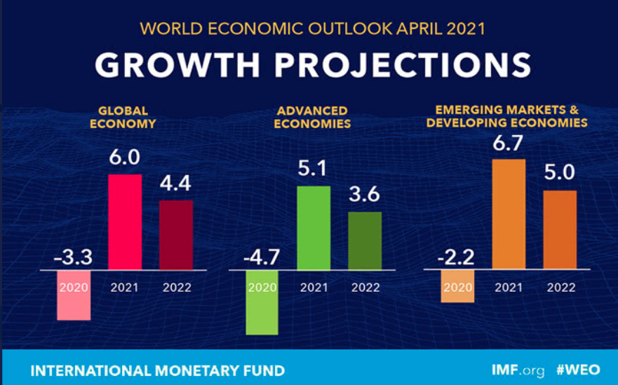
Trust that there will likely be more revisions to the IMF global economic outlook, predicated on the fact that nobody has a model for the present and post-Covid economic world.
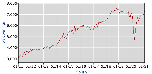
The latest U.S. JOLTS report was very strong, underscoring the increasingly good news on the recovery and the labor market. Job openings climbed 268k to 7,36k in February after surging 347k to 7,09k in January. This is the highest total since the 7,47k print in January 2019. The opening rate jumped to 4.9% from 4.7%, a new record high.
Research Report Excerpt #5
The March Producer Price Index or PPI data showed a rise of 1.0%, compared with a projected rise of 0.4% from economists surveyed by Dow Jones. The majority of the increase came from a jump in prices for final demand goods, the U.S. Bureau of Labor Statistics.
“Beyond temporary effects, inflation is unlikely to keep accelerating given ample slack in the labor market,” said Rubeela Farooqi, chief U.S. economist at High Frequency Economics in White Plains, New York.
In the 12 months through March, the PPI surged 4.2% percent. That was the biggest year-on-year rise since September 2011 and followed a 2.8% advance in February. The year-on-year PPI was boosted as last spring’s weak readings dropped out of the calculation. Prices tumbled early in the pandemic amid mandatory closures of non-essential businesses across many states to slow the first wave of COVID-19 cases. The PPI data is the hottest it has been in roughly 9 years, which again pulls forward the fears surrounding inflation. But it’s important to reflect on history as proving the difference between “reflation” and inflation:
Looking at the data now, which is problematic as this series was re-indexed to 2009-11 as the base date. Luckily we have 3 old PPI series in a spreadsheet and am looking at when the PPI was above 4.2% YoY in the series based in 1982 and as recently reported.
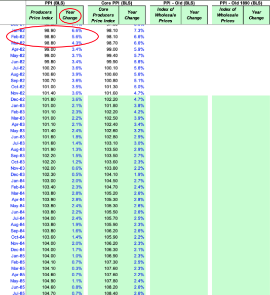
What’s clear is that the PPI was much higher many times before 2021 including in the prior picture from 1982. When was the PPI last 4.2 percent? The 1982 based series only runs to 2005. But right then, it was higher.
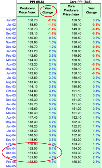
Moreover, yes, PPI was also higher than 4.2% in 2000 and the 2000-2003 period. That was the only period where the equity market actually experienced broad declines, as it pertains to investor considerations.
Equity markets had a negative initial reaction to the Producer Price Index data coming in much hotter than expected, but if we look back on history, we can also understand why the market rebounded significantly and even surged into the close, to close out the week. On that note, this was the third week in a row where the market surged into the final minutes to close out the week.
Research Report Excerpt #6
The EPS revision, however from FactSet for the Q1 2021 period continues to ebb higher. Just last week, FactSet was modeling Q1 2021 EPS to grow 22.5% for the period. They have since upwardly revised growth to 24.5% in the Q1 2021 period. If 24.5% is the actual growth rate for the quarter, it will mark the highest year-over-year earnings growth rate reported by the index since Q3 2018 (26.1%).
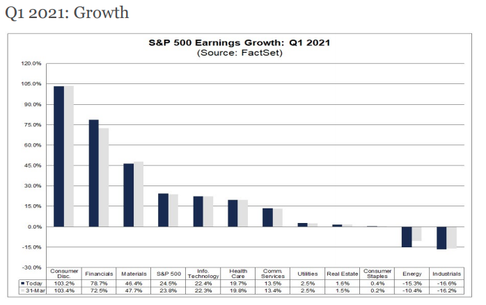
In looking at how 2020 results for earnings and revenues performed while also looking through 2021, here is what FactSet offers:
- For the fourth quarter, S&P 500 companies reported growth in earnings of 3.9% and growth in revenue of 3.2%. For all of 2020, S&P 500 companies reported a decline in earnings of -11.2% and a decline in revenue of -0.8%.
- For Q1 2021, analysts are projecting earnings growth of 24.5% and revenue growth of 6.4%.
- For Q2 2021, analysts are projecting earnings growth of 53.1% and revenue growth of 16.7%.
- For Q3 2021, analysts are projecting earnings growth of 19.2% and revenue growth of 10.1%.
- For Q4 2021, analysts are projecting earnings growth of 14.8% and revenue growth of 7.5%.
- For CY 2021, analysts are projecting earnings growth of 26.3% and revenue growth of 9.7%.
- Valuation: Forward P/E Ratio is 22.4, Above the 10-Year Average (15.9)
Research Report Excerpt #7
Although we haven’t concentrated on the supply chain issues heavily in previous analysis, because we remain of the opinion it contributes more noise than actual corporate earnings impact, here is our take on the subject matter from a global/corporate perspective. The fragility of global supply chains has been a major factor in the recent tensions between the U.S. and China. And here too there are parallels to be drawn with recent events in the Suez Canal. Rising wages and tightening environmental standards had already undercut China’s labor cost advantage over the preceding years. But price increases from the tariffs imposed in 2018 and 2019 and, most recently, disruptions to medical supplies and other products from the coronavirus shutdowns have only served to underscore the cost of over-dependence on Chinese manufacturing hubs. According to a 2018 survey of 432 member companies by the American Chamber of Commerce, around 35% of manufacturers operating in China had some plans to move their operations to alternative territories based on risks to future U.S.-China relations.

Less than 3 months into the new Biden administration, the U.S. is already reviewing its supply chain concentrations in semiconductors, batteries, pharmaceuticals and key minerals used in electronics. And this could not only lead to a reconfiguration of production locations over the coming years, but may also increase business investment in new processes such as 3D printing and industrial automation. Bottom line is that the interim fallout from supply chain issues are limited, but hold long-term benefits as restructuring of supply lines could prove greater corporate profitability down the road. With that said and as it pertains to the markets…
Research Report Excerpt #8
I think that what is most identifiable in the study above is that achieving such strong participation does increase the probability of price consolidation, but it basically leads to higher highs as well. The key words offered previously were interim top. Another chart that somewhat disavows the sentiment derived from the All Star Chart offerings is the following from the NYSE New Highs chart:
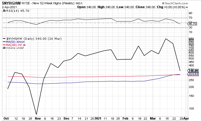
And here’s the thing with respect to the S&P 500 potential consolidation phase ahead: When you have Mega Cap Tech/FANMAG in the back pocket of the indexes, the dips are shallow and/or short in duration more often than not. It is very easy for the market to fall rapidly and then grind higher while many other individual names (Small Caps, Value) get hit. A reverse of what we saw in November – February, and broad market trend stays intact as well.
Research Report Excerpt #9
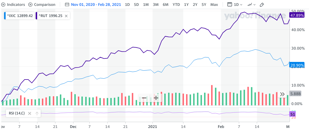
In just a few short weeks, the underperforming Nasdaq has bridged the gap in YTD gains with its peers, as it became cheap on a relative basis. Finom Group would not be surprised if the Nasdaq overtook it’s peer indices YTD gains over the next 100 days. We’ll look at this point of articulation from a historic perspective and through a study that we offered in October of 2020. The following chart shows 100-trading day relative price performance for the Russell vs. the NASDAQ back to 2000. When the line is above the y-axis, the Russell has done better than the NASDAQ over the prior 100 days, and when it is below it has underperformed. The y-axis runs from -30 points to +50 points.
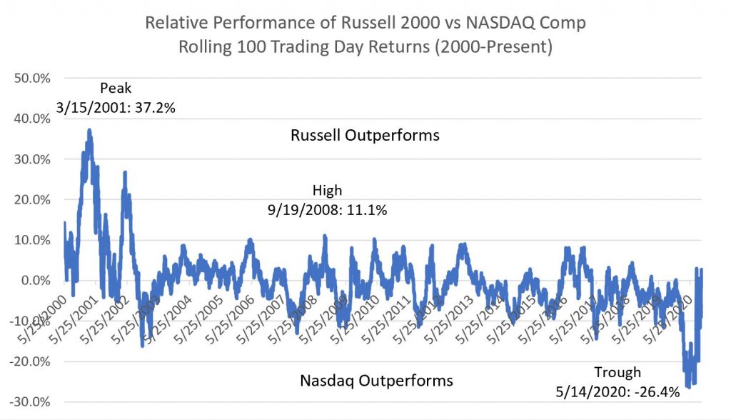
#1: For most of the timeframe here (2002 – 2016), you could set the proverbial clock with this relationship. When the Russell underperformed the NASDAQ by 8-10 points or more (2002, 2003, 2007, 2014, 2016, 2017, 2019), you could rely on small caps to play catch up over the next 100 days.
Conversely, whenever you saw the Russell outrun the NASDAQ by 8-10 points over the prior 100 days (2006, 2008, 2010, 2011 – 2013, 2016, 2017) you could bank on Tech catching a bid relative to small caps and closing up the gap in the next 100 days
#2: There are only 2 instances where this pendulum-like relationship (+10 points/-10 points) has really broken apart since 2000:
- The bursting of the dot com bubble, where the Russell outperformed the NASDAQ by 37 points (noted in the graph above) in 2001 and +20 points in 2002.
- The 100 days ending May – July 2020 (also noted in the graph), when the Russell underperformed the NASDAQ by 25 points.
#3: Through last Mid-October 2020, the Russell and NASDAQ were essentially even over the prior 100 trading days and with small caps catching up to the Nasdaq/Tech. As soon as the calendar turned from October to November, the Russell took a leadership role over the Nasdaq (RUT purple and NDX blue). You can even see where they cross over at the onset of November in the chart.