Research Report Excerpt #1
This Bloomberg chart was making the rounds this past week. Less than 45% of S&P 500 stocks trading above 50-DMA. The situation comes with the S&P 500 at all time highs, and of course the last time this happened was 1999/2000.
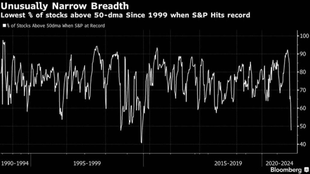
It seems as though anytime you correlate a chart of any kind with the Dotcom period, it will garner a great deal of attention. The date and the dip in this breadth indicator draw the average investor attention toward the low level reading, almost producing a comatose state such that the investor fails to look forward at what happened exactly after the dip in the middle of the chart. That’s right; a resurgence in the breadth indicator.
The Bloomberg “click bait” headline is a very narrow perspective. Why do I say this? If we go back just a few months ago in April, we had the exact opposite breadth dynamic. The percentage of stocks trading above their 50-DMA within the S&P 500 was above 90% on April 14, 2021. Since 2003, good things tend to happen going forward in the S&P 500 when breadth achieves such feats of strength as shown in the table below:
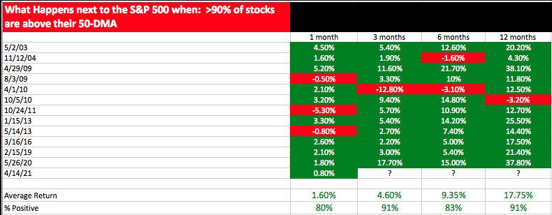
June 14th was the 3-month anniversary of this breadth signal. While this time frame since the April 14th signal fired wasn’t as strong as the average return (4.6% avg.), the S&P 500 is up nearly 3.5% since the signal. If we look at the average 6-month return after the signal, which would take us to October 14, 2021, the average return is 9.35 percent. With that being said, the percentage of stocks trading above their 50-DMA moving average to end the trading week… drumroll please…
Research Report Excerpt #2
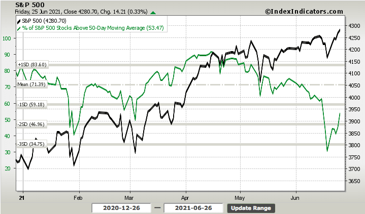
…After the breadth indicator finished the previous week at 30.30%, this past week it finished with nearly 54% of stocks trading above their 50-DMA. This was a robust improvement, obviously. Having said that and if we think more broadly, with the S&P 500 at all-time highs, we’d like to see more than ~50% of stocks trading above their 50-DMA. What we’d like to see, however, isn’t always what we should expect.
Research Report Excerpt #3
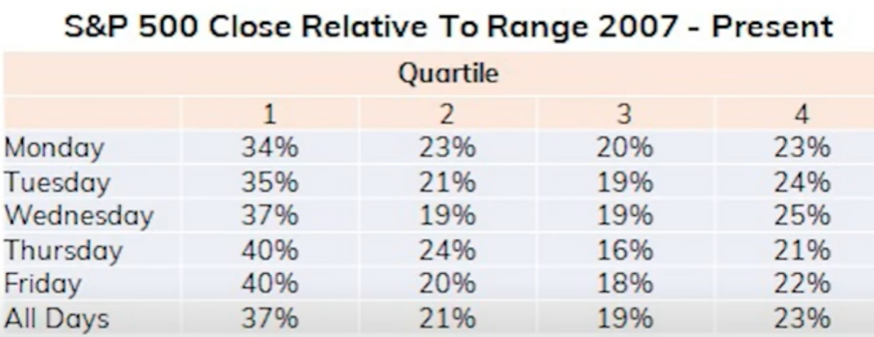
In thinking about how the market trades on a daily basis throughout the week, it may also be useful to know how it trades from open to close. The following table looks at this subject going back to 2007. It quantifies the markets relative closing value from the open.
Research Report Excerpt #4
Another way in which we can define the risk-on appetite by investors is by looking at the Equity Put/Call ratio. We don’t pay a lot of attention to its daily level, as they tend to swing with sentiment too frequently. Nonetheless and over time, we can identify a trend of investor behavior that confirms the sentiment and trend.
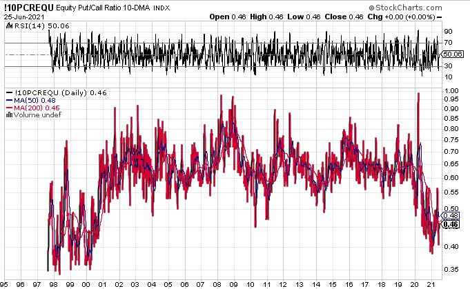
I’ve taken the Equity P/C ratio all the way back to the beginning of the Dotcom period. Notice anything? Indeed, today’s levels are similar to the Dotcom era. That’s how bullish investors have become in 2021. While the P/C ratio is not quite down to the Dotcom levels, we have been trending at the lowest levels since 2000. If you had fought this bullishness from 1997-1999, you would have been fighting a losing battle. I would suggest that, indeed, this period of market bullishness may end poorly for many investors, but I would also suggest we do not know when that period will arrive. It took more than 3 years from the start of the Dotcom market boom. Knowing our market history and juxtaposing it with the present day market environment is enough to keep a savvy investor closer to disciplined investing principles. Beyond that, normal accidents in the market are out of our control.
Research Report Excerpt #5
The 178 companies that have reported over the last month have averaged a one-day gain of 0.90% on their earnings reaction days. If we break the reaction day up into the initial opening gap and the open to close change, we see that the average stock that has reported has opened higher by 0.76% in reaction to the earnings news and then continued higher by another 0.11% from the open to the close of trading.
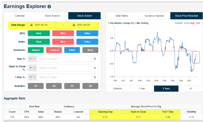
As shown in the top-right chart, we have a “stock price reaction” tracker in the Earnings Explorer that helps investors see how companies are reacting to reports over time. The reading shows the median 1-day share price change for all companies that have reported earnings over the prior three months. At the end of Q1, this reading had dipped to 5-year lows, meaning stocks were reacting more poorly to earnings than at any time since at least 2016. Over the last few months, this reading has been ticking higher and higher although it’s still negative. As more reports from late March and April roll off the 3-month tracker, however, the reading should tick back into positive territory soon provided the current trend of more positive reactions continues.
Research Report Excerpt #6
Post the latest FOMC meeting, something interesting happened. While yields initially rose after the Fed meeting, they quickly turned around and have been sinking ever since. (Goldman Sachs map for tapering below)

Although this may sound a bit convoluted, the idea is that the bond market isn’t buying the Fed’s narrative about tapering. You see, it is important to keep in mind that the U.S. government is proposing to spend a LOT of money this fiscal year. For example, the Biden administration has proposed a $6 trillion budget for 2022. This will mean there will be a LOT more bonds to sell/buy. So, since the Fed continues to be the dominant buyer of government bonds, the result is the Fed’s current bond-buying program will simply be REPLACED by the buying of all that new Treasury debt. Thus, the “taper” effectively will prove muted if at all, and the easy monetary policy will simply take on a different form.
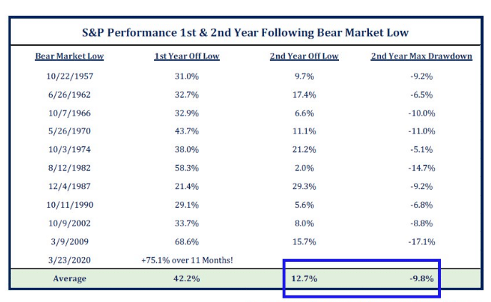
Research Report Excerpt #7
As shown in the quantitative data below, year 2 off the bear market low typically carries with it a more volatility and a bigger drawdown than year 1 off of the bear market low.
Research Report Excerpt #8
What we have come to understand about seasonal data, such as the quantitative seasonal data above, is that it should be paired with other data. But in keeping with the seasonal theme, June tends to end with a bit of an upswing, as shown in the chart below:
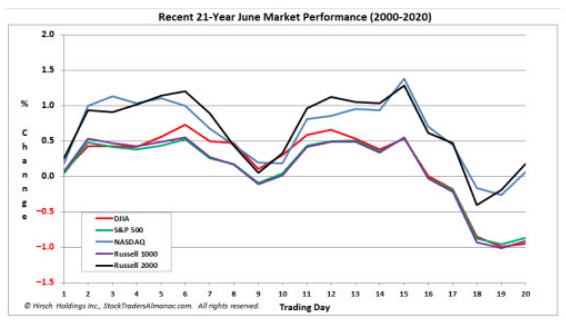
Also keep in mind that the market doesn’t often repeat, but it does often rhyme. We did get a dip in the back half of June, even if not the exact historical trading days assumed in the chart above. We have already seen an upswing as well.
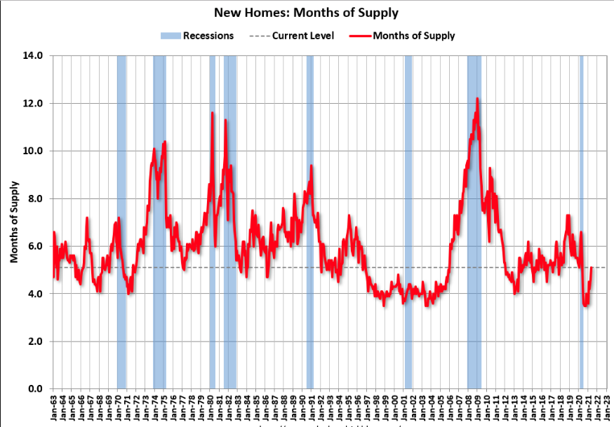
Research Report Excerpt #9
Sales of new single‐family houses in May 2021 were at a seasonally adjusted annual rate of 769,000, according to estimates released jointly today by the U.S. Census Bureau and the Department of Housing and Urban Development. This is 5.9 percent below the revised April rate of 817,000, but is 9.2 percent above the May 2020 estimate of 704,000.
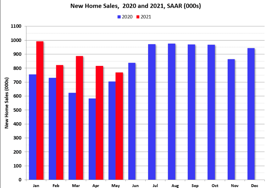
The months of supply increased in May to 5.1 months from 4.6 months in April. The all time record high was 12.1 months of supply in January 2009. The all time record low was 3.5 months, most recently in October 2020. This is in the normal range (about 4 to 6 months supply is normal).