
As we head into Election Day 2020, the market is seemingly stuck with determining the path it will be taking on the way to its ultimate destination. The destination is higher prices by way of improved corporate earnings through the delivery of a scientifically proven, effective vaccine that can be rolled out over the course of the next year, thus sustaining an economic recovery and expansion cycle. At present, the destination is more known than the path, but isn’t that seemingly always the way? Investors are always left with uncertainty for the near-term, even if the long-term is rather known and widely accepted.
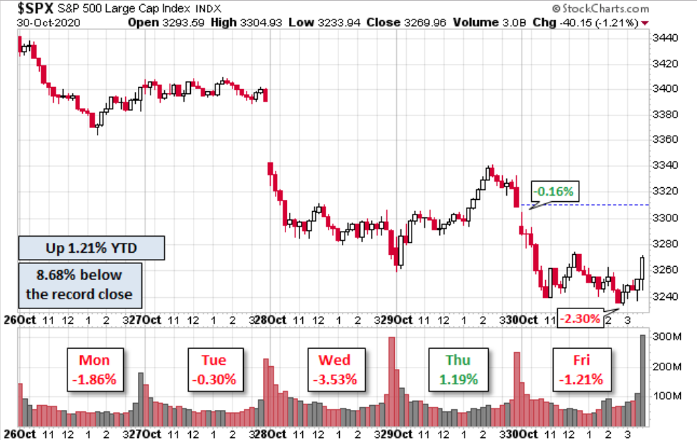
It was another rough week AND month for investors. For the week, the S&P 500 (SPX) fell 5.64% and finished with its 2nd consecutive monthly loss (-2.77% Oct.) The Nasdaq (COMPQ) performed ever so slightly better than than the S&P 500 with a drop of 5.51% for the week, but fell a touch less for the month (-2.29% Oct.). The Dow Industrial Average (DJIA) was the worst performing large cap index for the week, falling nearly 6.5%, while also carrying the worst monthly performance (-4.61% Oct.) If there was a beacon of long-term sustainable trend strength for the market it didn’t come from the small cap weekly performance via the Russell 2000 (RUT), which fell 6.22% for the week… but it proved the only index that was positive for the month of October 2020.
Finom Group has highlighted the Russell’s longer-term strength and the probabilities of said strength going forward, even if that going forward hasn’t panned-out in the previous week. Nonetheless, recall from a previous Research Report what we offered in the way of small-caps and the “whys”:
“Additionally, I would include the following chart in the overall action plan for small-cap sector/stock allocation:
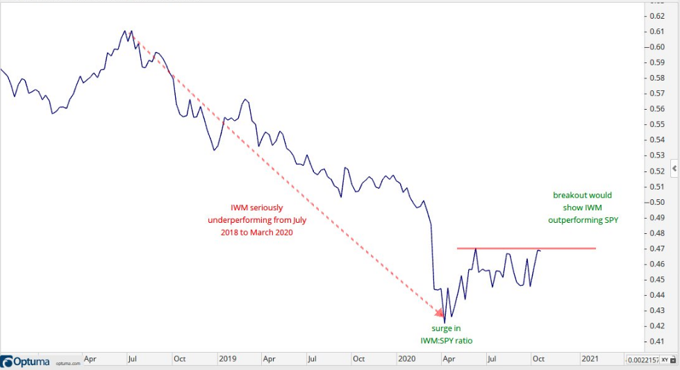
IWM has outperformed SPY since the March 2020 lows, which is a good thing according to market history. It’s currently at a level of resistance that has proven difficult to surpass and deliver a breakout. The IWM:SPY ratio plunged from July 2018 to March 2020 as small-caps seriously underperformed. The ratio surged in April-May and flattened out over the last 4 plus months. A breakout would show renewed relative strength and confirm my belief that small-caps can deliver strong performance into 2021. One might wait to see how this develops in the coming weeks as part of an overall risk management exercise.”
We don’t have the desired breakout of the IWM:SPY ratio as of yet, which may not prove such a bad thing. This is why we analyze the technical performance before jumping into the trade/investment. Technical analysis offers a perspective on the “developing situation”, the potential for the future. What technical analysis does not offer is a guarantee or a shield against pivots in the macro-market regime.
As it pertains to the weekly sector performance for the S&P 500 and such…
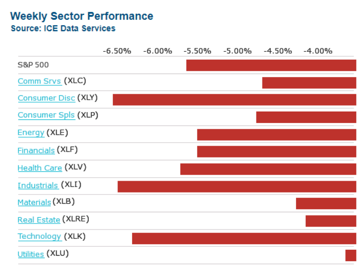
There was a clear flight to “safety” this past week, keeping in mind that all 11 sectors finished the week in negative territory (red). High dividend yielding Real Estate and Utilities outperformed growth and cyclical sectors by and large. It’s quite a turnaround in sector performance make-up from just 2 weeks ago and as highlighted in the weekly sector performance chart below:
As we move forward with our weekly Research Report, I will issue a construct for the report that mirrors our March Reports, without categories/section breaks. This will prove more a Stream of Conscious structure, given the unique state of market/investor affairs that somewhat rebuff typical and/or normal investor considerations. Additionally, this week’s Research Report will be free to our Basic Members, and the general public. We think investors deserve, given the unique year-end circumstances developing, to achieve a satisfactory, unbiased and fact-driven Research Report with resources going forward.
Stream of Conscious… Begins
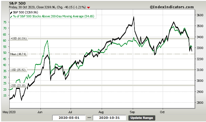
The S&P 500 stands ready to react and at a very interesting point in the technical landscape, which is seemingly fueled by the binary resolution of macro-market anxieties. For the technical picture to deteriorate to the extent it has over the last 2-months, and with realized Q3 2020 EPS having outperformed analysts’ expectations by leaps and bounds, it’s usually a change in the macro-perspective fueling the shift in the market technicals. In other words, new information is being digested by the market with respect to the macro picture. Nonetheless, the following S&P 500 chart is a microcosm of the developing macro situation that investors have been forced to consider:
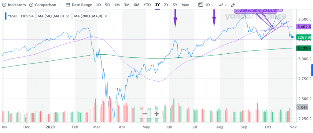
The inverse Head-N-Shoulder pattern is rather clear in the chart above (right side), having first developed the left and head of the pattern in September and then the right should into October. The base, or low point, of the head comes in at SPX 3,230s back on September 23, 2020. Thus far, the base continues to hold, providing long-term support as recognized by the horizontal (purple) line and dating all the way back to December 2019. During the S&P 500’s recovery process, this area 3,230-3,240 proved resistance, but since then it has provided support during consolidation phases. Despite the current bouts of increased market volatility (VIX), this remains a normal correction until proven otherwise. Like most everything else in the market; it is a developing situation for which an unbiased, flexible approach to allocating capital is the optimal engagement.
The S&P 500 closed the week below both its 50 and 100-DMAs. While not the end of the world and/or new cyclical bull market within a secular bull market, it’s not the ideal conditions as we also see that the 50-DMA (purple) has started to roll downward. This indicates that beneath the surface of the index, breadth is likely that much worse than the decline in price assumes.

As identified in the chart above, the percentage of stocks trading above their 50-DMA has dropped to rather bearish levels. During the first significant consolidation phase of the market recovery in June, such levels of weak breadth were not expressed. In September, as the S&P 500 had a stronger, 10.4% decline, breadth was a touch weaker than we witnessed to end the past trading week.
Such weakness in the breadth indicator demands confirmation that the market has materially weakened despite price support levels seemingly holding. The low-liquidity market environment that pervades the S&P 500 robust price action lends itself to rapid price moves. Therefore, when we look at shorter time period breadth indicators like the 20-DMA ratio of stock performance…

…it does tend to confirm what the percentage of stocks trading above their 50-DMA has suggested, a weakening of the overall market beneath trend support. As Finom Group has stated previously, breadth indictor analysis is often more useful during interim downtrends than during uptrends. Let’s face it, when were breadth indicators at their strongest; when markets hit an interim top. With this in mind…
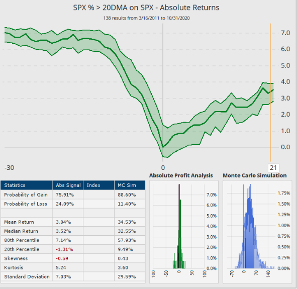
- The chart and table above recognize that less than 15% of stocks are currently trading above their 20-DMA.
- When this metric is under 15% and the S&P 500 is under its 20-DMA, the S&P 500 is higher, one month later 75% of the time.
- Mark the price and map-out for the median return folks!
- The median return is 3.52%. (study from Dan Russo, CMT)
What’s being referenced from the historical data above is a potential for the market to be or having “washed out”. Additionally, and referring to the better use case scenario for breadth analysis, this is where it would prove a greater indicator for investors inclined to “buy the dip”. It’s far easier to buy such weakness with breadth analysis than to sell into strong breadth, especially if a breadth thrust has fired. Speaking of breadth thrusts…
To the degree the market can fire a bullish breadth thrust, and did so in May (20-day) and even more recently in September (10-day), it can also fire a bearish breadth thrust. This past trading week felt as if the market was becoming overwhelmed with selling pressure, as there were 2 trading days with greater than 90% of stocks trading down on the day. While the percentage of stocks trading above their 20-DMA suggests a rather weakened bull market, we can dig a little deeper to identify if it has also fired a bearish breadth thrust akin to the March 2020 period. If it has, investors might take a “hands-off” approach until strength is found. Yes, sometimes it is better to buy in an uptrend than to “guesstimate” buying assumed bottoms.
In order to define a true bearish breadth thrust, we use indicators from the S&P 500, not the NYSE or Nasdaq alone. Why? The S&P 500 uses 2/3rd of stocks from the NYSE and 1/3rd from the Nasdaq. Using just the NYSE or Nasdaq leaves a lot of stocks out of consideration.
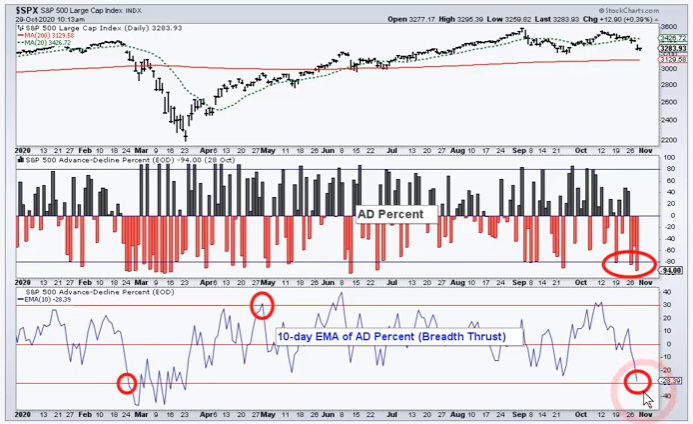
In the S&P 500 A/D Percent (middle panel) chart above, we can see off to the right side that we’ve had 3 days in the last 7 trading days whereby more than 80% of stocks moved lower (red bars). This happens and has happened a few times throughout the uptrend since April 2020. Having said that, the black bars represent percentage of advancing stocks, and this is where we find the weakness today a bit more concerning than in the past.
If we look at the circled cluster of 80% or greater declining stock days off to the right of the chart, the advancing stock days never saw more than 50% of stocks advancing on those up days. In other words, the up days didn’t offset the weakness on the down days, indicating there is indeed more selling strength residing on down days than buying strength on up days.
The dip buying is weaker than in the recent past. In previous months since the March 2020 lows, BIG DOWN days have been offset by BIG UP days. During both the June and September corrections, the biggest down day/decliners was followed by a cluster of big up days/advancers.
So what has changed in the dip buying activity, investor actions from the recent past to the most present trading regime? The technicals don’t offer verbiage, they simply paint a picture of the sentiment for the current market trend. For answers to the aforementioned question, we’ll likely have to look at the macro side of the market equation. But the question we were aiming to answer today was the question around a potential bearish breadth thrust.
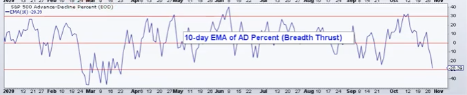
We separated the bottom chart from the former chart cluster. This S&P 500 chart recognizes the 10-Day EMA of A/D Percent, otherwise known as a breadth thrust of the 10-DAY A/D%. As one can see off to the left side of the chart, it is coming dangerously close to firing a bearish breadth thrust with a break below that -30% level and as it did back in March (Arthur Hill). If there was a time to watch/pause/hunker down/hedge if inclined/manage risk if deemed necessary, this may prove that time to do so.
With the S&P 500 still above a longer-term, 200-DMA (3,129), most stocks are also trading above this key long-term moving average or reference point.
From our perspective, this suggests that with more than 50% of the market still trading above its 200-DMA, the bull market is in tact, but weakened and pointing to an interim shift in the cyclical bull market when we include the aforementioned breadth analysis. To reiterate: If we were asked whether or not this would prove a reasonable point-and-time for which to hit the pause button on dip buying/allocating capital, Finom Group would suggest that it is always dependent upon individual investor time horizon, goals and risk appetite. There is simply no logical way to offer a blanket answer to satisfy all investor considerations.
If we were to go through all of our weekly breadth indicators, the market would likely prove to depict breadth weakness, support elsewhere and dependent upon the coming trading week’s price action development. For the sake of brevity we’ll simply highlight a way to characterize this rather in-between period of weakness and potential support with the following:
“The past week triggered about 50 more stocks to fall 20% below their 52-week highs, now 40% of them are below their 52-week highs. What does such a statistic indicate you might be asking? Our good friends at SentimenTrader can answer that query.”

- Above 50% = final innings of most bear markets
- Below 20% = indicator of a healthy market environment
- We’re still in no-man’s land here.
Usually, and another sign of a shift in investors’ behavior, we can point to equal-weight (RSP) vs. cap-weight (SPY) performance as pointing to underlying market strength/s. That was not the case this week, as they both performed almost identically and with weakness.
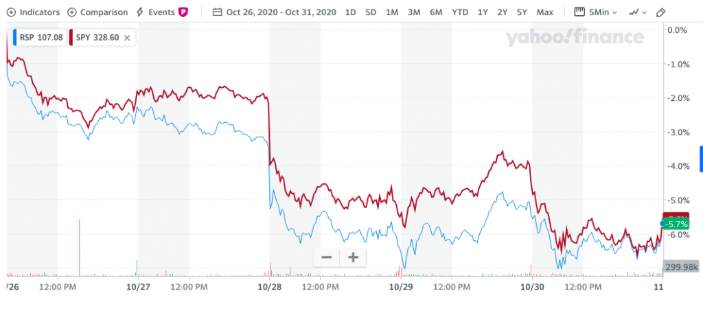
Again, charts offer no verbal analysis! Our take on this, and combined with the aforementioned breadth/technical analysis, is that there is apparent broader weakening of risk appetite that has developed over the last 2 trading weeks. We’ve witnessed some degree of deleveraging at the institutional investor level, but there may prove more to come depending on the breadth of hedge fund redemptions forecast ahead of peak hedge fund redemption period in mid-November. Currently, we see hedge fund leverage data as follows:
- Gross leverage at 191% (89%tile since 2010) Net leverage at 55% (88%tile). This is still relatively high, although lower over the last week.
Quick statistical tip of the week: If the market has an outsized reaction to the November 3rd election, a 5% one-day decline or greater…
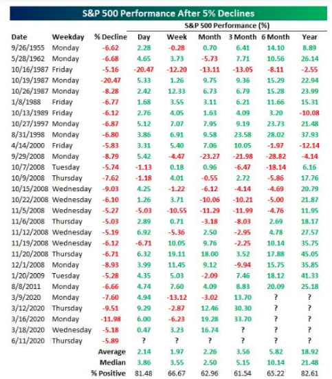
Have a game plan folks, have a game plan and this piece of historic data should prove a part of forward-thinking, game plans! After a single day where the S&P 500 has dropped 5% or greater, the following trading day was up on average 2.14% and 81.48% of the time.
Still Streaming…
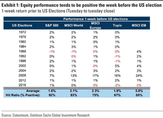
The bar graph below looks pretty ominous, given the elongated 2020 red bar! It appears misplaced and an outlier. What does the chart define for investors?
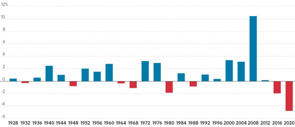
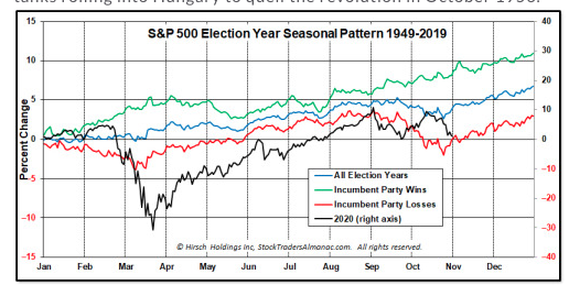
The chart explains that since 1928, the S&P 500 has never been down more than 3% in the last full week before a Presidential Election. Welcome to 2020 folks! Given it is such an outlier, I think we can determine the market’s recent weakness is not about the election, at least not entirely. Nonetheless, we can also see that in the 2016 election the market had declined a week ahead of the election. We haven’t had back-to-back Presidential Election cycles with a negative market performance a week out from the election since the 1960s. I (Seth Golden) wasn’t around to verify that I am proudly stating 😉 ! (Chart below is normal pre-election week trend for global markets)
Here’s another fun fact related to the weakness ahead of the 2016 Presidential Election: The market bottomed the Friday before the election in 2016. And here is yet another fun fact about trading days around the election that we offered to Finom Group members in our weekly State of the Market video this past Thursday: (Trader’s Almanac)
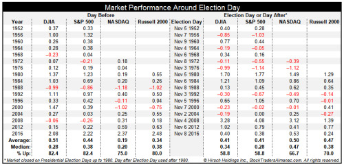
- Looking back at the last seventeen presidential elections since 1952, the day before Election Day has a clear bullish bias. DJIA and S&P 500 have declined just 3 times and average gains of 0.51% and 0.44% respectively.
- NASDAQ and Russell 2000 are slightly weaker, but still bullish.
- Election Day (or the day after prior to 1980) leans bullish, but with a greater frequency of losses. Incumbent party victories are shaded in light grey.
Maybe the aforementioned statistical probabilities concerning the S&P 500’s performance the day before the election is why investors bid the market off its lows in the final 15 minutes of trading on Friday? Either way, 2020 looks a great deal like the lead up into the 2016 election. The 90-day period leading up to this election is indicative of what investors witnessed in 2016. On July 31, 2020 the S&P 500 closed at 3,271. The index closed at 3,270 on Friday; we’ve gone nowhere in the last 90 days. In 2016 it was a very flat S&P 500 performance as well during the 90 days leading up to the Trump victory. Back then it was all about what occurred AFTER the results were announced. What’s important about rehashing, reiterating and revisiting the 2016 price action is recognizing that we’ve been here before.
The media can perform artistry with key words that trigger algorithms. Each Presidential election cycle is found with media narratives painting a dire scenario based on a popularized victor. In 2016, the popularized narrative surrounded the market crashing if Trump were elected.
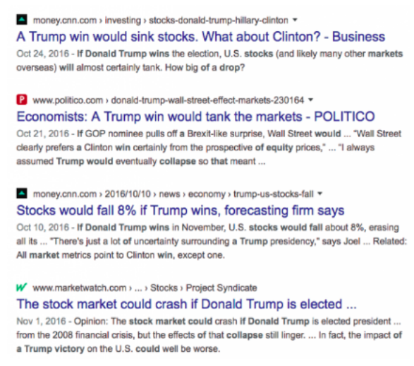
I think the media was giving Trump too much credit for being able to influence the market, and for that matter the economy. The reality is, historically speaking, Presidents don’t matter too much to the market. But in terms of the market’s performance under President Trump…

For the latest media hyperbole surrounding the challenging party in the 2020 Presidential Election cycle, Joe Biden’s tax policies have created the biggest media frenzy and headlines. Biden has proposed raising capital gains and corporate taxes. I’m of the opinion, both of these policies will prove extremely difficult to implement, even in a Blue Wave. It’s far more difficult to increase taxes than it is to decrease taxes. Simply put, getting Senators to go along with such measures has always proven problematic, even with a majority party in Congress. These are not individuals making a base salary of $250K; they can and frequently do incur double their public service salaries through speaking and consulting engagements. Joe Biden would be proposing to not just raise the taxes on those making $400k or more, but on the majority of Senators. Good luck with that Joe!
As it pertains to the corporate tax, I’m also of the opinion that where there is a headline number to be found, the media will likely run with it and not consider anything but the headline number. Joe Biden’s proposed corporate tax increase from 21% to 28% sounds extreme, but when one digs a little deeper they come to discover its not as imposing as the headline number appears. We explored all these tax hike plans in our recent State of the Market video as follows:

Trump’s corporate tax cut took the rate from 35% down to 21%, with effective rate at 17.7% (decline of 6.6%). So the Trump tax cut effective rate dropped from 35% to 17.7%, nearly 45% drop in the corporate tax rate. No wonder 2018 EPS was so strong, right? Biden’s proposed corporate tax hike would erase half of the Trump tax cuts and push it back up to 28%.
The Effective corporate rate is different from the Stated tax rate. You can see in the table above that while the Biden Corporate tax rate would be 21%, the effective reported tax rate is 17.7% since late 2017. Principally, if we use the Stated tax rate for Biden’s increase to 21%, the after-tax income comes in with a decline of -12.7%, which looks like it would cause a big drop in 2021 EPS and beyond. Now let’s remember that 21% is not going to be the actual rate corporations pay, but rather the Effective tax rate. At the effective tax rate, the After-tax income drop is only -4.2% and not -12.7 percent.
My contention is that Congress will never do it. They have been bought off many times over and Pelosi’s comment Thursday hints that Biden is going to have a tough time with anything beyond a token tax hike (2% or so).
Biden’s proposed 39.6% capital gains tax rate would be just shy of the record high under Carter.
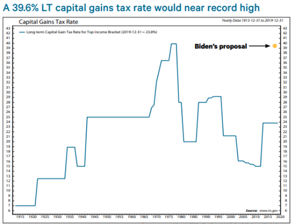
- It would be the biggest percentage point increase in history.
- Looked at the last 4 capital gains tax hikes. SPX mixed after.
- Few signs of LT impact in 2013 & 1987.
- Cyclical bears around 1976 &1969 hikes. Seems like other factors like economic growth, rates, and secular bull/bear were bigger drivers.
- Still, a big hike seems like a headwind.
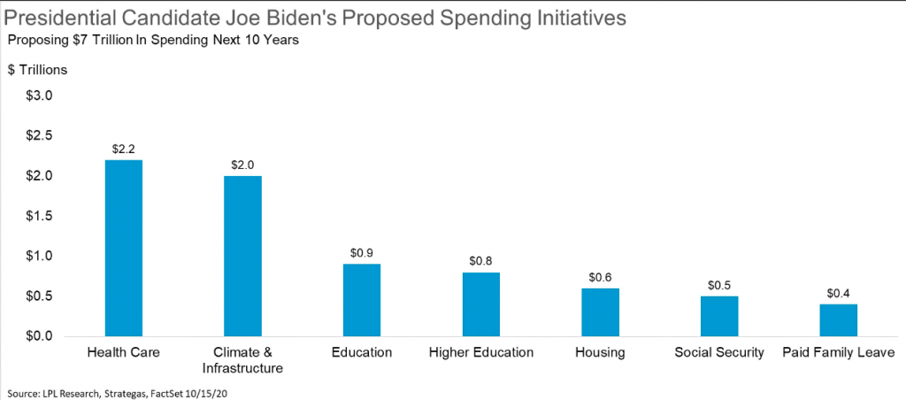
Sticking with the election, many investors are worried about higher taxes and more deregulation if former Vice President Joe Biden wins. Higher taxes may be one part of it, but Joe Biden is also looking at huge spending initiatives, indicated in the chart above from LPL Financial.
Here is what Goldman Sachs’ Janus Hatzius suggested about a Biden win, increased taxes, and a potential Blue Wave:
A blue wave—unified Democratic control of the White House and both chambers of Congress—could change the outlook in the following ways:
- a Democratic sweep would mean greater fiscal stimulus at the start of 2021.
- democratic control would likely lead to higher taxes, but probably not until 2022.
- spending would likely rise by at least as much as tax revenue, even beyond the short-term stimulus package.
- tariffs would likely come down over the medium term. While the Biden campaign has said only that he would “re-evaluate” tariffs upon taking office, we expect that a potential Biden administration would reverse the tariffs the Trump Administration imposed on imports from China and abstain from any new broad tariffs.
- Fed funds rate implications would be small at first but could ultimately pull forward the first hike by up to 2 years.
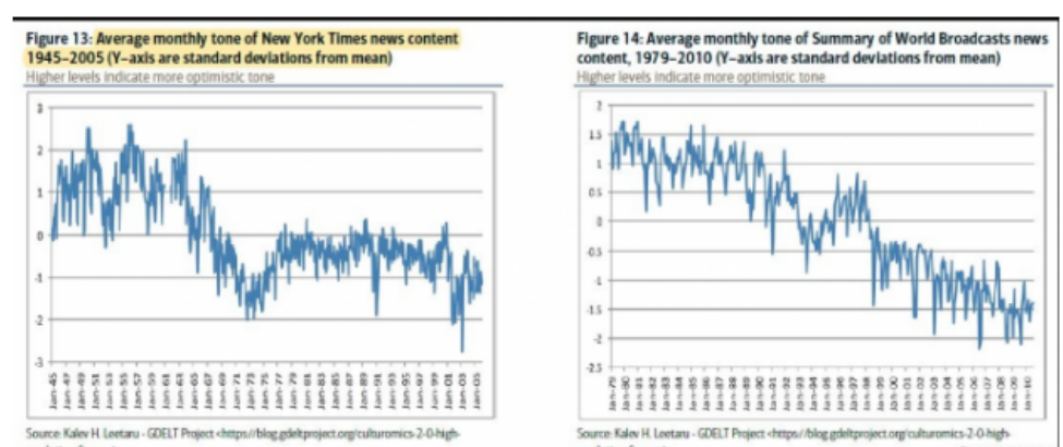
I’ve been an investor for the last 22 years, a sell-side analyst for ~5 of those years, and a portfolio manager for 8 of those 22 years. I’ve seen most headlines point to an ominous horizon for stocks and historically they come true roughly 10% of the time, but for very brief periods of time. Much of what the media headlines pertains to a particular subject matter, a singular data point or a limited duration and circumstantial outcome. None of the aforementioned are scalable, which is why the market doesn’t cave to such limitations and finite points of interest. So while the media is increasingly publishing pessimistic narratives month-after-month and year-after-year, the market generally moves in the opposite direction. (Following chart of media publications over decades, increasingly pessimistic narratives)
The point here folks; don’t let media narratives guide your capital allocations. Investors are not rewarded by being or becoming pessimistic. When fear is allowed to fester and grow, it becomes commonplace and irreversible in good times for most market participants. Investors are rewarded for investing capital with optimism and a longer-term time horizon.
Who is going to win the election you might be asking yourself right about now? It’s one thing to say the election doesn’t or shouldn’t matter to investors, it’s another thing to show the data in black in white to validate that fact, but of course who cares about the past. Most are only concerned with the future and on November 3rd we’ll find a new reality… possibly!
The latest polls, no matter where one looks really, are leaning considerably in favor of the challenger winning the Presidential Election. Joe Biden’s lead 4 days ahead of the election is nearly twice Clinton’s lead in 2016, and 2 points higher than the median for an election over the past 50 years.

With the recent decline in the stock market, despite the better than expected/forecast economic data, Biden is seemingly growing his lead ahead of Election Day. Keeping in mind that the last 90-day period has found the S&P 500 flat to down 2 points, this is also historically an infamous indicator when it comes to predicting the election results. To reiterate, on July 31, 2020 the S&P 500 finished at 3,271 and it finished at 3,270 on October 30, 2020, slightly lower for the 3-month period. Sam Stovall’s August-October Market “Presidential Predictor” closed in the red Friday. When the S&P 500 is lower from July 31 to October 31 in election years it is not a great sign for an incumbent presidential party win.
Since 1936, when the S&P 500 is up from the July 31 close to the October 31 close in election years, the incumbent party wins 85% of the time (11 of 13). When the S&P 500 is down over this 3-month span, the party in control of the White House has changed 88% of the time (7 of 8). In 20 of the last 23 elections, the incumbent party has been reelected when the S&P 500 was positive in the 3 months before the election.
As stated previously, markets don’t care who wins the Presidency, they simply desire a result. Having said that, when incumbent parties win the S&P 500 is up only 0.07% on average in November and 1.7% in December. When they lose, the S&P 500 is up 1.5% in November and 1.1% in December according to the Trader’s Almanac historic data.
A goodly amount of investors are mostly concerned with a contested election, for which the 20th century-present has a sample size of… 1! I get it, the contested Presidential Election of 2000 is still fresh in everyone’s mind which took place during the bursting of the dotcom bubble and ahead of the 2011 recession, again a sample size of 1. Yes, in terms of bubbles, the reality is they are very much like unicorns of the market. The dotcom bubble was previously only comparable to the “Tulip Mania” of the 17th Century. I kid you not, that is what the dotcom era evoked as a comparison and how infrequent we find bubbles. Other industry level bubbles (Housing, Oil) have come and gone, but few if any market bubbles. Nonetheless and as I digress, here is a look at the 2000 Contested Election chronology of market fluctuations and outcomes.
Contested Election 2000:2020
- Election Week: The election was held on November 7th, 2000, but the outcome was unknown for over a month because of the time it took to recount Florida’s ballots and decide who won its Electoral College votes and therefore the presidency.
- From the close on Election Day through the end of the next week on 11/17, the S&P was down 4.5%.
- By the end of a little over 2 weeks since the vote, the S&P was down 6.3% from 11/7 to 11/24.
- From Election Day on 11/7 through November month-end, the S&P was down 8.2%.
- Week 5 and through year-end 2000: The Supreme Court decision Bush v. Gore was announced on December 12th. Despite investor relief about the conclusion of the U.S. presidential election, the S&P fell 0.65% that day as a revenue and earnings warning from Compaq Computer further fueled concerns over tech profitability in a slowing economy. As a result, the S&P was still lower by 4.2% from Election Day (11/7) through the Supreme Court’s decision on 12/12.
- Volatility only got worse even with the certainty of the presidential outcome. Later that week, Microsoft announced it would miss estimates for the first time in a decade, leading to a large tech selloff.
- Post the Supreme Court’s ruling on 12/12, the S&P had 5 more down +1% days through year-end: 12/14 (-1.40%), 12/15 (-2.15), 12/19 (-1.30%), 12/20 (-3.13%), and 12/29 (-1.04%).
- From Election Day on 11/7 through year-end on 12/29, the S&P 500 declined by 7.8%.
As for what this means if this year’s presidential race is contested as a worst-case scenario: 1) Not knowing who will be President for days or even weeks after Election Day certainly does contribute to incremental volatility. 2) But investors understand an outcome will eventually be called and can start discounting the winner based on legal proceedings. 3) Long-lasting and significant volatility usually stems from an economic shock as opposed to politically related issues.
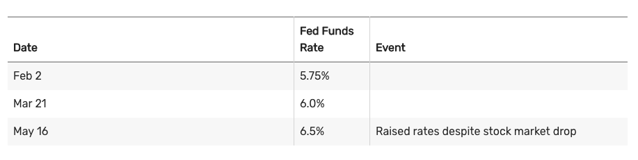
There are many differences between 2000 and 2020 when we accommodate for a contested election outcome. Interest rates, for one, were significantly higher in 2000 and heading in the “wrong direction” of equity market performance. (Rate hike table from FOMC enacted in 2000)
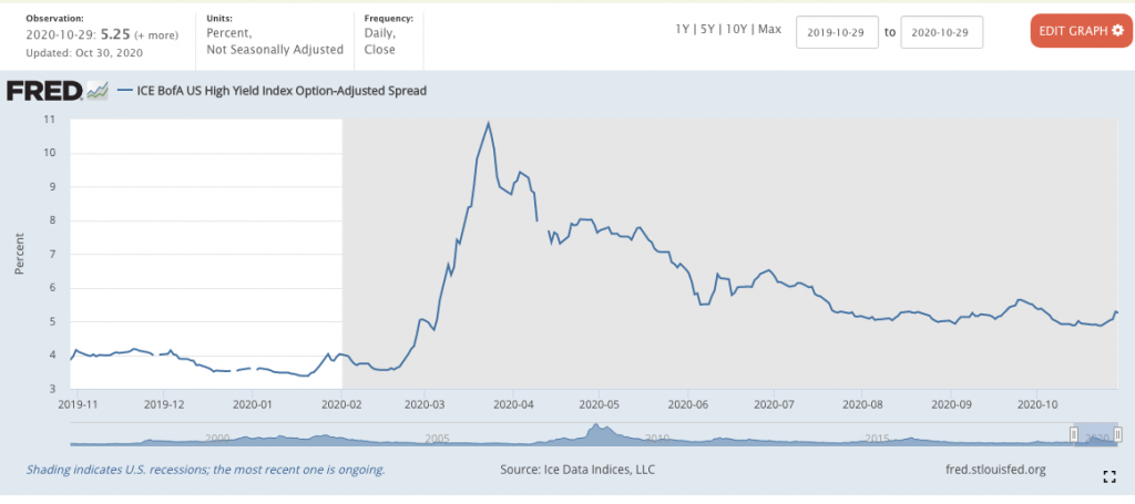
With a zero interest policy by the current FOMC and mandate for inflation that has proven persistently unattainable in the last 15 years, the market related angst ahead of the 2020 election may be accommodating for a contested election already. The FOMC is likely going to prove a backstop of liquidity should it be found necessary to sustain credit market performance/characteristics and facilitate a flow of capital into risk assets. We are likely to hear more from the FOMC near-term, in conjunction with their announcement this past Friday. (High-yield credit spreads below, still not showing credit market stress despite ~6% S&P 500 drawdown last week)
The Fed has already acted this past week in order to support the economy in ways it hasn’t in the past and even during the Great Financial Crisis. The Fed on Friday said it is reducing the minimum loan size to $100,000 from $250,000 and will ease restrictions on debt for companies already participating in the Paycheck Protection Program.
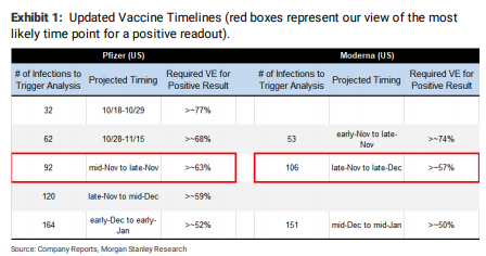
At this moment, another difference between 2000 and today is that we have a recovering stock market and a recovering economy, the opposite trend for both variables in 2000. Some might argue that COVID-19 can lay waste to all opposing variables, and that may have merit, but it is speculation until proven otherwise. The window of time for the pandemic to usurp the Fed’s policy tools seems a narrow window, given a vaccine is likely to become approved in late November, with distribution slated for December and into 2021. By all accounts and expertise (Dr. Fauci/Scott Gottlieb), most are aligned with a timeline for a COVID-19 vaccine approval by the FDA in late November 2020. The window for bearishness in the market may prove extremely limited beyond the November 2020 election, as announcement of an approved vaccine will kickstart the discounting mechanism by equity markets.
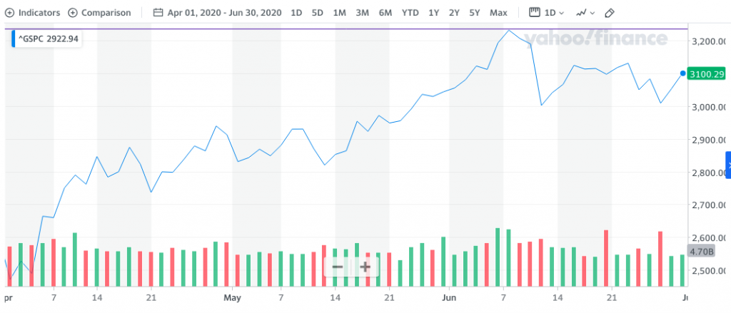
Moreover, the difference between a societal vaccine perspective and an investor’s perspective is profound and with respect to forward-looking markets. If anything has been validated in 2020, it is that markets are forward looking, even if the economy was still lagging and shutdown from April-early June. Go look at a chart of the market’s performance over that period of time.
Society may not find inoculation on the broader population until Q1 2021. An announced FDA vaccine approval in November 2020, however, will find a market discounting its benefits from future economic reopening and strength for the balance of the year. This is a key distinction of markets vs. societal benefits to consider as you plan your market exposure through the election and year-end period. This is not a forecast, but something for investors to consider!
Been Streaming and Streaming…
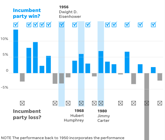
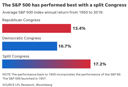
This coming week’s election will likely prove to eliminate some degree of investor uncertainty, even if contested. The reality is that the President matters less than the make-up of congress, where many will focus their attention. A little more on my personal ambivalence concerning a contested election. Since 1950, the average annual stock return for the broad S&P 500 stock index was 17.2% under a split Congress, according to LPL Financial. It falls to 13.4% when Republicans control both the House of Representatives and the Senate, and drops to 10.7% when Democrats control both chambers.
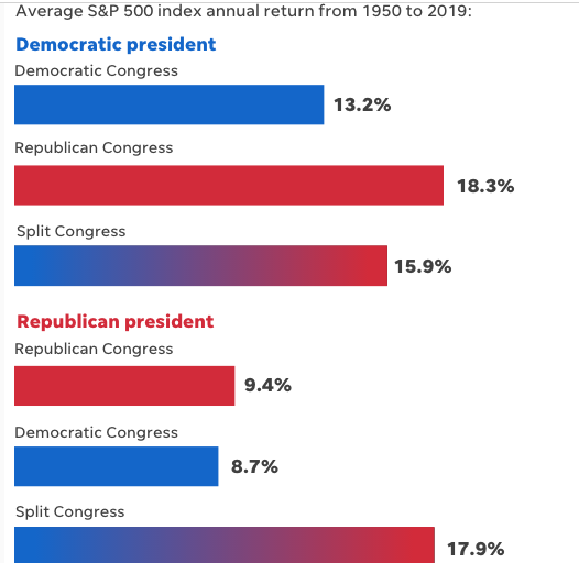
When broadening the scenario to include the presidency, the best situation for stocks since 1950 has historically been a Democratic president and Republican Congress, while a Republican president and Democratic Congress has been the weakest.
A majority of recent economic expansions have ended under GOP administrations. For instance, 10 of the past 11 recessions started while a Republican was in the White House. The one exception was President Jimmy Carter.
With respect to a contested election, the margin of victory or delta is likely to take precedence in the minds of investors/market participants. If the margin of victory proves wide, any contestation is likely to be dismissed as sentimental/ego more than a viable contestation and therefore investors will likely lack concern for the inevitable result. To reiterate, the margin of victory will likely reign supreme for contesting and in the eyes of investors.
I would be cautious on selling stocks based on next week’s election outcome alone because investors could miss out on future gains. Excluding the 2008 financial crisis outlier, the average path of the S&P 500 during years that the party in power loses is roughly in line with the average for all election years.
- Investors selling just prior to President Barack Obama taking office would have missed out on a 26% total return year in 2009 and the kickoff to the second strongest bull market in history, according to data from SunTrust Private Wealth Management.
- And investors selling just prior to President Trump taking office would have missed out on a 22% return in 2017, the figures showed.
As an investor, we are constantly thinking about the future of our capital allocations. We should be prepared for surprises, but we shouldn’t let them scare us out of the market altogether. When thinking through what the future might look like, it’s helpful to look at the past. The worst returns we’ve ever seen are possible, but are they likely? And based on what? And how bad can it get? Least we forget that 95% of the time, stocks have delivered a positive nominal return, and the worst 10-year period ever saw stocks fall 5% a year. Stay invested folks!
Additionally and as you can see in the first two bars in the chart below, if an investor had invested $10,000 starting in 1900, but only had it in the Dow when Republicans were president, it would now be worth nearly $99k. On the other hand, that same $10,000 would have grown to nearly $430k if it was invested only when Democrats were president. Seems like an obvious decision to make then? Look closer! That same $10,000 in 1900 would have grown to more than $4.2 million if the investor had remained in the market the entire time, regardless of which party has presidential power.
Staying Invested vs. Investing in Single Party

Just stay invested folks. The average trader is likely going to do themselves more harm than good by trying to hedge for any potential election period volatility, drawdowns and roller coasters in the market that may come thereafter. Weather the storm and understand the nuances that will normalize into 2021. Sometimes the more we do, the worse we perform.
While the election may roil markets in the short term, Jurrien Timmer, Fidelity’s director of global macro, says the pace of the economic recovery and the course of the pandemic are likely to be more important to stock market returns than who ultimately controls the White House and Congress.
Historically, Octobers of election years have experienced heightened volatility. But once the winner is declared, markets have rebounded. Over the course of a full 4-year presidential term, investment returns have been surprisingly similar regardless of which party controls the White House: Under Democrats, returns have averaged 8.8%; under Republicans, 8.6 percent.
Stock market returns and presidential parties

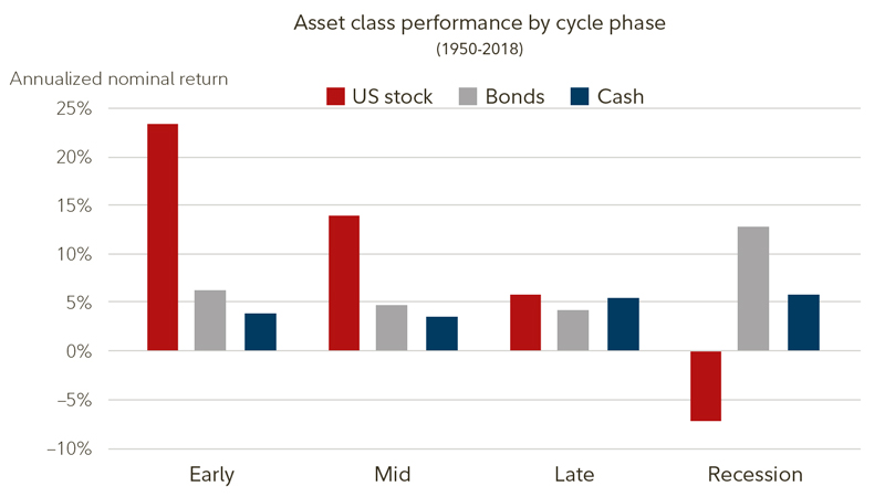
Despite the suppression of economic activity from the coronavirus on some sectors, particularly those associated with leisure and travel, most signs point to a recovering economy. The U.S. is in the early phase of the economic cycle, which has typically offered the strongest stock returns of all 4 phases of the business cycle.
I could go on a longwinded, as if I haven’t already, diatribe of economic data points aligning with the aforementioned economic recovery, but to what end? Investors/traders are more impressed with the near-term macro-market uncertainties. The numerous economic data points delivered over the last 30 days and even the whole of the Q3 period identified a much stronger than forecast economic recovery.
Third-quarter gross domestic product expanded at a 33.1% annualized pace, according to the department’s initial estimate for the period.
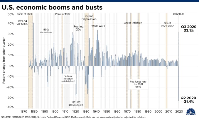
The gain came after a 31.4% plunge in the 2nd quarter and was better than the 32% estimate from economists surveyed by Dow Jones. The previous post-World War II record was the 16.7% burst in the first quarter of 1950.
The economic rebound from Q2 to Q3 was fueled by the continued reopening of businesses and reversing much of the economic fallout stemming from COVID-19-related lockdowns. As shown in the LPL Chart below, consumer spending, the largest contributor to GDP in the U.S. and roughly 70% of economic output, rebounded in a powerful fashion in the third quarter.

“GDP rebounded stronger than expected in the third quarter, but the big question on everyone’s mind is whether the economy can remain on firm ground in the fourth quarter and into 2021,” stated LPL Chief Market Strategist Ryan Detrick. “Barring a new round of fiscal stimulus, it’s likely that growth will taper off in the fourth quarter, but we still don’t expect a double-dip recession.”
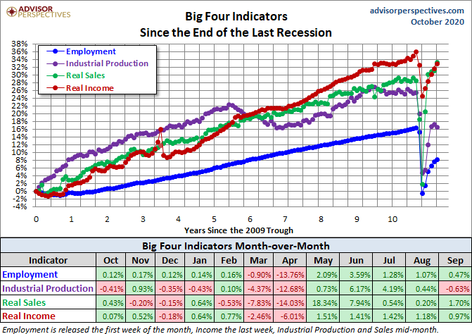
Coupled with recent economic data are the Big 4 categories we often consider. The chart and table below illustrate the performance of the generic Big Four with an overlay of a simple average of the four since the end of the Great Recession. The data points show the cumulative percent change from a zero starting point for June 2009.
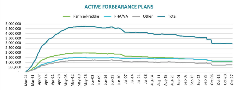
Yea but what about mortgage forbearance? I’ve heard it all before folks and remember what it actually takes to “take the economy down”. The data needs scale. Mortgage forbearance issues alone have no possibility of taking down the U.S. economy anymore than Student Debt had from 2010-2014.
Such concerns of an economic slowdown or regression, absent additional stimulus are rational and may prove warranted and even partly a force factor of the recent market consolidation. Remember, the market is a forward-looking discounting mechanism. When will the next tranche of fiscal relief be delivered to the American people will also likely be determined by the election outcome. Here is how I frame the timelines for the next package and dollar amount: (not a forecast)
- Blue Wave: First package of $800bn-$2bn by year-end and should the market and economy prove to falter.
- Incumbent President, divided Congress remains: $1-1.8bn by year-end, no contingency.
- Biden, divided Congress: $800bn by year-end and should the market and economy falter.
- House very unlikely to flip.
In recent weeks, the Federal Reserve Chairman and other Fed Presidents have impressed upon legislators and through various speaking engagements, that another round of fiscal relief would be warranted to maintain the current pace of the economic recovery. To-date, the Fed officials’ pleas have fallen on def ears it would seem. Our tax dollars at work folks. Never let a good stimulus package go without its political agenda first, while the American tax payer is placed last in the consideration once again.
Streaming Over, Time For Amazon
The market is cheaper! Cheaper than what? Whenever someone says the market is cheap or expensive, the first question should always prove it’s relative value; in other words its cheap or expensive relative/compared to what!
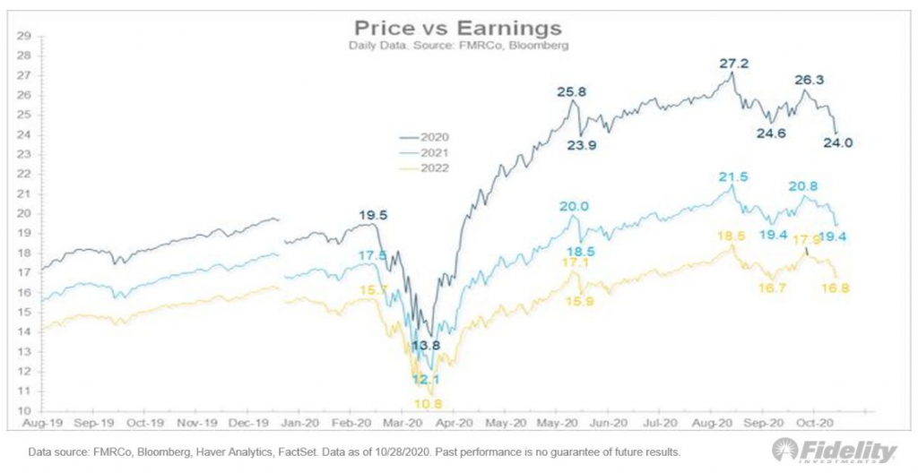
Firstly, the market has become cheaper as it has declined in price while earnings estimates have moved higher, for seemingly weeks on end. The chart below identifies the S&P 500 price/EPS falling from a recent Trailing PE of 27.2 to 24 presently.
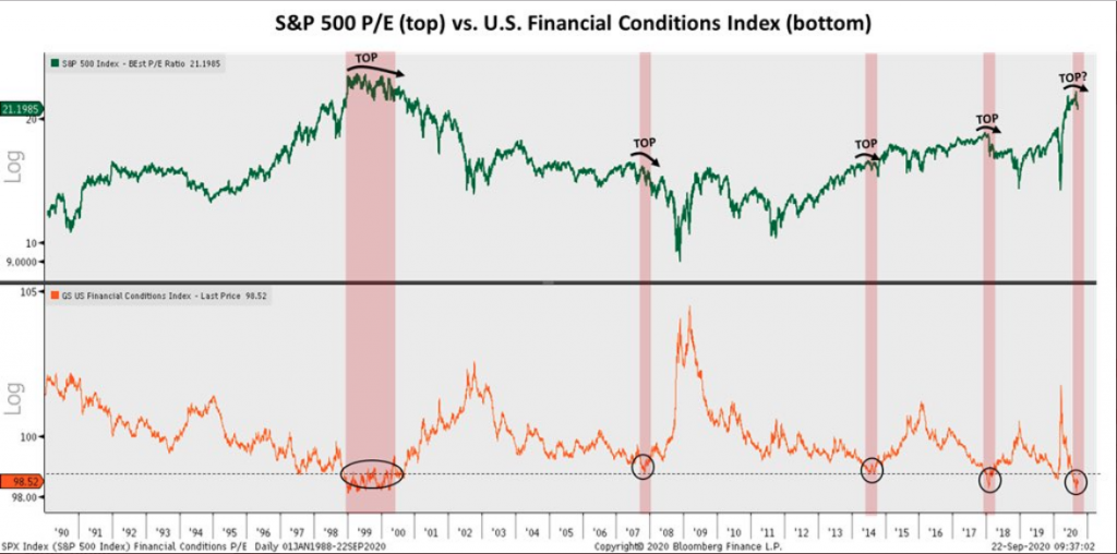
P/Es or multiples usually struggle to rise once financial conditions become as easy as they have become in recent months. P/E-expansion is usually found coming out of a bear market and recession while financial conditions are easing through the same period, but then P/Es prove to peak while earnings catch up and rebound. The chart below offers this narrative with SPX PE’s atop and Financial Conditions Index at the bottom.
As we’ve traveled through earnings season it has been made abundantly clear that investors have priced in better than expected results, already. Again with the forward-looking… blah, blah, blah right?
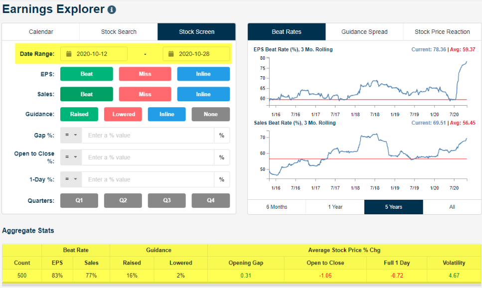
Through Thursday of this past week, more than 500 stocks had reported earnings since the Q3 reporting period began on 10/12/2020. Some 83% have beaten EPS estimates, 16% have raised guidance. The average 1-day share price reaction is -0.72 percent. No, that is not a misprint folks! Priced in! (Bespoke Investment Group EE)
Although strong beats on both the top and bottom line are not finding share price appreciation in the current earnings season, we should not dismiss the trending results. Earnings and liquidity are the 2 driving forces of markets over time. Liquidity has been poor since 2016 and compared to all prior periods dating back to the turn of the century. The period since 2016 has resulted in higher levels of periodic volatility regimes.
Referring back to those market driving earnings, Q3 tracking estimates continue to find positive revisions by analysts and in the most recent FactSet reporting. This is, once again, a significant upward revision that takes the tracking of Q3 2020 EPS from -16.5% to down just -9.8 percent. Yes, this recent revision blows my previous -15% decline model/forecast out of the water, I am happy to say!
Positive earnings surprises reported by companies in multiple sectors (led by the Communication Services and Consumer Discretionary sectors) were responsible for the large decrease in the overall earnings decline during the past week.
Insight/2020/10.2020/10.30.2020_EI/S%26P%20500%20Earnings%20Growth%20Q3%202020.png?width=920&name=S%26P%20500%20Earnings%20Growth%20Q3%202020.png)
- Looking at future quarters, analysts predict a (year-over-year) decline in earnings in the fourth quarter (-11.2%) of 2020.
- However, they are also projecting a return to earnings growth starting in Q1 2021 (14.5%).
- During the upcoming week, 126 S&P 500 companies are scheduled to report results for the third quarter.
While the market sold off by greater than -5.5% this past trading week, let me kindly remind investors of some of the biggest earnings beats that were captured during the Q3 2020 earnings season:
- GOOGL ($16.40 vs $12.29 est.)
- AMZN ($12.37 vs 7.41 est.)
- FB ($2.71 vs $1.91 est.)
The beats recognized by these individual company results above is reflected in the increased earnings optimism for 2021. The current consensus analysts estimates for 2020 EPS and 2021 continue to ratchet higher. It should be perfectly acceptable to witness stock prices declining while earnings move higher as it declares a longer-term and more profitable opportunity for savvy investors.
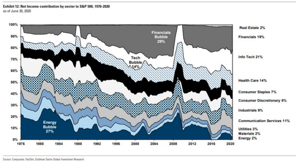
To the extent we’ve discussed a market bubble in the past at Finom Group, we continue to dismiss such a notion given the magnitude of where earnings contributions are coming from within the S&P 500, in comparison with the 1998-2000 time period. The following comparison between 2020 and 2000 was offered by Credit Suisse this past July:
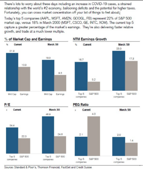
Goldman Sachs: “At the peak of the tech bubble, Information Technology never generated more than 14% of the S&P 500’s earnings, the profit contribution from Info Tech increased over the past few years and the sector now accounts for 21% of S&P 500 net income”. (chart below)
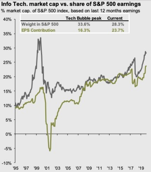
The following is another great chart from J.P. Morgan showing Information Technology sector earnings contributions & sector’s weight in the S&P 500. The sector’s weight is ahead of its earning contribution, but the gap is not in the same neighborhood that it was in 2000.
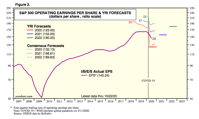
Finom Group has offered its FY2021 EPS forecast of $172-$176, as we remain of the opinion estimates will be proven too low as the global economy will rebound with the inoculation period. We think the timelines offered for the inoculation period are underestimating the potential acceleration along the same lines the vaccine would prove to surpass initial development estimates. Never bet against human ingenuity!
As a side note and with the Semi-Conductors coming under pressure in the last week or so…
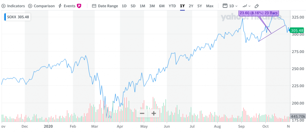
… this is still a sector that fuels the Information Technology and Industrials despite price action as viewed through the Philly Semiconductor Index (SOXX). While the Semi-Conductor Index and individual stocks have come under pressure with the broader markets…
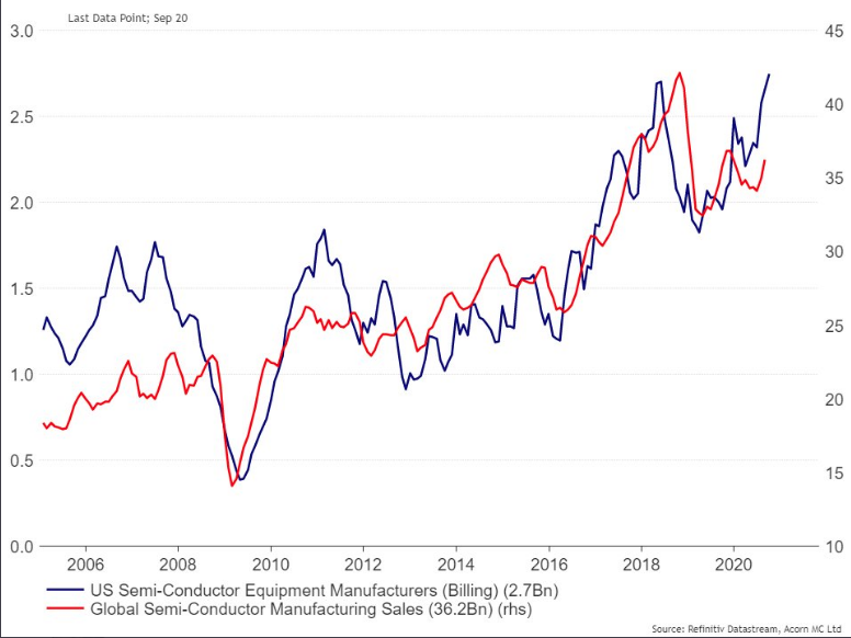
… Semi-Conductor sales continue to rise! As it was with strong earnings finding weaker share price performance, weaker Semi-Conductor stocks with rising Semi-conductor sales is likely a longer-term opportunity for investors!
Investors shouldn’t dismiss the current epidemic infection rate and hospitalization rates rising. At the same time, the United States is not Europe and the Asia-Pac region is seemingly finding a robust recovery without a 3rd wave. For every bad there is a good and every pro there is a con!
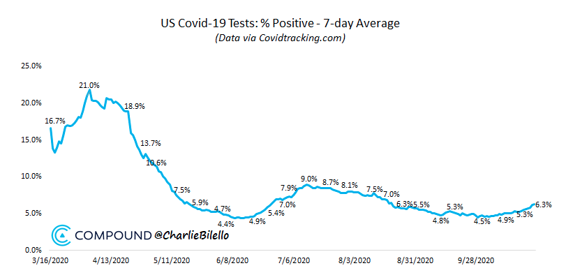
We have a history for which to recognize the impact of a rising epidemic curve that we didn’t have previously, a playbook so to speak. And while Europe is undergoing newly reimposed restriction in France, Italy, Germany and the U.K., we have not to this point. It is far easer to re-impose restrictions from the largest employer, the government in Europe. The public sector is a much larger employer in Europe than it is in the United States. The impulse to reimpose restrictions on the economy, therefore, are likely found with greater ease in Europe than the United States. This is something most market participants haven’t factored into their “lockdown” calculus. This is not to say restrictions, to some degree, are not a probability in the U.S., but rather it will likely be met with resistance at the government and civilian levels. While lives are put at risk without restrictions, there are many other considerations state and local governments are forced to calculate.
With respect to the hospitalization rate, investors might consider that while the rate is rising, it remains a goodly amount below that found in July, with several states re-instituting restrictions and the market finding new all-time highs thereafter. Today’s rising infections are finding younger cohorts more capable of fighting the virus without the need for hospitalization. Not the case for all new infections, but a detail nonetheless.
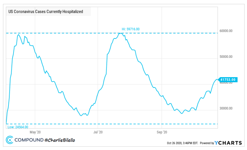
Goldman Sachs: “We think investors would look through a temporary pullback in activity if a safe and effective vaccine were confirmed—because we could have a high degree of confidence that activity would rebound soon. But until that point it will be important to monitor case growth and hospitalizations across major economies; evidence that new restrictions in Western Europe were curbing new infections would be an encouraging sign.”
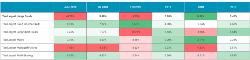
Nothing within this weekend’s Research Report negates, dismisses or forecast near-term market potential ups or downs, but it does lend to the weight of the evidence for the future economic, earnings and market recovery. Near-term volatility in price should prove opportunity long-term. It’s far easier to buy dips than it is to short with a strong entry and strong exit, and then finding the courage to change course all of a sudden and align for the market reversal. Even the best hedge funds in the world can’t achieve such strong, profitable shifts in positioning. The worst thing one can do is to pivot too much into a wave of market volatility, reacting to the whipsaws in price action near-term and losing focus on the long-term probabilities. (Top 10 hedge funds performance data YTD below table)
Michael Batnick recently offered the following commentary regarding near-term market price action potential and risk:
“The only reason we put our hard-earned money on the line is to secure financial freedom. That’s it. And if a 6% drop in one week is impacting your ability to live the life you want to live, then you’re taking too much risk. Maybe you’re not worried about this 6%, but you’re worried about the next move lower. In which case, I repeat, then you’re taking too much risk.
The stock market hates uncertainty. You should love it. Uncertainty amplifies risk, and risk plants the seeds for future reward, eventually, most of the time (Japan, etc).”
There is no such thing as a perfect market, perfect economy, perfect set-up for a trade or perfect macro-environment. Never, and I do mean never… never let the good be the enemy of perfect. I was recently asked what my best indicator was for increasing market exposure and buying stocks/ETFs.
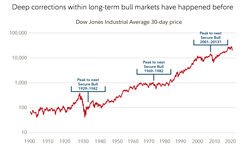
The chart above says it all! Markets move from the lower left-hand corner to the upper right-hand corner over time. If you desire more granularity for market outcomes by magnitude over time…

The market is up, annually, some 77% of the time. Roughly 23% of the time the market is delivering a 20-30% return for the year. And my indicator is simply how much cash can I invest to benefit from that chart’s outlined trajectory. When stocks go on sale, know that they will only prove the sale for so long. Ergo, regardless of what happens with market price action in the month of November, I would be staying the course and further aligning with the long-term market trend and probabilities for 2021, utilizing my game plan as a guide for capital allocations.
Some of our Finom Group members will recall what we wrote and offered below, from our March 29, 2020 Research Report:
Today people are saying: “There are so many bewildering uncertainties, and so many enormous problems still facing us, both long and short term, that there is no hope for more than an occasional rally until some of these uncertainties are cleared up. This is a whole new ballgame.”
With all of that being said, here is what James Fullerton, the former Capital Group Chairman offered, as it pertains to the past and present day markets:
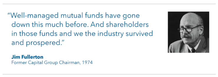
“In 1942 everybody knew it was a whole new ballgame. And it sure as hell was. Uncertainties? We were all in a war that we were losing. The Germans had overrun France. The British had been thrown out of Dunkirk. The Pacific Fleet had been disastrously crippled at Pearl Harbor. We had surrendered Bataan, and the British had surrendered Singapore. The U.S. was so ill-prepared for a war that the cavalry school at Fort Riley was still teaching equitation, and I would guess that probably 75% of our field artillery was equipped with horse-drawn, French 75mm guns, Model 1897 (including the battalion in which I was then serving).
On Saturday, April 11, 1942 (remember when the exchanges were open on Saturday?), The Wall Street Journal stated: “Brokers are certain that among the factors that are depressing potential investors are, (1) widening defeats of the United Nations; (2) a new German drive on Libya; (3) doubts concerning Russia’s ability to hold when the Germans get ready for a full-dress attack; (4) the ocean transport situation with the United Nations, which has become more critical; and (5) Washington is again considering either more drastic rationing with price fixing or still higher taxes as a means of filling the ‘inflationary gap’ between increased public buying power and the diminishing supply of consumer goods.” (Virtually all of these concerns were realized and got worse.)
Yet on April 28, 1942, in that gloomy environment, in the midst of a war we were losing, faced with excess profits taxes and wage and price controls, shortages of gasoline and rubber and other crucial materials, and with the virtual certainty in the minds of everyone that once the war was over we’d face a post-war depression in that environment, the market turned around.“
I’m sure after reading Fullerton’s representations from WWII and 1942, the question going through your mind right now is, “What, what changed the markets’ direction?” The answer is actually quite simple and a truism of human behavior throughout time. We can only sustain panic for brief periods and once the “fright or flight” human condition/emotion kicks in, the frightful are unfortunately self-removed from the equation and those willing to fight and endure are found as the beneficiaries of a rewarding future.
Next week might stink something awful for investors, next month may test your endurance, but we hope that most investors will remember to never bet against the human spirit, which always has proven to overcome!
If you found our in depth Research Report and included State of the Market video excerpts resourceful and beneficial to your market knowledge, subscribe to our Contributor ($7.99) or Premium Membership ($49.99 Research & Trading) today to receive our Research each week, as we only offer two free offerings a year.


