After 2 trading days having concluded for the week, and despite the seemingly unchanged level in the S&P 500 (SPX), there has been a goodly amount of price action that has taken place. At its trough level for the week-to-date, the S&P 500 dropped to foreseeable and forecastable levels before rebounding on Tuesday with a 1% rally on the day. Thus far, we believe that the market continues to send a longstanding message that pullbacks/drawdowns are little more than buying opportunities. How one “buys the dip” is no less important than recognizing the market’s message, as discipline should not be dismissed for the sake of a consistent market message.
Identifying market regimes through longstanding price action is of upmost importance for investor/trader success, as it pertains to achieving long-term goals. We discussed the current market regime 2 weeks ago in our State of the Market video, as follows:
- **Stock indexes have been making new highs because primarily down days have been followed by up days in greater proportion than up days have been followed by down days.
- As it may be seen from the chart below, the percentage of down days followed by up days in a rolling 252-day period recently reached an all-time high of 69.3% while the percentage of up days followed by down days is at 47.02% and much below the all-time highs.
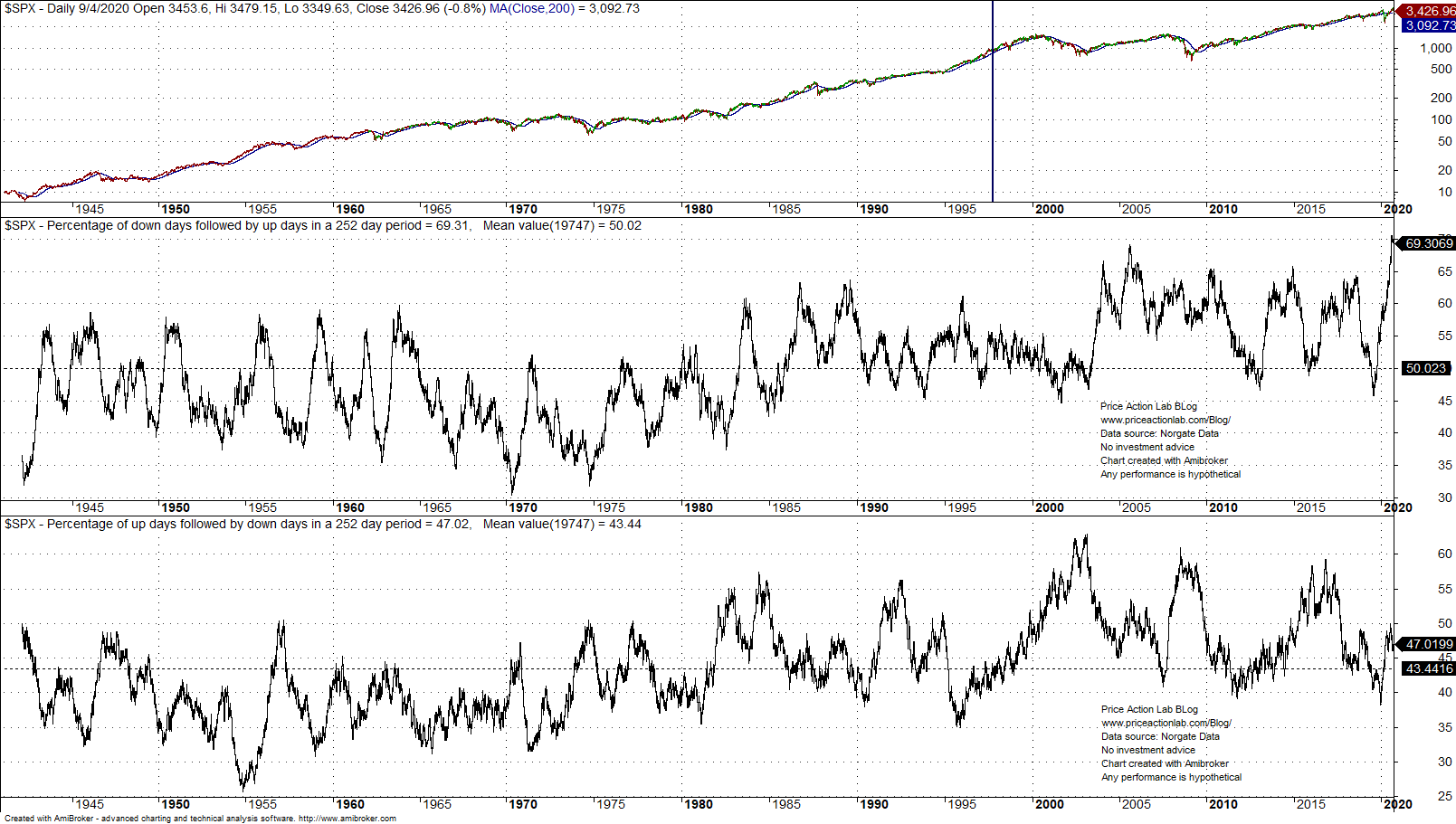
- The above analysis basically explains why the stock market keeps making new highs while in mean-reversion regime: there are market participants that buy the dips.
- Some call these actions wise while others call it market manipulation by funds and/or central banks.
The aforementioned should be a fundamental basis for your investing strategy and goal definitions, but I digress as we revert our conversation to this week’s market action. Will “Turnaround Tuesday” find follow through on Wednesday and beyond? If only we had a crystal ball, right? Ideally, one shouldn’t find themselves with a less favorable approach to investing/trading, considering such limited and short-term time frames. Think long-term, position yourself using an unbiased, flexible game plan!
Coming into the trading week we recognized the weakening technical picture for the major averages and adjusted our trading plan to anticipate further potential weakness. Here is what Finom Group offered subscribers in our most recent Research Report:
“As we approach the week ahead, Finom Group encourages investors/traders to remain disciplined in their approach to engaging the market with additional capital allocation in mind. The Nasdaq had closed below its 50-DMA in the previous week and again this past week. The S&P 500 has now followed suit by closing below this important moving average. While these are NOT make-or-break levels for the markets, they do demand of investors a more cautious approach that allows for the markets to continue to message whether the worst of the downturn is approaching or if something of greater downside magnitude is afoot. As we look deeper into the technicals, market internals/breadth and macro-economic data, Finom Group believes the long-term trajectory remains aligned with a secular bull market, even if the near-term technical outlook has deteriorated somewhat.
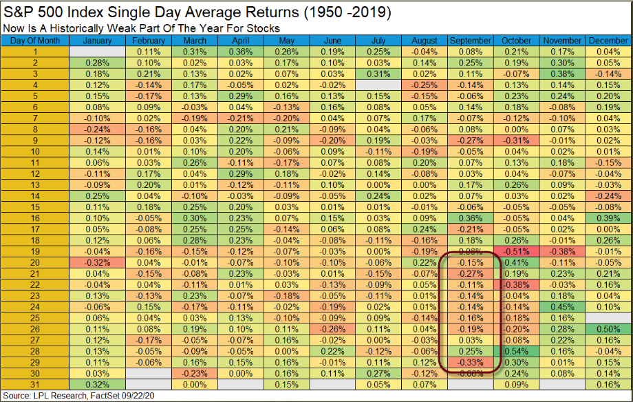
Given that the week following the September Options Expiration week is typically the absolute worst week for the S&P 500 annually, one might anticipate more weakness in the week ahead. This might find the S&P 50 filling this gap from 3,284 to 3,272, as shown in the chart above. The gap fill may find a tradable bounce and from there…
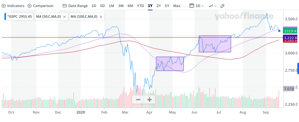
The S&P 500 chart above identifies 2 separate consolidation periods that have already taken place since the March 2020 bottom. One of them found the 50-DMA breached to the upside and pushed back below, identifying resistance at the moving average. Ultimately the first consolidation period from late April to late May found a breakout until the first week of June, which identified another month-long consolidation period and subsequent breakout. The horizontal line in the chart identifies what has proven a very, prominent magnet for price action going all the way back to December of 2019.
In the chart, we can see that price revisited the 3,220-3,330s several times since December 2020. This level proved to be a peak in early June and then support in mid-July. Given the frequency for which price revisited this magnet level, I would greatly recognize this level of potential support within your portfolio management game plan and until the consolidation period has culminated. Also within the chart, I think it’s necessary to recognize that we have had multiple 5%+ drawdowns since the bull market resumed and each consolidation period has led to higher highs. This is the view from the 30,000 foot-level, the forest for the trees!“
Now that we’re all caught up…! Our technical outlook has come to pass with gap fills and a drop to 3,229 intraday in the S&P 500, before a sharp rebound ensued. The open-ended question remains as to whether or not the rally will find legs or yet another setback given the dynamics surrounding quarter and month-end rebalancing affects. In earnest, investors/traders may do themselves a greater justice by looking ahead to the following week where their may prove tailwinds for stocks, just ahead of the kickoff to earnings season. J.P. Morgan suggests this may prove a better environment for investors:
J.P. Morgan looking at month-end flows as a bullish factor next week.
- Rebalances from fixed-weight asset allocation portfolios, along with the reversion of option rolling-driven expiry week momentum, tended to cause the market to mean-revert into month-and quarter-end.
- Equities have underperformed bonds month-to-date (but outperformed quarter-to-date by -5%)
- A large majority of these portfolios rebalance on a monthly rather than quarterly frequency …. historically, the monthly rebalance effect is over 5x stronger than the quarterly rebalance effect. Thus, the equity buying by monthly rebalancing portfolios (due to equity underperformance MTD) much more than fully offsets the selling by quarterly rebalancing portfolios, meaning these portfolios are expected to be net buyers of equities into month/quarter-end.
- We would expect rebalances by these fixed weight asset allocation portfolios to provide a tailwind to equities next week
Obviously, we won’t know if J.P. Morgan’s team is accurate in their outlook until next week, but Peter Tchir, author for realmoney.com is advising investors to NOT buy the dip yet. His latest article was published Monday, and wouldn’t you guess it, investors/traders didn’t heed his warnings.

See what we mean about thinking in such short time frames; everyone has an opinion on the near-term and those opinions greatly vary.
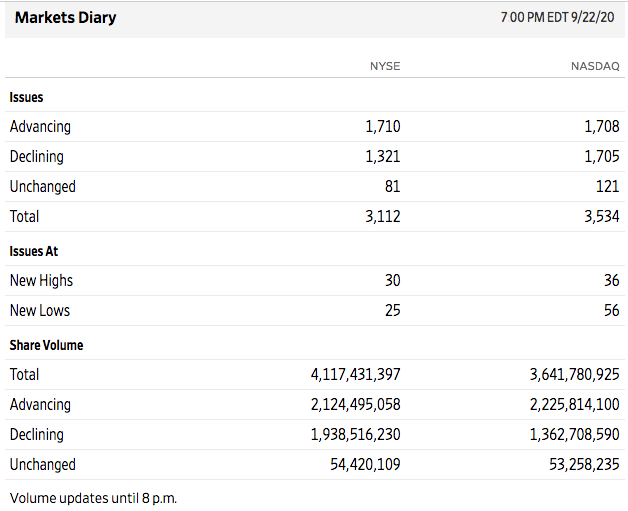
Tuesday’s turnaround wasn’t as strong as the 1% rally in the S&P 500 or 1.7% rally in the Nasdaq (COMPQ) might assume. Breadth was relatively week for the trading session and some key sectors greatly underperformed for the trading day. One day does not make for a trend or a reversal of trend, but we’ll need to be monitoring breadth going forward, as it may lend itself to defining a resumption of the uptrend or to the contrary.
As we can see from the A/D statistics below, the NYSE had slightly more advancers than decliners, and the Nasdaq was basically break-even for this particular breadth reading. Additionally, the Nasdaq produced more stocks hitting new lows than new highs on the trading day.
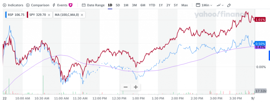
Looking at breadth by way of the S&P 500, we would have liked to have seen the Equal-Weight index ETF (RSP) perform in kind if not better than the Cap-Weight index ETF (SPY). That didn’t happen Tuesday, but again, one day does not make or break a market let alone offer enough data on the go-forward probabilities for the market. We’ve seen such relatively weakness from the RSP:SPY ratio in the past and frequently. (RSP and SPY 1-day performance chart)
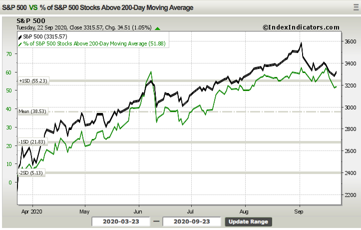
As we look further under the hood of the S&P 500 rebound back above it’s 50-DMA on Tuesday, it came with more stocks moving back above their 200-DMA, but not by much at all. The chart below depicts the percentage of stocks trading above their 200-DMA rose only slightly on Tuesday and remains above 50 percent.
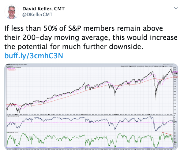
Some suggest that keeping the percentage above 50% is critical for the continuation of the uptrend, but a dip below would find much more downside. David Keller CMT of StockCharts.com offered the following with respect to this breadth indicator on Tuesday:
“If less than 50% of S&P members remain above their 200-day moving average, this would increase the potential for much further downside.”
Is David going to be proven right? We don’t have the answer to that question, but we do have the charts in front of us. In the charts above, the percentage of stocks trading above their 200-DMA rose above 50% back in early June, then tumbled with the S&P 500 correcting some 8.3 percent. The breadth indicator also fell below 50%, to a trough level of roughly 34% in the days to follow. Did the market fall “much further” then and with the percentage trading above this moving average having dropped below 50 percent? Clearly the answer is NO! What we have here is a prediction without using the weight of the evidence in its entirety. Having said that, this is something to monitor, as a market that has expressed a breadth thrust in June and is found lacking for liquidity can often wreak havoc on technical analysis.
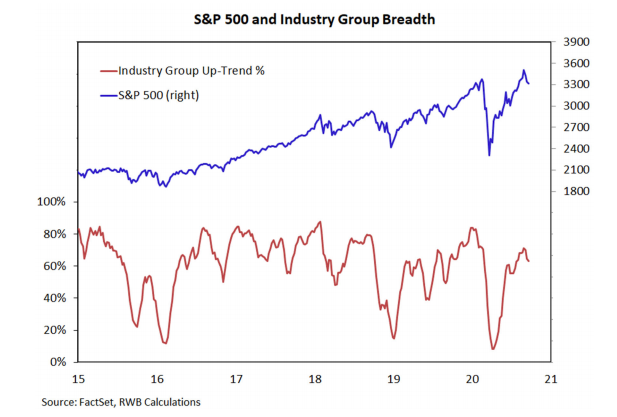
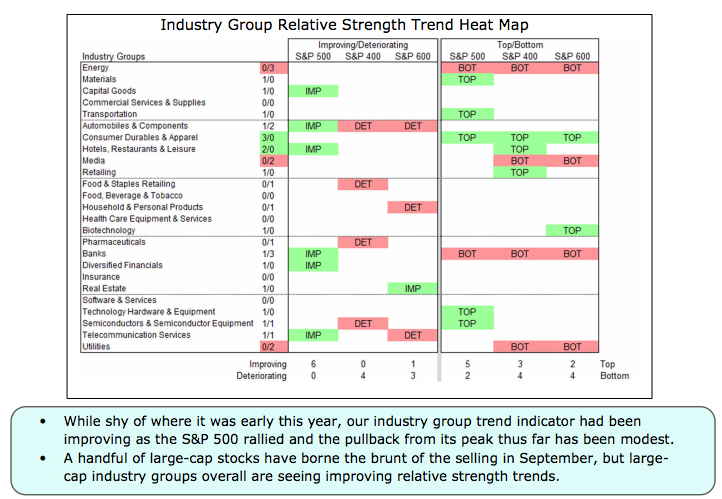
Our final look at certain of many ways to monitor and/or track breadth comes from R.W. Baird’s Willy Delwiche. His charts suggest that industry level breadth, on an absolute and trend basis remain at healthy levels, but bear monitoring.
Just a heads-up when it comes to monitoring market breadth: This tends to be a futile exercise during uptrends and as periods of weakening breadth during an uptrend ebb and flow in between periods of strengthening breadth. In other words, during an uptrend, breadth indicators have little utility for investors/traders. Price action is of greater consequence. During downtrends, however, breadth indicators prove to capture greater utility in defining “washout” levels.
As we look forward to the remainder of the trading week, let’s first take a walk back in time to a former “market timing” call that was promoted by Jim Cramer on July 14th’s Mad Money show. On the show, Cramer outlined a seasonal market call from famed market technician Larry Williams.
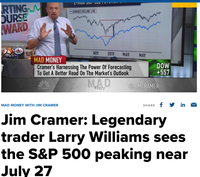
Larry Williams predicted the S&P 500 would peak at former highs & rollover, given seasonal patterns, on July 27-28. While his timing proved extremely faulty, the level the S&P 500 was trading at that time was 3,239 (July 27 close). We did just revisit such a level. The problem with the call, however, was that the peak in the market, to-date, has been 3,588 or ~250 points higher… or ~11% higher. Heck, the average S&P 500 ANNUAL return over the last 40 years hasn’t been that high (11%). That’s how much upside one would have missed by heeding the call/warning from Larry Williams and as promoted by Jim Cramer. Even if you captured just half of that move to the all-time highs, one would have done very well by ignoring such market timing calls. There’s a discipline and advantage to simply staying invested folks!
Below is a back-of-the-envelope attempt to quantify the effects of market timing, recently offered by Ben Carlson. It is far from a perfect approach, but what you see here is a calculation of the 10-year profit and loss (P&L) of all monthly net flows into equity mutual funds and ETFs, and compared that to the 10-year P&L of a dollar cost averaging strategy. Both of these are then compared to the long-term compound annual growth rate (CAGR) for both the S&P 500 and cash.
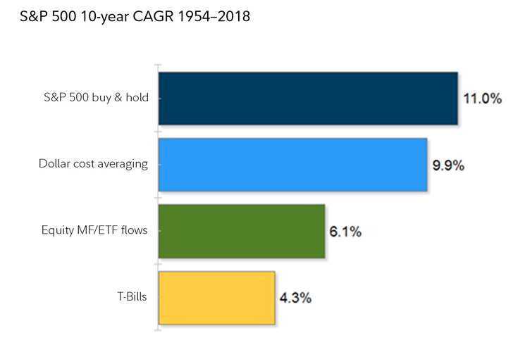
As you can see, while dollar cost averaging comes very close to replicating a buy and hold strategy (represented by the long-term CAGR of the S&P 500), fund flows (as a proxy for market timing) lag far behind and are pretty close to what you can earn by sitting in cash. Market timing, on aggregate, tends to detract from performance while increasing volatility. Nonetheless, and despite the preponderance of evidence, active investors/traders will attempt to time the market via equity sales, hedging or simply going short the market as a whole. Literally happens on a daily basis.
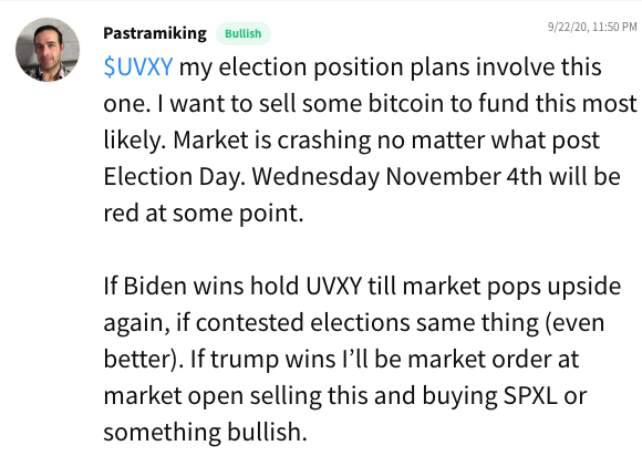
Much of the market timing you’ll see is correlated to a narrative about the economy and/or political events to come/circulating. Keeping in mind, markets follow earnings and liquidity and not narratives, the drumbeat sounds ever-louder when markets are trending higher and achieving records. The following graphic and social media commentary from a trader identifies the most popular of market-related narratives in the here-and-now:
The election angst of 2020 has taken center stage as early as January of this year. Investors have been consistently hedging election risk for months and months now. Some of the election risk hedging has been evidenced, since the New Year came to pass, within the VIX Futures Term Structure. Vance Harwood of sixfigureinvesting.com identifies the hedging activity around the election in a rendering of Term Structure as follows:
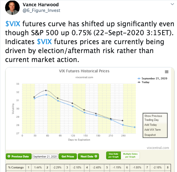
Term Structure identifies the risk of a contested election and or transfer of power from the incumbent to the challenger. Folks, this is a terrible way to hedge, as one is inviting significant risk leverage into their portfolio at already elevated risk premium levels. There are other means for which to hedge risk with lesser premium and leverage.
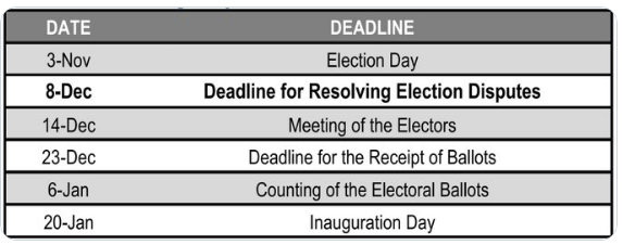
We think the odds of a contested election have increased recently and with the President of the United States all but saying he would expect the “judges” to do the right thing, should there be a contested election based on nefarious polling results. Having said that, identifying the probable outcomes from a contested election center on a sample size of 1. We have only one market-era related contested election back in 2000. Indeed the market had an adverse reaction in 2000, but was it solely due to the election or simply the continuation of an economic outlook that proved problematic after the bursting of the dotcom “bubble” and/or missteps from a central bank that had taken rates from 4.75% to 6.25% over the course of 18 months? A sample size of 1 with other variables at play is what investors are letting guide their market engagement, a sample size of 1. In case of a delay or contested election, there are procedural dates to consider, with December 8th arguably critical.
Harkening back to our key point of emphasis, markets don’t follow narratives and market timing can set your portfolio goals at a disadvantage.

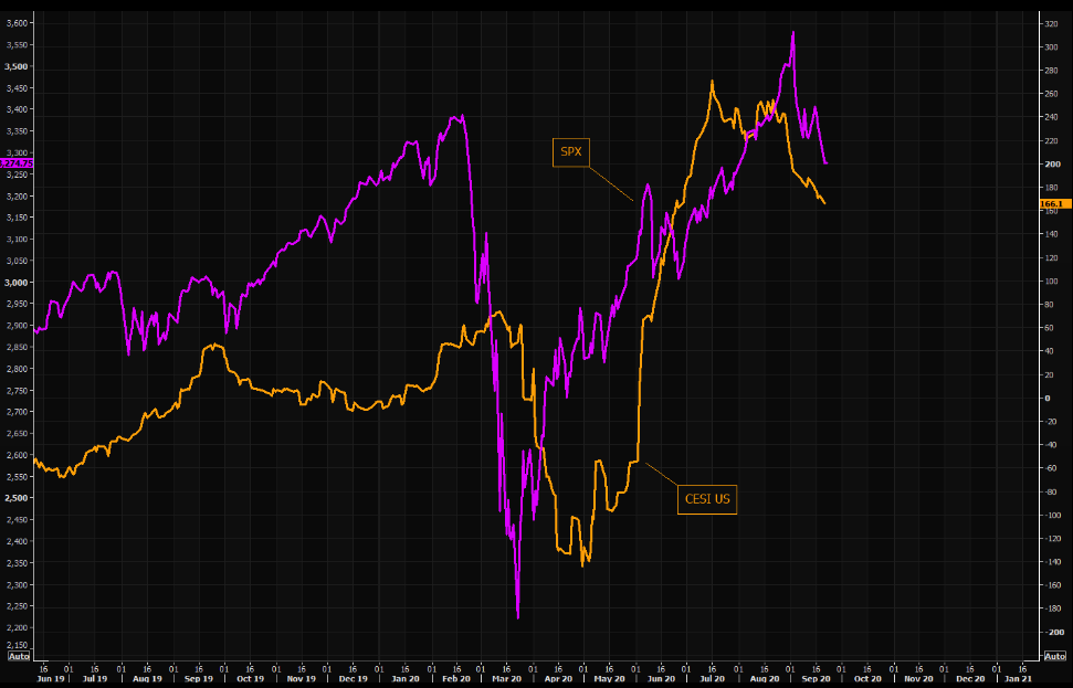
Shifting gears to the economic recovery, and rather quickly, the economic data continues to validate a trending recovery. Already this week we’ve seen the Citi Economic Surprise Index continue it’s trend lower. In our view, this is just a factor of economists catching up to the necessary revised outlooks for economic metrics and not an absolute weakness in the actual economic data itself.
Having said that, if the data is weakening, it should be. That’s seasonally what happens in the month of September, which has historically proven a “throw away” month for the economy. September butts up against the end of Back-to-School/College-Sendoff season and Halloween/Q4 Holiday Shopping season. The average household curtails spending in September while reducing credit card debt. Even so, there was a bit of a surprise uptick in Redbook weekly retail sales this past week.
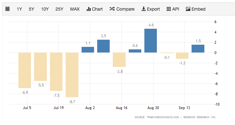
The Johnson Redbook Index measures the growth in the U.S. retail sales. The index is based on the sales data of around 9,000 large general merchandise retailers representing over 80 percent of the equivalent ‘official’ retail sales series collected and published by the US Department of Commerce.
With the aforementioned in mind, the housing sector continues to support an economic recovery from the pandemic lows in May. As reported on Tuesday, total existing-home sales, completed transactions that include single-family homes, townhomes, condominiums and co-ops, rose 2.4% from July to a seasonally-adjusted annual rate of 6.00 million in August. Sales as a whole rose year-over-year, up 10.5% from a year ago (5.43 million in August 2019).
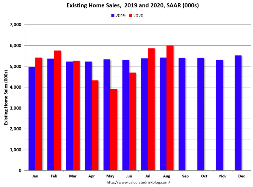
Total housing inventory at the end of August totaled 1.49 million units, down 0.7% from July and down 18.6% from one year ago (1.83 million). Unsold inventory sits at a 3.0-month supply at the current sales pace, down from 3.1 months in July and down from the 4.0-month figure recorded in August 2019. This is the lowest level of inventory for August since at least the early 1990s.
As it also pertains to the housing sector data, mortgage application data is due out Wednesday. With respect to those mortgages, however, we continue to see a strong mortgage market and loans in forbearance declining. The Mortgage Bankers Association’s (MBA) latest Forbearance and Call Volume Survey revealed that the total number of loans now in forbearance decreased by 8 basis points from 7.01% of servicers’ portfolio volume in the prior week to 6.93% as of September 13, 2020. According to MBA’s estimate, 3.5 million homeowners are in forbearance plans.
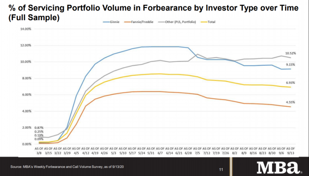
This graph shows the percent of portfolio in forbearance by investor type over time. Most of the increase was in late March and early April, and has been trending down for the last few months.
The world is a noisy place folks, and the market is an even more concentrated, noise-littered place. With that, we’ll leave with some prescient thoughts from an all-time great and dearly missed Steve Jobs…