Research Report Excerpt #1
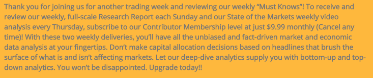
Over my many years of investing and providing a financial market service to investors, I’ve found the perception principle reins supreme amongst investors/traders. It’s often very, very detrimental to the average investor/trader as well. Here’s what I mean by way of the following tweet via Michael Santoli of CNBC. (Again, Seth’s tweet):
The so-called MysteryBroker (someone Santoli worked with formerly at Barron’s), has been a well-tweeted narrative by Michael Santoli since late 2020, and followed by thousands upon thousands of investors/traders. As the tweet was offered by Santoli on May 24th, the MysteryBroker forecasted a significant correction 5 weeks prior to that May 24th update. Two trading weeks since, and the market narrowly missed a new all-time high on Friday.
Most investors/traders don’t have access to the famed CNBC hosting personality that is Michael Santoli. They perceive his hosting gig to be a validation of his market/investing expertise. The noise created by the MysteryBroker narrative since late 2020 captivates many based on the fear-driven narrative and inaccessible personality of the CNBC host. The noise distracts from one key underlying fact within the tweets about the MysteryBroker though. While many have latched on to the forecasting from the MysteryBroker, they overlook the fact that Santoli is relying on someone else’s perceived expertise as well. Why does a perceived expert (by the average investor/trader) need to rely on someone else’s expertise? Forest for the trees as they say!
The message from this analysis is simple and something I think all Finom Group members, including myself, may need to consider more deeply: No one is an investing or analytical expert, some are simply better than others.
Research Report Excerpt #2
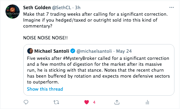
The Cycle Composite tells us the market is also doing what it typically does from this point forward. We may still yet find a rough patch during the Summer Doldrums as indicated in the Cycle Composite for 2021, which calculates the 1-yr. Seasonal cycle, 4-yr. Presidential cycle, and 10-yr Decennial cycle on an equal-weight basis.
The “Seasonal” data is often a good resource for baseline expectations, but it doesn’t always lend itself to historic outcomes at even a 50% positivity rate. Therefore, we often suggest paring the seasonal data with other quantitative data points.
Research Report Excerpt #3
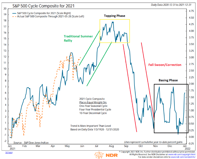
A fund manager can be in the underperforming areas of the market, and still outperform the S&P 500, even if not recommended.
It may prove a bit of a dog fight to outperform over the state period, admittedly, but now imagine when the market shifts and the underperforming areas of the market become the outperforming areas of the market, as the economic cycle shifts. You may find the former dog fight becomes a “glide path”. (chart from Cornerstone Macro Research)
Research Report Excerpt #4
One of my favorite economic metrics, although not shared widely amongst economists, is the “Household Debt Service Obligations as a Percent of Disposable Personal Income” metric. While there’s tremendous focus on the government’s debt levels, Consumers appear to be in much better shape. Ever since the Financial Crisis, Household debt service payments as a percent of disposable personal income have been coming down, and this measure continues to be near at least 40-year lows.

What this metric informs: The average household has plenty of disposable income, after they pay down their debt obligations on a monthly basis. It also suggests that many households learned a valuable lesson from both the Dotcom and Great Financial Crisis eras. The average household only took on debt they could service or pay down each month. Another way of putting it; they became more fiscally responsible. Don’t you wish you could say that about the Federal government? I kid, I kid…
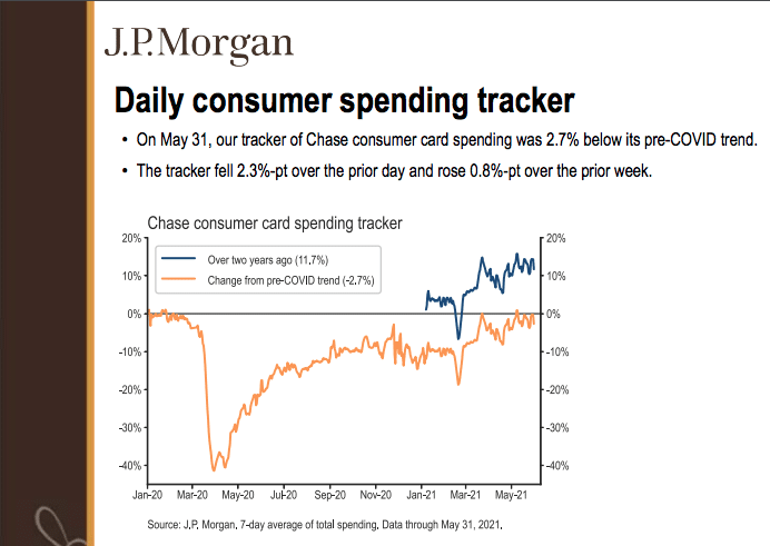
Research Report Excerpt #5
A microcosm of retail sales data can also be tracked with J.P. Morgan debit/credit card data. The data in J.P. Morgan’s report is based on transactions sourced from select Chase consumer credit and debit cards and is not representative of Chase’s overall credit and debit cardholder population. All cards included in the data were used for at least one transaction in each of 18 consecutive months, resulting in a panel of more than 30 million US cardholders. The data may differ from total U.S. consumer spending for many reasons, including differences between cash and card spending patterns, geographic and demographic differences between the panel of Chase customers and the overall U.S. population, and other factors.
Research Report Excerpt #6
In speaking of these large cap names, a goodly amount are in the FANMAG cohort, market history is validating that nothing out of the ordinary is taking place in this new cyclical bull market that hasn’t taken place in the past.
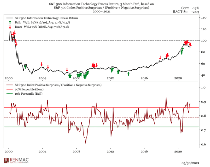
While we forgo the “Earnings” portion of this week’s Research Report, as we are out of earnings season, we can still utilize quantitative data to validate the normalcy of the current market cycle. When positive earnings surprises are abundant in the market, Technology tends to suffer on a relative basis. It happens historically, and it’s happening today. In the chart above, the top panel is the Information Technology sector returns line. The very bottom panel indicates S&P 500 EPS surprises. When surprises are above the red line, typically Information Technology returns are muted, if not lower. As analysts catch up with the EPS rate-of-change probabilities going forward, Finom Group would expect the level of earnings surprises to normalize to lower levels. This may happen by the 4th quarter of 2021 in fact. One of the reasons we are of this opinion is based on current analysts activity with respect to forward-looking earnings estimates.
Research Report Excerpt #7
Insight/2021/06.2021/06.04.2021_EI/Change%20in%20S%26P%20500%20Quarterly%20EPS%20First%20Two%20Months%20of%20Qtr.png?width=912&name=Change%20in%20S%26P%20500%20Quarterly%20EPS%20First%20Two%20Months%20of%20Qtr.png)
In fact, the second quarter marked the largest increase in the bottom-up EPS estimate during the first 2 months of a quarter since FactSet began tracking this metric in 2002. The previous record was 5.7%, which occurred in Q1 2018.
Research Report Excerpt #8
Fast-forward to the week that was and we can see that, indeed, the percentage of Nasdaq stocks trading above their 50-DMA has climbed above the 50% threshold.

Research Report Excerpt #9
A start to the tapering process still appears unlikely before 2022, and the first increase in the federal funds target rate would not be expected to follow until several quarters later. But the Fed could potentially begin to hint at a shift in this direction at its annual economic symposium at Jackson Hole in late August. Since the 1970s, there have been seven hiking cycles undertaken by the Fed, beginning in August 1980, May 1983, December 1986, February 1994, June 1999, June 2004 and December 2015. And prior to this most recent hiking cycle, the Fed signaled its first move toward a tapering of its post-financial-crisis Quantitative Easing program in May 2013. Now, exactly 8 years on from the 2013 “taper tantrum,” it may be instructive for investors to review past patterns of market return around the initial stages of Fed tightening/tapering.
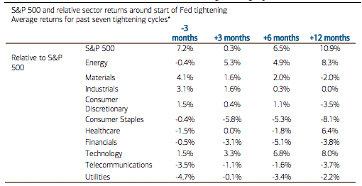
The data vary from cycle to cycle. But, on average, the market has tended to tread water immediately after the first move to tighten monetary policy, with performance improving thereafter. Higher-yielding sectors such as Utilities, Telecommunications and Consumer Staples have typically been among the weakest as the Fed starts to tighten… And Energy and Technology have historically been the biggest out-performers.
The bigger takeaway from the table above are that tapering does not equal the demise of the bull market; it may simply equate to the pausing of the bull market. Gains thereafter are typical and on average double-digits over the next 12-month period.