Research Report Excerpt #1
The average duration of a bear market is 446 days (calendar days). The average duration of a bull market is 2,069 days.
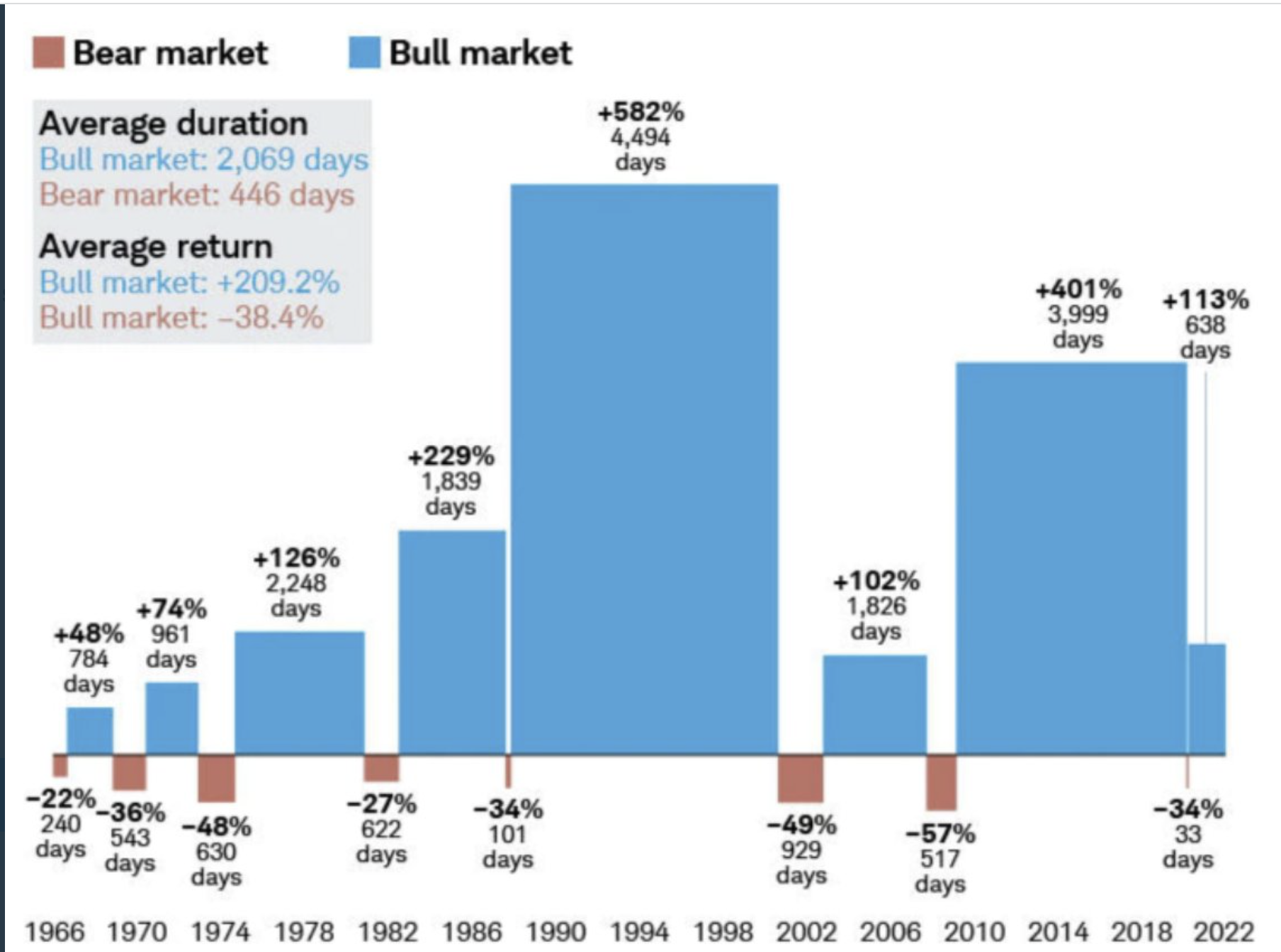
The average bear market return is -38.4% while the average bull market return is +209 percent. I’m of the belief that the savvy investor should be willing and able to choose in favor of bullish outcomes, and endure any bear market that comes their way. A bear market comes wrapped in dollar bills, but the downside price action forces us to see only the teeth of the bear market.
Research Report Excerpt #2
The average investor’s portfolio is taking it on the chin, so to speak, in 2022. Most investors have a number of individual stocks that are down more than the indices. The average stock index is known as the Value Line Geometric Index. Unlike the S&P 500, the average stock represented by XVG has already dipped below its pre-pandemic level, as shown in the chart below. The XVG is currently below its pre-pandemic high.
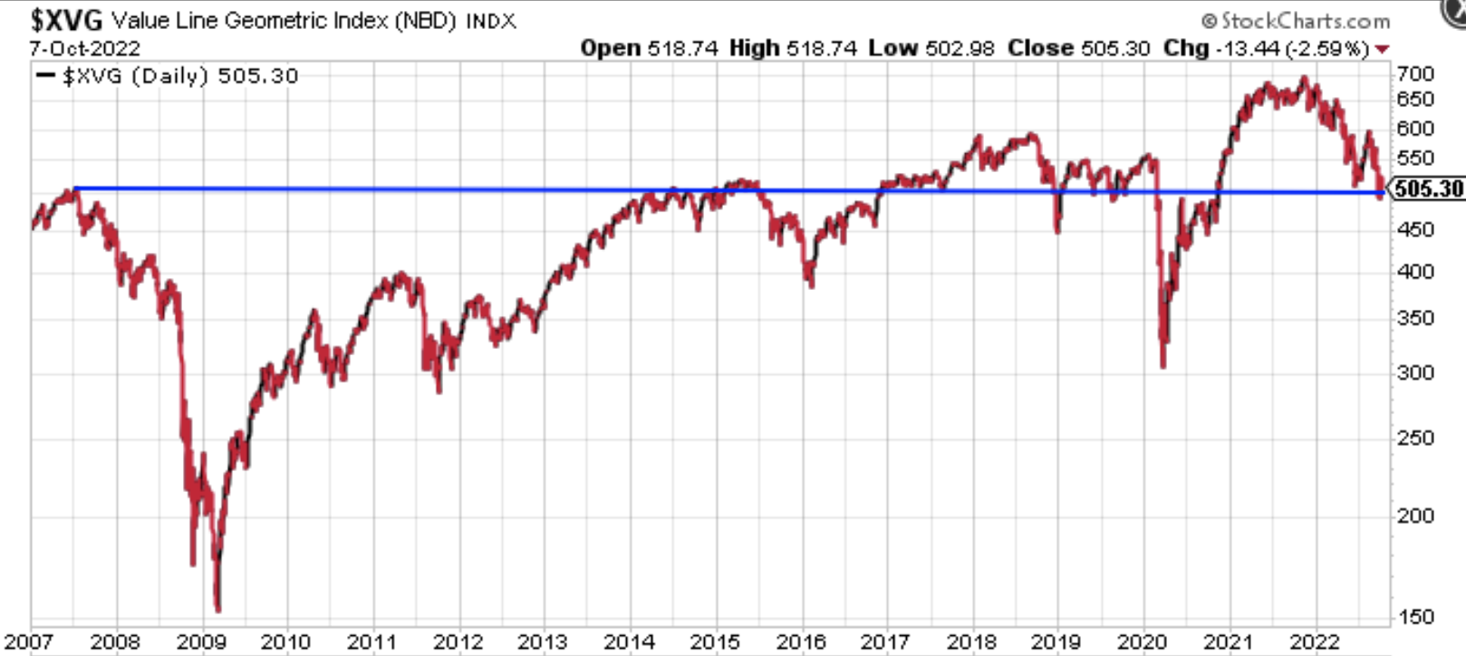
Additionally, we can see that where the index currently resides has proven strong resistance and support in the past. The horizontal trend line shows support going all the way back to 2007 and resistance during the mid 2010s. What may happen from this point forward in the average stock index and overall market (SPX) is likely dependent on the pending Q3 earnings season and this coming week’s inflation data. It’s very possible that a break through the trend line seen in late 2018 occurs again here in 2022, but quickly finds a bottom and reverses higher. It’s just as possible that the support holds on favorable bank earnings and more benign inflation data.
Research Report Excerpt #3
The Grand Daddy of the performance ratio charts may come by way of the Nasdaq 100 (NDX) versus S&P 500 (Growth vs. Value) performance ratio chart.
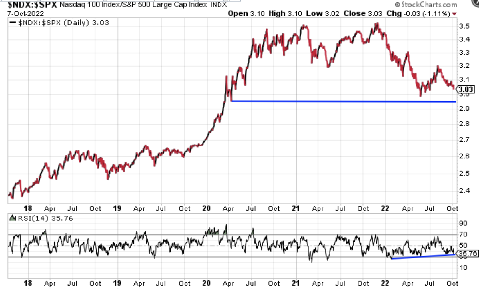
The 5-year chart of the performance ratio has been finding critical support at where it broke to the upside in April of 2020, just after the indices bottomed. It’s also important to remind ourselves that the performance ratio has been a leading indicator of a market bottoming process in the past. Historically, since 1999 Dotcom bubble, the NDX:SPX performance ratio bottomed 4-6 months ahead of the S&P 500’s bottom. The charts below demonstrate the technical analysis above:
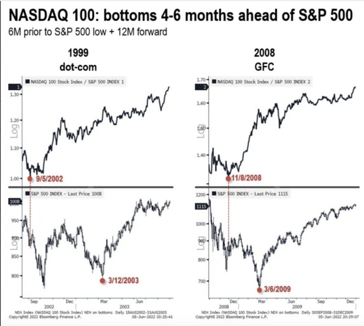
The top 2 quandrants represent the dotcom bottoming period in 2002 and Great Financial Crisis period in 2008, for the performance ratio in question (NDX/SPX). The bottom to quandrants are for the same periods, but only the SPX trend. We can see that the dotted lines from the bottom of the performance ratio to the SPX charts below don’t line up with the ultimate lows for the S&P 500. Thus, the performance ratio tends to bottom before the S&P 500, by 4-6 months. In the current bear market, the performance ratio bottomed in May, assuming that is the bottom for the performance ratio. This is why this performance ratio is currently the Grand Daddy of them all. If that May bottom does not prove the ultimate bottom in the performance ratio, historically the S&P 500 has not bottomed and we should anticipate more downside in the indices on an absolute basis in the coming months. If the performance ratio was the bottom and the chart holds, then the S&P 500 is still basing/bottoming within the appropriate time frame as prior bear markets.
Research Report Excerpt #4
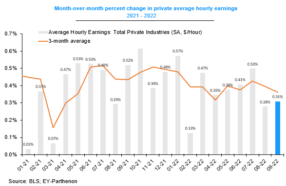
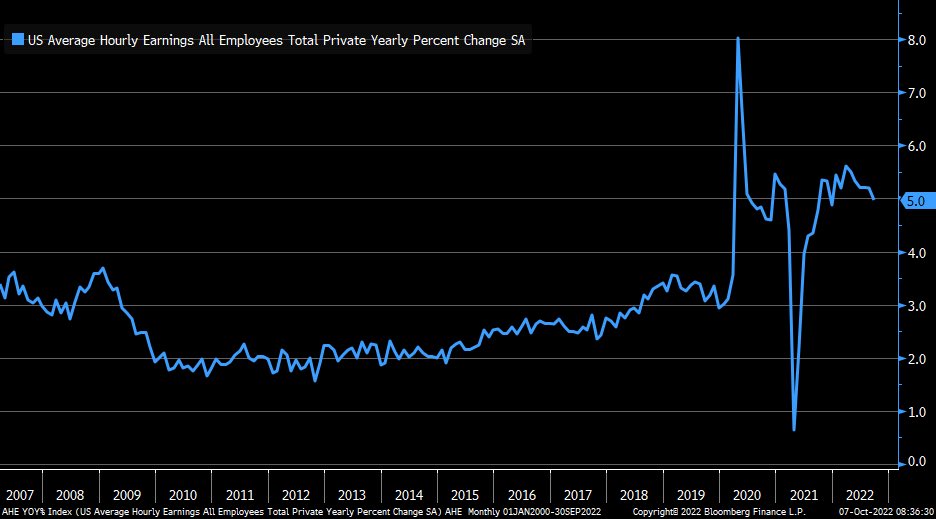
There is some good news that came from the monthly jobs report. Wage inflation dynamics were encouraging with average hourly earnings rising a moderate 0.3% M/M in September, below the 0.4% pace of the prior 3 months, and wage growth moderating 0.2ppt to 5.0% YoY, its softest reading since December 2021.
Goldman: “This week brought three pieces of encouraging news about the prospects for gently reversing labor market overheating without a recession. Fewer job openings, few layoffs, softer wage growth.”
Research Report Excerpt #5
“In the following chart, we plot the unemployment rate alongside its trailing 12 month moving average from January 1948 to January 2016. The red and green circles delineate important crossover points, with red crossovers delineating upward (bearish) turns, and green crossovers delineating downward (bullish) turns: (bear/bull in market performance terms)

As you can see, historically, whenever the unemployment rate has crossed above the moving average, a recession has almost always followed shortly thereafter. Similarly, for every recession that actually did occur in the period, the unemployment rate successfully foreshadowed the recession in advance by crossing above its moving average.
Research Report Excerpt #6
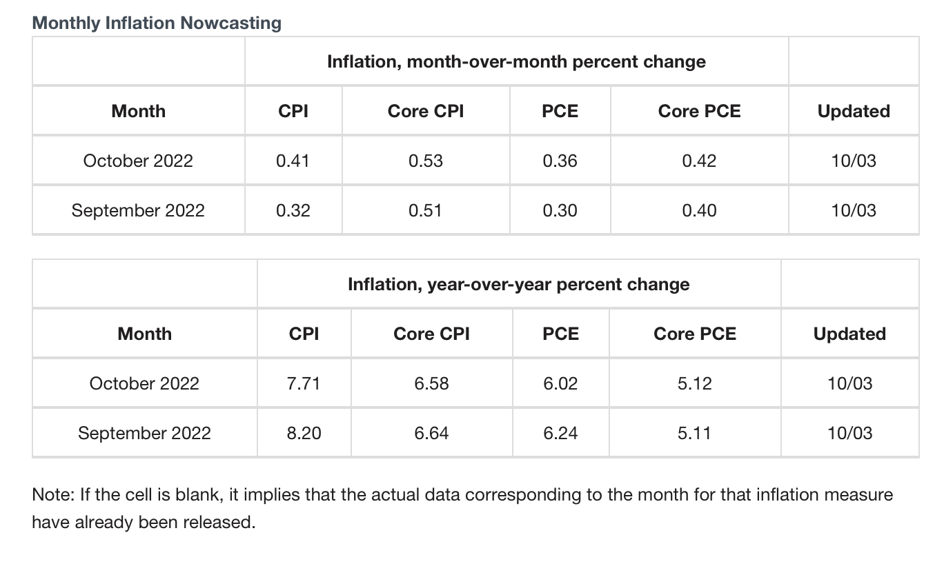
Regardless of what many inflation guages are suggesting, the forecast from the Cleveland Fed continue to point to upside for the YoY Consumer Prices Index. The M/M CPI is only forecast to cool from the upward momentum ever so moderately (top rows and columns).
Research Report Excerpt #7
According to Jonathan Harrier, the S&P 500 was higher by 2.5%+ for the second day in a row, but also while below its 200-DMA.. Apparently, this happened only 11 other times when below the 200-DMA. The forward 1-year returns from such occurrences are noted in the table below:
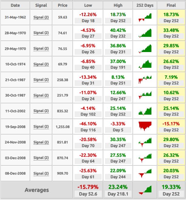
Take notice of the average drawdown folks! The average drawdown is nearly 16%, and further contextualizes the point of recognizing the signal while the S&P 500 is beneath its 200-DMA or in a downtrend. Historically, we tend to see wild upside rallies even when in a downtrend and especially within bear markets. In fact, every occurrence dated in the table was during a bear market.
Research Report Excerpt #8
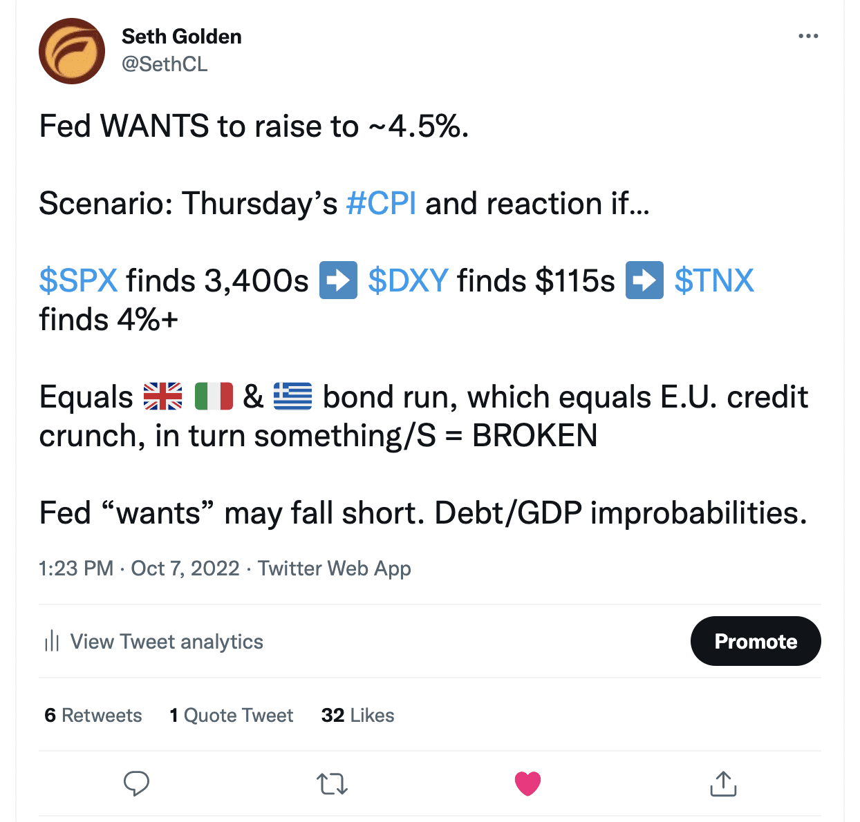
My tweet from Friday, time stamped even before Kyle Bass’ tweet, is rather short-hand for all I mentioned above. The scenario that I put into game theory was one that finds the CPI not falling, badly missing even the estimates to the upside, with even greater upside, and markets fall further. The safe-haven Dollar likely gets another very strong bid under this scenario, regenerating the U.K credit market issues that may reverberate in other highly indebted countries around the Eurozone such as Greece and Italy, which would become a growing issue for the Eurozone as a whole.
Research Report Excerpt #9
It’s very probable that the Fed knows it holds very little in the way of tools for combatting inflation given the issues fueling inflation center on the supply side of the equation, and not the demand side. In the past, when the Fed hiked rates rapidly to battle inflation housing went down quickly and housing generally leads economic conditions, as the knock-on effects of a home purchase carries a stimulative economic impulse. During the current accelerated rate hike regime, and with housing falling rapidly once again, the difference between past cycles and today is the strength and stability of the household and corporate balance sheet. “So I don’t buy a home; I spend my paycheck elsewhere given my accrued savings and higher wages.” The point is that I can still spend, and with the labor market being what it is, my job security is satisfied.
In other words, the Fed has only had to fight inflation by fighting inflation in the past. Today the Fed is fighting inflation, the prevailing wealth effect since the pandemic, and the fiscal policy implementations that provided households with government transfer checks, which resulted in now $1.3trn in excess savings (down from $2.2trn at the start of the year). Again, the Fed likely understands this game theory and its concepts. Hence, why not simply keep going until something does break, sooner rather than later, and consider the job done with still yet rates staying elevated compared to the turn of the century period, while the economy adjusts over time? I know its rather out of the box thinking, but this path actually holds higher “soft-landing” potential.