
As we learned last week, the health of the labor market remains very strong. There are more job openings than job seekers, which is a first since 1970. The prime-age employment-to-population ratio, probably the best indicator of the health of the job market, is back to 2005 levels. How long will it be very strong is anybody’s guess, but all indication is that the overall economy is supportive of job gains through 2018 and early 2019, at least.
June’s 213K increase in total Nonfarm payrolls was accompanied by upward revisions of 37K. The unemployment rate increased to 4.0 percent. The Investing.com consensus was for 200K new jobs and the unemployment rate to remain at 3.8 percent. A positive in the report was the increase in the participation rate to 62.9% versus the prior month’s participation rate of 62.7 percent. The number of unemployed actively looking for jobs jumped 499,000 to 6.564 million. Because the change in payrolls was smaller than the change in the number actively looking for a job, the unemployment rate increased to 4.0% from the prior month’s rate of 3.8 percent. The average hourly wage paid to American workers rose by 5 cents, or 0.2%, to $26.98. The yearly rate of pay increases was unchanged at 2.7 percent.
Unemployment claims have fallen to 50-year lows recently, well under the 300,000-water mark level. The May 2018 unemployment rate dropped to 3.8%, a level touched only once since 1969 and before recently ticking higher in the June NFP report. In a recent article titled, Why a Recession in 2019 is Possible When Unemployment is at 50-Year Lows, Raul Elizalde suggests an imminent recession based on unemployment expressing record low levels. Firstly, anybody making a projection or suggestion out a year or more is simply speculating with the probability of a great many variables that could provide accuracy for the prediction, even if not the main catalysts provided within the prediction or thesis itself. Secondly, well the data speaks for itself as we see in the chart below offered by Bloomberg.
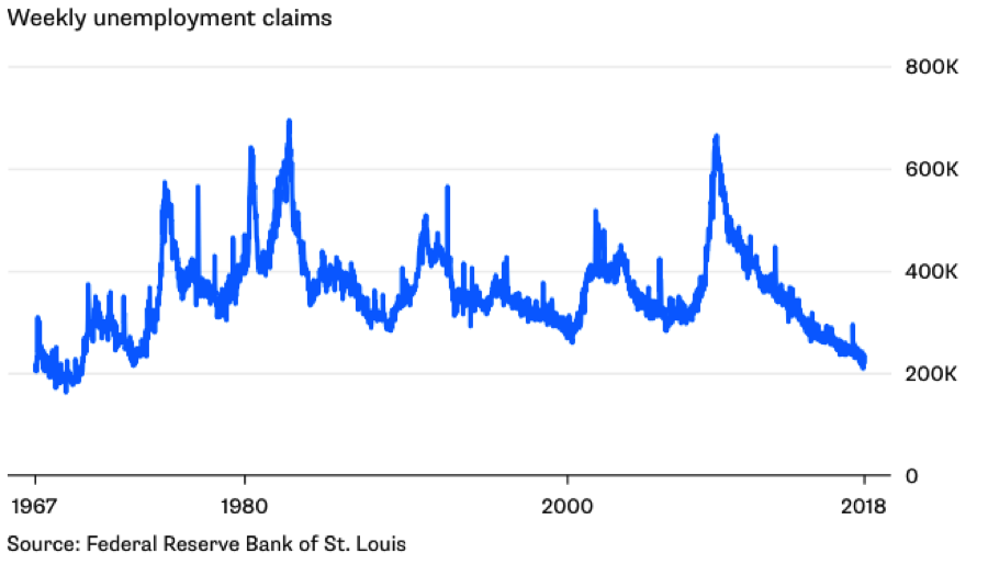
Weekly jobless claims previously dipped below 300,00 back in 2015 and here we are some 2.5 years later, still not expressing recessionary economic conditions. Everyone wants history to repeat itself for some reason even though many of the economy’s variables have shifted, changed and/or evolved.
The economy, like it or not is strong and has strengthened from Q1-Q2 2018. Every naysayer, doomsayer and perma-bear would have the bulls believe this is as good as it gets. Maybe so, but we’ll likely only know that to be the case in hindsight. They point to excessive debt at the consumer and corporate levels. In doing so, the excessive part lacks the necessary due diligence and general analysis needed to define whether or not the claim is objective or subjective. So let’s take a quick look at corporate debt levels before discussing the other highly feared Fed Factors.

As shown in the chart above, this is all that debt does over time, be it consumer or corporate debt. The signs of a healthy economy are rising debt levels as they express confidence within an economy cycle. So when you hear bears screaming or crying over debt levels, it’s your contrarian indicator in most economic cycles, as debt levels should be increasing in bullish economic cycles. Now, how much debt is too much debt? Well let’s talk about that for a moment by using the following chart from the Federal Reserve of the United States.
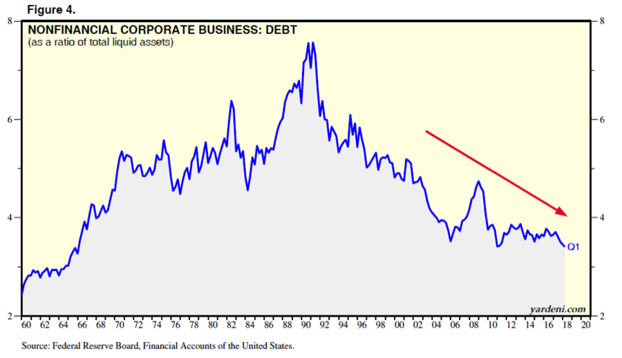
When we think about debt, we should also find ourselves considering whether or not cash flows and/or liquid assets are sufficient enough to service that debt. As illustrated by the Federal Reserve chart above, cash flows and liquid assets as a percent of corporate debt are near multi-decade lows, which means that corporations can easily service their rising debt. This comes from the Fed’s decade long monetary policy that maintained accommodative policy through low interest rates even as the economy had largely recovered from the Great Recession some years back. In other words, cheap debt was an underlying goal of Quantitative Easing whereby the Fed knew at some point it would have to raise rates and as such it was giving corporations ample time to build debt for economic expansionary purposes while economic demand boosted cash flows to service such undertaking of debt. And this is before even mentioning that once a recession does ensue, as they always find a way to do so, the cash levels used for debt servicing will still be sufficient for some time given the low level of interest rates.
Once a recession comes to pass, demand is curtailed, cash flows dwindle and liquid asset valuations follow. But the Fed understood this was always going to be the case and as such extended its accommodative monetary stance well beyond economic stability was in-hand. The Fed also understood/understands that rates, like debt, only go in one direction over time as they do so in opposing manners. Debt goes higher as rates go ever lower. But to cap this point and in reviewing the Federal Reserve’s chart above, debt levels are not recession indicators. If a recession is to happen, debt simply amplifies the recession for longevity, which again is why the Fed took so long to begin tapering and tightening.
With regards to those rates and/or yields on U.S. Treasuries is the infamous flattening and inverting of the yield curve. No doubt about it, the yield curve has been flattening for some time now and is at its narrowest levels in several years. The likelihood of inverting is real and some might say inevitably near-term oriented given how narrow spreads have become. In a recent macro-update by The Fat Pitch, the publication offers the following take on the yield curve and economic conditions:
“The bond market agrees with the macro data. The yield curve has ‘inverted’ (10 year yields less than 2-year yields) ahead of every recession in the past 40 years (arrows). The lag between inversion and the start of the next recession has been long: at least 10 months and in several instances as long as 2-3 years. On this basis, the current expansion will likely last through 2018 at a minimum any image by clicking on it.”
The first, superficial problem with suggesting an inverted yield curve IS the signal for the recession to come is of course the data and what we determined earlier in this report. There is no one indicator of a recession as there is no one reason for such a recession. If it were that simple, everyone would be alerted to abandoning risk in favor of safety until that one indicator flashed a buy signal and a return to expansionary economic conditions. And remember, Raul Elizalde suggested unemployment claims to be the indicator of a pending recession. But let’s now look at leading economic indicators or LEI, kindly. Typically, the LEI has peeked at least 7 months before the next recession in the past 50 years.
The LEI hit a new uptrend high in May with June’s reading to come later this month. Positive contributions from the ISM new orders index, the financial components and consumer expectations for business conditions more than offset the negative contributions from building permits and working hours in manufacturing. In the six-month period ending in May 2018, the leading economic index increased 3.0% (about a 6.1% annual rate), the same rate of growth as over the previous six months. In addition, the strengths among the leading indicators have remained very widespread.
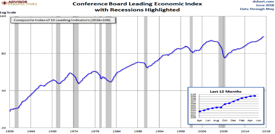
The economic data looks strong and the fact is that we’ll only likely understood it to have peeked in hindsight. But in the meantime, historically economic data peeks have offered investors ample time before an impending recession takes place.
Data For The Week Ahead
The data for the week ahead is rather light but incremental with regards to inflation concerns. The Producer Price and Consumer Price Index readings are both due out this week. To end the week, consumer sentiment will be reported. The bigger report, with respect to reflation, will come on June 29, 2018 in the form of the Personal Income and Expenditures index reading. This is the metric or data the Fed relies on mostly as it pertains to its rate hike forecast and or policies.
Truth is, one could take the PCE Index back to the early 90s and it doesn’t change much at all. Simply put, the economy won’t allow for true inflation, something on the magnitude of the 1980’s, which has proven the anomaly and not the paradigm. Where the consumer has a will, industry will find a way to extract economic elements of reflation in favor of deflation. If you believe this to be a farce, well, tell that to Amazon’s reported results and its user base. Or, simply look at retail inventories and gross profit margins by comparing today’s results to those prior to the Great Recession.
Earnings Week Ahead
This coming week the Q2 2018 earnings season is set to begin with Pepsico being the bigger of the weekly reports coming to us on Tuesday. Deutsche Bank recently downgraded the stock to “Hold,” with analyst Steve Powers predicting lower-than-expected earnings thanks to commodity price inflation. Back in April, Goldman Sachs downgraded Pepsi to “Sell” because of its weak organic growth. But the banks are what will likely be the biggest reports due out this week.
On Friday, it’s a quarterly reporting deluge by the big banks. Citigroup, Wells Fargo, PNC Financial and JP Morgan Chase are all set to report results prior to the opening bell on Wall Street. Subjectively speaking, the financial sector may be the sector that is holding back the S&P 500 from achieving new highs. Bank stocks are down -5.7% this year, underperforming the broader market’s +2.6% gain and the Finance sector’s -4.8% decline. So why the underperformance, treasury yields!
The yield on the benchmark 10-year Treasury bond has been slowing declining as the shorter term 2-year Treasury bond has been slowly climbing, flattening the yield curve. The conundrum about bank stocks is the spread between 2- and 10-year treasury and bank profitability as a function of this yield spread. Now let’s look at bank and financial sector earnings expectations in the chart below, provided by Zack’s Research.
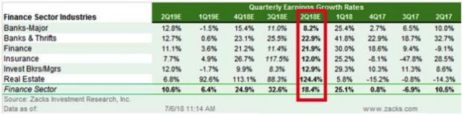
As shown in the chart, earnings are expected to be strong. More importantly, they are expected to be even stronger in Q3 and Q4. But this makes it all the more relevant for investors to focus on reported guidance. Lastly, let’s look at total S&P 500 Q2 2018 earnings expectations from both FactSet and Thomson Reuters.
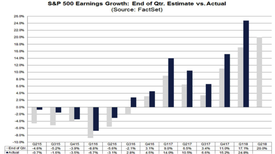
According to FactSet for Q2 2018, the estimated earnings growth rate for the S&P 500 is 20.0 percent. If 20.0% is the actual growth rate for the quarter, it will mark the second highest earnings growth since Q3 2010 (34.0%). FactSet, much like that of Thomson Reuters, generally undershoot the actual reported earnings. As shown in the chart below, the estimates generally undershoot the actual reported earnings by 3.5-4% on average.
According to Thomson Reuters, Q2 S&P 500 earnings are expected to grow at roughly 20.7% YOY. This estimate has been steadily raised over the last month and from a 20% estimate starting point.
Regardless of what one thinks signals a recession or a peak equity market cycle, the data suggests that the beat marches on in 2018. With that said, multiple expansion may be hard to come by given the litany of macro and geopolitical factors.


