
After another green day on Monday, with S&P 500 (SPX) finishing the day that much closer to a record closing high and the Russell 2000 (RUT – small caps) leading markets higher, stocks were poised to achieve record levels on Tuesday. All but the Nasdaq (COMPQ) had been rallying heading into Tuesday’s trading session and that backdrop proved to rule much of Tuesday… until the final hour and half of trading. Late in the trading session, all U.S. indices retraced their gains and finished in the red. The high of the session for the benchmark S&P 500 was ~3,382 before the reversal, finishing lower by more than 26 points on the day and now down for the trading week.
The action really shouldn’t come as any surprise to investors who have been awaiting some respite for stocks going higher and consolidation. The S&P 500 has been trading at nearly 3 std. deviations above its 50-DMA, where it typically finds some degree of price and/or time consolidation. Additionally, the path taken by the S&P 500 since the March bottom has been extremely duplicative of the 2009 March bottom and subsequent rally.
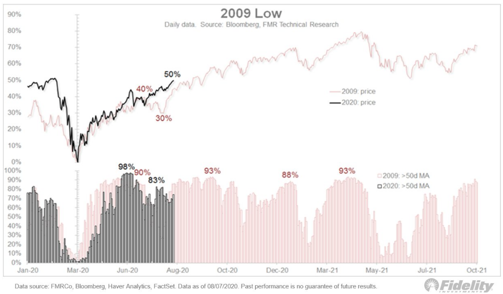
As stated many times in the past, analogue tracking is not presumed to be a perfect expectation, event the 2009 analogue has proven very much mirrored in terms of breadth and price action in 2020. Markets are not just a forward discounting mechanism, but also an expression of human behavior.
It was around this time in 2009 that the S&P 500 did indeed find consolidation. In fact, the chart from 2009 identifies the exact same date of August 11th for which the S&P 500 took a dip, rallied the next day and then took a deeper tumble. My how human behavior remains absolutely the most consistent aspect of financial markets, regardless of the unique and unprecedented circumstances confronting the population.
Coming into Tuesday’s trading session, the S&P 500 was up 10 of the last 11 days and up 8 days in a row for the first time since 8 in a row in April 2019. The index hadn’t hit 9 in a row since November 2004, per LPL FINANCIAL. Unfortunately, that streak from 2004 remains unmatched since and as of yesterday.
On days like Tuesday, where the markets have an outside reversal of fortunes, the sharp intraday move in the opposite direction of a longstanding trend can manifest a tree in a rather sizable forest. The tree acts an impediment to the average investor, forgetting about the trend and the consistency of human behavior. They fail to recall the large forest as the tree stands in their immediate path. Simply put, we should let these trees stand in our way and we must develop the discipline that recognize and remembers the sizable forest that abounds us. I say this as a reminder that
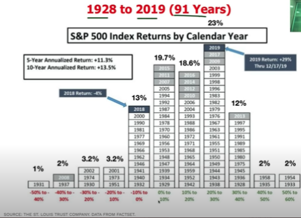
- 77% of the time the S&P 500 is up on the year.
- 23% of the time the market is up 20-30% on the year.
- Market is down 22% of all years.
- I’m bullish & statistically I’m right to be so. Market history is not hidden and with tight correlation to human behavior. We repeat that which bears a positive outcome more often than not.
- Investors should always be considering dip-buying activities. (SPX table of returns dating back to 1928)
Social media is a common place where trees confront investors daily. Andrew Thrasher of Thrasher Analytics offered his own tree planting yesterday. Here is what The Chart Report outline with regards to Andrew’s technical notes on the VIX and VVIX:
“The chart shows the Volatility Index ($VIX) and the Volatility of the Volatility Index ($VVIX). Andrew points out that $VVIX failed to make a new low along with the $VIX recently. The last time Andrew pointed out a divergence between these two was back in mid-February, just days before the crash began. This divergence doesn’t necessarily mean that we’re due for another epic crash. But, it is a sign that stocks could experience some turbulence in the near-term. In a comment to The Chart Report, Andrew said, “It’s worth paying attention anytime $VIX and $VVIX diverge like this. Not a great look for volatility, when you pair this divergence with the fact that sentiment on the $VIX is only 8% bullish right now.” Few analysts understand volatility as well as Andrew.
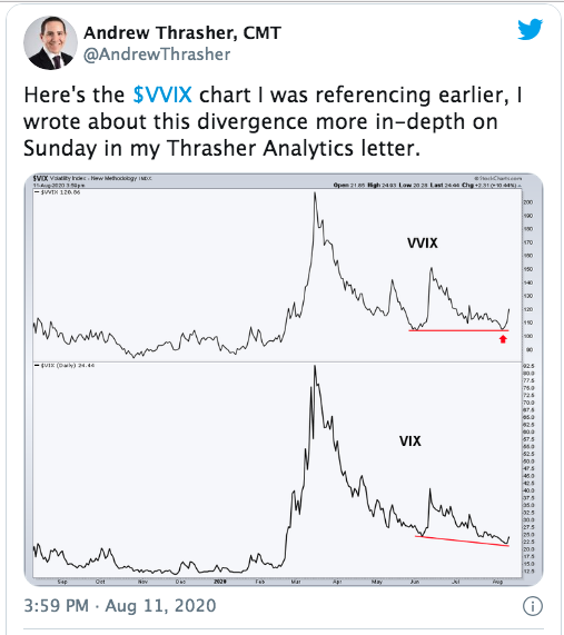
When anybody offers a chart and likeness “just before the February – March crash, it becomes a very formidable tree, beckoning fear amongst investors. The reality is the chart analysis has little utility aside from inducing fear and maybe defining expectations for investors. The main issue with any technical analysis on the VIX, as this is simply comparative analysis, is that the descending triangular formation in the two indexes is typically the only patterns they display. One didn’t know last week or coming into this week whether or not VVIX would make a new low akin to VIX. These charts only tell us what happened, not what will happen in real time. Until Tuesday, indeed VVIX was on the verge of making a lower low and that’s all we really know until proven otherwise, like it was on Tuesday. So what is an investor to do with this chart comparison other than to accept a pretty chart comparison. Does one buy VIX call options and hope the premiums don’t outlast the spike? Does one simply recognize and anticipate some volatility and potential market turmoil? One has more than 1 question to interject, obviously 😉 !
In reviewing the volatility complex and action from Tuesday, much like the S&P 500 action, this was to be expected.
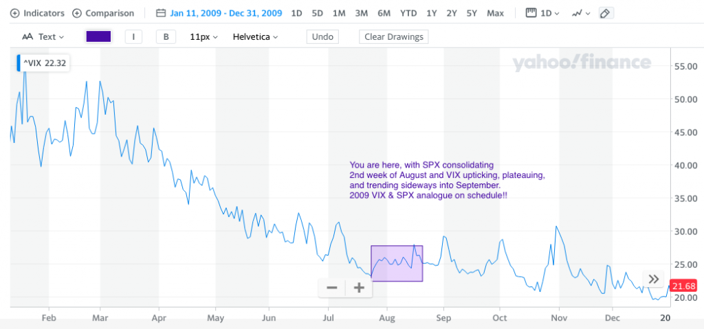
The VIX 2009 chart above, identifies a period where the VIX trough last week and then briefly rallied higher for which a plateau was found. that plateauing lasted until September and as the VIX took a longer-term trajectory below 20. I remind investors that the VIX analogue for 2009 has actually found slight outperformance from the index, to the downside, in 2020. Having said that, the current rally in the VIX on Tuesday maintains the 2009 analogue quite well and remains suggestive for the VIX to stay above 20 until December. Of course, the outperformance YTD may continue, but may also prove dependent on the election cycle. There was not an election in 2009 of course.
In further analyzing the VIX by way of comparing it to S&P 500 realized 10-day volatility (HV), here is what we found via works performed by Adam Warner. The average difference between the two dating back to forever is 4.26 and the median is 4.71. Having said that, the current spread/value is 14.55 or the 112th highest of all time.
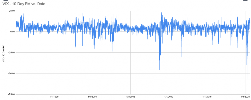
Again and as no surprise, the spread between the VIX and S&P 500 10-day realized volatility was a greater indication of things to come. Having said that, when things come is purely a guesstimate and doesn’t need to be a point of emphasis. Traders whom attempt to time such comings in the market usually fail and/or create poor trading disciplines, highlighting market timing over time in the market. I’m of the opinion the spread indicated above is also a signal that the markets are moving from a higher volatility regime to a lower volatility regime.
What produced the early markets’ rally on Tuesday was offered to be a Russian COVID-19 vaccine, by the media. I would argue that a Russian vaccine determining the markets’ path seems out of touch with reality. As I’ve often said, however, the media needs a story to attach to price, no matter how ridiculous it might be found.
Russia announced Tuesday that its vaccine had been approved by its health regulators, making it the first coronavirus vaccine in the world to be registered. Full-scale production is due to start next month. Russian President Vladimir Putin insisted it was safe and effective and that one of his daughters had already received the vaccine.
A vaccine, a vaccine, my right eye for a vaccine. The reality is that the market has a mandate dictated by human behavior and market structure and flows supporting such a mandate. Here is what Finom Group offered regarding the market’s mandate in our weekend Research Report to subscribers this past Sunday:
As we progress through the year, however loosely one wants to define progress, the data will continue to prove a guide. An investor has the choice to view what data they deem important, but if ALL of the data isn’t included, your progress as an investor will hold limitations. That is precisely what has happened to the skeptics in the last four months. No one knows whether the recovery continues unabated or if we will now witness a plateauing before the next step in the journey begins. Watching the wrong data and listening to the “noise” isn’t the way to proceed. The noise is everywhere, unfortunately, and the facts are few and far between. Finom Group aims to deliver facts and with the facts at-hand, we suggest the market will produce higher prices by year-end, barring any policy missteps and or exogenous event. The near-term is more murky than the long-term, given the political conflict that is afoot and demanding resolution through fiscal policy action. Until such resolution is found, remain flexible and look for portfolio rebalancing opportunities. Investors shouldn’t overlook what appears to be a market mandate to achieve new highs. While the headlines may prove fearful near-term, the algorithms have an agenda: New record levels.
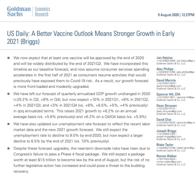
While I couldn’t propose when a new record high for the S&P 500 will be found, it will be found nonetheless. But a vaccine approval would definitively aid in achieving that mandate. Recent analysts notes from Goldman Sachs and Morgan Stanley are quite positive on the potential of a near-term vaccine approval and mass scaled inoculations going into 2021.
- Goldman Sachs: A Better Vaccine Outlook Means Stronger Growth in Early 2021: “We now expect that at least one vaccine will be approved by the end of 2020 and will be widely distributed by the end of 2021Q2.”
Morgan Stanley also reflects positively the offerings from Goldman Sachs in its latest report from Matthew Harrison, the firm’s head biotechnology analyst.
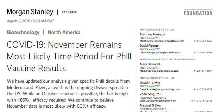
“We expect at least three vaccine candidates with PhIII data this fall: We updated our analysis of the timelines for vaccine PhIII readouts given (a) detailed trial design information disclosed by Moderna, and (b) the ongoing spread of the virus in the US. The attack rate (population-wide infection rate) has almost doubled in the US since our prior analysis ~4 weeks ago which now makes data by early November (as opposed to mid-November) our base case expectation. Our base case assumes vaccine efficacy of ~60%. While an October readout is possible, it requires overwhelming vaccine efficacy of ~85%. Importantly, while AstraZeneca has not yet started its US PhIII, management indicated it can pool results from its UK, South Africa and Brazil studies. While these studies started prior to the Pfizer and Moderna PhIIIs on July 27, the majority of patients are in the UK where the attack rate is low. Thus, we believe it may take 2-3 months to accrue enough events in these studies putting data on a similar timeframe with Pfizer and Moderna. PhI data from Pfizer’s full-length spike protein candidate, Moderna’s data in older patients and PhII data remain the near-term updates ahead of PhIII data.”
While many investors are still found with disbelief for a near-term vaccine that in the past took more than a year and a half to bring to market, I think this will prove the wrong stance come November. The market is likely agreeing with this sentiment as well. With the focus on a vaccine and the S&P 500 near a record high, it may have gotten lost in the shuffle that the technology sector has fallen for 3 consecutive days, in a redundant row 😉 !
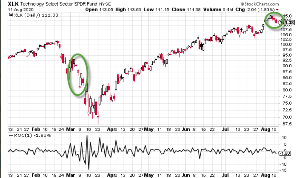
This represented the first 3-day losing streak for technology since early March. This ended a record 107 days in a row without a 3-day losing streak, topping the previous 106 day record from April 2017. The good news and to the consternation, possibly, of many market bears is that while this took place the S&P 500 still managed to make higher, new bull market highs. We explained the strength and broadening breadth of the markets in our weekend Research Report, which identified small caps and Industrials taking the lead of late.
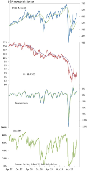
- The best performing S&P 500 sector over the past 1 month and past 3 months has been the Industrial sector, according to the chart above from R.W. Baird’s Willy Delwiche.
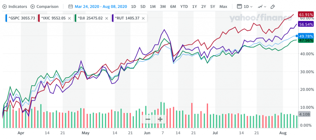
Believe it or not, small-cap stocks viewed through the Russell 2000 have performed better than large cap stocks in the Dow and S&P 500 since the March bottom. In fact, the Russell 2000 is outperforming the S&P 500 by nearly 7% and the Dow Jones by nearly 9% since the March lows. If anybody suggests that small-caps are lagging, they would only be referring to the YTD time frame, which is not consistent with a new bull market cycle given the prior bear market intra-year.
Although the major averages fell on Tuesday, the Industrials and small caps were the out-performers on the day, falling the least. The more recent out-performance of small caps and cyclicals like industrials, Financials and Energy have sparked up the debate for whether or not value stocks will also come back into favor. There’s no need to entertain such a debate when there are easier ways to profit in the market.
As we progress through the trading week, it appears that the House and Senate are no closer to a relief package deal for the average American household/tax payer than where they came into the week. Senate Majority Leader Mitch McConnell pushed Democrats and the White House to restart coronavirus relief talks on Tuesday as an impasse over aid leaves millions scrambling to cover bills. “I think it’s time for everybody to get back to the table, and let’s get a deal done,” he said.

The fact remains that jobs need to come back. Without jobs, incomes can’t come back. In the debate between should we or shouldn’t we pass another round of fiscal relief, a closer look at personal income numbers doesn’t leave much room for discussion. More stimulus is very much needed, and soon.
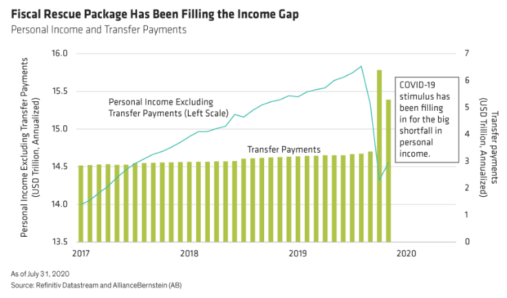
The COVID-19 crisis has left roughly 12 million people still out of work, nearly 10% of the total number of people employed before the crisis. The labor market has started to improve as the economy has gradually reopened, but there’s still a mountain to climb before things get back to normal. This means continued government support is necessary to keep households solvent and the U.S. economy on the path to eventual recovery.
Household income has held steady to this point, but only because of transfer payments, in the form of stimulus checks and enhanced unemployment benefits from the government.
How long can the equity markets travel northward without another round of fiscal relief remains to be seen. Either way, I propose that this sizable tree, will likely be overcome near-term as well. We’ll have a better indication on the steadfastness and resolve of both parties come the 15th. Technically, the Senate isn’t really even in session presently, but still working to make a deal.
If a deal is not fashioned by the end of this week, Senate Majority Leader Mitch McConnell may announce a recess for the Senate. This has the potential to send a more profound message to the House, for which the market may not be able to ignore further. Up until this point, the market has whistled past the bickering and political discord. Usually it is the market speaking, by declining, that moves legislators… to legislate and pass bills. As such, it shouldn’t be of any surprise that the two parties have slow walked even the negotiations. Make no mistake about it folks, without a new round of relief, a policy misstep will be felt in markets; we’re just not there yet apparently and hopefully it will not come to that. Millions of people are out of work and pending evictions.
While the situation on the ground seems ominous, coming out of a recession and bear market that is also typical.
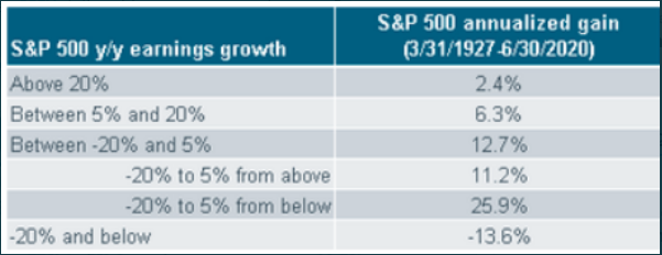
The table above serves as a reminder to investors that the best market returns come when earnings are terrible (-20% to 5% from below) and inflecting from the bottom. So for those of you who are in disbelief and fighting the market rally, in spite of the circumstances in the macro-picture, you’re also fighting history and human behavior. The data doesn’t lie and is quite powerful; why fight it? LPL Financial asks a similar question of investors when dissecting the common mantra that the market is “disconnected from reality”:
“The S&P 500 Index, which has risen four straight months, has returned 5% so far in 2020, despite probably the worst pandemic in the United States in 100 years and one of the sharpest economic contractions since the Great Depression. How does that makes sense? Let’s start with some context for the stock market’s recent strength:
- The pandemic has an end date. Markets are looking forward to better days ahead. Although the timing is uncertain, the stock market is expressing confidence that the pandemic will end eventually with a vaccine—or multiple vaccines—and with help from better treatments in the interim. Progress has been tremendous with many shots on goal that are likely to score at least one and maybe more success stories.
- Low interest rates. Stocks are expensive, no doubt, but they look cheap compared with US Treasuries yielding about 0.5%. When discounting future profits back at such low interest rates, equity valuations get a significant boost.
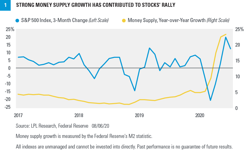
- Massive monetary stimulus. The stimulus from the Federal Reserve has driven the money supply, measured by M2, sharply higher—roughly 25% above last year’s levels. Some of that money has found a home in the stock market. Historically, money supply growth and stock prices have tended to move together, which has certainly been the case over the past few months [FIGURE 1].
- Support from the winners. The so-called stay-at-home stocks have thrived in this environment. We saw evidence of that in the blowout earnings reports from some of the technology giants on July 30. The good news extends beyond those companies, however, with about 40% of the S&P 500 classified as technology, digital media, or e-commerce. Add in some of the most defensive industries within the consumer staples, telecom, and utilities sectors, and more than half of the index is well positioned for this difficult environment.
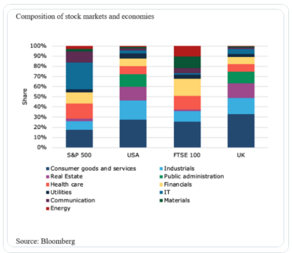
Moreover, the S&P 500 is very different from GDP (gross domestic product) that we use to measure the output of the US economy. Some of the key differences include:“
- The S&P 500 is more manufacturing driven, while GDP is more services driven.The services economy was harder hit during the lockdowns and, with social distancing, faces a tougher road back than manufacturing.
- The S&P 500 is more investment driven than consumption driven. Capital investment has been supported by technology spending and has not been hit as hard as consumer spending during the pandemic. As a result, the S&P 500 has been more resilient to the pandemic. We also believe the value of tech-based intellectual property is better captured by the S&P 500 and its profits than the GDP calculation.
- The S&P 500 is global, while GDP is domestic. Roughly 40% of the sales for the S&P 500 are derived internationally, while US exports in the GDP calculation make up only 13% of US GDP. The US economy is a net importer, while the S&P 500 is a net exporter, which is why the S&P 500 prefers a weaker US dollar. A weaker US dollar helps make US companies’ goods cheaper around the world and enhances international profits. A strong dollar hurts US exports, but it helps control inflation and supports consumer activity, which is a big part of the US economy.
- The S&P 500 likes higher oil, while GDP likes cheaper oil. Profits for the energy sector benefit from higher oil prices, but higher energy costs crimp consumer spending. The industrials sector also generally benefits from higher oil prices through capital spending by energy producers.
LPL Financial’s commentary has been offered by Finom Group in the past. Simply put: “The market just isn’t the economy. Structural composition of earnings vs. economic output by sector/industry tell the tale of the tape.” (See chart below)
The S&P 500 is up more than 50% from the March lows as of this week. This disproves the “it’s just a bear market bounce” theory. Some have been in that camp the whole way up and will remain stuck there. Here is where this S&P 500 rally ranks with the other bear market bounces.
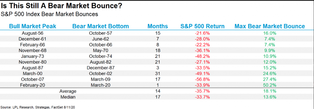
As we can see from the LPL Financial table above, this is an atypical type of bounce, validating that it is also unlikely the market delivers anything more than typical bull market consolidations absent another exogenous event. I would welcome consolidation as a long-term investor and intermediate-term trader. Moreover, I’ve heard it all before and with respect to consolidation forecasting. We have this natural tendency to believe that overbought conditions and overheated markets will correct and do so more severely than when markets are trending slowly higher.
The recent rally has left the market short-term overbought by most measures, admittedly. Short-term overbought often triggers some studies that suggest a downside edge, but when the overbought condition gets very strongly overbought, then those downside edges often don’t materialize with efficacy or utility. And at some point, rather than strength leading to weakness, the strength will beget more strength. The strong move higher over the last several days has turned the market so overbought that we are seeing this scenario begin to unfold. The study below looks at the 7-day win streak in the Dow Jones Industrial average. It exemplifies this concept. (from Quantifiable Edge
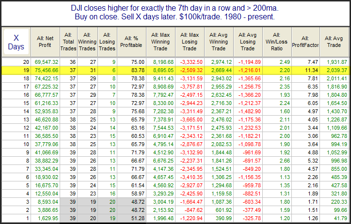
There is not much of an edge over the 1st few days highlighted in grey. Once you get out a little further, the stats appear solidly bullish. Least we forget about market breadth thrusts, which fired back in June and what they foreshadowed for market returns a month later? Recall the first breadth thrust to “fire” was a Break Away Momentum (BAM) breadth thrust in early June.
- The first breadth thrust is called a Break Away Momentum breadth thrust or BAM. (Walter Deemer)
- Break away momentum occurs when 10-day total advances on the NYSE are greater than 1.97 times ten-day total NYSE declines. It is a relatively uncommon phenomenon, occurring only 23 times since World War II (an average of once every 3 1/2 years). Cyclical bull markets, though, are traditionally heralded by break away momentum
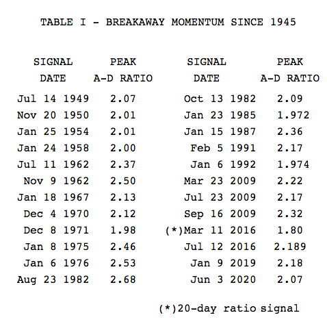
- Post-BAM declines/corrections tend to be surprisingly brief and shallow given the amplitude of the BAM-generating advance.
- When the train leaves the station it doesn’t back up to let late-comers get aboard.
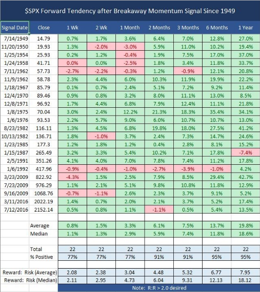
In speaking to the table of forward-looking performance for the S&P 500 after firing a BAM breadth thrust, we think it’s also important to note the maximum drawdown identified in the historic data. Over the next 3-6 month time period, the maximum drawdown after firing a BAM breadth thrust historically was just 4.3% in 2009, which came 1-week after the breadth thrust was fired. In 2020, the breadth thrust fired the first week of June, which found a rapid 8%+ drawdown and equally as rapid retracement of that drawdown.
Since we are now 2-months removed from the June BAM breadth thrust, we are forced to recognize that once again history has proven a guide. The average return 2-months later, indicated in table above, is 6.1 percent. In 2020 and 2-months later the S&P 500 has actually out-performed the average return post a breadth thrust firing.
This week’s earnings release calendar is somewhat of a bridge to next week’s more pressing retail earnings releases. The big boys of retailing will be up to bat next week as Wal-Mart (WMT), Target (TGT), Macy’s (M) and others are all slated to report. Today’s economic data calendar will paint a picture of potential reflation via the Consumer Price Index, but most investors will focus on the initial jobless claims and retail sales slated for release on Thursday and Friday respectively.


