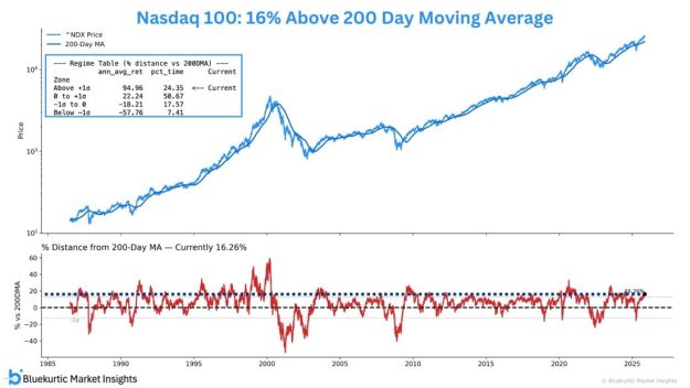
A two-panel chart showing the Nasdaq 100 price versus its 200-day moving average since 1985. The top panel plots the index and its 200-day MA, along with a box showing four return regimes based on distance from the 200-day MA. It highlights that the current reading is about 16% above the 200-day MA, placing it in the “Above +1 standard deviation” zone, which historically delivered the highest annualized returns. The bottom panel shows the percentage distance of the Nasdaq 100 from its 200-day MA over time, with dashed lines marking one standard deviation above and below. The latest value is labeled at roughly +16%. Branding “© Bluekurtic Market Insights” appears at the bottom.

Market Mania – FinX Weekly Top 10 #18

“If there is such a thing as “up is bad”, it’s when the HLL Indexes are doing this and break into warning levels. Both are currently at their respective “high alert levels” (NYSE HLL is a warning above 1.50). It is important to keep in mind, however, warnings can survive many, many months before the indices actually render a larger correction/pullback/bear market.”