
As we journey forward, into another trading week ahead, we encourage investors to digest one simple truth when it comes to markets and investing: “Intelligent investors understand the importance of planning for a wide range of outcomes by thinking in terms of probabilities, accepting and understanding that they will be wrong from time to time. It then becomes important to have the willingness to admit to oneself that we can’t or don’t need to know everything.”
All Things S&P 500 Related
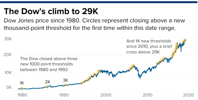
Before the major averages fell on Friday, they were all positive at some point through the week. In fact, the Dow Jones Industrial Average (DJIA) moved above 29,000 for the first time in history.
Shortly after this achievement by the Dow, a digestive phase in the market took down all 3 major averages on Friday. When the week was completed, the S&P 500 (SPX) and Nasdaq (NDX) were up 0.9% and 1.8%, respectively, for the week. The Dow was up 0.7%, but trust that what would prove to be most pervasive amongst investors is the relative market complacency by the end of the week and after a seeming step-back from the “brink” between Iran and the United States. Digging into market complacency is highly subjective. Finom Group doesn’t necessarily believe the market is overly complacent as we assess a plethora of market themes on a daily, let alone, weekly basis. Furthermore, we don’t believe assessing markets as being complacent lends itself to favorable market positioning.
In that disclosure, however, we are forced to recognize that we don’t make the rules for the market that is largely governed by greater activity and analysis than our solitary entity. Having said that, here is what we’ve come to recognize and offer in points of analytical observations by way of a couple market statistics one might find useful when forecasting the future outcomes near-term:
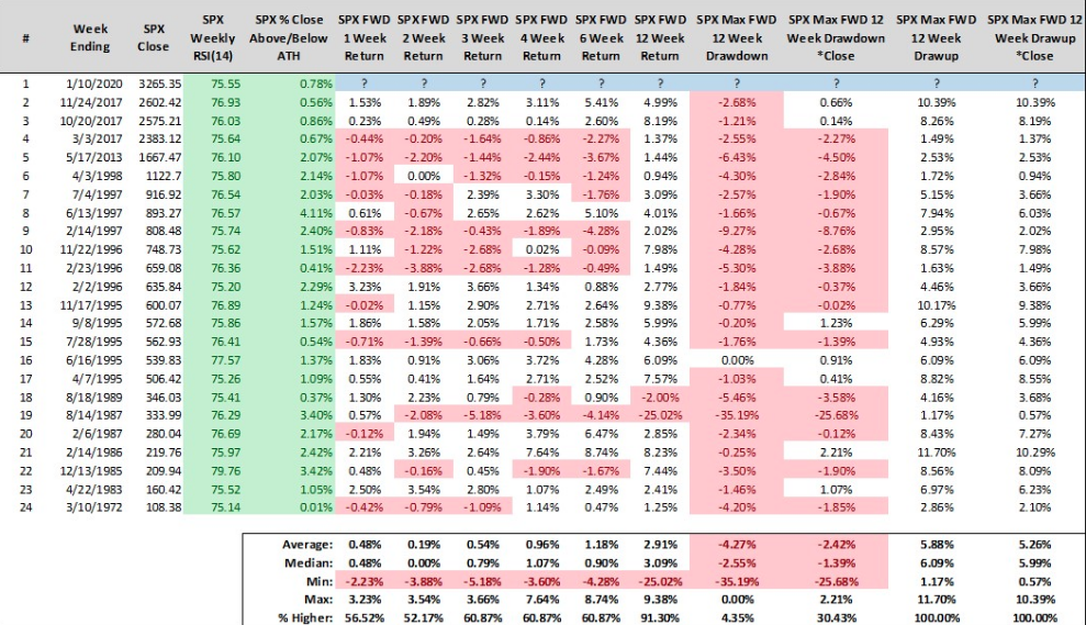
- The S&P 500 closed higher 12 of the last 14 weeks and closed at a new weekly all-time high through the time period examined. This has happened only *1* other time since 1990 (12/15/2017).
- The S&P 500 has completed 15 consecutive weeks without a weekly decline of -0.50% or worse. That’s happened only *2* other times since 1970: 12/22/2017 and 03/10/1972.
- We don’t think this was what most analysts, strategists, traders or investors forecasted at the beginning of this market rally, which ties in to our opening statements: Intelligent investors understand the importance of planning for a wide range of outcomes by thinking in terms of probabilities, accepting and understanding that they will be wrong from time to time.
Time to travel back in time folks! And why do we keeping calling our valued member folks? If we were to direct the conversation to each and every one of our valued members by name, the bullet points would be greater than 3,000… and we are grateful for the honor of servicing your financial market needs!
In last week’s Research Report we discussed possible market outcomes to the upside and to the downside. At this time, we reiterate that we remain of the opinion a market pullback of sorts is likely over the coming 30-day period. Nonetheless, from last week’s report we also offered that upside potential was correlated to a key Fibonacci level at S&P 500 3,290.
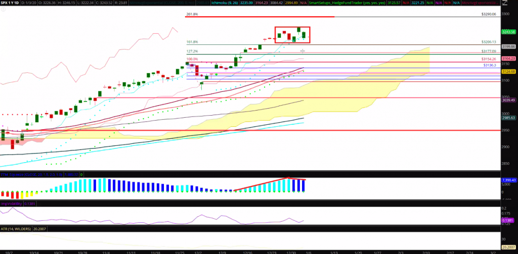
“The S&P 500 chart above identifies the the island top, potential technical formation but also… On Thursday, the S&P 500 gapped higher. On Friday the S&P 500 filled the gap. This happened and proves interesting, but for obvious geopolitical reasons. Nonetheless, bullish candles outnumber bearish candles and the Fibonacci 6.18 level seems to be a magnet just above current levels, at 3,290.
So here is what a CMT (Certified Market Technician) might say about the current technical formation in the chart above: “A move to 3,210 for the S&P 500 would likely put traders on alert for a potential island top at the highs.” What we would say is that, “If the bulls desire the uptrend to continue to seek and achieve the Fibonacci level noted, they will need to make a stand this coming week.” Breadth is at the bulls back, but that can shift rather quickly.”
It would appear that, indeed, the bulls did make a stand in the face of Iranian retaliation and growing fears of escalating conflict, as the S&P 500 gained nearly 1% on the week and the Nasdaq led the major averages with outsized gains. While overbought conditions only increased for the week, so did the greater likelihood of achieving that key Fibonacci level in the week ahead. And don’t get us wrong, certainly the minor downturn in the major averages Friday have created certain breadth divergences once again, but we can’t dismiss the powerful trend in place anymore than we can dismiss market illiquidity as a market driving force. Speaking of divergences…
Andrew Thrasher of Thrasher Analytics recently pointed out breadth divergence in the Nasdaq, which is heavily loaded with tech titans in the composite index.
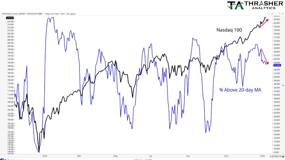
As shown in the chart above, the percentage of Nasdaq stocks above their 20-DMA made a lower low Friday, as short-term breadth begins to diverge from the uptrend in price. That’s a pretty sharp divergence we must admit. Additionally, when we review past divergences from within the 2019-2020 chart we can see that there is usually a tight correlation whereby when breadth diverges from price, the Nasdaq falters shortly thereafter… until the Q4 2019 period at least. This market internal/breadth indicator first gave way in November and then again in December of 2019, but the Nasdaq continued to trend higher. The most recent divergence would be the 3rd and begs of investors to consider whether or not the Nasdaq can continue to ignore the divergence and produce new highs. It should also be noted that even with the divergence, breadth remains at strong levels. Don’t dismiss that important fact.
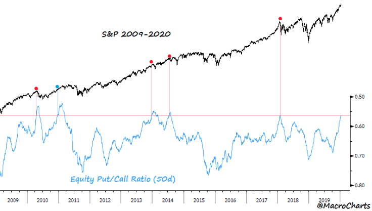
Alongside the Nasdaq, the Dow, NYSE and S&P 500 hit new all-time highs during the week. The rally was once again broad-based, as the cumulative NYSE advance-decline index posted yet another all-time high on Wednesday. This bodes well for investors, but as we discuss breadth extremes, the near-term market probabilities may not prove as favorable, and why? As the MacroCharts author puts it, “Extreme & historic complacency is now in full display.”
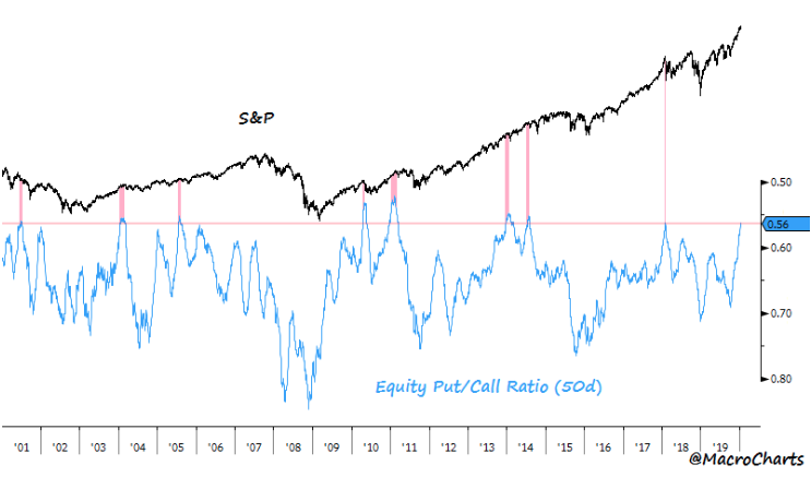
As shown in the chart above, the 50-day Put/Call Ratio (inverted) has dropped to 0.56, among the most extreme overbought readings in 20 years. Now, let’s zoom in on the chart for specific like extremes in the equity put/call ratio.
- APR 2010 Topped 1% higher then corrected -17% over the next two months.
- DEC 2010 Market ignored the signal, extended +7% in two months, then gave it all back in one month, then spent four months topping and fell -22% (for traders, this was the only signal that failed in 20 year)
- DEC 2013 Topped less than 1% higher then corrected -6% in one month.
- JUL 2014 Topped less than 1% higher then corrected -4% in two weeks, rallied back to the highs then dropped -10% in one month
- JAN 2018 Market had already topped, corrected a total -12% in two weeks.
If that’s not extreme enough sentiment for you and doesn’t offer itself on some level the way sniffing salts do a professional boxer, how about the extreme amount of S&P 500 call options bought last week? Last week, investors/traders bought to open 21.6 million speculative call options. That’s the most ever recorded in a week. The previous record was 19.7 million during the week of Jan 26, 2018.
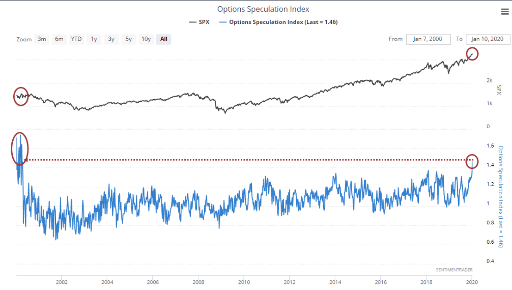
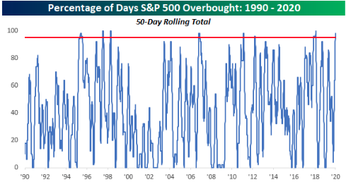
Speaking of January 2018, we all know what happened shortly after that on February 5, 2018. The market had an intraday drop of 5 percent that day. We can’t and shouldn’t expect a similar market performance based on the charts above, but we can suggest the longer we remain in overbought territory, the greater chances of such a market pullback performance. Bespoke Investment Group calculates the market has been statistically “overbought” 98% of all days since October, the longest such stretch since late-2017-early 2018.
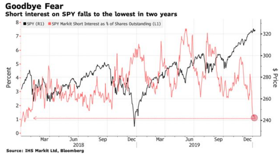
As we have mentioned in the past, the clearest view into the psyche of traders is not delivered through weekly investor surveys, but outlined in hedging activity or lack there of, as determined by the equity put/call ratio charts above. But we can further emphasize investor sentiment conditions based on the open interest in short positions for the S&P 500 index ETF (SPY).
Finom Group would suggest that fund managers are chasing the market at this time, leaning into momentum names like FAANG. Can we not lie to ourselves people. Alphabet shares (GOOGL) are up nearly 7% already this year and Facebook shares (FB) are up more than 6% in 2020. Apple Inc. shares (AAPL) are up nearly 6% while Amazon shares (AMZN) are outperforming the S&P 500, but trailing their FAANG peers, up nearly 2 percent year-to-date.
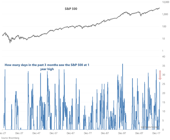
Moreover, while we know the Fibonacci 61.8 level is within arm’s reach for the S&P 500 to achieve, we’re not sure whether or not it gets there next week and here is why. According to Sentiment Trader findings, the past 3 months have seen 26 days in which the S&P 500 was at a 1-year high (daily high prices). Over the past 15 years, this ALWAYS led to a pullback in the S&P 500 over the next week.
All that has been recognized and featured in our weekly Research Report, thus far, does suggest the market is overheated and found with extreme sentiment. Does this mean investors should start selling all their holdings. We think not! We think the optimal strategy, in an expansion cycle and where earnings are forecasted to rebound with YoY growth in EPS of greater than 9%, is to revisit one’s risk exposure for potential rebalancing and shopping list of stocks/ETFs to acquire during a pullback.
In terms of the relative strength index (RSI) for the S&P 500; it improved on the week. The S&P 500 weekly, 14-day RSI finished at 75.55 with the S&P 500 closing the week at another weekly high. It’s easy to suggest that this is usually an area where the market begins to correct. Having said that, it’s also important for investors to consider their personal time frames with regards to their portfolio holdings. Nonetheless, here are the statistical findings concerning the S&P 500 and its 14-day RSI closing at 75.55 with a new weekly high (According to Steve Deppe): The fact is that 21 of 23 occurrences saw the S&P 500 close higher 12 weeks (3 months) later. So if we do have a pullback near-term, we might expect the market to be higher than it is come Monday, three months later.
Comparative analysis is a great tool, as we aim to comb through a litany of historic charts and data, but don’t let any of these studies, charts, breadth studies and positioning data determine your outlook on the market long-term. Ultimately, the market will trend in tandem with earnings. As earnings move higher, the market will follow. As such, the interim media and analysts’ commentary provides a good deal of noise that only proves to test the resolve of traders and investors. Focus on those earnings’ probabilities long-term and you will likely perform well as an investor.
For now and for traders with more near-term horizons and considerations, we get it, we get it… the near-term means everything right? Well, with that being said we would think that based on the preponderance of evidence put forth that coincides with overbought and overheated market conditions, the near-term risk reward is rather unsavory.
This doesn’t exonerate a move higher in markets, but rather it suggests the reward to the upside is quite limited, and therefore exposure to the market is best to be kept limited or potentially hedged. Rebalancing one’s portfolio does present itself as an exercise consistent with hedging activity, JUSTSOYAKNOW! 😉 Below is a conversational response to a recent e-mail communication between Finom Group and a Premium Member: (Permission was granted)
- Member: The Research Reports are very helpful and show that the market is about to take a turn for the worse. You guys say that doesn’t mean we should sell, why not if we can get our stocks back cheaper?
- Finom Group: It’s not hard to point out market internals/breadth, but to time the market’s response to weakening internals/breadth and hoping to sell ahead of that market turn lower… that’s what people have been hoping to do since December and since then the market has traveled another 4% higher. Breadth is not a timing tool and we’re always best reacting to the market than trying to be proactive, especially in a bull market with earnings growth and compound that with limited market liquidity. Work with the market, don’t try to fight it or outsmart it. The market will likely win!
One of the key reasons the market has seemingly defied geopolitical turmoil, trade wars and a relative earnings recession is that valuations do indeed matter, but market liquidity forces the elongation of market trends and can stretch those valuations to extremes in a recognizable low rate environment.
We’re not interested in arguing with investors/traders who won’t recognize that earnings grew roughly 20% in 2018, only to find a bear market in Q4 2018 and the FW12M PE at 14. Those investors who are largely permabears, weren’t complaining then and when earnings were growing substantially into a bear market. With the market gaining 28.88% in 2019 they complained furiously that there was no earnings growth. In 2018, the market simply digested strong earnings growth and a significant breakout in the market that began in mid-2016 and carried through September 2018. Remember, breakouts can be quite powerful.
In 2018, the digestive period found a valuation extreme at the end of the year, when market illiquidity was at its peak and only then was able to correct the downtrend. Besides a catalysts of great consequence that can prove to adjust investors’ appetites for risk, valuation extremes often prove the only weapon against market illiquidity. And there is no way to deny that equity markets still remain quite illiquid.
Another way we can explain illiquid markets in the context of overbought conditions is by way of identifying what is causing the flight to risk assets. Simply put, Fed bond purchases and Repo market activity is understandably forcing investors to move out on the risk-curve. The Fed doesn’t directly provide any liquidity to the equity markets, but rather it provides a shift in investor sentiment, risk appetite.
Through the Fed’s bond market activities the Fed is able to keep rates relatively low, which drives strength into corporate credit markets.
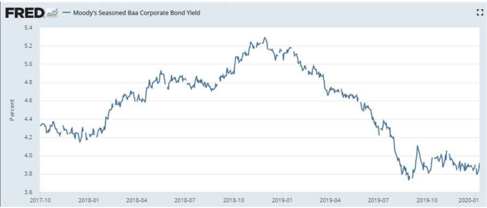
The yield on lower-investment-grade corporate debt is a good deal lower than two years ago, supporting stocks and reflecting ample liquidity, even when equity market liquidity remains at record lows. If investors can’t find appreciable yield in the bond market, well… they have to go out on to the risk-curve and increase exposure to equities. This is where pension funds are found forcibly shifting their portfolio models.
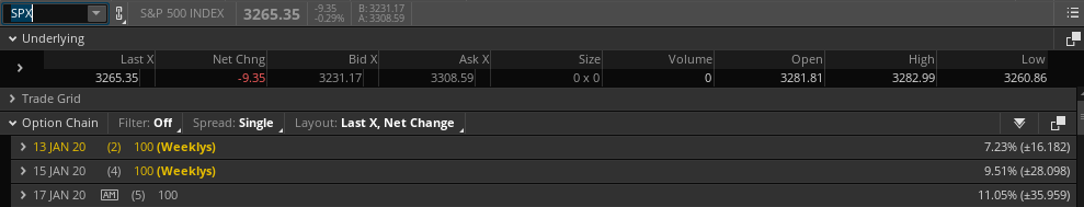
For the week to come, the S&P 500 weekly expected move has dropped from $44/points in the previous week to just around $35/points.
The VIX dropped roughly 10% last week, but has failed to hit a new 52-week low. The 52-week low remains as of April 2019 at 11.03. The fact that it has not made a new 52-week low as the S&P 500 has achieved new highs leads investors to take up false narratives that claim the VIX is not confirming the record highs in the S&P 500. Folks, the VIX is not a “confirmation tool”, as the chart below identifies. (Chart from David Keller)
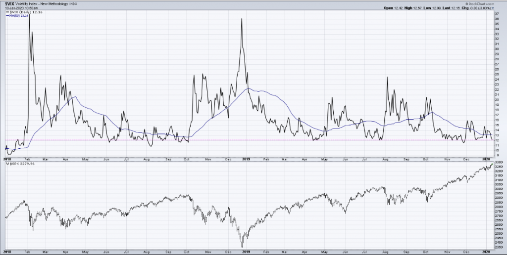
Sometimes a low VIX correlates to a short-term market top (mid-2019) and other times it remains low during extended uptrends (mid-2018). You never know which it is until after the fact. Based on hindsight analysis alone, we shouldn’t be using the VIX to confirm anything more than what it is presently reacting.
Weekly Economic Data
We entered last week’s economic data release schedule with some optimistic economic data releases 2 weeks ago. Housing sector data remains strong, consumer spending ticked higher in November and inflation pressure remains muted. While there was a plethora of strong economic data points, the ISM manufacturing index was not one of them, as it contracted to the lowest level since 2009. Even so, we don’t suggest to investors that they lay too much importance on the manufacturing data, which despite its truculent and stubborn reaction to rebounding, is a lesser component to economic activity in the United States.
To kick-off the week, more ISM data was scheduled for release this past week, but from the service sector. The ISM non-manufacturing index came in better than expected on Tuesday. The enormous service side of the U.S. economy sped up at the end of 2019, coinciding with solid holiday sales and reduced trade tensions with China.
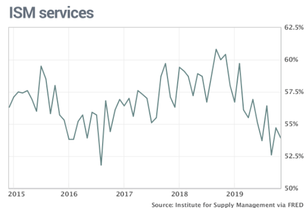
The Institute for Supply Management’s survey of service-oriented companies such as banks retailers and restaurants rose to a four-month high of 55% in December, from 53.9% in the prior month. New orders grew more slowly, however, as did employment. Both indexes were still positive, though.
“The respondents are positive about the potential resolution on tariffs,” said Anthony Nieves, chairman of the services survey.
There remains a contraction in the manufacturing sector of the economy, but that is not seeping into the larger, services sector of the economy, as factually disseminated. The divergence remains large between the two sectors.
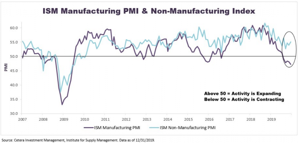
We urge readers to consider that for all the angst over the manufacturing recession, it simply doesn’t lend itself as a recessionary signal. Here is what John Lynch of LPL Financial had to offer with regards to the contraction in the manufacturing sector more recently:
“We’re still constructive on economic fundamentals, even amid manufacturing’s malaise. Manufacturing has historically been a bellwether for the economic outlook, but its role in output has shrunk. Manufacturing accounts for about 11% of gross domestic product, according to Bureau of Economic Analysis data, so it’s unlikely the sector alone will drag the rest of the economy down. ISM’s PMI has dropped below 50 three other times this cycle without a recession materializing, and other key segments of the economy still look solid.“
On Wednesday, private sector payrolls proved a strong beat against economists’ expectations. U.S. private-sector employment picked up in December as businesses added 202,000 jobs, according to data released Wednesday.
Economists polled by Econoday had expected a December gain of 157,000 compared with an originally reported increase of 67,000 in November. On Wednesday, ADP revised November’s gain to 124,000.
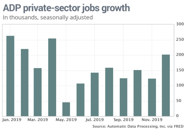
Overall, three- and six-month average ADP job gains now stand at 159,000 and 151,000, respectively, close to the 12-month average of 163,000 but still well below 2018’s pace of 213,000. This suggests labor markets have settled into a steady, more modest pace of growth.
“As 2019 came to a close, we saw expanded payrolls in December,” said Ahu Yildirmaz, vice president and co-head of the ADP Research Institute. “The service providers posted the largest gain since April, driven mainly by professional and business services. Job creation was strong across companies of all sizes, led predominantly by midsized companies.”
Mark Zandi, chief economist of Moody’s Analytics, said, “Looking through the monthly vagaries of the data, job gains continue to moderate. Manufacturers, energy producers and small companies have been shedding jobs. Unemployment is low, but will begin to rise if job growth slows much further.”
It’s clear that the service sector is where the growth is and that has been the case throughout the longest expansion cycle in history. For those investors and analysts whom choose to live and reside in the old world economy dating pre-1970s, they seem to disavow the notion that the manufacturing sector is unworthy of our focus, despite the evidence that suggest to the contrary. Here’s a conversation from our very own Seth Golden on Twitter with a private investor who believes that the weakness in the manufacturing sector bleeds into the service sector.
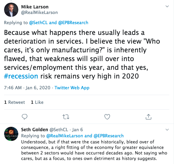
By the way, Mike Larson Senior Analyst at Weiss Ratings, said the same thing last year! And by the way, that conversation was before the ISM service index data was released this week, which continues to prove Seth Golden’s point.
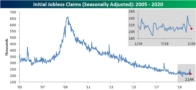
On Thursday we received the weekly initial jobless claims that continued their streak of declines. Initial jobless claims declined by 9,000 to 214,000 in the seven days ended Jan 4. the government said Thursday.
According to Bespoke Investment Group’s analysis on claims, initial jobless claims have now essentially reversed the massive spike observed around Thanksgiving 2019 and are back within the range that has been in place for most of the past year.
With a strong ADP private sector and initial jobless claims trend in-hand, all that was left for the weekly economic data calendar was the highly anticipated December 2019 Nonfarm Payroll report. The economy created 145,000 jobs in the final month of 2019 to cap off the ninth straight year in which new hires topped the 2 million mark. This was only 15k shy of economists estimates, but proved a “not too hot, not too cold” report by most analysts measures.
The unemployment rate stayed at a 50-year low of 3.5%. What’s more, a broader measure of joblessness known as the U6 rate fell to 6.7% to mark the lowest level on record.
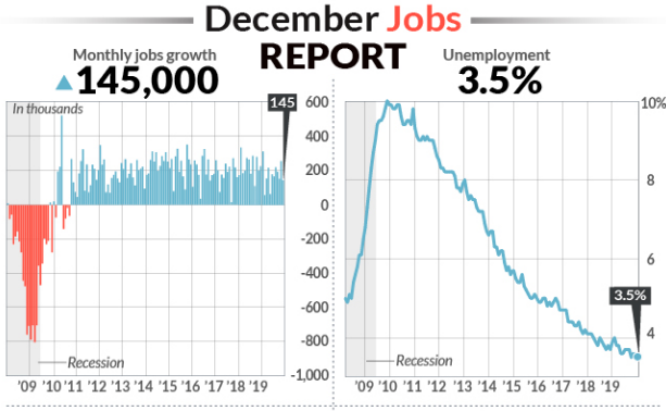
If we factor in the benchmark revisions, hiring is slowing steadily despite monthly volatility, but this is to be expected this far into the expansion cycle. Q4 2019 job growth was above trend. The 12-month average of 159k is still above the roughly 115k pace needed to hold the unemployment rate steady at current rates of participation, unemployment and population growth.
The economy created 2.1 million jobs for the full year, down from 2.7 million in 2018. Much of the decline reflects a slower U.S. economy and a slump in manufacturing, but the ultra-tight labor market has also made it harder for companies to fill open jobs.
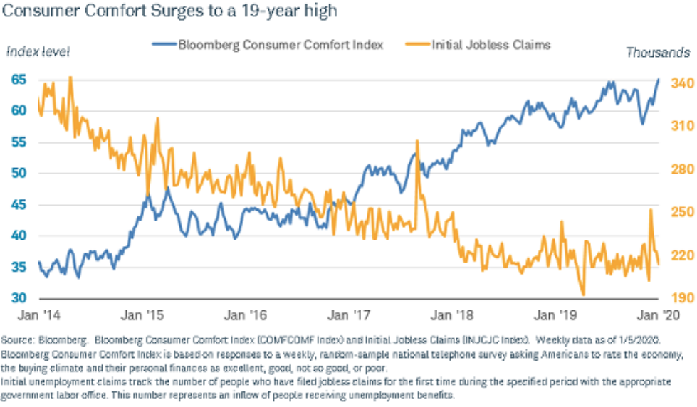
In keeping with the theme of our report, if you don’t think that this 19-year high in the Bloomberg Consumer Comfort Index didn’t find itself as a warning signal from market participants, you’d be wrong. According to the Sentiment Trader, yeah, you probably guessed it already…
“The Bloomberg Consumer Comfort Index..ask[s] Americans to rate the economy, the buying climate and their personal finances as excellent, good, not so good, or poor. Consumers haven’t been this fat and happy since October 2000.“
Firstly, the Bloomberg Consumer Comfort Index is not an economic data point or economic indicator. It’s nothing more than a coincidence indicator, which apparently didn’t work so well during the early to mid 1990s? Secondly, the consumer of 2020 can’t be compared to the consumer of 2000 or even the consumer from 2000-2008. And why you might be asking? Well if you are new to finomgroup.com you might be asking…
The following chart is what we deemed the most important chart that would demonstrate the health or weakness of the average consumer in the United States. A healthy consumer has a healthy debt to income ratio and a high disposable income level as a percentage of household debt obligations.
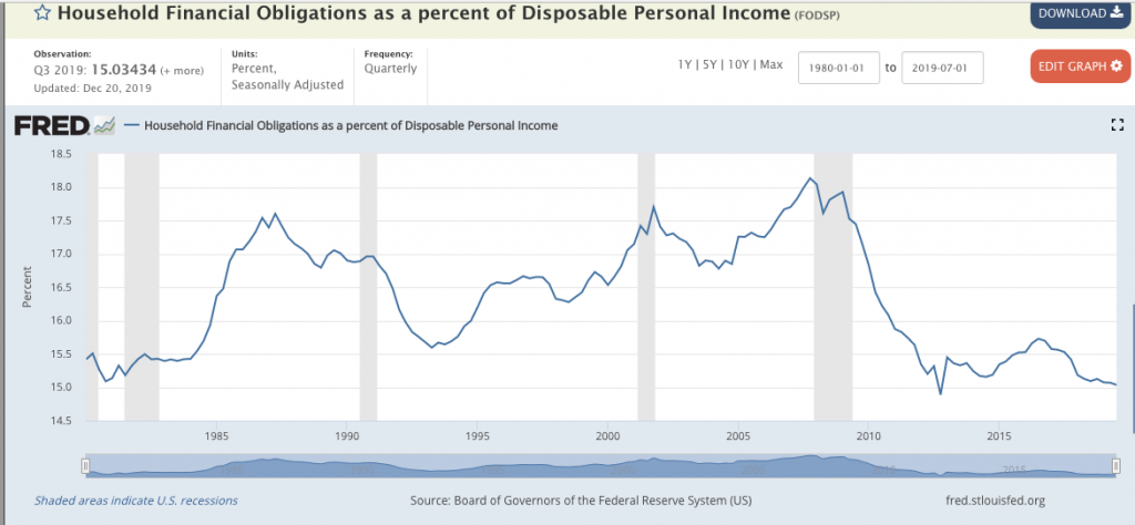
As outlined in the latest St. Louis Federal Reserve Bank report, the average household/consumer balance sheet is in its best shape since the 1970s. That was not the case in 2000 or anytime leading up to the Great Financial Crisis of 2008. Given that consumer spending comprises some 70% of GDP, does that mean the U.S. economy can’t go into a recession with household balance sheets this strong? No, but it does mean it remains on the lesser probability of the scale. Additionally, it suggests that should an exogenous shock hit the economy and prove to push it into a recession, the recession would likely be a shallow and short-lived occurrence.
Finom Group’s U.S. economic outlook remains firmly intact and the latest slew of economic data releases suggests that trend-growth in 2020 is what we should expect. We believe that the backdrop for the economy remains with more tailwinds than in 2019, as trade feuds de-escalate and consumer’s remain optimistic about their wages and the overall economy. Consumer sentiment is near cycle highs, wages are growing, credit delinquency rates are low and have improved for much of the expansion cycle and a presidential election year tends to play favorably for the economic expansion. Having said all of that, we offer some insight from David Woo, Head of Global Rates, FX and EM Fixed Income Strategy & Economics at Bank Of America Merrill Lynch:

“How could the second half of 2012 provide a roadmap for 2020? In our view, 2012 could very well be the playbook for 2020. If you recall, 2012 was about the eurozone crisis. The first half of 2012, it was about how the crisis spread from Ireland to Portugal from Portugal to Spain from Spain to Italy, and the world economy was on the verge of basically going into a recession together with Europe.
Of course, in July 2012 the President of the ECB, Mario Draghi, gave a very memorable speech in which he said, we will “do whatever it takes,” and then “it will be enough.” That speech was enough to calm down the market. In fact, the global economy soon took off because all the pent-up demand in the system, which had been accumulating for months, just got released suddenly. It was like a spring that was so compressed when you let it go, it just bounced.
In many ways, the same pent-up demand has been accumulating in the global economy through most of 2019. And we believe the dissipation of policy uncertainties will allow businesses to go back to rebuilding inventory, undertaking capex spending, and go back to hiring people. So from that point of view, we do believe that if indeed these political uncertainties were to lift, we could see much better performance in financial markets in the world economy.”
The economic data released during the past trading week didn’t hinder or improve the outlook for Q4 2019 GDP. Most forecasts remained the same on a week-to-week basis. For the coming week, the economic data calendar is quite heavy, but doesn’t kick into gear until Tuesday.
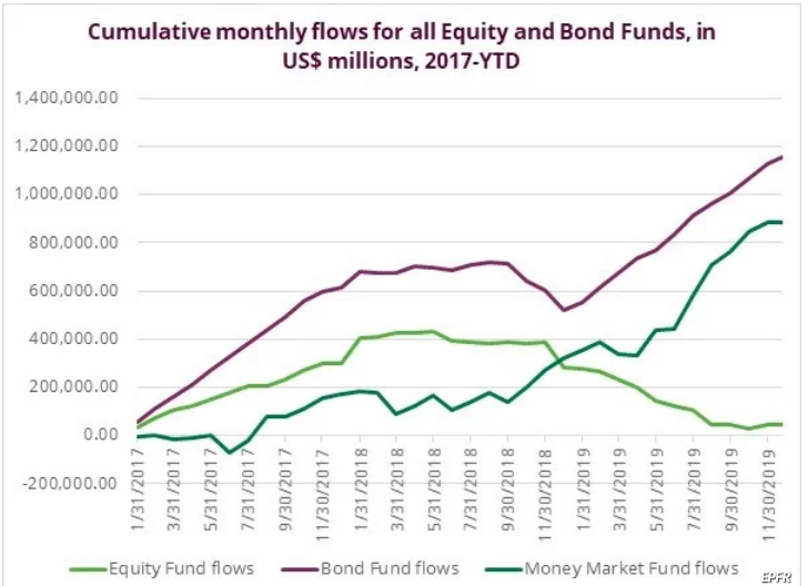
Fund Flows
According to Lipper Weekly FundFlow Insights, for the third week in a row, equity ETFs witnessed net inflows, attracting $8.8 billion for the most recent fund-flows week. Authorized participants (APs) were net purchasers of domestic equity ETFs (+$6.8 billion) for the second consecutive week. Meanwhile, non-domestic equity ETFs witnessed net inflows for the third week running, though they took in $2.0 billion this past week. SPDR S&P 500 ETF (SPY, +$2.1 billion) and Industrial Select Sector SPDR ETF (XLI, +$1.4 billion) attracted the largest amounts of net new money of all individual equity ETFs. At the other end of the spectrum, iShares Core S&P 500 ETF (IVV, -$847 million) experienced the largest individual net redemptions, and SPDR Portfolio S&P 500 Value ETF (SPYV, -$543 million) suffered the second largest net redemptions of the week.
For the forty-second consecutive week, conventional fund (ex-ETF) investors were net redeemers of equity funds, withdrawing $18.0 billion. Domestic equity funds, handing back a little more than $15.2 billion, witnessed their second weekly net outflows while posting a 0.75% return on average for the fund-flows week. Their non-domestic equity fund counterparts, posting a 0.19% gain on average, witnessed their eighth consecutive week of net outflows, handing back some $2.9 billion this past week. On the domestic equity side, fund investors turned their backs on large-cap funds (-$10.4 billion) and small-cap funds (-$2.5 billion), while investors on the non-domestic equity side were net sellers of international equity funds (-$2.7 billion) and global equity funds (-$0.2 billion).
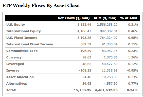
For the second week in three, taxable bond funds (ex-ETFs) witnessed net inflows, attracting some $9.8 billion this past week, while posting a 0.18% return for the fund-flows week. Investors were net purchasers of corporate investment-grade debt funds (+$6.7 billion) and flexible funds (+$1.8 billion), while balanced funds (-$653 million) witnessed the only net outflows of the group. For the fifty-third straight week, municipal bond funds (ex-ETFs) witnessed net inflows—taking in $2.3 billion—their largest weekly net inflows going back to 1992 (when Lipper began tracking weekly flows), while posting a 0.57% gain on average for their second straight weekly market gain.
One of the scary market truisms that have heralded market tops for decades surrounds the retail investor. You’ve probably heard it one too many times, “The retail investor is the last to pile into the market, that’s the top.” Well, based on fund flow data at year-end 2019, that may be exactly what has been taking place again; the retail investor piling in near the top of the market.
Retail investors posted a positive inflow to equity funds during the week ended December 26, 2019, only the third since late in the second quarter of 2017, according to data from EPFR. “The fact this group recorded its second retail inflow in the past two months is more significant,” given the consistent retail outflows seen in recent quarters, according to Cameron Brandt, director of research at EPFR Global.
“There’s still a lot of money on the sidelines,” Jeffrey Kravetz, regional investment director at U.S. Bank Private Client Reserve told MarketWatch. “Retail investors have been cautious this year,” he said, adding that last December’s sharp downturn drove this caution.
“The fund flows you’re seeing is that they’re probably looking at their portfolios and statements and realizing that it’s been a good year and not wanting to miss out.”
Moreover, the latest TD-Ameritrade Investor Movement Index validates the surge in flows from certain of the retail investor community. TD-Ameritrade clients continued to increase equity market exposure in their accounts during the December IMX period. The IMX increased to 5.55, up 7.35%, from 5.17 the previous period. This marked the highest score in 14 months.
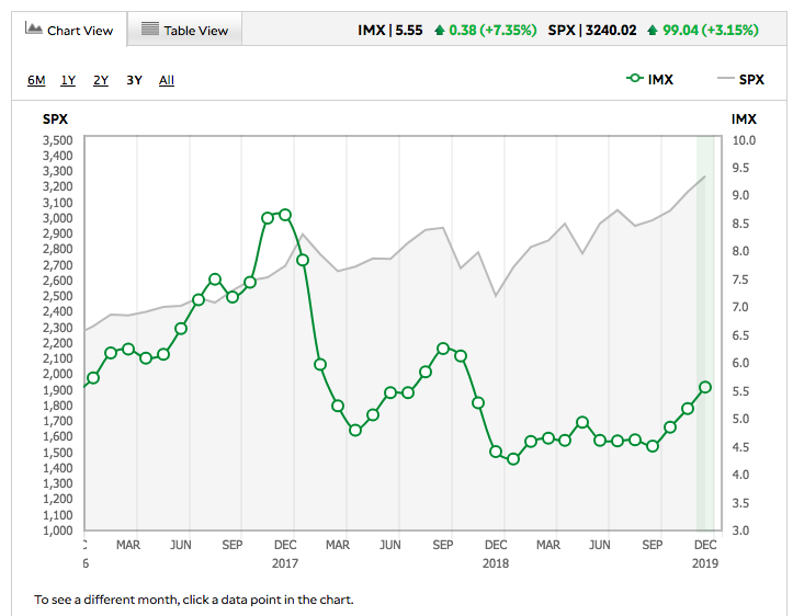
TD-Ameritrade clients were net buyers overall, and increased exposure to equity markets during the period. The increase in exposure was mostly driven by net buying in broad-based equity products, including ETFs and mutual funds. Clients were also net buyers of less risky assets, including fixed- income products. Market volatility continued to be light, with the CBOE Volatility Index, or VIX, not registering a closing price above 16 during the period.
Earnings Outlook
The moment has arrived folks! This week represents the official kick-off to earnings season. Sure we’ve already seen some earnings trickle in recently and most notably from Fedex (FDX) and Bed Bath and Beyond (BBBY) which both greatly disappointed. And some seasonal holiday updates from retailers like Macy’s (M), J.C. Penny (JCP) and the great disappointment from Kohl’s (KSS) have actually disproven the usual trend in forecasted EPS on a quarterly basis to be improving at this point within an earnings season. Coming into last week, FactSet was forecasting Q4 2019 EPS to decline -1.4% YoY. But that has worsened after some of the latest earnings reports and cuts to Q4 guidance by certain retailers.
According to FactSet, estimated earnings for the fourth quarter decreased by 4.7% from September 30 through December 31. This percentage decline was larger than the five-year average (-3.3%), the 10-year average (-3.1%), and the 15-year average (-4.4%) for a quarter.
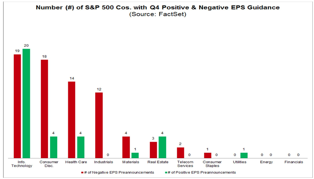
However, a smaller percentage of S&P 500 companies have lowered the bar for earnings for Q4 2019 relative to recent averages. Of the 107 companies that have issued EPS guidance for the fourth quarter, 73 have issued negative EPS guidance and 34 have issued positive EPS guidance. The percentage of companies issuing negative EPS guidance is 68% (73 out of 107), which is below the five-year average of 70 percent.
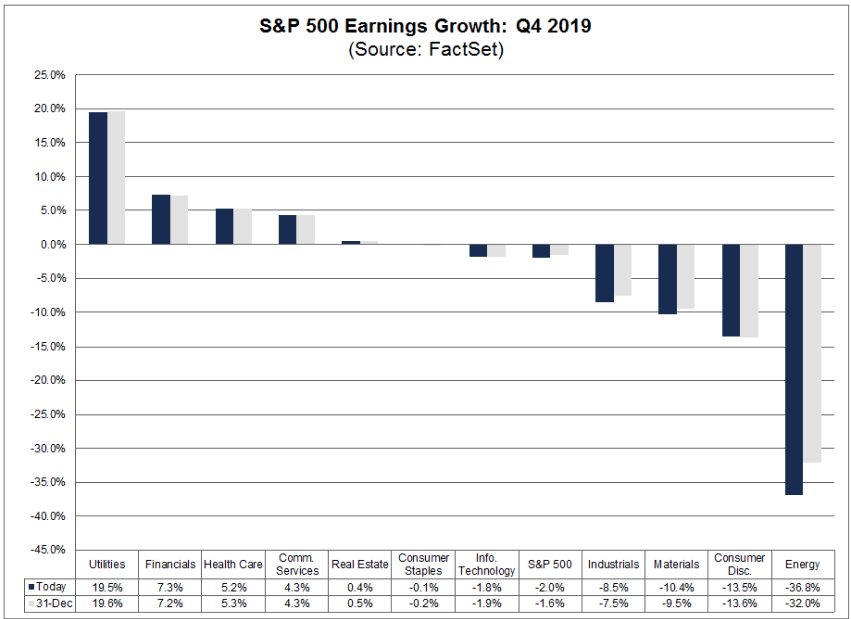
- It is interesting to note that the Information Technology sector is the only sector in which analysts have not lowered earnings expectations (in aggregate) since the start of the quarter. The expected earnings decline for the Information Technology sector today (-1.8%) is equal to the expected earnings decline on September 30 (-1.8%).
Because of the net downward revisions to earnings estimates, the estimated (year-over-year) earnings decline for Q4 2019 is -2.0% today compared to the estimated (year-over-year) earnings growth rate of 2.5% on September 30.
Looking forward, FactSet forecasts the following for FY2019 and FY2020 as follows:
- For CY 2019, analysts are projecting earnings growth of 0.2% and revenue growth of 3.9%.
- For Q1 2020, analysts are projecting earnings growth of 4.6% and revenue growth of 4.3%.
- For Q2 2020, analysts are projecting earnings growth of 6.4% and revenue growth of 4.9%.
- For CY 2020, analysts are projecting earnings growth of 9.4% and revenue growth of 5.4%.
- The forward 12-month P/E ratio for the S&P 500 is 18.4. This P/E ratio is above the 5-year average (16.7) and above the 10-year average (14.9).
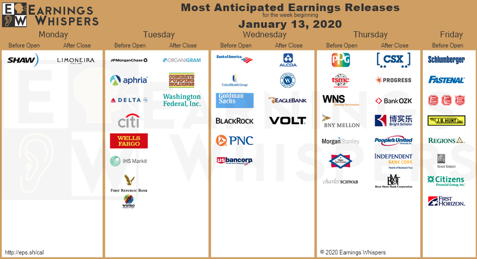
The graphic below identifies the most anticipated earnings releases for the week ahead:
As it was with FactSet’s latest Q4 2019 EPS forecast, Refinitiv’s earnings forecast has been found with a greater decline forecasted for the reporting period. Please see their respective forecasted metrics and valuation findings below:
Aggregate Estimates and Revisions
- Fourth quarter earnings are expected to decrease 0.6% from 18Q4. Excluding the energy sector, the earnings growth estimate is 1.9%.
- Of the 19 companies in the S&P 500 that have reported earnings to date for 19Q4, 84.2% have reported earnings above analyst expectations. This compares to a long-term average of 65% and prior four quarter average of 74%.
- 19Q4 revenue is expected to increase 4.2% from 18Q4. Excluding the energy sector, the growth estimate is 5.4%.
- 68.4% of companies have reported 19Q4 revenue above analyst expectations. This compares to a long-term average of 60% and an average over the past four quarters of 58%.
- For 19Q4, there have been 74 negative EPS preannouncements issued by S&P 500 corporations compared to 35 positive, which results in an N/P ratio of 2.1 for the S&P 500 Index.
- The forward four-quarter (20Q1 –20Q4) P/E ratio for the S&P 500 is 18.5.
- During the week of Jan. 13, 26 S&P 500 companies are expected to report quarterly earnings.
When it comes to the question of what to expect from the financial sector reporting season and beyond the big banks, analysts polled by S&P Global Market Intelligence expect fourth-quarter earnings per share to increase 10.5% from a year earlier. That is the second-highest estimate among the 11 sectors. (Utilities are expected to see an 11.8% increase in EPS, with five sectors expected to suffer earnings declines.)
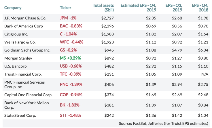
As it pertains to the big money center banks that are the first to report within the financial sector, here are the expected fourth-quarter EPS results for the largest 12 U.S. banks by total assets, among analysts polled by FactSet, compared with actual results for the previous and year-earlier quarters:
This earnings season is either going to validate the multiple expansion that took place in 2019 or propose a serious headwind for further gains near-term. Of course, the deciding factor is predicated on forward-looking guidance. The market/investors have given the FY2020 EPS forecast the benefit of the doubt to date… it’s time, it’s time! Big money center banks, which will report this coming week, will either further accelerate January’s equity market gains or prove to halt them altogether.
Estimates for full-year 2020 have come down over the last few months, but they still represent a material acceleration from the 2019 pace. The way Q1 2020 and full-year 2020 expectations evolve in the coming weeks and months will depend to a large extent on management guidance and commentary as Q4 2019 results are delivered.
Investor Takeaways
We always identify a great many key technical charts for the major indices inside each weekly Research Report, but it is quite possible that the most important chart is the “attempting” breakout of the Financial Sector Spiders ETF (XLF).
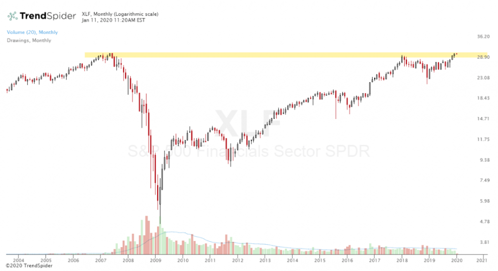
It has been a long road traveled for the XLF since the Great Financial Crisis. A breakout here in the XLF would be very bullish for bank names and provide a layer of market stability that it hasn’t necessarily been found with for several years. With earnings season kicking off and big banks set to report, we might have our answers to the stability of markets and investor confidence near-term. A confirmed breakout, would further our belief that even when the market corrects, it would prove a buying opportunity.
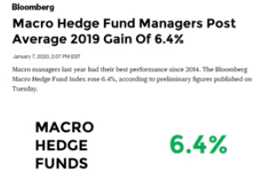
Market participants will remain infatuated with the FOMC and their “not QE” and Repo market activities for the foreseeable future. The bulls always need something to worry about and the bears are always oblige to guarantee a fresh dose of reasons for bulls to worry. The balancing act helps to reinforce underperformance on the part of fund managers, but allows a great opportunity for outperformance on the part of individual investors who aren’t encumbered by “wash rules”, RIA liabilities and fund manager Board of Governance regulations. In a year where the S&P 500 gained nearly 30%, the average fund manager didn’t even generate a return of 10% according to the latest Bloomberg data.
Bulls appreciate the FOMC’s policies when they provide stimulus to the economy and bears despise this support, especially when it comes at the expense of rates. What is probably most fascinating is the expected or anticipated ignorance the bears hope to find in their counter party and with their fist pounding “if not for QE” narratives.
The latest permabear rants about market’s surging has come by way of correlating the Fed’s balance sheet expansion with the S&P 500’s “typical” seasonal melt-up and first 5 trading day’s of January performance. The suggestion is that if not for the Fed pumping liquidity into markets by expanding its balance sheet, it would have fallen. Of course, since the Fed began expanding its balance sheet again in October 2019, at such a rapid rate, the S&P 500 has traveled higher by some 365 points or just under 12 percent.
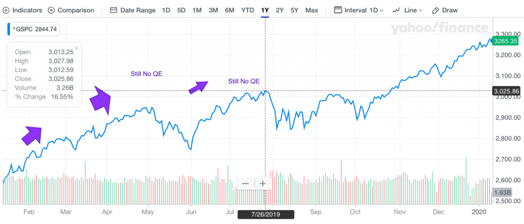
“But there was no QE or balance sheet expansion from the bottom in the S&P 500 in December 2018 and through the period when the S&P 500 achieved 3,000+ for the first time.” And that’s the point we hope the chart helps investors identify. The chart is a fact! There was no QE or expansion of the balance sheet as the market climbed from 2,400 all the way up to 3,000+ in July 2019. In fact, the FOMC was just slowing the pace of asset sales during this period, tightening. The point that is being offered is that permabears and media pundits alike will always find something to blame for the rise in markets, which isn’t found with the logic of historical market moves for the sake of distracting investors from the truth by way of fear mongering. And the truth of course is that the market is a forward looking pricing mechanism that follows the path of earnings over time. As we mentioned at the onset of our weekly Research Report, follow the earnings and you’ll likely generate strong returns on capital over time. Follow the permabear rants and you’ll likely join their chorus in due time.
We can’t stress enough how important this earnings season will prove to be for all market participants and as valuations have stretched almost all the way back to the Fall of 2018 highs, and before the market corrected in 2018.
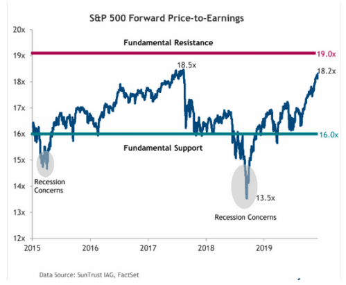
Right now, stocks are almost back to the same valuation levels in 2017, which at the time had not yet fully accounted for the impact of the just-passed corporate tax-cut law. Profits would surge by 20% in 2018, on quicker growth and lower tax rates, so in effect the market was a bit less expensive than it appeared in January 2018. It’s easy to review the chart above and suggest we may be in for another “uh oh” moment in markets. But unlike our previous chart of the S&P 500 that pointed out no QE during the market’s rally to 3,000+, the S&P 500 Price-to-Earnings Ratio chart positioned doesn’t tell us about Fed tightening through 2018, which was the real fly in the ointment for markets back then. Had it not been for Fed tightening… well we’ll never know now will we. Try saying that 5-times fast!
It’s easy to consider the present melt-up in markets as being overextended and found with extreme sentiment and greater positioning. What’s difficult for many investors to consider in the wake of a powerful move higher in markets is the bigger picture through the review of past market performance. We don’t deny the market is richly valued today, but compared to what?
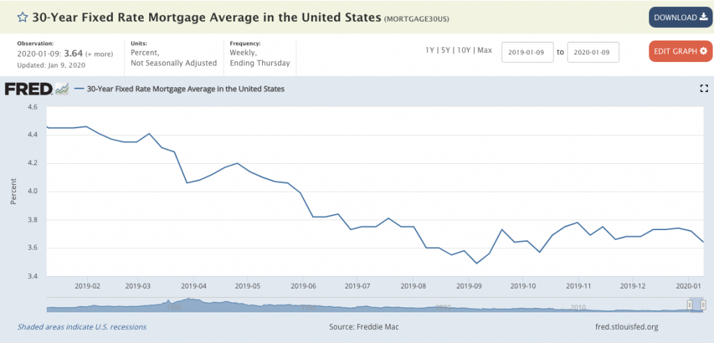
Interest rates were higher and the Fed was embarking on a determined tightening campaign in 2018, while the Fed now is on hold after 3 rate cuts last year. Fixed rate mortgages traveled higher throughout 2018 as the Fed raised rates and in 2019 rates retreated as the Fed cut rates. And with that the housing sector has rebounded throughout 2019 and into early 2020.
In January 2018, the mania for selling volatility reached an extreme and crashed, causing the implosion of XIV, which further provided fuel for one of the largest 1-point daily losses in the stock market. While volatility sellers are once again active, not as much leverage has built up in the volatility trading complex of instruments, by all evidence.
So while we can certainly look at a chart of the S&P 500’s valuation and suggest it is once again richly valued, the reasons why a correction was found in 2018 don’t support the reasons for a correction this time around. To this point, we don’t necessarily know for sure that valuations will provide the fuel for a pullback this time around, given the shift in Fed policy and relatively low rate environment.
Due to the fact that valuation is subjective, we simply can’t rely on it as a means for capital allocation decision making, but we should be considering it along the lines of risk management within the risk/reward model. The risk/reward evaluation is increasingly in play as valuations become stretched relative to history, even if not relative to rates. Hoping that other investors are considering relative valuation due to low rates is just that, hope. Investors can afford to be wrong with how to better value markets as the market provides validation one way or the other. The risk of underperforming markets should they prove the low rate valuation paradigm, can be compensated for in the future and with greater certainty.
Given the heightened awareness of overbought market conditions carrying a stretched price-to-earnings multiple, we can also drill down to the sector level to see just how stretched valuations have become. The chart below shows where valuations stand for sectors relative to levels seen over the last ten years.
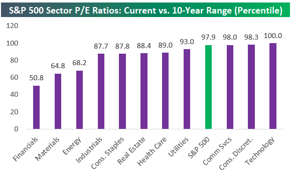
As depicted in the chart above from Bespoke Investment Group, the S&P 500’s current P/E ratio is higher than 97.9% of all other P/E readings seen for the index over the last 10 years. Additionally, 3 sectors have valuations in the 98th percentile or higher, with Technology at the top at 100 percent. Over the last ten years, Tech’s P/E ratio has never been higher. The only sector where valuations are currently “average” compared to the last ten years is Financials. Go figure and got to get to our final thoughts: (Chart below from Chris Ciovacci)
Nobody likes a consolidation period more than permabears. Nobody hates a breakout period more than permabears, but even bulls get concerned by the power of a breakout period, such as we’re seeing in the present day. Once an index/stock breaks out of a trading range and multiple new highs are set, it becomes difficult to predict how far the rally can go. The idea that an individual can select the exact time to take profits and change positioning with hedging strategies may prove detrimental to ones performance. The daily chart of the S&P 500 shows how many times a trader could have suggested the market was “due for a pullback” during the Q4 2019 period and over the last 200 point rally in the S&P 500. Each and every time this idea, if exercised, would have been a losing proposition. And the market is too complacent right, soooooo…
The “market is too complacent” is currently littering the landscape of the Fintwit community of Twitter participants. The problem with “the market is too complacent” theory is according to this theory and the folks who follow every VIX index tick is that the S&P 500 has been “complacent” since the rally started last October, and the VIX was again below its median average in 2019. The VIX was 13 on October 15, 2019 and it’s 12.56 today. Selling equities and buying bonds just because of “complacency” back then would have been a poor strategy and more obviously a losing proposition. This is just one of many examples of trying to outsmart the market, which often fails. Trust us, the market is never wrong and is always the purveyor of truth. The stock market will win more often than it loses and as it finds the ultimate truth in earnings.


