
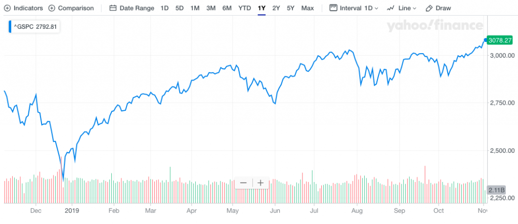
More record highs for the S&P 500 were set Monday and those record highs came alongside varied opinions on the market’s performance for the remainder of the calendar year. The bulls are cheering and bears are reeling from what appears to be a steady melt-up in markets through October’s end and at the beginning of November. These record high levels, which are pushing the S&P 500’s forward looking 12-month EPS price-to-earnings multiple closer to 18X, are creating some nervousness even amongst the bulls. Market bull and former strategist for Prudential and Deutsche Bank, Edward Yardeni, is one such individual who is concerned that stocks are getting too expensive.
If the S&P 500 forward earnings multiple ticks to 19 or 20, the Yardeni Research president warns it could spark a “nasty correction.” Right now, the index is at 17.5X. The historic norm is 15X to 16X.
“I just don’t want too much of a good thing here. I’d like this bull market to continue at a leisurely pace not in a melt-up fashion. That’s actually the risk.”
Yardeni expected 2019 to be a winning year, even as stocks were plunging last December. Yardeni wasn’t the only one who believed the market would rebound in 2019. Finom Group also suggested the same sentiment in calling for a rebound in late December of 2018. In our weekly Research Report dated December, 16, 2018, here is what we offered to Finom Group’s subscribers:

“There is nothing materially wrong with the U.S. economy, despite the S&P 500 YTD performance. Global macro-headwinds along with geopolitical headwinds have combined to increase the level of fear surrounding future corporate earnings, compressing the SPX multiple in much the same way it did from late 2015-2016. Back then and much like today, oil prices plunged and the yuan was steeply devalued. The same permabear rants that proliferated back then are present today. Having said that, the bears only found SPX marching higher thereafter and as earnings growth accelerated into 2017 and beyond. Get ready for a potential bounce in the coming weeks as the calendar year ends and begins a New!“
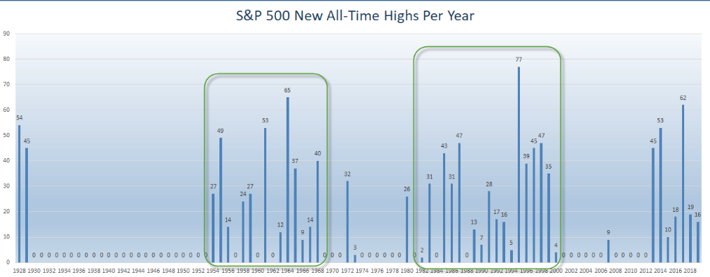
While we are discussing record highs for consecutive trading days or weeks presently, it’s important to recognize just how many record highs have taken place this year. The S&P 500 has made 16 new all-time highs so far in 2019. Remember, new highs tend to happen in clusters that can last more than a decade. (chart from Ryan Detrick)
Investors would do themselves a disservice by ignoring history and historic data. History offers investors insight and probabilities. While the colloquialism, “anything is possible” is quite popular in everyday life, it is less useful when it comes to investing. This is one of the biggest mistakes novice market participants adopt, possibility. What these and any investors would greatly benefit from is the understanding of probabilities. Probabilities bake in risk potential while outlining market performance probabilities through the dissemination of historic market performance metrics. This is why investors should study market history and the components of analogues. As we have commenced trading for the month of November and with probabilities in mind, we look at the historic data to better understand market performance probabilities.
From the statements above and studying market history, it’s always important to recognize that history does not always repeat itself. While data suggest probable outcomes, their is always the potential for outliers. Recall that the six-month period from May through October has historically been the worst time of year to own stocks. This period of the year is commonly know for the colloquialism “Sell in May and go away”. “Selling in May” did not work this year. If you had sold in May you would have missed the S&P 500 rising 10% from May 31 through the end of October. Does that suggest that future market gains were pulled forward. It certainly could, but we think that is a lower probability.
Moreover, given that the worst 6 months for returns didn’t exactly pan out, it begs of investors to look forward to the next 6 months representing November through April.
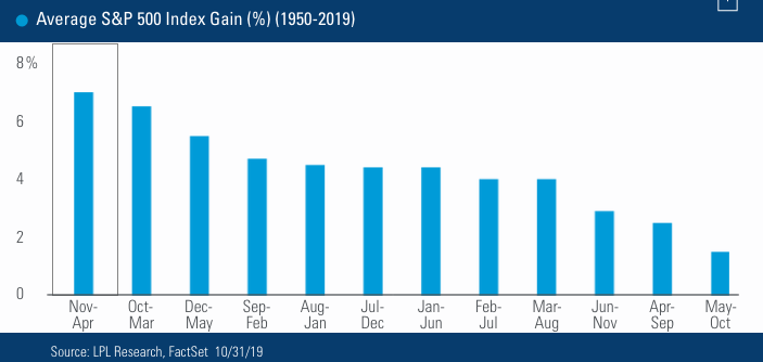
As we can see from the bar chart above from LPL Financial Research, the November through April period is the best time to own stocks. In the short term, the calendar also looks very friendly: November and December historically have been the best two months of the year for the S&P 500. They are especially good periods to own stocks when the market has been strong throughout the year.
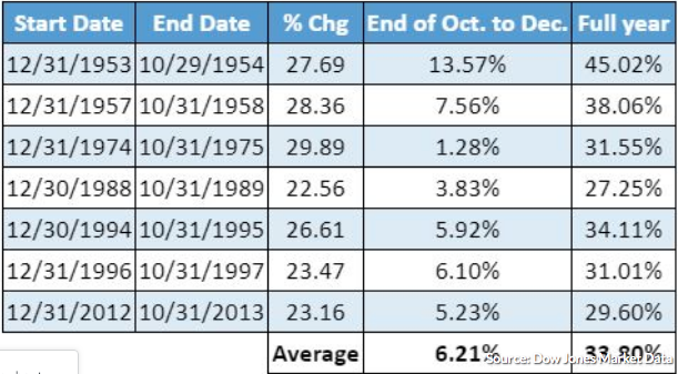
- When the S&P 500 has gained at least 20% through Oct. 31, the benchmark’s return is 6.21% on average for the remaining period, with an average full-year gain of 33.8 percent. (See table below)
While we look at historic data and analogues to guide market expectations and to better understand market performance probabilities, we can’t help but to reiterate, as we’ve seen with the “Sell in May and go away” failure, that history doesn’t always repeat. Another issue regarding historic data and seeking out probabilities of market performance going forward is obtaining/having the right inputs. Everything we’ve noted above is representative of market normalcy and does not account for special circumstances, outliers. One outlier that we’ve recently looked at and outlined in this past weekend’s Research Report takes aim at the present period, November through December. The question we ask is whether or not our inputs are the right inputs when deciphering probabilities for the time period.
Based on a recent study by Datatrek, we discovered there is actually a strong probability that some of the “Sell in May and go away” returns have historically pulled forward gains from the end of the calendar year. Check it out folks!
The S&P 500 rallied more than 7% in the month of January. It proved to be one of the strongest January months in history. “Strong January Playbook”, or historical analysis of what happens after the S&P 500 has outsized gains in January, has worked nearly every month in 2019. Abnormally strong January returns have been a historically clear signal about market direction over the balance of the year.
- The S&P 500 rose by 7.9% during January 2019, one standard deviation above this month’s average return of 1.2% since 1958 (first full year of data).
- There’s only been 8 other Januaries that have also returned +1 standard deviation above the average, or 15% of the time: 1961 (+6.3%), 1967 (+7.8%), 1975 (+12.3%), 1976 (+11.8%), 1985 (+7.4%), 1987 (+13.2%), 1989 (+7.1%), and 1997 (6.1%).
The reason why we are now talking about the Strong January Playbook and historical data is because, as we mentioned before, history doesn’t always repeat itself and we need the right inputs. The S&P 500 was higher most of the time every month on average from February through July after an especially robust January return. But that didn’t happen this past May (down 6.7%). Here are two more examples of the Strong January Playbook not “playing out”.
- September did better than expected. The average historical return in “Strong January years” during this month is negative 0.1%, with the S&P lower +60% of the time. This September, the S&P 500 defied this trend with a +1.7% return.
- Also in October, the S&P was up roughly 2.1% for the month. The average historical return in “Strong January” years for October is negative -2.5% and the S&P 500 was down +60% of the time. However, excluding the stock market crash in October 1987, it was up an average of 22 basis points. So while this month’s return bests the average, it is directionally in line save the outlier year of 1987.
And what is on everyone’s mind now, of course, is what happens in November and December during the Strong January Playbook. Datatrek identified the periods as follows:
- November (good): The average historical return is +1.3% and the S&P was higher 75% of the time. The worst return was -8.5% in 1987 and the best was +6.5% in 1985.
- December (really good): The average historical return is +2.8% and the S&P was higher 88% of the time. The weakest return was -1.2% in 1975 and the strongest was +7.3% in 1987.
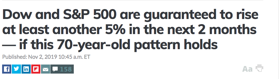
Now recall from the table above and statement offered in this MarketWatch article offered by Mark Decambre…
- When the S&P 500 has gained at least 20% through Oct. 31, the benchmark’s return is 6.21% on average for the remaining period, with an average full-year gain of 33.8 percent
According to the article and table, history suggests the S&P 500 should deliver another 6.21% for the remainder of the year, based on all years in which the S&P 500 had already gained at least 20 percent. Unfortunately, it obviously doesn’t take into consider the Strong January Playbook input. For those of you familiar with the saying, “Therein lies the rub”. Inputs are varied, nuanced and widely overlooked, but most importantly can alter the probabilities.
In other areas of the marketplace we’re also finding studies with varied probabilities and viewpoints. With markets at all-time record levels and the VIX hitting a 3-month low recently, investors have been pushing their short VIX futures bets, which now reside at record levels.
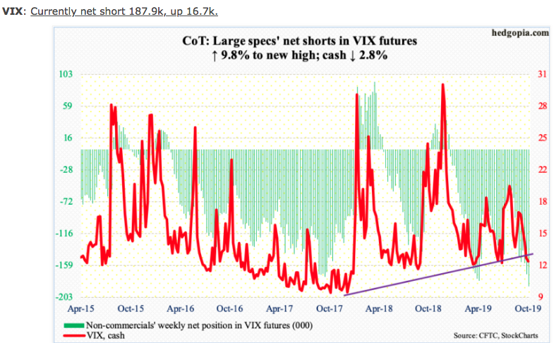
Non-commercials, who this past week raised net shorts in VIX Futures to a new record, are doing so in a manner that assumes that spot VIX will continue lower. Since April last year, the VIX has not broken 10-11, but closed out last week under 12.50, hitting a new 3-month low. Protection is cheap presently, in and of itself creating hedging opportunities that have previously resulted in an increase of VIX call option and .SPX OTM put buying activities.
Given the juxtaposition of S&P 500 record levels and YTD lows in the VIX coupled with non-commercial record net shorts in VIX futures, this is leading many to suggest something bad this way comes. Most aren’t representing complete VIX complex positioning and for the greatest of details surrounding this subject matter, we strongly urge investors/traders to read our weekly Research Report. But we digress…
In looking back on the historic data, a recent study from Andrew Thrasher of Thrasher Analytics finds that even with the VIX hitting multi-month lows, a substantial VIX spike is actually quite unlikely. Thrasher’s inputs are as follows:
- “First let’s take a look at how often the VIX hits a new 3-month low while being under 20. Since January 2009, this has happened 143 times.“
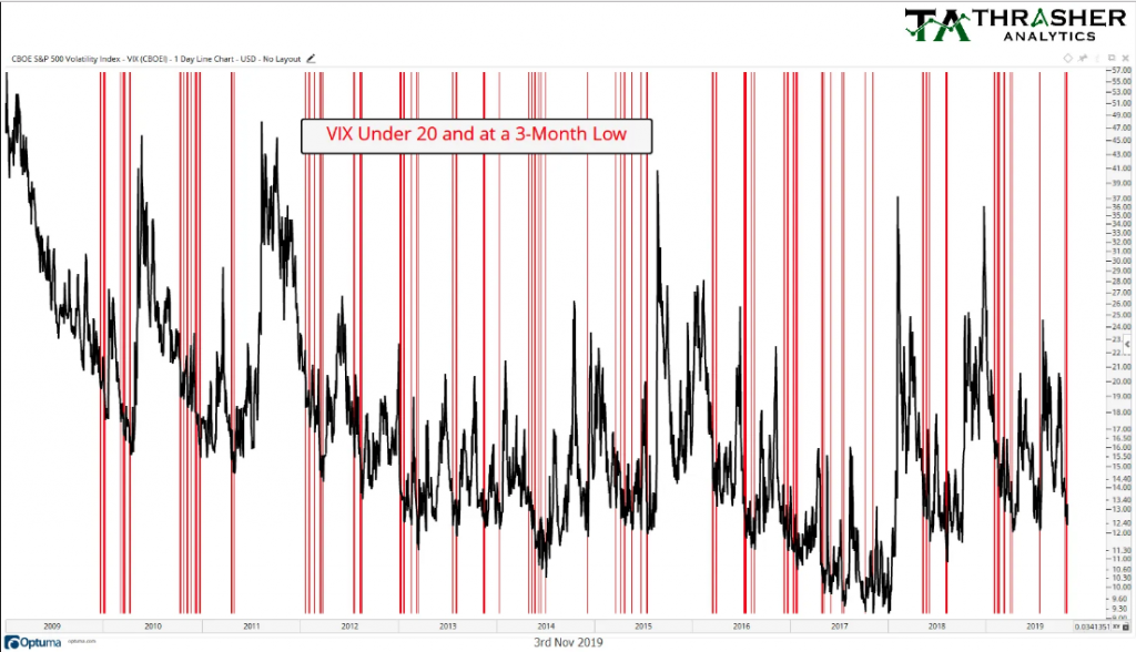
“How many of these were followed by the VIX rising by at least 50% over the following 5 days? Three. Give it one more day and the count hits 6 (as shown in the chart below). Some may be asking what’s some special about 3-month lows? I also looked at 1-year and 1-month lows as well – both of which gave the same or very similar results to using a 3-month look-back period.”
Wow, at most and looking out over the next 5-6 days only 6 of these such occasions produced a 50% rise in the VIX. Unfortunately, we are lacking potentially important inputs such as, which of these occasions came with the S&P 500 at record highs? Also, which of these occasions came with non-commercial VIX Futures short interest at record levels for their respective time periods?
The study from Thrasher is still relevant, but offers investors an opportunity to advance their probabilistic understandings of future market and VIX performance. As such, again we would suggest investors read our weekly Research Report that discusses VIX complex positioning at present.
So why are we here, with indices at record levels? It’s likely the same reason we saw the market decline some 20% in late 2018. Markets don’t like uncertainty and in late 2018 there was a great deal of uncertainty. Uncertainties surrounding future earnings, a potential recession, a government shutdown, future path of monetary policy/rates, inflation and tariffs became the biggest uncertainties for investors. Since then, those same uncertainties have found resolution or became more clear. Much of what plagued the market in late 2018 was created by man; they were manmade crises of consequence that demanded a reaction from markets. As we’ve said many a time before: “The markets dictate policy, it’s just a matter of when markets decided to speak up!”
Something Finom Group also reminds investors, with the aforementioned in mind, is that which man has done can be undone. Within one of our articles a few months back, we asked investors to recognize these principles that we believed would find market favor and continuing to rally as manmade crises were resolved for the betterment of the global economy and earnings results going forward:
“The good news in these regards, is that the issues surrounding global trade, manufacturing, rails and freight are largely manmade crisis/issues. Just as man created them, they can be found satisfied and remedied for the betterment of the global economy.“
It appears that the Fed’s interest rate hikes and over-tightening has been corrected. It appears as though the trade war has found its climactic point and has since been de-escalating. Unfounded recession fears have subsided. These manmade crises built up a wall of worry which the market has overcome year-to-date and the most recent headlines on trade suggest a near-term trade deal of sorts is on the doorsteps for investors to act more optimistically.
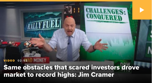
CNBC Mad Money host Jim Cramer recently suggested that the market’s record rally run was built on the back of fear and uncertainty over the aforementioned manmade crises.
“These obstacles are exactly what makes a bull market thrive. They cause investors to go negative and then, as the averages rally, these same people come back in at higher levels, sending us still higher.”
Panicked buying, triggered by fear of missing out, causes stock prices to rise exponentially as investors put money to work. That’s contrasted with panicked selling, which is associated with fear and causes market sell-offs.
“The panicked money managers … represent the fuel that this market needs to go higher, and right now this rally [has] fuel in spades.”
In reviewing what took place, the 2018 bear market into year-end, it’s important to reflect on what might very well be the most important element that creates homeostasis in any market, liquidity! As we can see from the J.P. Morgan chart of S&P 500 futures market liquidity, it found a multi-year low in late 2018.
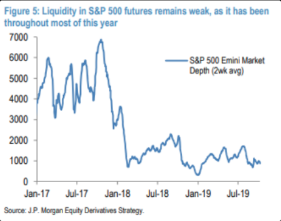
Liquidity works both ways. In a down market, a lack of liquidity can serve to exacerbate selling pressure and intraday moves. Oversold conditions care not for valuation, especially in an algorithmically-charged marketplace. It’s with this in mind and with the understanding that liquidity does indeed work both ways that investors might ask themselves if the market melt-up can equally shrug off overbought conditions for an extended period of time. Having said that and if it does continue with a melt-up through year-end, tacking on another 4-6% returns, we also ask investors to revisit the V-shaped bottom from the calendar year turnover.
If you were short the market then, but failed to lock-in profits as the calendar year turned a New 2019, and through January, you gave up 7.9% of your profits. So again, with liquidity in mind and liquidity still disgustingly low a year later (see former chart), if the markets continue to melt-up through year-end, one might consider the V-shaped bottom from the former melt-down once we enter 2020? And something else to consider if this market does take the melt-up path without any significant pullbacks is the following chart of the S&P 500:
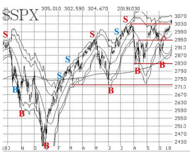
See the little red circle at SPX 2,950? That circle represents one of two open gaps to fill in the chart. (Gap also created on Nov 4) Folks, if the market does produce even the low-end of the historic Strong January Playbook returns for the typical November-December period of 4.1%, that would put the S&P 500 at roughly 3,200. Most gaps, most gaps get filled, it’s just a matter of when they get filled. As we reflect on probabilities, we would ask investors/traders to file this article away for future reference, in case liquidity does prevail positively for markets through year-end and with the Strong January Playbook in mind, at least. Because if we flip the V-shaped occurrence around… well that’s a probability we suppose/propose also! It’s all fun and games until someone gets hurt, as they say!


