
Welcome back investors! One week every quarter, Finom Group offers its weekly Research Report freely to the public. This is that week, and hopefully newcomers will discover a wealth of analysis, insights and information that they can utilize to improve upon their journey through the markets. So let’s kick-off this week’s reporting with a quote from our chief equity market strategist Seth Golden, and as a review from two weeks ago:
“Strength begets strength and calling a top, hedging for downside protection, has proven the greatest risk and found many foolish over the last 15 months. The BULLS are in the best shape of any group of investors out there, and they can deal with anything the market throws at them now, assuming they’ve stuck to the trend. And why are the BULLS in the best position; the reason, they alone have the resources to manage their portfolios without emotion. And when the BEARS come a’ growling with a host of reasons for market turmoil, be sure to listen for a comments about earnings. Seems as though BEARS are found allergic to commenting on earnings. Funny how that works!”

The S&P 500 (SPX) rose 1.52% for the week and is now up ~20% year-to-date. The Nasdaq (COMPQ) was that much stronger than its peer large-cap index, rising 2.82% this past week, but with a lesser 17.39% year-to-date gain. The Dow Jones Industrial Average (DJIA) rose by .96% on the week and is now higher by ~16% year-to-date. The small-cap Russell 2000 (RUT) was the outperforming index this past week, rising by 5.05%, but remains the worst performer year-to-date with a gain of just over 15 percent.
Finom Group discussed the more defensive nature of the markets over the last couple of trading weeks. We know that in the earlier periods of a new cyclical bull market, rotations are more frequent, and we should remain open to further style/sector performance rotations going forward. As it pertains to the small-caps/RUT/IWM, we also highlighted a possible rotation afoot this past trading week that aligns with seasonal patterns, denoting a more aggressive sentiment shift. Here is what we offered in our latest State of the Market this past Thursday:
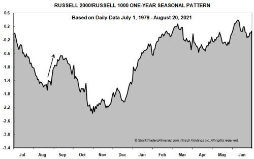
- In the above chart, daily data since July 1, 1979 through August 20, 2021 for the Russell 2000 index of smaller companies are divided by the Russell 1000 index of largest companies, and then compressed into a single year to show an idealized yearly pattern. When the graph is descending, large-cap companies are outperforming small-cap companies; when the graph is rising, smaller companies are moving up faster than their larger brethren.
- In recent years, another sizable move is quite evident just before Labor Day. One possible explanation for this move is individual investors begin to return to work after summertime vacations and are searching for “bargain” stocks. In a typical year, small-caps would have been lagging and could represent an opportunity relative to other large-cap possibilities. As of today’s close, Russell 2000 is up 13.4% compared to the Russell 1000 being up 19.0% year-to-date. Lagging small-caps and resilient U.S. consumers could be the ideal setup for a repeat of this pattern this year. However, the small-cap advantage does historically wane around mid-September. (Stock Trader’s Almanac)
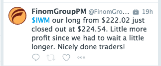
Finom Group had anticipated the potential rotation in favor of small caps during the weaker weekly performances 2 weeks ago. Our chief equity strategist offered a dip buy trade alert for IWM, which became profitable this week.
We don’t think the current rotation from large-caps to small-caps or defensive to offensive positioning is over, but the momentum of the rotation may be peaking. This market moves fast; what’s en vogue one week may quickly fade in the coming week/s. Additionally, and with respect to the Nasdaq and S&P 500, the indices are still tracking a 3rd consecutive year of double-digit gains. This is something last achieved from 2012-2014, and something we thought most probable coming into 2021. We outlined our sentiment for 2021 in the provided video. (link to video)
At the sector level this past trading week…
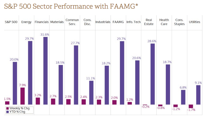
… offense was certainly on the field. As shown in the chart above, the worst performing sectors of the market were the defensive sectors that includes Health Care (XLV), Real Estate (XLRE), Consumer Staples (XLP), and Utilities (XLU). Noted previously, these defensive sectors were the favored sectors in the prior 2 weeks. Rotations happen quickly, not that we suggest investors bother chasing such rapid rotations, which can often prove detrimental to one’s performance. On another note, Information Technology (XLK) was the worst of the best this past week. While the sector finished positive for the week, it is largely considered a defensive sector given its reliable and visible earnings growth characteristics.
In my investing career, I’ve often made the mistake of waiting for a market sell off, so I often missed the buy points through cyclical rallies. The market is not in the business of giving investors what they want, so often we have to go out and take what it has to offer. What we want is a perfect signal, clarity! Are you waiting for clarity, are you a Dollar Cost Average (DCA) type of investor/trader? Know this: Markets never have 100% clarity; so don’t search for it. Markets never check all the boxes in order to deliver a perfect signal. To know and accept this truism of markets, and for the sake of investing/trading with appropriate expectations, is to better participate and grow your probable success as an investor/trader.
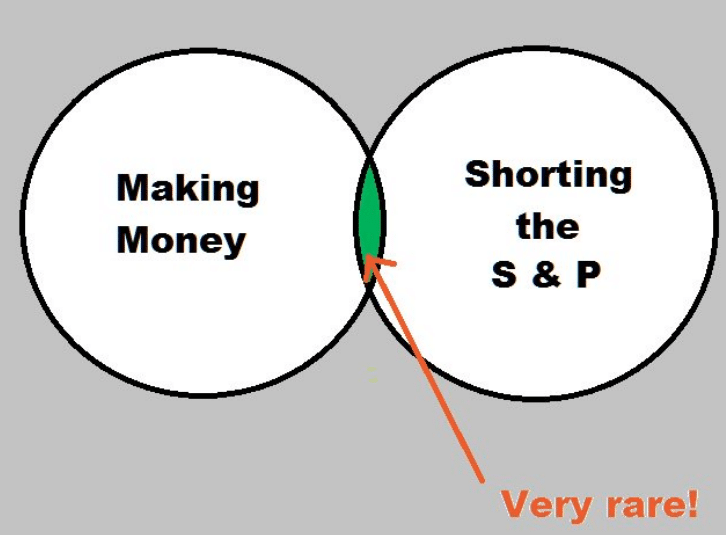
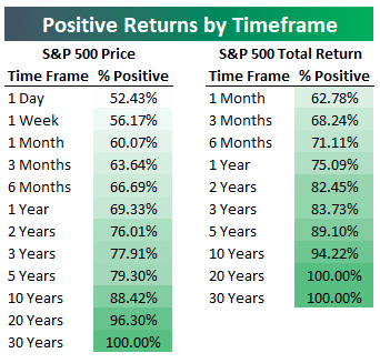
What you don’t want to do as an investor is well outlined in the graphic above. Investing and trading well, demands aligning one’s process with the greater probabilities. The market historically delivers a positive return annually and roughly 75% of the time. Therefore, shorting the market delivers a low probable return. In other words, it’s hard to make money shorting the S&P 500. Keep it simple, recognize the long-term trend, and participate on-trend.
Before I turn things over to Seth, I’ll offer some final words with respect to investing/trading disciplines that we often look to reinforce through our weekly Research Report:
“Connecting all the dots for an investor/trader is a difficult, time consuming process. Simply put, investing is difficult and trading is that much more difficult because it suggest a shorter time frame being considered for profits. As we often say, “Time is your best friend as an investor, so don’t unfriend time.” I’m not detracting from the art of trading, but rather suggesting that any trade taken should come with a willingness to adjust the time frame if the market dictates doing so, and assuming the fundamentals haven’t changed for the trade idea. The chart may change for the interim, but align with the fundamental strength over a longer period of time. And finally…
“Do what works! The market works to achieve gains over time. It’s easy to get sucked into the narratives of quick and outsized home runs or touchdowns in the current market regime. Many investors are taking outsized risks, throwing hail marry passes. Are you throwing too many hail marry passes, hoping for a quick score or are you playing it more disciplined, with a defined game plan and steady diet of run and pass plays. Certainly, every now and then that hail marry pass scores a touchdown! The win percentage, however, is less than 50/50. The greater probable returns on the football field come from a steady diet of running and passing plays, a slow steady march down the field. It’s the same way with the markets and investing. Do what works more often than not, what the probabilities favor!”
So Much Time, So Many Studies
Another week has come and past; I hope that when I should depart, they bury me upside down so the “taper tantrum” fear mongers can kiss… Be nice Seth, be nice! After all, the market is littered with participants that have found their hubris quickly rebuked by price action. Always be humble before the market, thankful for that which it has been constructed in order to deliver long-term, positive returns.
Edward briefly touched on the subject of Dollar Cost Averaging (DCA). Let’s quickly discuss DCA with actual statistics, but first… I favor the DCA approach within the context of a long-term holding strategy. In that sense, I consider it a subcomponent of my overall investing strategy. My general holding period for a Golden Capital Portfolio investment is 24 months. Within that time frame, I’m actively trading around a core, long-term holding. Within this practice is a DCA component that helps to compound long-term gains, assuming there are long-term realized gains. And yes, we will get into some charts and quants shortly, don’t rush me or “I pity the fool”. Mr. T., no, anybody? 😉
Back in 2014, SVRN Asset Management performed a study that compared DCA vs. Buy and Hold strategies. It really wasn’t even close! Edward mentioned earlier that waiting for a pullback or even a crash will often find investors missing out on a plethora of opportunities. The chart/s below outline the futility of the “WAITING TO BUY THE DIP” strategy, which is also often combined with the DCA strategy. This is not to suggest NOT to BUY THE DIP, but if it is your only strategy for at least market performing, then you don’t have a strategy for market performing.

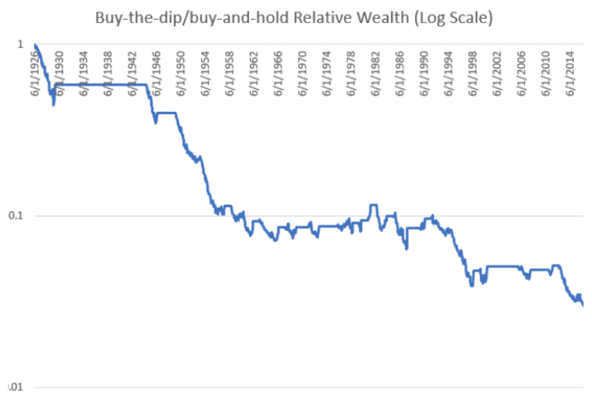
“…investors sitting on a lot of cash are usually worried about equity valuations or the economy, and tell themselves and others that they’re going to buy gobs of stock after a crash. The strategy sounds prudent and has commonsense appeal—everyone knows that one should be fearful when others are greedy, greedy when others are fearful. But historically waiting for the market to fall has been an abysmal strategy, far worse than buying and holding in both absolute and risk-adjusted terms.”
What about waiting for a deeper crash? For every drawdown level from -10% to -50% (in increments of 5%), waiting for a crash before buying results in lower absolute and risk-adjusted returns.

The whole “thing” about waiting for a dip sounds smart, it sounds logical, and even disciplined. The problem is that the probabilities inform it is anything but smart or disciplined. Just because we hear it on CNBC, see it constantly promoted in social and financial media, doesn’t mean it holds value or is an effective strategy for investors. Often, colloquialisms become colloquialisms because they are witty, offered from “authorities” in their field of expertise or combine simplicity with logic. The problem with colloquialisms is that they are not often truisms, and therefore don’t align with the greater probabilities. So the next time you decide to “like” a famous quote or market colloquialism on social media, ask yourself about the probabilities and/or if this colloquialism is even practical. Market participants love to beat the tar out of the Buy and Hold strategy because it comes with a dose of steady boredom. There’s nothing boring, however, about the outperformance of the strategy as denoted above. As the Brits would say, “So bugger off!”
You wanted charts and quants, you got your charts and quants. In truth, and for our visitors this week, this is part of our weekly Research Report and due diligence routine. The current market technicals, breadth/internals speak to the trend strength and/or weakness while the quants address those current conditions with historic likeness in order to project the forward probabilities of market returns. Long sentence, poor grammar I’m sure; so reread to correct for my shortcomings in the dissemination, kindly! Bottom line: If you’re investing/trading is to have a successful and repeatable performance, your process should incorporate multiple disciplines within a honed process over time. Nobody lands on a successful, repeatably profitable strategy in year 1 of investing/trading. If you think your “The Chosen One” who has done so, let’s talk in another 12 months. Investing success takes time, always has and likely always will.
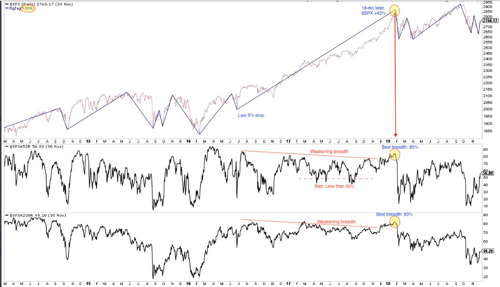
Our first quantitative study of the week was offered back in April of this year. The criterion of the study denotes that greater than 90% of S&P 500 stocks traded above their 50-DMA on April 14, 2021. This depicts extremely strong market breadth. As a side note, such strong breadth will always prove unsustainable.
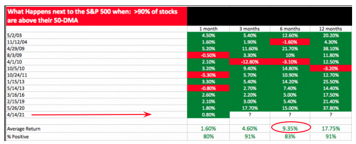
Dating back to 2003, when the interim breadth proves this strong, the forward S&P 500 returns are usually positive out 12 months. The % positive rates are all 80% or better across the aforementioned time frames. The average return after the breadth criterion helps investors better understand what they might expect going forward from the S&P 500. Indeed, the market was higher 1 and 3 months later, after the signal. The market is up ~8% since the signal. Six months after the signal, the average return for the S&P 500 is 9.35%, which certainly doesn’t leave a lot of meat on the bone, but look at the 12-month return and % positive rate past the date of the signal. The 2021 S&P 500 has achieved GREATER GAINS than many of our quantitative studies have offered in the past, so don’t get married to the average return, it is but a probability.
Our next quantitative study comes from Steve Deppe, which was disseminated after the Q2 2021 period ended. The period marked the fifth consecutive quarter whereby the S&P 500 gained more than 5% in the quarter. Back then it also proved the 5th consecutive monthly gain for the S&P 500.
- The S&P 500 is up >5% for 5 consecutive quarters for only the second time in history. The other time was 1953/1954.
- The next four quarters it gained another 26.4%.
The study alerted us to probable gains going forward. It’s easy to look back on the study to recognize that the market has indeed delivered on the greater probable outcome. The market is not as “random” as many would propose. What we rather state is that those suggesting the market is random, or even out to get them, simply don’t desire to study in order to support a well-rounded investing process.
Don’t get me wrong, the greater probabilities don’t always come to fruition. In the studies above, there is/are red occurrences, right? Here is another example where the probabilities are currently being defied by an extremely strong cyclical bull market:
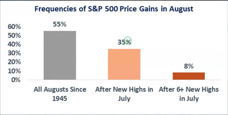
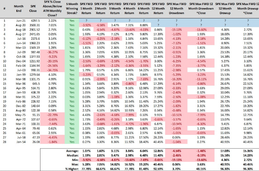
- The S&P 500 was up 17.02% YTD at the end of July. Since WWII, this has happened only 12 other times and the rest of the year was higher 11 times. That’s a good thing! But…
- The only time it didn’t work was 1987, but it was up 32% YTD ending July. Market was still up in both Aug. & Sept. in 1987, but then…
Coming into the month of August, the market had achieved 7 record highs in the month of July. Since 1950, the S&P 500 has never risen in the month of August after making 7 or more record highs in July. In the month of August, and with only 2-trading days left in the month, the S&P 500 is up 2%+ already. Certainly those gains could be erased in the final 2-trading days of the month this coming week, but it seems a lesser probability. Assuming the S&P 500 will have held a gain in August, it will have bucked the study noted above. Having said that, this is but one study, a particular data point. There are a litany of studies that informed and have pointed to positive returns in August. To be honest, however, not many, not many at all. In the market bucking the historic data, there is a bigger message I would hope investors have received from the strength of the current bull market.
Since July, the S&P 500 has had 5 separate win streaks of at least 5-trading days. In early July, there was also a streak of 7 positive days in a row, for which the S&P 500 was also up 7 days in a row. We outlined the study from LPL Financial, which points to this achievement below:

- The S&P 500 Index was recently higher 7 consecutive days for the first time since last August, but even more impressive is it made new highs all seven of those days.
- You have to go back to June 1997 to find the last time we saw a streak like that!
- Incredibly, this has happened only 8 other times since 1950 and stocks were higher a year later every single time.
Since this streak ended on July 2, 2021, indeed the S&P 500 has traveled roughly 3.5% higher. September 2nd will mark the signal’s 2-month anniversary. Looking at the 3-month average return (in the table above) after such a signal, the market is higher by 3.9%, suggesting much of the gains may have been pulled forward in the first 2 months since the signal. What this might also suggest is that this bull market is stronger than the average bull market, and has consistently delivered above average returns across many studies. Be open to a wide range of possibilities near-term, but align your trading/investing regiment with the longer-term probabilities outlined, as a discipline.
What about hypothetical drawdowns based on the study above? That’s a great question! Chris Ciovacco assisted with that analysis in the recent past and as outlined below. While everyone is still, and has been clamoring for a larger market correction/pullback, they have largely been doing so with respect to the mean reversion probabilities. Certainly such recognition of market’s natural mean reversion potential should be taken into consideration, but is what you’ve witnessed from the 2021 bull market normal or extraordinary? If you’ve been expecting and positioning for some mean reversion in 2021, you’ve likely missed a great deal of the rally. Ahhhhhh!
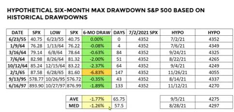
- What about the maximum drawdowns using the historical dates from the LPL study of streaks of higher highs for 7 consecutive days.
- Chris Ciovacco’s table above outlines the maximum and average drawdown using each date.
- The maximum drawdown was 6.83% in 1965.
- The average drawdown was less than 2% over a 6-month period.
Two ways to bring utility to the drawdown table after a 7-day new high win streak above: 1) Don’t hurt me with near-term value, lower prices. If that’s the worst the market can do, bring it on given the long-term probabilities. 2) The average drawdown speaks against the clamoring for even a 5% correction, which everyone on CNBC/Bloomberg has been predicting since the 203 trading-day streak without a 5% pullback began.
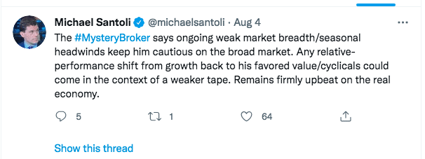
Anybody see a weaker tape this past week, as the market has somewhat rotated from growth to value, large-cap to small-cap. Don’t have me get into the nonsense of the Mystery Broker failed prognostications in perpetuity by CNBC’s Michael Santoli. I will digress…

- A week ago Tuesday, the S&P 500 suffered its largest 1-day drawdown in more than a month. This came on the heels of a 5-day win streak.
- Bay Crest’s CMT Jonathan Krinsky informed the CNBC audience that the dip was not the dip to be bought.
- Price tends to drive sentiment, no matter what excuses are outlined by analysts/strategists.
- Since that day, the S&P 500 has rallied 1% and to new all time highs. Apparently, Krinsky has not learned the lesson of the market or had not been listening to the market’s message.
Our last quantitative study will prove more current and as the market looks to close out a 7-month winning streak this coming week, while also starting the month of September. Again, this study will come from LPL financial, and again, it will be followed with a study from Chris Ciovacco that looks at maximum drawdown potential from within the LPL Financial study.

- When the S&P 500 is up >15% YTD, at the end of August (like ’21 will likely be), big drops the rest of the year are rare.
- In fact, continued strength is the norm.
- Yes, ’87 is in here, but up 38% YTD was a really stretched rubber band. The S&P 500 is up nearly half that amount heading into September this year.
- Using this criterion, the market was higher over the next 4 months 86% of the time. That is a very high probability of positive returns folks!
As noted in the bullet points for the study above, 1987 proved a huge detractor from the study, and with a massive drawdown in the final 4 months of that calendar year. It helps investors to keep this in mind, and avoid throwing a hail marry pass in favor of steadily marching down the field over the next 4 months. So let’s look at the drawdowns correlated to the dates in the study, as defined in the TABLES below:
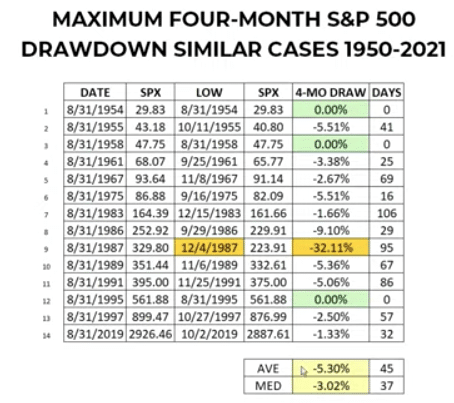
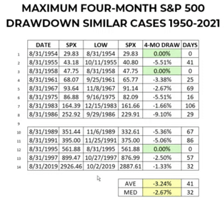
WHY THE TWO TABLES FROM THE SAME STUDY? In the top Max 4-month drawdown table it includes the 1987 year, while the bottom table does not. The average maximum drawdown improves by ~2 percentage points if we remove the 1987 drawdown. This does not exonerate the larger drawdown, but it helps with mor realistic expectations for positioning purposes. Either way, if the maximum drawdown is the average from the first table (which includes 1987), don’t hurt me with better valuations!
The probabilities outlined in the few studies presented help us to develop and sustain appropriate market expectations going forward, while executing on a pre-existing game plan. Don’t have a game plan? You’ve come to the right place, me thinks. If you like what you’ve seen thus far, subscribe today and receive our weekly, exclusive content!
Brushing Improves Breadth
It’s true! So brush, brush brush! They say rotations are the lifeblood of a bull market, yet so many seem to detract from this understanding when market breadth erodes, and due to such rotations. While large-cap and growth are indeed the heavy weightings of the S&P 500, they do not populate the majority of the market. In fact, they are an ever-shrinking part of the market for a goodly period of time.
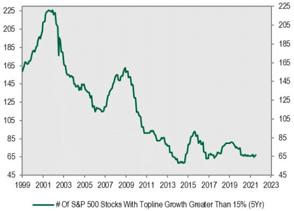
- Why are growth stocks so expensive today? One reason is that there aren’t many of them!!
- During the Dotcom period, nearly 1/2 the market could have been classified as growth stocks, compared to a meager 67 today.
- This is a small portion of the S&P 500 and/or NYSE
Indeed, much of the market is populated by small, medium, value/cyclical stocks. Since the Q2 2021 period, this heavily populated part of the market has been correcting while the large-cap/growth portion of the market held up the market due, in large part (no pun intended, ok intended), to its large-cap weighting. This proved a known and massive rotation, which also came with breadth erosion or weaker breadth. Naturally, if a large portion of the market corrects, breadth will deteriorate, but the market can travel higher due to large-cap/growth leadership weightings in the index. Most technicians and savvy investors understand this truism and can visualize it in their head, yet all we’ve been hearing from them for months now is just how bad breadth is and why a bigger correction looms… large!
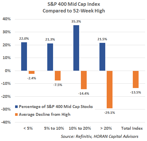
We will quickly look at the small and mid-cap stealth correction in our previous notes offered below, and before moving on. While this goes back to early August, if the financial media continues to beat the drum for a deeper correction, we should not forget that most stocks have already expressed that deeper correction:
The following two charts show detail for the S&P 400 Mid Cap Index and the S&P 600 Small Cap Index. The mid cap index is down 2.40% from its high yet the average decline for the stocks in the index is 13.5% and nearly 57% of the stocks are down more than 10%.
The S&P 600 Small Cap Index has seen even broader weakness with almost 70% of the index’s stocks down more than 10% from their 52-week highs. The percentage of stocks down more than 20% is 37.4% with the average decline equaling 31.7%. The small cap index is down 5.15% from its high and the average decline of the stocks in the index from their 52-week high is 18.4%.
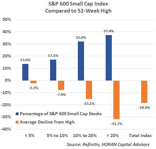
This broader weakness in the index holdings themselves is reflective of a correction occurring under the surface of the indexes. You might call this a stealth correction. This under the surface corrective action might prevent a more severe correction from occurring near term, keeping in mind corrections are a normal action for equity markets.” (Horan Capital Advisors)
With a stealth correction came weakened market breadth and en vogue correction calls that have failed to materialize at the index level. You don’t have to favor cap-weighted indices, but you better learn to appreciate them if you want to do well as an investor. This, however, should not detract from your understandings about market breadth. What we know about technicals/breadth is that they don’t predict the future and are constantly developing conditions of the market. Like any other condition, it can improve and/or erode over time. When breadth is strong, it’s largely lacking for action on the part of the investor. After all and as exampled by Edward, it’s hard to buy when breadth and price are trending up. It’s easier to buy when breadth identifies washed out levels and a bottoming in price. Don’t run when stocks go on sale, that’s your opportunity beckoning!
Coming into this trading week, breadth was relatively neutral; not too hot, not too cold and… well we all know the story of Goldilocks and the 3 Bears. Kind of a pitting of opposing market sentiment in that title don’t ya think? One of our broader breadth trend indicators which perfectly outlined breadth neutrality that was outlined last Sunday was as follows:
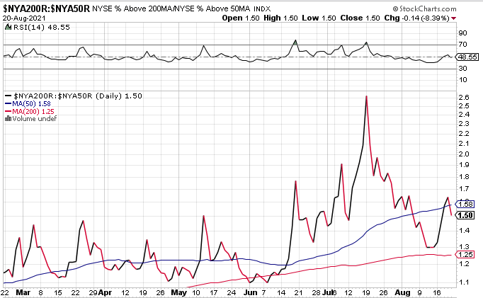
“As it relates to NYSE breadth, our trusted breadth indicator above also highlights breadth neutrality. The relative breadth performance of % of NYSE above their 200-DMA to 50-DMA is right at the level that separates bullish from bearish conditions, 1.50.”
“In the recognition of breadth neutrality levels at the end of the week, is the all important need for more “price information”. It’s a matter of having an edge and adhering to the laws of market probabilities. Sometimes, this will evoke the need for investors/traders to exercise greater patience, allow price action to reveal opportunities aligned with one’s game plan. Indeed, the need to express greater discipline on the part of the active portfolio manager when an edge isn’t clear and present is optimal. The good news, for those active portfolio managers, however, was articulated and characterized above; this is a fast moving market. I wouldn’t be surprised if price action delivered a more clear message, resulting in breadth moving above or below the neutral level on Monday.”
The message was certainly achieved on Monday with the S&P 500 advancing .85 percent. Now let’s take a look at where the breadth indicator above finished the past trading week, shall we? Keep in mind, when the breadth indicator is falling, that details the strength of the interim trend measured by the % of stocks trading above their 50-DMA improving faster than the % of stocks trading above their longer-term 200-DMA.

At 1.13, the current level denotes broad market breadth strength, consistent with what we saw in price action this past week. The breadth analysis proved actionable if you bought Thursday’s dip, which simply served to halt a 5-day win streak for the S&P 500 and possibly kept the index from overheating.
Based on the aforementioned breadth indicator, we should have also witnessed a greater percentage of stocks trading above their 50-DMA this past week, when compared to the previous week, right? Let’s see what the S&P 500 had to say about that assumption, we shall.
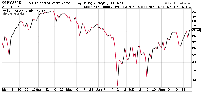
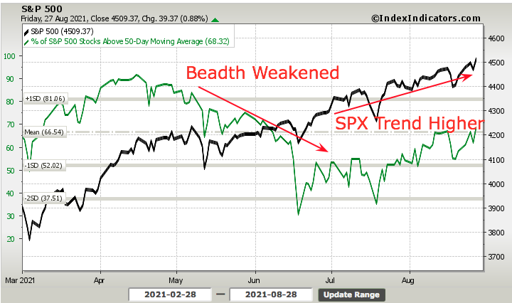
Coming into this past trading week, the % of S&P 500 stocks trading above their 50-DMA was at a neutral 58% level. At week’s end, and as depicted in the breadth chart above, the % of stocks trading above their 50-DMA rests at just above 70% and at its best level since mid-June. This just so happened to coincide with the broader market rotation into small/mid/value stocks and out of some large/growth stocks (AAPL/MSFT). We can see the same dissemination, but with the S&P 500 included in the breadth analysis below:
As I mentioned earlier, market breadth proves in-actionable for the majority of market participants, and far easier to take advantage of when it weakens. It’s even more actionable when it weakens, alongside price and rapidly. This market moves quite fast, both to the downside and to the upside. Hence, we can rationalize buy-the-dip opportunities when they appear and within the context of a rapidly moving cyclical bull. We discussed this very subject in our weekly State of the Market, and using the following breadth indicator:
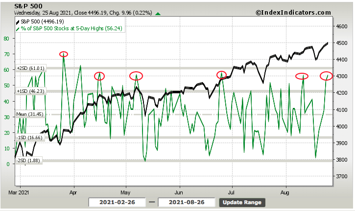
- Be patient, history suggests there is little reason to chase the market, this deep into the cyclical bull market rally, which has traveled 100% from the March 2020 lows.
- Our “patience” indictor falls in line with the 5-day win streak analysis above.
- The % of stocks trading at 5-day highs is at 56%. This is usually at a threshold that suggests near-term downside pressure on the market/stocks. After such a win streak, weakness and/or profit taking is to be expected, not to be feared.
The date on the chart was as of Thursday morning, or Wednesday’s closing reading of the % of stocks in the S&P 500 trading at their 5-day highs. At such levels, we usually see an interim top/pause. Low and behold, Thursday the S&P 500 fell more than a half percent that day. The decline came with expanded volatility, which Finom Group recognized the broader breadth improvements on the week, and shorted volatility via VXX Thursday. This of course, while everyone was clamoring and hyperbolizing their knowledge of the pending Fed Chairman’s speech at Jackson Hole set to take place on Friday. “Many people struggle to decide what to eat for lunch, and yet they have absolute confidence in what Fed Chair Jay Powell will be saying later that morning at Jackson Hole.” (my friend Steve Sears) Logic!
Without going into a long-winded series of breadth analytics, as we really must move on to other pressing subject matter, be careful with all the concerns over breadth divergences and hunting for breadth confirmation. Breadth is a condition/feature of the market, not a bug. If you want to find a problem underneath the hood of the market, it’s easy to find. Like Edward offered before; there is no perfection to be offered by the market. Your job is to provide yourself with enough experienced and proven resources to develop your skill set and market aptitude over time.
So with our remaining time here, I will post a number of charts/breadth metrics with a few comments:
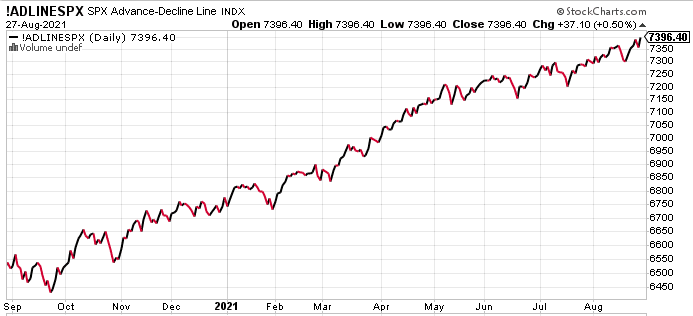
- With the S&P 500 achieving its 52nd record high for the year this past week, it’s always better when the A/D Line for the index is also making a new high. As shown above, this was achieved. It’s not necessary, but does prove cautionary when it is not occurring.
- Regardless, the A/D line is a breadth condition and if not confirming the index level high, can always do so in the future.

- The broad market, NYSE A/D Line has not made a new all-time high since early July. While many will suggest the NYSE A/D Line should be used to confirm the S&P 500 all-time, I might disagree with this antiquated notion. Why?
- The NYSE has grown to include various international funds and bond funds over the years.
- What does that have to do with the S&P 500, to my point!
- Nonetheless, the NYSE A/D Line, like the small and mid-cap S&P 500 A/D Lines have improved and are above their respective 50-DMAs at the end of the week.
- What about the Nasdaq? I’ve heard a lot of bad things about what’s taking place under the hood there!
- Firstly, the Nasdaq has a lot of junk once you get beyond the top 100 stocks or the Nasdaq 100 per say.
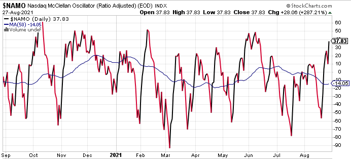
- But the Nasdaq McClellan Oscillator (MCO) points to strong conditions, which have improved over the last month or so. The measure of the 20-EMA A/D Line suggests a strong interim trend, but may also be nearing an interim topping point. A pause would likely prove healthy and opportunity for the savvy investor.
- The MCO is also used to validate Hindenburg Omens, which have fired 12 times in the last 6 months within the Nasdaq. If the MCO is positive, the Hindenburg Omen is invalidated. The MCO, as shown in the chart is positive.
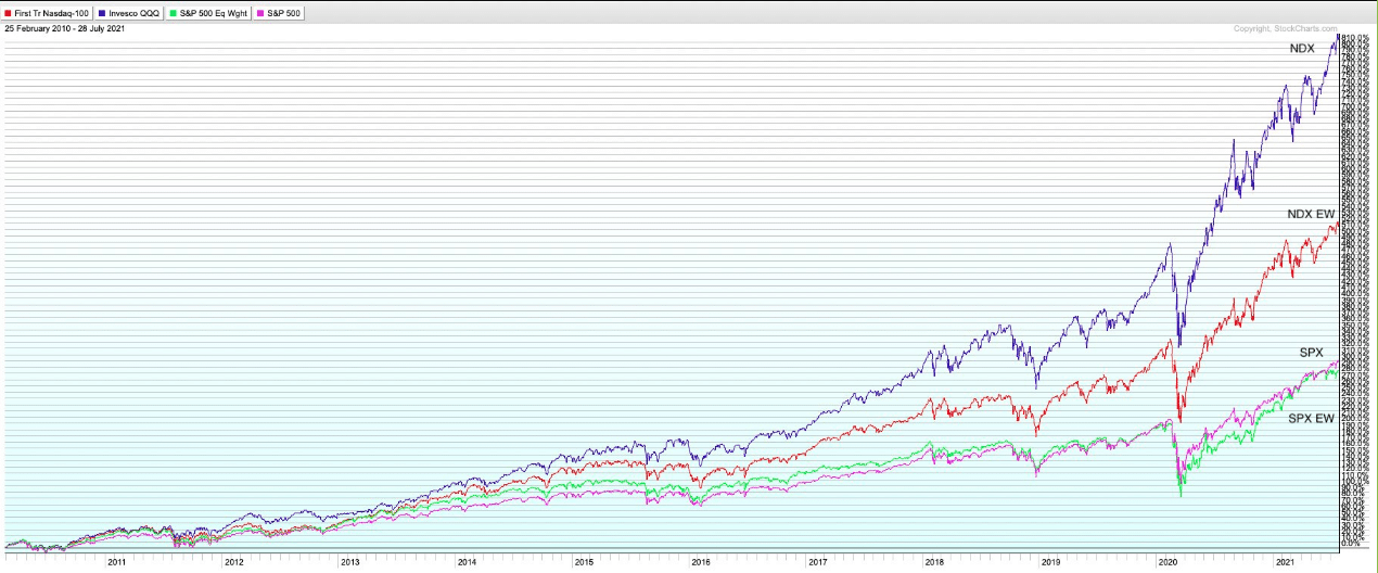
- When analyzing Nasdaq breadth, it is a reasonable practice to analyze the breath of the Nasdaq 100 (QQQ). As it trends, the Nasdaq tends to trend.
- As shown above, there is often a greater separation between the NDX and the NDX Equal-Weight (QQQEW) than its peer S&P 500 and S&P 500 Equal-Weighted index (RSP)
- Again, this highlights the junk in the Nasdaq, in general, that isn’t as populated in the S&P 500.
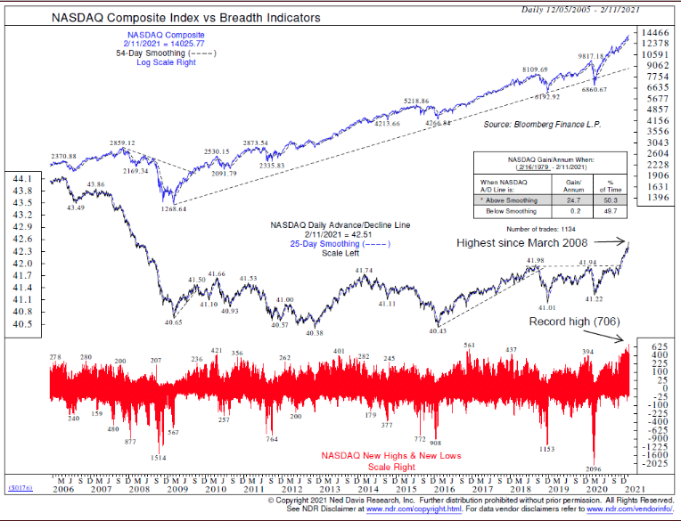
- You didn’t post the Nasdaq A/D Line Seth? Again, the Nasdaq has a lot of garbage and can trend higher for years without the A/D Line making a new high.
- The Nasdaq has lots of “fallen angels” so the A/D Line has a downward bias. Even in the Nasdaq’s 674% rally from 3/09 – 2/20, the A/D Line was rangebound and last made a new high in February of 2021.
- Were you really going to sit out a 674% rally because the Nasdaq A/D Line proved rangebound, in the era of index investing?
- Just because you see interesting breadth charts and bearish patterns that litter the social media landscape, does not make them smart charts or practical.
At the “end of the day” (I think this colloquialism is used to often and wrong), or the bottom line when it comes to market breadth, be mainly aware of its utility or when it is most useful (when breadth expresses oversold or washed out price). Breadth confirmation is often a perpetual demand on such analysis that is rarely satisfied, and when it is satisfied it is usually followed by another breadth divergence rather quickly. Imagine if you’re trade or investing decisions and executions in 2016-2017 demanded breadth confirmation, just to pick a recent example where the market didn’t have more than a 3% drawdown for more than 300 trading days:
Note the BEARISH breadth divergence in the panels at the bottom vs. S&P 500 chart atop? This is also why the absolute level of the individual breath metrics need to be recognized as healthy or cautionary. And now piss off the whole of the investing community with a J.P. Morgan study, also from 2014 and which holds true to-date:
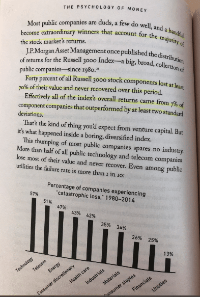
If you’re demanding breadth confirmation as your guide to allocating capital, breadth confirmation has a major problem: All equity market returns come from just 7% of stocks. You don’t have to like the market cap-weighting structure, but if you’ve put all the puzzle pieces together thus far, you may have also concluded why Buy and Hold, good large-cap companies, is the best offensive strategy!
Getting Macro-Economical On Yo Arse!
Despite the financial media narratives and opining, the economy is still humming along at an above average growth rate (6%+). The latest, positive revision to Q2 2021 GDP pointed to stronger growth than initially reported at 6.6 percent.
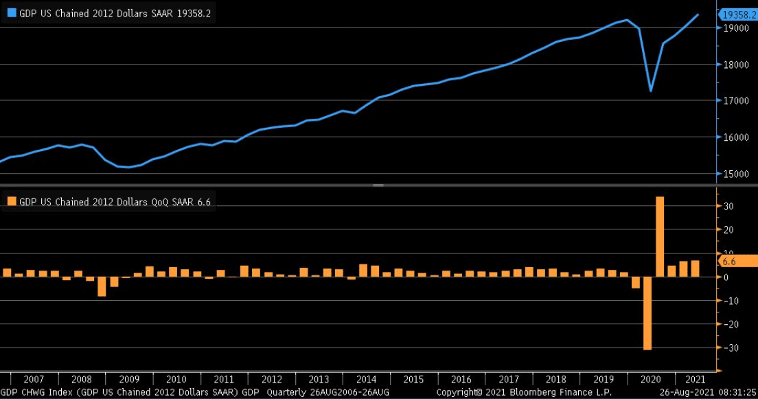
Personal consumption expenditures were bumped up to 11.9% from 11.8%. Business fixed investments were revised higher to a 9.3% clip from 8.0%, while the contraction in residential investment deepened to a -11.5% rate from -9.8 percent.

Some 70% of U.S. economic activity comes from consumption/consumerism. What we’ve heard from the financial media over the last 2 weeks and since the weaker than forecast July retail sales is that the Delta variant has plagued the economy and consumer over the last month or so. Finom Group wholly disagrees with this assessment and gas-lighting from the financial media.
Indeed, the July monthly retail sales were weaker than anticipated on a MoM basis, declining 1.1 percent. While the weakening occurred MoM, sales still grew 16% YoY. And yes, even the YoY growth rate was slower than previous monthly readings, but this is to be expected after setting such a higher bar earlier in the year. Sorry to disappoint folks, but retail sales are not going to grow double-digits on a YoY basis in perpetuity. I’m not so sure we would want that anyway, as it would likely prove out the inflationary conditions to be far less than transitory, and thus thus result in a more curtailed expansion cycle. For short, if we witness double-digit retail sales growth in 2021, I’d be willing to bet a recession closely follows. But that is an improbable outcomes, and I digress.
What is most important, as it relates to the consumer spending trends is to continue monitoring conditions. Our analysis debunked the media’s offering of a Delta-related retail slowdown 2 weeks ago in our State of the Market, as follows:
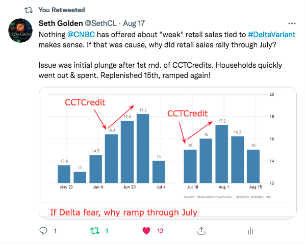
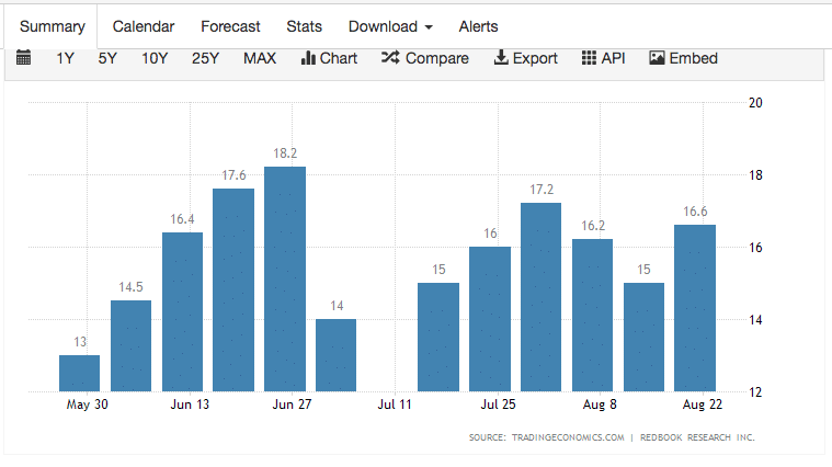
- June retail sales grew faster than economists estimates.
- The Redbook weekly retail sales release (YoY) shows the surge from mid-month into month-end of June. This tells us that indeed, consumers took the Child Care Tax Credit checks and spent it, boosting retail sales.
- But between month end and the next check there was a lull in retail sales as shown in the chart above.
- When did retail sales ratchet higher once again, you guessed it, mid-July when the Child Care Tax Credit checks were once again received.
- The Child Care Tax Credit checks provided tough comps in June, but it’s clear that regardless of Delta, when the consumer has the money to spend they are indeed spending it.
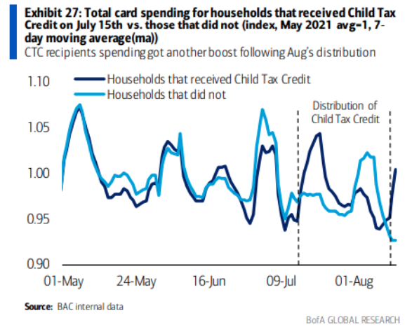
In my analysis for Finom Group members, we recognized the impact of when the CCTCredits were received and how quickly they were spent. By the way, these credits will continue to be sent to qualifying households for the remainder of 2021. The first round of checks went out and were received on June 15th. As it proved the first check/direct deposit of its kind, the spending impulse proved rather strong amongst recipients. The lull from that spending spree, if you will, was met with the unavoidable credit card bill and shows up in the steep drop-off through the 1st week of July (see tweet above and chart below).
The spending impulse from the CCTV July 15 period wasn’t as strong as the first round of checks in June, but still shows the consistent pattern we anticipated in our analysis 2 weeks ago. By the end of July and into the first week of August, retail sales weakened and remained at still yet double-digit growth rates. Mid-August, the next check came and low-and-behold, the usual acceleration into month’s end. “But you said that the Delta variant caused the MoM slowdown, Seth?” No that was the financial media! I’m saying the ebbing and flowing in retail sales is being more so impacted by the timing around the CCTCredits and the coincidental credit card bill that adjusts the spending impulse for each subsequent, monthly CCTCredit received. There’s no issue with Covid-Delta that was highlighted throughout the earnings season from the retail community, and with many retailers raises full-year guidance, WalMart and Kohl’s just to name 2 such retailers.
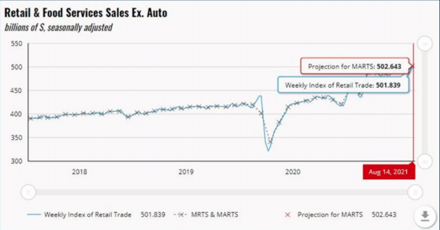
While the University of Michigan served to foreshadow the blame Delta-COVID game that has become synonymous with weakened consumer sentiment and retail sales, the high frequency data analysis above speaks to the contrary. Additionally, while many economists and market participants opine and concern themselves with the UofM consumer sentiment data, it might be worth highlighting that the Chicago Fed has an early forecast on August retail sales, based on actual high-frequency data, of +2.4% MoM. That’s strong and undercuts the UofM survey concerns held by the financial media and market pundits. In the second week of August, the Weekly Index of Retail Trade increased 1.0% on a seasonally adjusted basis after increasing 0.7% in the previous week. This is in keeping with the Johnson’s Red Book retail sales.
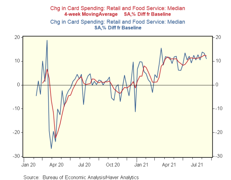
Moreover, according to the Bureau of Economics, the latest data on payment card transactions identifies that consumption remains solid. In the week ending August 17, card spending is up 11% against a typical level of spending during this time of year and before the pandemic.
Alrighty then! I think we beat that horse to… well you know! And if your question is, “Yea but when those CCTCredits and Unemployment Insurance benefits run out, what then?” PEOPLE GO BACK TO WORK! That’s what people always do! The JOB of the stimulus programs was more about bridging the income gap through the Covid period. With vaccines, vaccinations rising, and over 10mm jobs available (JOLTS), more and more people will be heading back to work, just like every other post-recession recovery period.
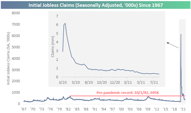
Speaking of jobs, this past week and for the first time in four weeks, seasonally adjusted jobless claims came in higher with claims ticking up to 353K. Additionally, last week’s reading was also revised 1K higher to 349K. Albeit higher, this week’s print does remain at the low end of the range since the pandemic began and is less than 100K away from the March 13, 2020 level of 256K (the last print before claims rose into the millions). (Bespoke Investment Group)
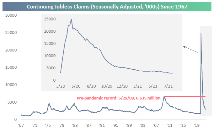
Seasonally adjusted continuing claims were also disappointing this week. Last week’s print was revised higher by 45K to 2.865 million, and while this week’s number was lower at 2.862 million, it was worse than expectations for a decline to 2.72 million. Thanks to that higher revision, claims have now fallen for three weeks in a row and are once again at pandemic lows.
On the manufacturing front, which we’ve anticipated cooling from record levels above 60, the IHS Markit Flash U.S. Composite PMI Output Index posted 55.4 in August, down sharply from 59.9 in July. The rate of output growth slowed for the third month running from May’s series high. August data signaled another marked upturn in the health of the manufacturing sector, as highlighted by the IHS Markit Flash U.S. Manufacturing Purchasing Managers’ Index™ (PMI ™) posting 61.2 midway through the third quarter, despite falling from 63.4 in July. The improvement in operating conditions was the slowest for four months, but substantial nonetheless.
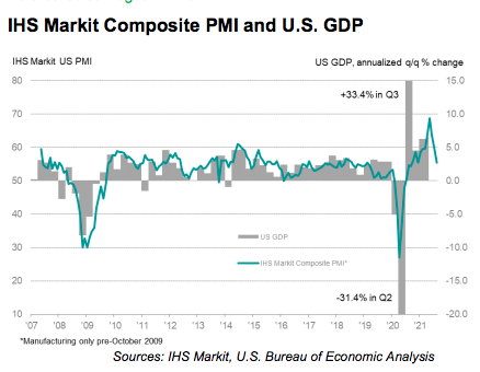
The bigger detractor in the IHS Markit Composite PMI came from the services side of the equation, which is consistent with some degree of air travel weakening, as well as hotel occupancy data over the last several weeks. The seasonally adjusted IHS Markit Flash U.S. Services PMI™ Business Activity Index registered 55.2 in August, down from 59.9 in July, to signal the softest rise in output since December 2020. The slowdown in activity growth was often linked to labour shortages, the spread of the Delta variant and some instances of supply chain disruption. For the whole of the IHS Markit reporting period, current levels are consistent with a strong expansion that is likely normalizing from above average GDP growth to a slower rate of growth.
Housing is another key component to overall economic activity. As I’ve said many a time before, “When we buy a home, we tend to buy more crap to go into that home.” At least today’s consumer is doing so in a more responsible manner, as characterized by the level and trend in the Household Financial Obligations as a Percent of Disposable Income chart below:
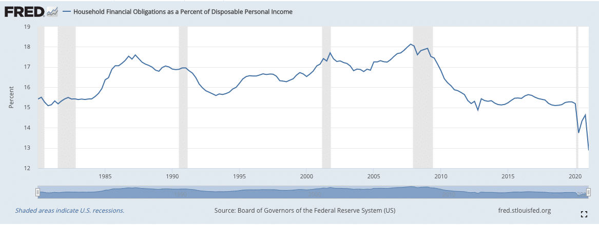
In other words, this economic metric informs that the disposable or discretionary income to spend has been increasing when compared to debt burdens. Now let’s look at the housing data!
Total existing-home sales, completed transactions that include single-family homes, townhomes, condominiums and co-ops, grew 2.0% from June to a seasonally adjusted annual rate of 5.99 million in July. Sales inched up year-over-year, increasing 1.5% from a year ago (5.90 million in July 2020).

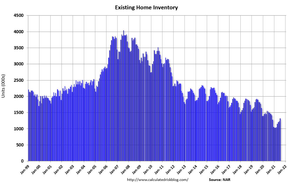
Total housing inventory at the end of July totaled 1.32 million units, up 7.3% from June’s supply and down 12.0% from one year ago (1.50 million). Unsold inventory sits at a 2.6-month supply at the present sales pace, up slightly from the 2.5-month figure recorded in June but down from 3.1 months in July 2020. (Charts from Bill McBride)
While we’ve heard the cries of a housing bubble, it’s very difficult to create a bubble with record low inventory levels and astoundingly healthy household balance sheets. As inventory pushes higher into and through 2022, the housing market will normalize the average home price appreciation to its long-term trend. This normalization process will also be favorably impacted by an increase in construction employment as well as lower commodity/input prices. As the year progresses, it is important to note that the back half of 2021 comparisons from a year ago become incredibly challenging.
Sales of new single‐family houses in July 2021 were at a seasonally adjusted annual rate of 708,000, according to estimates released jointly today by the U.S. Census Bureau and the Department of Housing and Urban Development. This is 1.0% above the revised June rate of 701,000, but is 27.2% below the July 2020 estimate of 972,000. Speaking of challenging comparisons!
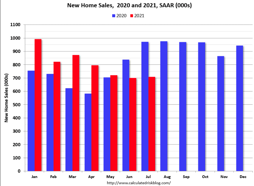
The new home sales rate is now slightly below the pre-pandemic level of around 740 thousand (the three months previous to pandemic). There are a number of factors impacting the current run rate, including pull-forward demand as families sought out suburban regions and left urban/metropolis regions as well as the delayed 2020 selling season, which we believe demand some time to normalize to trend.
Completed inventory is near record lows, but inventory under construction is closer to normal.
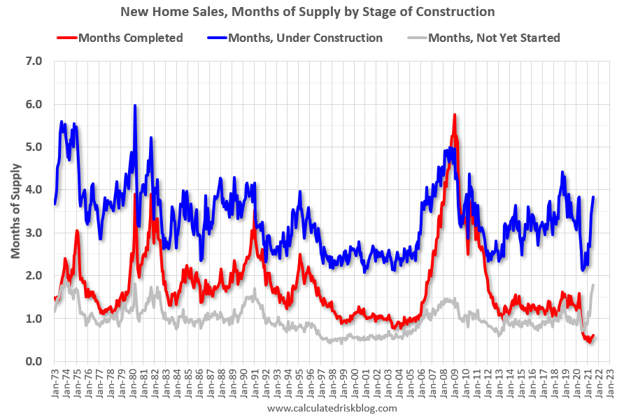
This graph shows the months of supply by stage of construction. The inventory of completed homes for sale was at 36 thousand in July, just above the record low of 33 thousand in March, April and May 2021. That is about 0.6 months of completed supply (just above the record low).
While the debate around transitory and sticky inflation will wager on further, the FOMC is ultimately tasked with a dual mandate that includes price stability (inflation). The latest Headline PCE price index, the FOMC’s core gauge of inflation, was up 0.417% MoM and is up 4.17% year-over-year. Core PCE YoY is now at 3.62%, above the Fed’s 2% target rate.
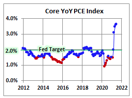
If there was good news out of the core PCE index during the month of July it was that the pace of “inflation severely slowed MoM. The base effects period of inflation (May-August) should be cresting soon and into year-end show modest normalization and/or a degree of transitory inflation impact.
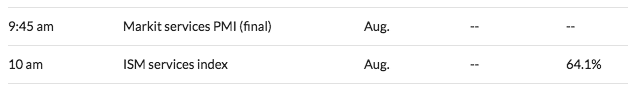
For the coming week, here is a look at the data slated to be released throughout the week. As is customary, the first week of a new month that holds a Friday is understood to be “jobs week”. During jobs week, market participants will gain a better purview on the strength or weakness of the labor market with the release of the ADP employment report on Wednesday, Thursday’s jobless claims, and the all-important Nonfarm Payroll report slated to be released Friday.
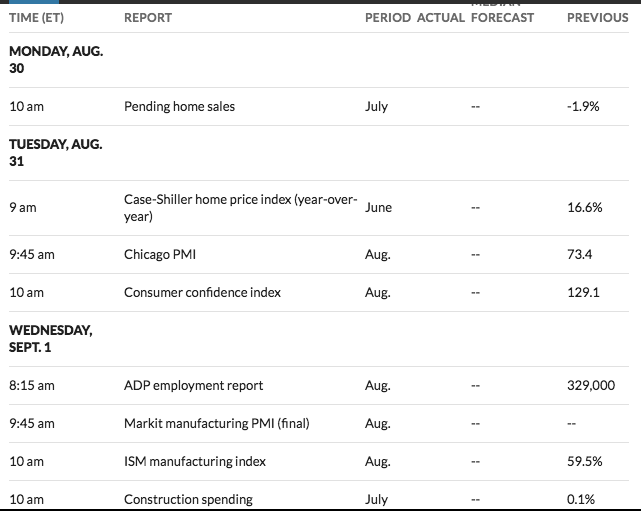
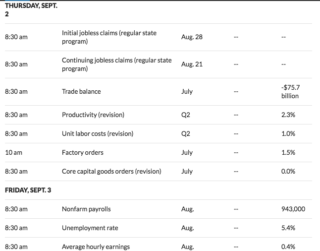
The “will they or won’t they” continued debate on messaging the plans for tapering to begin, may hinge on Friday’s Nonfarm Payroll strength or weakness. The FOMC members have put forth a criterion for beginning the tapering process that consists of achieving its inflation mandate (achieved) and further substantial progress in the economy, which would be discernible in the trending employment reports to come.
Earnings Season Hiatus
Earnings season, by-and-large, has come to an end. Until we are closer to the Q3 reporting season, we will be foregoing this segment of Finom Group’s weekly Research Report. With that being said, let’s take a look at the most recent commentary and updates to the Q2 2021 reporting season. Recall the following from Finom Group just last Sunday: With Q2 earnings season at an end, we are now prepared to issue our revised FY2021 EPS forecast, which had been previously revised at the onset of the earnings season and highlighted in our July 18, 2021 Research Report as well:
“Today Finom Group is announcing its positively revised FY2021 EPS outlook from $193 per share to $208 per share. As a reference point, our original outlook coming into FY2021 was the highest on the “street”. The street caught up to our outlook by the end of Q1 earnings season. We are now, at the top-end of analysts projections once again, based on nothing less than the supportive economic outlook for EPS growth.”
Based on current trends in the economy, deleveraging of the corporate balance sheet, still yet cash strapped consumer with a healthy balance sheet etc. we are raising our FY2021 EPS forecast from $208 to $214 per share. The rate of change in profit/operating margin performance has somewhat laid to rest concerns over increased input costs/expenses, in part due to supply line bottle necks and the trend in reflation.
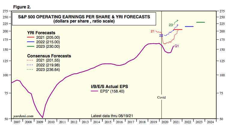
Coming into this week, consensus FY2021 EPS estimate has nudged a little higher from $201.19 to $201.55 per share. We anticipate the FY2021 EPS estimate to be slightly higher than it is today, come the next earnings season in November 2021, barring an exogenous event. Additionally, Finom Group anticipates the need to further positively revise our EPS growth estimate come the Q3 2021 reporting period.
For now, Refinitiv Q2 EPS update is provided as follows:
Aggregate Estimates and Revisions
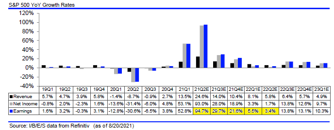
- 21Q2 Y/Y earnings are expected to be up 95.4%, up from 95.7% a week ago. Excluding the energy sector, the Y/Y earnings estimate is 79.9%.
- Of the 489 companies in the S&P 500 that have reported earnings to date for 21Q2, 87.7% have reported earnings above analyst estimates. This compares to a long-term average of 65.6% and prior four quarter average of 83.4%.
- 21Q2 Y/Y revenue is expected to be 24.9%. Excluding the energy sector, the growth estimate is 20.8%.
- The estimated earnings growth rate for the S&P 500 for 21Q3 is 29.8%.
- During the week of August 30, 9 S&P 500 companies are expected to report quarterly earnings.
The below table shows YoY quarterly earnings growth peaking at 94.7% (as of the prior week) for Q2 for companies in the S&P 500 Index. As the quarters roll into 2022, the YoY comparisons becoming more difficult, in part due to elevated corporate earnings now due to higher demand, i.e., satisfying pent-up demand. Importantly, as the back half of 2022 earnings growth expectations show, double digit earnings growth is expected to resume. For the calendar years, 2021, 2022 and 2023 earnings are expected to equal, $201, $220 and $236, respectively.
Coming out of a recession like we just experienced, a spike in earnings growth, then a slowing to a more reasonable rate of growth, is a mostly normal pattern as seen below. During this period of slowing, and as the economy continues to grow, historically, the equity market has continued to trend higher, all else being equal. The slower earnings growth is just one component the market considers in the interim. We would not expect the market trend higher to be without its normal and to-be-expected fits and starts.
Nearing the End Zone
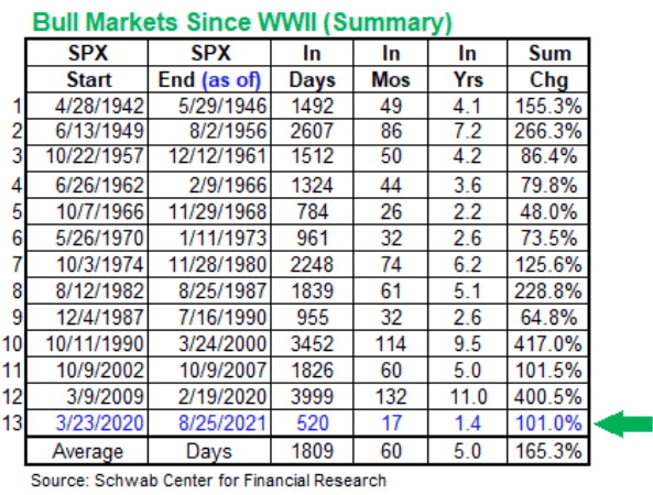
We’ve traveled the “gridiron” of our weekly Research Report and have reached our final destination, the end zone. Here we’d like to remind investors of the current strength of the bull market. The S&P 500 closed at a new high this week, exceeded 4,500 for the first time ever, and is up more than 100% since the COVID19 low in March of 2020. Compared to other bull markets in history, it remains stronger than 5 of the previous bull markets, which all lasted longer.
This is not likely the end, but rather the beginning of a multi-year, cyclical bull market within a secular bull market. While this is easy for me to share, I recognize that for many investors the facts are easier to digest without a linebacker (price action) barreling down on us. The emotions of investing are something all investors contend with. I can’t stress enough that having an experienced resource base/system to surround yourself with is critical to your emotional quotient (EQ), and long-term investing success. As a 22-year veteran of markets, I’ve never met a single investor/trader who has “gone it alone” and done well. Ego needs to be cast aside and accept that you are unlikely to be THE ONE! The best way to grow a confident, successful approach to investing is with a team of resources AND a positive outlook.
There is far too much nonsense out there in the financial and social media that isolates and misinforms the average investor who isn’t resourced. One example of misinformation you’ve probable heard before goes something like this: (Bespoke Investment Group chart below)
“I don’t buy this rally, there’s no volume to it!”
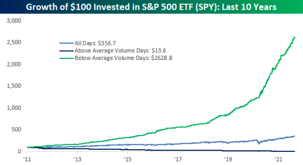
- Markets rise on low volume, fall on high volume. Why? Because investors get bullish at varying rates, because buying is and should be a process while panic selling occurs all at once due to emotions/fear!
Speaking of confidence, one’s ability to buy dips confidently is a key component of successful investing. Many claim to wait for a pullback, but when it comes… no action, no execution. It’s that lingering doubt, that thought that highlights all of the “what ifs” present that leaves investors like deer in the headlights. If an investor lacks conviction in the trend, they are lost. They see the dip in a stock/ETF on their watchlist, then start to question everything. They start listening to the headlines on CNBC/Bloomberg about why stocks will fall further, their confidence is further shaken. The investor then convinces themselves they are learning, they are being disciplined by waiting for a better price, forgetting that a discipline centers on a plan of offense, not defense. You have to be aware you aren’t going to pick the exact bottom on your trades, and you need to be aware of how your emotions are going to work against you. Forget about bottoms, forget about the perfect entry, and focus on the end zone; now execute the game plan!
Successful investing comes down to a successful mindset and maintaining a positive outlook. Part of that mindset minimizes the element/s of fear, but rationally recognizes risk factors. The fear of losing money is such a big driver that it literally destroys most who manage money. Successful investors have confidence, they get that confidence from being successful. How does one become successful? The answer lies in the very impediment to success, FEAR.
When an investor is in a constant state of defense/fear, being led by headlines and fear mongering tactics laid out by the “authorities” in financial media, it proves counterproductive. That is especially true during a strong BULL market trend. Their chance for success diminishes greatly. Just ask the army of foolish bears who have called and continue to call every new high as the ultimate top. Those folks live in FEAR, they have a pessimistic outlook and don’t understand how the equity market works and what drives prices higher over time, EARNINGS. They start each day looking for THE reason the market has to pull back and end the day with less capital. You can see these words play out on Twitter ever day.
When you’ve come to a point where you no longer fear corrections, but actually look forward to the opportunity they breed, you’ve likely experienced a good deal of success as an investor/trader. Finom Group looks forward to being just a small part of that overall success when you decide to subscribe to our service and weekly Research Reports, if not already! (Please see our membership offerings for weekly correlated content)
Earlier I mentioned that the 2021 bull market is delivering returns that are above and beyond some of the quantitative studies and seasonal data, which includes the Cycle Composite Index.
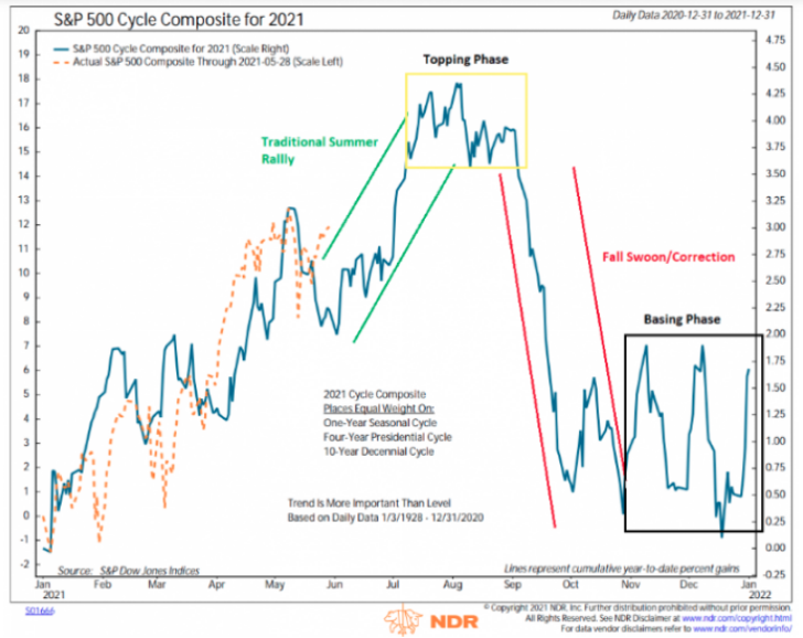
- No April dip.
- No June swoon.
- No August roll over to-date (knock on wood)
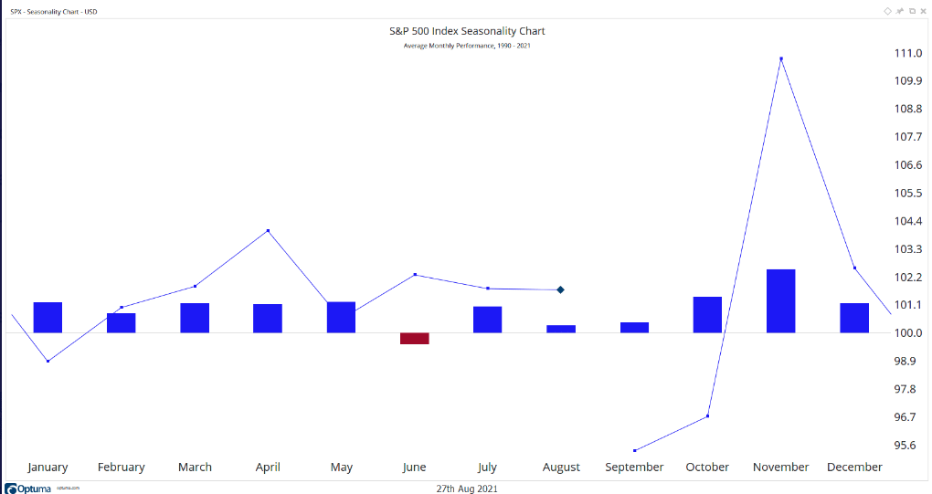
We can recognize the seasonal tendencies have been invalidated to some degree based on the chart below. “So far, all but 2 months in 2021 have been above median monthly performance for the S&P 500, based on historical trend since 1990”. (Andrew Thrasher)
So with just 2-trading days left in the month of August, it remains to be seen if the seasonal trends continue to be mismatched by the strength of the 2021 cyclical bull and through the end of the year. Don’t fall in love with the trend, but our breadth indicators and macro-market analysis should assist with knowing how to engage market disruptions.
This past trading week, some considerable breadth strength developed. Up Volume across the Nasdaq and NYSE proved to significantly support the overall price action. The UP Volume for the NYSE on Friday was 86 percent. And going back to the previous Friday through this past Tuesday, the Up Volume averaged greater than 75% over the 3-trading day period. Such strength in market breadth usually bodes well across 1-12 month time frames for the S&P 500, as shown in the dissemination from SentimenTrader below:
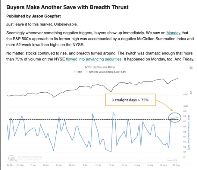
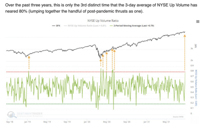
- On Tuesday, we witnessed an 81% upside volume day. It proved the third straight day 76% or more.
- Since 1928, there have been 86 non-overlapping periods with 3 consecutive days of 75% or greater Up Volume. Like we’ve seen so often, the primary highlight of thrusts like this is a remarkably positive risk versus reward ratio over the medium-to long-term.
- Across all time frames, the S&P 500’s average return was well above random, the average drawdown (risk) was a small fraction of draw up (reward), and there was a much higher probability of a big rise than a big drop.
- The following chart was the relative performance for the NYSE Up vs. Down volume to close the week

In further outlining the strengthened market breadth/internals this past trading week, what this chart of Up vs. Down volume also suggests is that we may find breadth peaking near-term (chart above Up:Down Volume for NYSE). Such levels are not often sustained for very long. Does this suggest going out there and shorting the market? No! But it does suggest you better have a playbook/game plan for when breadth and/or price weakens.
Nobody seems to remember anything about the month, but everyone remembers the last tick and what the price at the end of Friday’s trading session was. While the S&P 500 is up more than 2% in August, it hasn’t been a smooth ride. Two weeks ago the VIX rose some 50% off its base. Volatility is the price we pay, as an investor, for future returns.
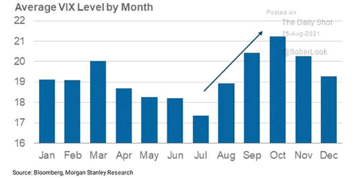
We fully expected a higher degree of volatility in the month of August, based on the seasonality factors and historical data, but the VIX has the potential to not only finish the month lower than the July close (18.24), it may also close the month with a lower average reading than July.

Seeing how we are rounding out this report, I don’t wish to dismiss the fact that the SKEW Index remains at record levels, and has been for some time now (157.25). I don’t bring this up to frighten investors, but rather to better understand that risk is part of investing; we knowingly take risk. In its 3-decade history, there have only been 18 days when the tail-hedge index has logged a higher reading. One of those years, indeed, was 2017 when the largest intra-year drawdown was ~3 percent. Sounds just like 2021; does it not?
In a recent sector report by Fidelity, they provided information on the market’s expectation of tail risk fears by evaluating the Skew Index and what the skew level indicated for future stock returns. Fidelity’s commentary is noted below, along with their conclusions in the graphics to follow:
“Skew, a statistic derived from the options market, measures investors’ perception of tail risk, or the risk of extreme market events. It’s very high currently, in the top decile of its historical range—and that may be a good sign for the stock market. Like many sentiment indicators, skew has often been useful as a contrarian signal, historically: In the past, the more concerned investors have been about tail risk, the shallower drawdowns have been.”
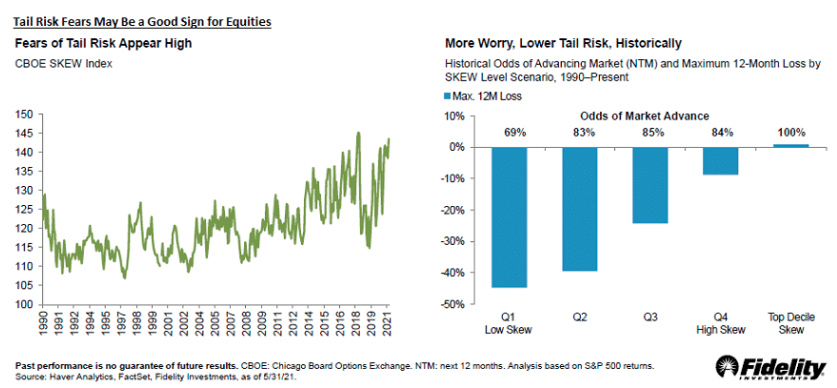
As the right chart depicts, high levels of fear tend to be associated with favorable market returns over the next twelve months. With the current SKEW in the top decile, the chart indicates advance odds are 100 percent. Could this time be different? Sure. The analysis period for the above data only goes back to 1990, but this current market does seem to be climbing one big wall of worry. For all those market pundits claiming that investors are overly complacent, that is definitely not the signal from the SKEW Index.
With the remaining 4 months of the trading year ahead, remain flexible, on-trend, and prepared for a wide variety of outcomes. Don’t be fearful of market drawdowns and/or corrections. When the market fumbles the ball, pick it up and run with it!


