
Before we get started with today’s daily market dispatch, I wanted to remind our readers about something we discussed in the Finom Group Trading Room on Tuesday. The following chart from Tom McClellan identifies the S&P 500 this year against the S&P 500 in 1995. The two are taking a very similar path. Why are the two time periods being compared? Many are comparing the two years because of the Fed activity likeness in the two periods. In both years, the Fed began and completed a mid-cycle, insurance cut regime that culminated in three, 25 bps rate cuts. So there you go.
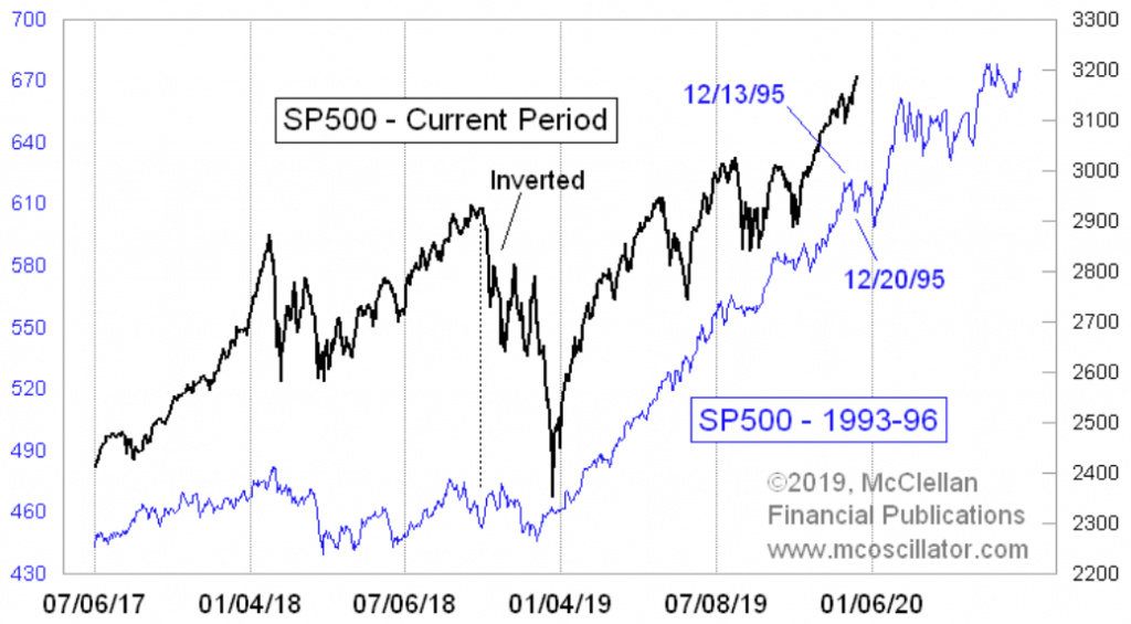
“The SP500 in 2019 continues to follow the pattern it laid down in 1995. There was a notable hard dip to a bottom Dec. 20, 1995, which is just ahead on the script for this year.”
What’s probably most interesting and plausible concerning the Dec. 20th date just ahead, is that it just so happens to coincide with monthly options expiration day. This is not to say that “a notable hard dip” will repeat in the current year, but just another interesting circumstance in the comparison to take note of this week. Let’s move on…
The Dow Jones Industrial Average rose 31.27 points, or 0.1% to a record close at 28,267.16, while the S&P 500 index gained 1.07 points, or less than 0.1%, to 3,192.52 to also post a record, and the Nasdaq Composite Index gained 9.13 points, or 0.1%, at 8,823.36 to a record. On Wednesday, equity futures are pointing to another positive open on Wall Street. It’s anybody’s guess as to whether or not the gains will continue to come as the market continues to melt higher into the end of the year and as the House of Congress is set for an impeachment vote on Wednesday.
Seeing how we have happened onto the conversation of impeachment, which is arguable a political process and with a presidential election year ahead, let’s take a look at some market implications surrounding an election year and volatility. Bank of America Merrill Lynch recently coined the term “politicians implied-VOL” when discussing this topic. BofAML uses rate-VOL in their model for implied-VOL because “no other measure best captures the cumulative effect of QE and the effect of forward guidance given the former accumulates assets and the latter anchors uncertainty about the future path of funding costs and the potential risk of re-pricing across the fixed income world”.
Another way to visualize the same dynamic is simply to plot the index against the VIX. Perhaps more than any other year post the Great Financial Crisis, 2019 has been characterized and defined by central banks engaging in a coordinated effort to ratchet down market-based measures of volatility in the face of another surge in “politicians’ implied vol”, to use BofAML’s terminologies
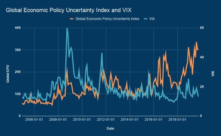
.
“Unsurprisingly, the [EPU] has shot sky high over the past decade and yet it’s had surprisingly little effect on investors”, Bloomberg’s Lu Wang recently wrote, adding that “it all makes a kind of sense when considered alongside what central bankers have been doing”.
Piggybacking on the commentary from Wang above, BofA’s Ioannis Angelakis underscores the point in his year-ahead outlook.
“Once again, central banks are trying to safeguard the economic outlook while political risks threaten to derail the achievements of years of accommodative policies across the globe”, he writes, describing the scatterplot below.
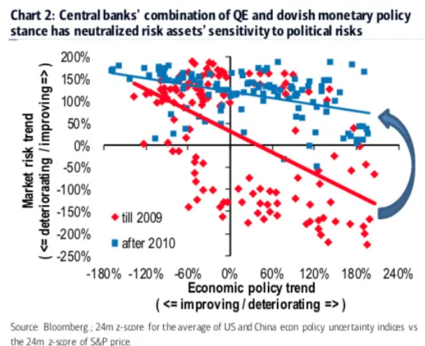
“2019 has been about more rate cuts and more QE. 2020 will be the year when central banks need to confirm their ability to dampen tail risk and support the global economy”, BofA’s Angelakis says, on the way to cautioning that “monetary policy communication mishaps will be key in 2020 [as] it will be a fine balancing act to shift the focus from rate cuts back to forward guidance”.
BofAML, like many market participants, is looking ahead to 2020, as we now have just 7 trading days left in the year and decade. With the chronology in mind and for the sake of looking forward, Finom Group has been denoting analysts and strategists’ S&P 500 12-month price targets as the calendar year is set to turn anew.
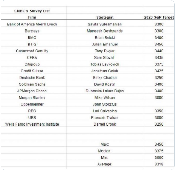
Given the table of projected price targets above, there is now a new high water mark amongst the analyst community. John Stoltzfus of Oppenheimer Asset Management is now at the top end of stock market projections for 2020, giving an S&P 500 target of 3500 for the year. That would be nearly a 10% climb for the index and from Tuesday’s closing price.
“We see 2020 as a year that will be defined by a reassertion of global growth as the negative overhang affecting the global economy and markets is lifted as progress is made gradually in the ‘phases’ that we expect lie ahead.
I have confidence in the Federal Reserve’s ability to navigate “uncertain waters.”
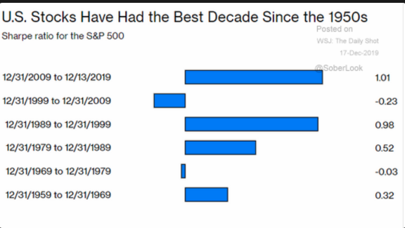
Stoltzfus did highlight a few risks to his projection, including a breakdown in trade negotiations or changes in monetary policy. Stoltzfus is obviously just one of the many analysts who believe the market is set for additional gains in 2020 and found relying on a rebound in earnings growth, global economic activity and PMIs rebounding and central banks remaining highly accommodative. Having said that, the boat is leaning heavily to one side with yet another analyst piling into the bull market camp. This as we culminate the best decade for the stock market since the 1950s as it pertains to Sharpe ratio performance. (See chart below)
What we would encourage investors to consider is that these price targets are just that, price targets. They are no less subject to scrutiny and fail-ability than any other point of fundamental analysis. As an investors, favorable market price targets shouldn’t bias or sway your capital allocation and fundamental investing principles. Often times, one of the mistakes investors consistently make is positioning along the lines of likability. If I like or dislike something I position accordingly. For example: I like the collective S&P 500 12-month price targets, therefore I feel the market is cheap and I position in favor of the forward-looking price targets. Sentiment and bias likability positioning is not the same as fundamental positioning. Essentially, your aligning positioning in this example for the sake of likability. DONT DO THAT!!
Moreover, Stoltzfus isn’t the only market bull of late looking for a continued double-digit rally continuation in 2020. Strategist Jim Paulsen expects 2020 to be another banner year for stocks. The Leuthold Group’s chief investment strategist wouldn’t be surprise if the S&P 500 soars another 15% next year, but the long-time bull doubts it will be the best market on the planet.
“This will be like the third time we’ve had re-acceleration in the global recovery just in this expansion alone. We had it in 2012 and 2013. We had it again in 2017 [and] 2018. Every time that’s happened, international stocks have beat U.S. stocks, and I think they will again.”
Paulsen’s 2020 strategy includes under-weighting U.S. stocks and going for the hardest hit markets.

“The emerging markets will be the big winner of 2020. They’re under-owned in most portfolios. They’re unloved because of their underperformance in recent years.”
Paulson expects stocks will push deeper into record territory despite high valuations as long as the 10-year Treasury note yield stays below 3%. According to Paulsen, the rally could persist at these higher valuations for some time.
“We have very low inflation. But more important, we have very stable inflation. We have the least volatile consumer price inflation rate over the last 30 years of any time in U.S. history.”
Be it any of the noted strategists or analysts pointing favorably toward another favorable equity market year in 2020, none have said or will say the market is likely to go up in a straight line. That’s simply implausible. Investors should always anticipate and expect set backs and drawdowns throughout the year. A more recent article from Bloomberg denotes the affects of drawdowns and how simply looking at any one calendar year may cloud the reality or difference in net gains.
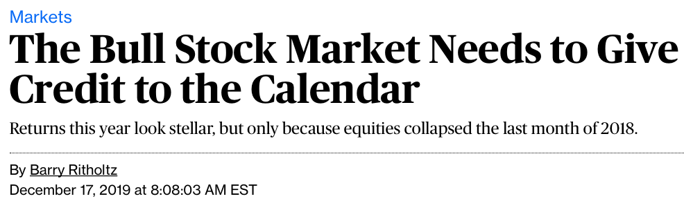
Looking at market returns on a calendar-year basis can be misleading. Recall that from the market close on Monday, Dec. 31, 2018, until today, the S&P 500 has gained 27.4%, or 30% including reinvested dividends. But if we use a slightly different time horizon, starting from the Sept. 20, 2018 peak rather than the last day of last December, things look a lot different. On that basis, the S&P 500’s returns have been almost 9% and 9.4% on an annualized basis. In other words, most of this year’s market returns, almost 90% of them, are a recovery from that fourth-quarter bear market.
“There is no avoiding the peak-end rule, but it might help to annualize 2018-2019 markets to understand why investors might feel a little less optimistic than the 2019 annualized gains lend themselves to be. Rather than thinking of these two years as minus 6.2% and plus 29.8% (for the S&P 500, 2019 is year-to-date), it might be savvier to look at gains across those two years. In the case of the S&P 500, the gains total 24%, or 11.4% on an annual basis. Again, not bad and above average, but by no means stellar.“
As an active trader or portfolio manager we’re always a work in progress as we analyze market conditions and trends, fundamentals and technicals. It’s been a great calendar year and the year isn’t quite finished. With this in mind and with overbought conditions persisting, we continue to hear the cries for a market pullback. Certainly the noted chart/analogue at the beginning of today’s article lends itself in some way to providing reasonable plausibility for a pullback/drawdown, but it remains to be speculative until it actually takes place. In the meantime we analyze those market conditions and/or breadth/internals.
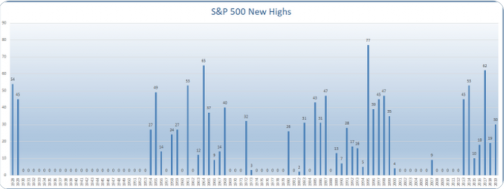
In the current trading week, the trend for the markets continues higher; the momentum is still with the bulls. As of Tuesday, the S&P 500 has hit 30 new all-time highs for this year. Harkening back to December 2018, this is not what a lot of analysts or strategists were calling for in 2019 and as such we encourage investors to always consider the potential for this community of market participants to be “found wanting”. (Chart from Ryan Detrick)
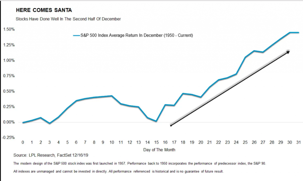
As the melt-up narrative remains in focus, offering that additional new all-time highs are still ahead in this year, it’s important to take a look at history and what we might expect in the few trading days left available in the calendar year. Historically speaking, most of December’s gains take place in the tail end of the month, hence the term Santa Claus rally, as it typically occurs after Christmas.
“December has been a good month so far, but can it continue? Turns out, the majority of December’s gains have tended to happen in the second half of the month—so we still have time to believe in Santa,” explained LPL Senior Market Strategist Ryan Detrick.
With the historical probabilities noted and indicating more gains in the calendar year ahead, let’s now look at some market breadth/internals. Of late, volume has actually been pretty good for the S&P 500.
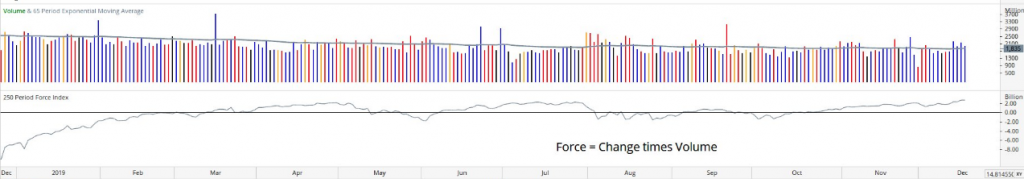
Continuing to combine the upside and pullback narrative, market internals allow traders to actively manage risk and provide capital allocation and/or hedging signals during an uptrend. It’s important to decipher that statement and understand it is also an analytical suggestion. Notice we made no mention of selling, even if a pullback/drawdown ensues. The purposeful phrasing is in keeping with the denotation of an “uptrend”. And it’s been a powerful uptrend within a low liquidity regime to boot. Having said that, for the sake of analyzing market breadth/internals the potential for a near-term drawdown is afoot. Afoot does not mean imminent, but market breadth/internals are building the case for a drawdown to take place at some point near-term.
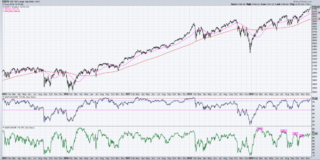
The market is certainly strong across the board. Nonetheless we have to take note that almost 80% of the S&P 500 issues are trading above their 200-day moving average presently. That has happened just three times in the last five years, and every time the market has exacted a pull back of varying degrees. (Middle chart, from David Keller)
Moreover, while the percentage of stocks trading above their 200-DMA is at lofty levels and expressing that index ETFs are obviously in overbought territory, with price sitting one standard deviation or more above their 50-DMAs, there’s more to these overbought signals that bears defining/analysis. While these overbought conditions could typically be taken as a sign of potential near term downside afoot, taking a look under the hood reveals that things may not be as overbought as we might think.
Index ETFs are overbought, no doubt and sector ETF prices have become elevated relative to their 50-DMAs. But when we look within the sector ETFs, the same is not entirely true for the individual stocks of each sector. As shown in the charts below from Bespoke Investment Group, only a handful of sectors like Health Care and Consumer Staples currently have an elevated number of stocks above their 50-DMAs. Other sectors like Communication Services, Consumer Discretionary, Industrials, Materials, and Technology have seen other periods this year where a higher percentage of the sector’s stocks had been above the 50-DMA. As for the Utilities and Real Estate sectors, only 35.7% and 31.25%, respectively, of stocks are above their 50-DMAs.
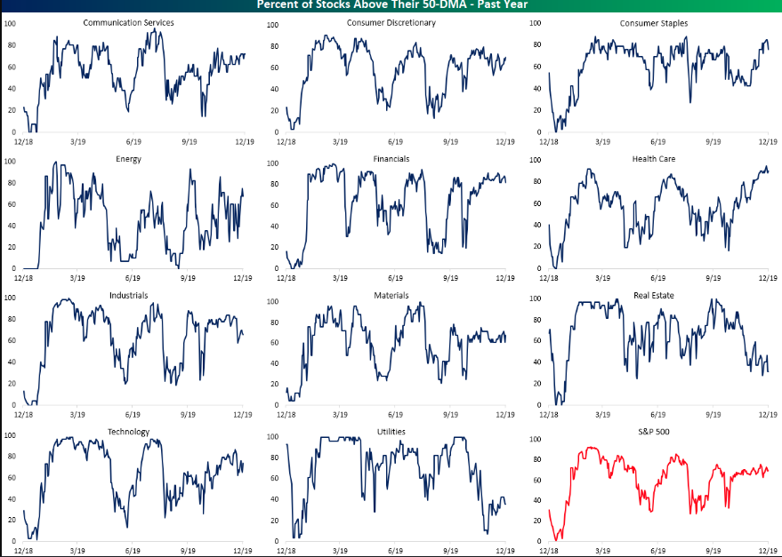
That is notable in that for the two sectors, the readings are in the 12th and 6th percentiles of all days over the past year, respectively. This all means that while many stocks have participated in the rally, there are still plenty that could benefit from the technical catalyst of a break above the 50-DMA.
Now do you see why we outline that market breadth/internals are so vast and found with so much nuance that they prove a difficult leading indicator. What we can clearly say is that market breadth/internals are strong, but using them to actively track the probability of a drawdown for which to take action in one’s portfolio… better to simply understand the trend of market and earnings fundamentals and stick with the trend in our opinion. And with that, let’s look at some of the economic data releases from yesterday and be thankful there are none slated for release Wednesday, hahaha!
Housing Starts and Building Permits proved the strength in the housing sector has rolled forward and through the Q4 2019 period, as low rates have further provided a tailwind for the industry. Builders began construction on new homes in the U.S. at a pace of 1.37 million in November, the Commerce Department said Tuesday. This represented a 3.2% increase from a revised 1.32 million in October and was 13.6% higher than a year ago. Year-to-date, starts are up 0.6% compared to the same period in 2018.
Last year, in 2018, starts were strong early in the year, and then fell off in the 2nd half – so the comparison will be easy in December.
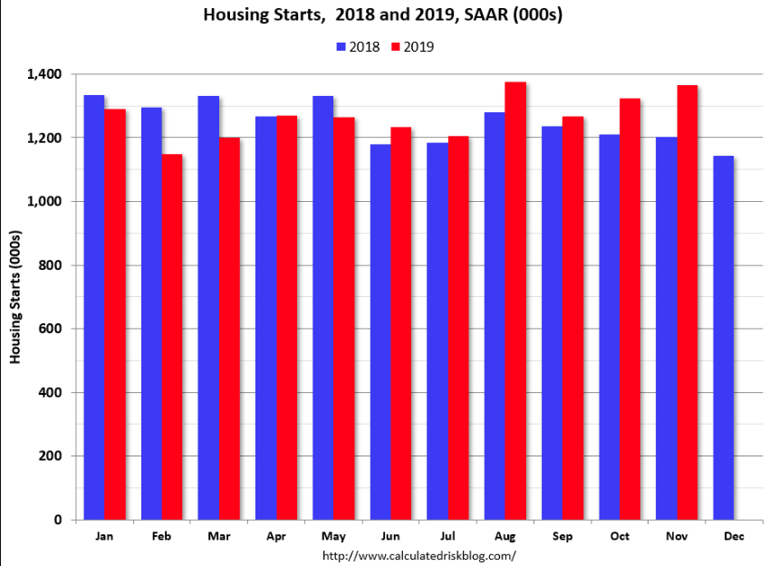
Meanwhile, permitting activity hit yet another post-recession high. Building permits for privately-owned housing units were authorized at a seasonally-adjusted rate of 1.48 million. That was 1.4% above the pace of 1.46 million set in October and 11.1% above last year’s rate.
In addition to the strong housing data released Tuesday, Industrial Production proved stronger than anticipated, although it has been a rather rough year for the manufacturing sector on the whole.
U.S. industrial production jumped 1.1% in November, the biggest gain in more than two years, the Federal Reserve reported Tuesday. But for the past year, production in still down 0.8%. Output had been down in three of the past five months. Putting things into better, long-term perspective when it comes to industrial production it is important to identify the overall strength in the data series as identified in the chart below:
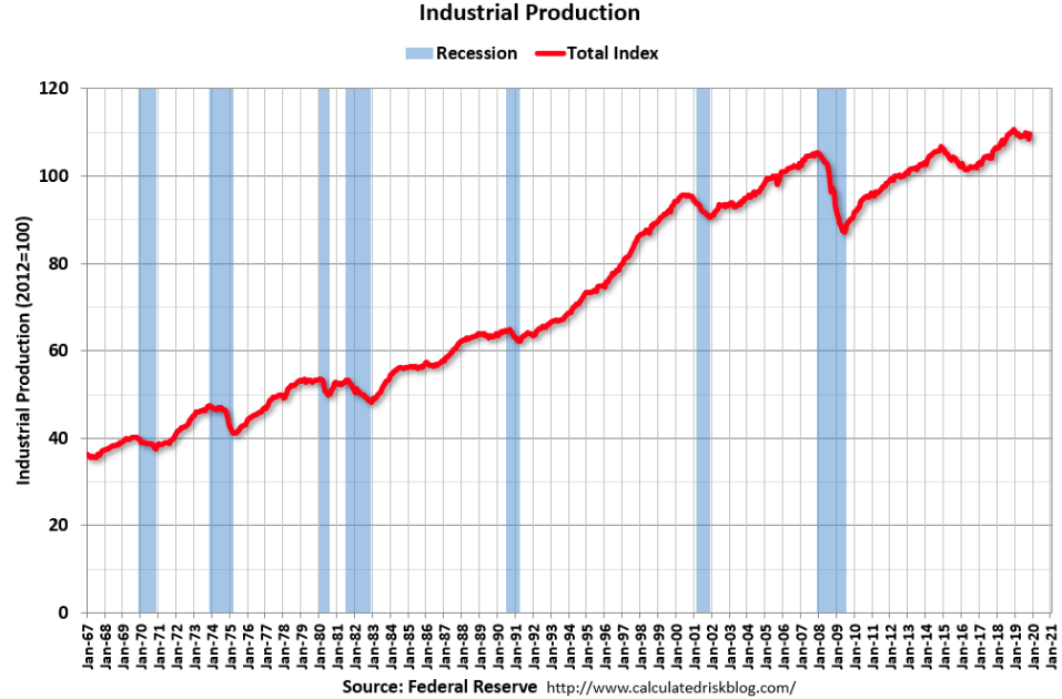
Industrial production increased in November to 109.7. This is 26% above the recession low, and 4.1% above the pre-recession peak. So down YoY, but still at very strong levels historically.
Last, but certainly not least in a string of favorable economic data series was the the JOLTS survey. In the survey, the number of job openings ticked up in October, and more Americans quit their jobs. Taken together,both are signs of a strong labor market that is likely to carry forward into 2020.
The following graph from Bill McBride shows job openings (yellow line), hires (dark blue), Layoff, Discharges and other (red column), and Quits (light blue column) from the JOLTS.
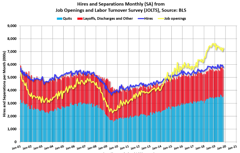
Hires (dark blue) and total separations (red and light blue columns stacked) are pretty close each month. This is a measure of labor market turnover. When the blue line is above the two stacked columns, the economy is adding net jobs; when it is below the columns, the economy is losing jobs. Throughout the expansion cycle, the economy has been adding jobs.
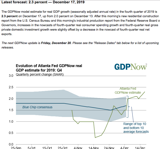
As noted previously, the recent string of favorable economic data has proven to lift the prospectus growth forecasts for Q4 GDP. Coming into Tuesday’s economic data releases, the Atlanta Fed GDPNow forecast was 2.0 percent. After the strong data releases, that forecast has been raised to 2.3% GDP in the Q4 2019 period.
Investors might keep in mind that come Friday, the final revision to Q3 2019 GDP will be released alongside the latest Personal Income and Expenditures (PCE) data. Consumer spending and the Personal Savings rate will accompany this data series. Finom Group desires to see consumer spending transacting at a healthy pace while the Personal Savings rate ticks slightly lower, indicating that holiday retail sales are also probably growing at a healthy clip in December 2019.


