
Once every quarter, Finom Group releases its weekly Research Report to the public. To receive our Research Reports and State of the Market weekly video going forward, subscribe today. Now, let’s go deep on this Super Bowl Sunday and see what the market has in store for investors/traders!
It is not always an easy task to remain optimistic about the outlook for the state of the economy or the stock market. Our weekly routines and defined processes can go a long way to achieving a well-rounded investor psychology that isn’t impacted by the wide array of headlines and price fluctuations. If there has been a better example of headline risk and price fluctuations than what was expressed over the past 2-week period, well, I’m all ears!
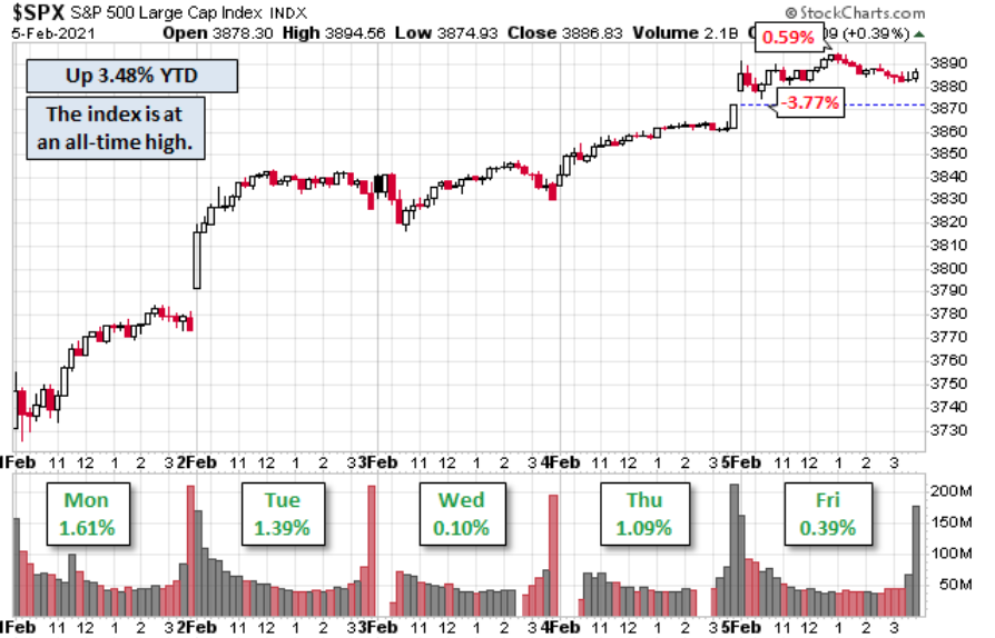
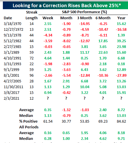
Just two weeks ago, the S&P 500 (SPX) fell some 3.3% and 4.5% from the all-time highs to give back all of the gains in January, and to squash the dreams of a January Trifecta. The January Trifecta, if you recall, would have claimed a positive Santa Clause rally followed by a positive First Five Day New Year rally and a positive return for the month of January, known as the January Barometer. But alas, January finished in negative territory. No, this does not spell doom and gloom for investors/traders. In fact, the January Barometer has more recently NOT led to declines over the next 11 months of the year. (LPL Financial table)
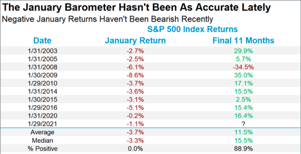
Going back to 2003, the S&P 500 has still been positive 88.9% of all years and the one year it was down occurred during the Great Financial Crisis. Let’s also consider that two legs of the Trifecta did come to fruition and what that may portend:
- Of the last 11 times since 1950 (last year, 2020 is the most recent) that the SCR and FFD were both positive (and the full-month January was negative), the next eleven months advanced 81.8% of the time and full year advanced 72.7% of the time with gains of 8.2% and 4.1% respectively.
- These are statistically significant results over a longer time frame and shouldn’t be discounted.
The historic data/studies are here to inform investors of where the greater probabilities are to be found for capital returns. The data, however, is not here to determine the precision of returns or offer a guarantee of positive returns. Moreover, and as Warren Buffett has been known to say…

With that being offered, indeed the market had a determined and strong rebound from the previous week’s decline. On behalf of Finom Group, we hope our weekly Research Report served you well with respect to maintaining a flexible, unbiased, and well-resourced manner for appreciating market pullbacks for what we believe them to be: Long-term opportunities! Our macro-market outlook remains unchanged, pointing bullish, but always scanning for probabilistic returns.
As our chief market strategist Seth Golden outlined during the week, the Golden Capital Portfolio had recently added an investment in Caterpillar (CAT) to the portfolio. This was an idea/observation we first brought to members back in October of 2020, before it rallied some 25% to all-time highs. After the Caterpillar released rather strong quarterly results, the stock has exacted a 20% correction, where the shares were added to the Golden Capital Portfolio. (Not a recommendation)
Have a great month of February investors/traders, and without any further adieu, here is Prince Akeem of Zamunda. Yes, he (Seth) made me say that!
Markets Go On a Wild Ride
You’re darn right I made Edward introduce me as such. “Coming to America Part 2” is coming soon. If you grew up in the ’80s or ’90s you know this is an American classic starring Eddie Murphy. Now if only they create a The Goonies Part 2, my life will be complete! But I digress

I do find favor with so many of Warren Buffett’s quotes over the years. They are so well-rooted in the understanding of what markets can help the average investor achieve if only they look at downturns the way they look at a sale from Macy’s (M).
“Look at market fluctuations as your friend rather than your enemy. Profit from folly rather than participate in it.” ~ Mr. Buffett
This should be where we pick-up our weekly Research Report, in my earnest opinion; after coming through a decline of 3.3% two weeks ago only to rally more than 4.65% this past trading week. Again, in my earnest opinion! When the heat gets turned-up on the market, it seems that sentiment can shift rapidly and market participants start leaning toward the direction of price with their sentiment. This is especially the case when price draws lower. Your one job as an investor is to simply afford yourself the time to become friends with market drawdowns, to see them as your friend/opportunity. Drawdowns have to be part of an investor’s/trader’s expectations and recognizing that we must…
Plan trade with entry > set goal/s for trade > achieve trade objective = discipline/process
The aforementioned is what I often refer to as my PSA to all traders and investors, my Public Service Announcement: Plan, set goals, achieve objective! You’ll know if you’re process is successful or demands refining and course correction by the ability to achieve repeatable profits. Now, about those corrections and sentiment suggesting, “We must correct 10% or greater because… XYZ!”
Most strategist have been warning or calling for a 10% correction since last November, yet here we are. Every week someone is marched out on CNBC touting a 10%+ correction due to XYZ. I’m not in the business of saying they will or won’t be proven right or wrong. I simply don’t care. It does not affect my investor psychology what a hedge fund strategist offers as he aims to predict the future. Were he/she found with such a skill, I’d much rather him/her disseminate the Lottery numbers. But alas!
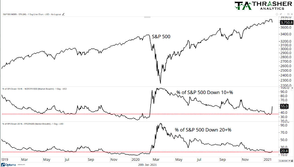
I think what can often get missed or overcome by the noise of these prognosticators is the fact that MOST stocks have already corrected 10% or greater. The chart above from Thrasher Analytics from January 28th identifies this point of fact. Remember, it’s a market of stocks folks! The S&P 500 was down 3.3% two weeks ago, but 55% of stocks were already off of their highs by 10% or greater… already, already!! (middle panel above) By Friday January 29th, the percentage of stocks 10% or greater from their highs grew to 60 percent. Just saying, underneath the surface of the index, price had proven a much greater correction than many had assumed. This is something that we discussed in the Finom Group Trading Room with members.
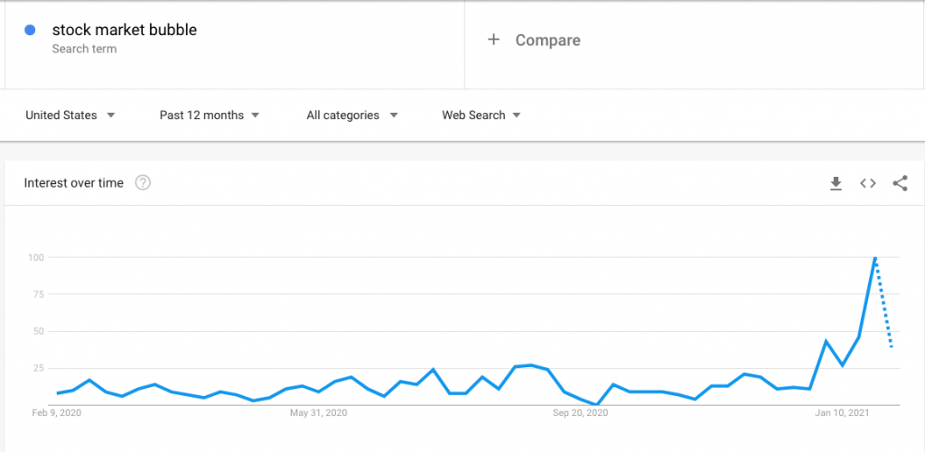
One of the 2021 “talking head” themes centers on the notion of market bubbles and how stimulus is creating such a bubble. If there has been a bubble in anything its been the heralding and hyperbolizing of the stock market as representing a bubble. Look at the Google Trend search results below:
I refer to these types of people who engage in such discussion as “quacking ducks”. I’ve no intention on feeding these ducks. My only objective as an investor is to achieve a return on capital. This doesn’t mean I completely ignore the quacking, it simply means I need to remain informed and with a greater focus on the task at-hand, investing capital and due diligence efforts. What I’ve seen in my 22 years as an investor, analyst and strategist is that the financial media likes to maintain quacking duck issues at the forefront and for the most part, they lose sight of what is really going on with the stock market. What is nice to see these days, however, is a stock market that isn’t paying a lot of attention to politics or any other background noise for that matter. Instead, the market is paying attention to economic data and corporate earnings. Over time, these are market driving forces. Alright, lecture of the week from Prince Akeem is over with, let’s go look at some charts! I’ve astutely labeled the coming segment…
Some Charts
Our first chart will not necessarily come from the indices, although we’ll certainly get to those, but rather from investor sentiment readings. (Bespoke Investment Group)

The latest sentiment survey from Investor’s Intelligence, which surveys newsletter writers rather than individual investors, showed that Bullish sentiment in this survey came in at some of the lowest levels since the fall. At 57.8%, it was the first sub-60% reading since mid-November and the lowest reading since November 4th. Bearish sentiment was slightly higher rising to 16.7% from 16.5% though it is still below levels from two weeks ago. While these survey results still lean historically bullish with the bull-bear spread at 41.1—which is in the top decline of readings going back to the 1960s—a higher share of respondents did report that they are looking for a correction. That reading climbed above 25% for the first time since the first week of November. While that is far from a historically high reading (historical average of 25.77%), it did end a streak of consecutive readings below 25% at 12 weeks long.
Across the history of the survey, there have been 42 streaks of readings of “looking for a correction” below 25% that lasted for at least 12 consecutive weeks. In the table above, it shows the 14 of these instances that occurred without a prior occurrence in the past year. While it is just one particular study, it does suggest some choppy to potentially downward price action near-term. Let’s remember, however, that there are many, many inputs to consider and the historic data is not a guarantee as we saw in this study below, which we discussed in our weekly State of the Market:
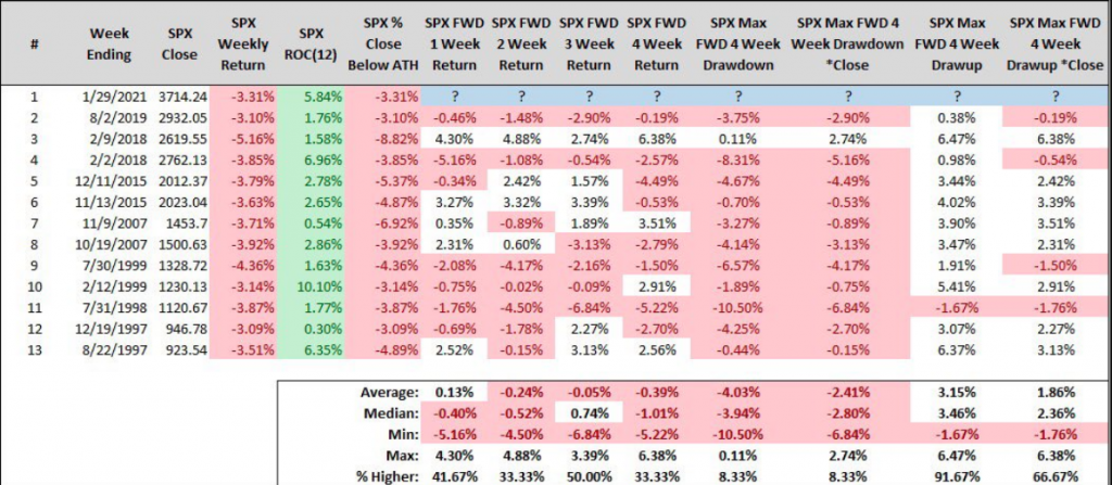
- Here are all instances of the S&P 500 falling -3% or more during an uptrend (i.e., positive returns over the trailing 12 weeks) that closes within -10% of our all-time high weekly close. (Since 1990)
- Study from Steve Deppe CMT as of week of January 25th .
If we look at the study of when the S&P 500 falls -3% or more during an uptrend, the 1-week forward returns are negative by a median of -.40%. The positivity rate 1-week later is also only ~42%, and yet the market rallied 4.65% after this signal. Just another example of staying informed so as to maintain appropriate expectations, but remaining flexible to a wide variety of outcomes.
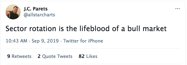
As it relates to all the “market bubble” characterizations, here is something else that Bespoke Investment Group offered to help evidence just how healthy this “best ever” bull market has performed. In a 2019 tweet, Allstarcharts founder and CMT J.C. Parets foreshadows:
Don’t miss this point for validation sake. If we want to dissect the difference between a healthy bull market and a “propped” bull market, sector performance is a healthy tool. Sector rotation throughout the rally off the March lows has been incredible. In each of the 5 acts in this bull market, the only sector that hasn’t been a leader in at least one of the acts has been Real Estate.
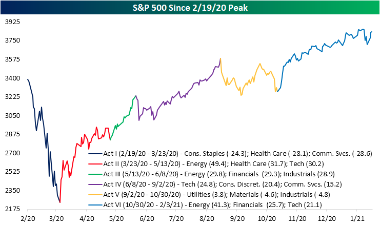
Now, step back and think about how this bullish, continuous sector rotation of leadership has also been seen in other indicators. If sector rotations are a sign of a healthy, if not vibrant bull market, where else would it show up? That’s right, it would show up in the percentage of stocks trading above key moving averages and in advance decline lines (A/D lines). It would also show up in the way of many if not all market cap weights moving on-trend.
It didn’t matter whether it was the micro-cap index or large-cap index, they all made new all-time highs this past week. The chart below was published via TradingView.
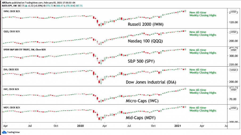
This, combined with the fact that most every sector within the S&P 500 has been trading above its 50-DMA for some time now, validates the new bull market as being healthy, if not vibrant and found for successive new highs to come. In 2021 already, the S&P 500 has achieved 6 new all-time highs. Are the ducks still quacking? Let’s wave and look at breadth in that case.
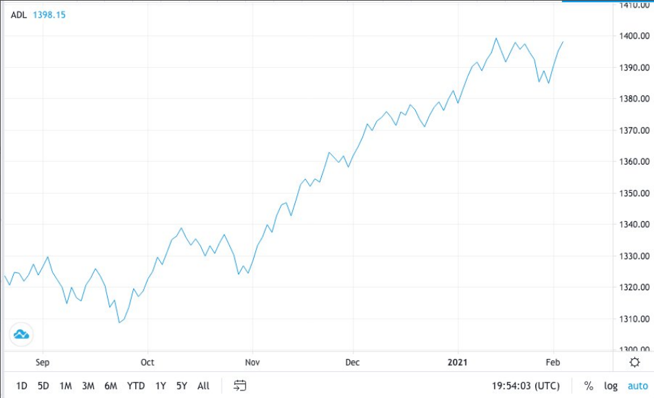
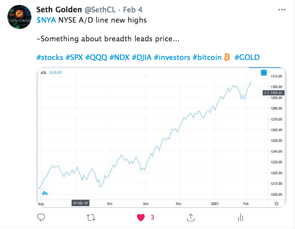
The “tape” was pretty subdued this past Wednesday. The S&P 500 was making every effort to hit a new all-time high but by day’s end only managed to hold a 3 point gain. While the gains were quite modest for the day, what I had recognized was that the NYSE A/D line was on the verge of achieving a new all-time high.
What I also recognized in that subdued tape from Wednesday was that while price action was like watching paint dry, the volume composition was anything but boring. In fact, volume was quite bullish.
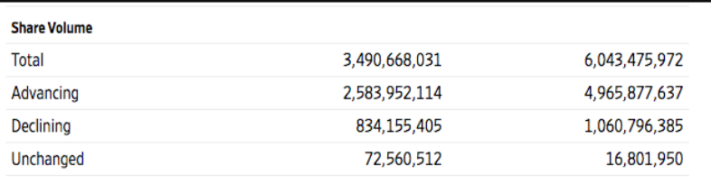
The Advancing volume in the Nasdaq (COMPQ) and NYSE (NYA) was pretty strong compared to the Declining volume. This is one of those breadth clues on Wednesday that helped facilitate some willingness for our members to enact trades, as we discussed these metrics in the Trading Room. More importantly, the bullish volume supported the probability of gains for the indices ahead. Low and behold, Thursday’s strong move in the major averages and a new all-time high for the NYSE A/D line per tweet:
Probably my least liked tweet of the week. Bunch of permabears that #fintwit maintains 😉 !
Harkening back to last weekend’s Research Report, we discussed the rather rapid 4.5% drop from the all-time highs and 3.3% weekly decline. In a more illiquid market, we tend to see such rapid price moves. Therefore, we tend to look at what such price action does to market breadth using a faster moving average like the 10-DMA. Recall what we offered below, from last week:
“The percentage of stocks trading above their 10-DMA has a more material breakdown and call to action. When the percentage of stocks trading above this rapid moving average gets to roughly ~10%, it has historically been a clear “buy signal”. One can be found nibbling above this breadth breakdown level, but a great degree of buying is suggested when it gets to the 10% level, which is highlighted in the chart (circles). Below is the breadth indicator to end the trading week:
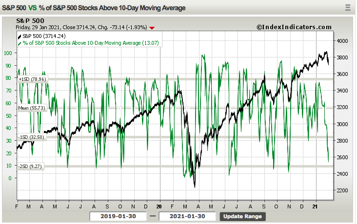
This breadth indicator continued to fall as the S&P 500 fell ~2% on Friday, finishing the week at a level of 13.07%, and very close to the 10% level. Yes, the breadth indicator can breach the 10% level, even if ever so modestly, but it doesn’t spend much time around this level before the buyers step in and bid up the market once again. If the market should continue to consolidate, as one might expect in the coming week/s, this would be another key indicator to watch and employ as part of one’s game plan for executing one’s shopping list of stocks/ETFs.”
It looks like the smart money, those who study such breadth indicators for game-planning purposes and future executions were thinking along the same lines as Finom Group. If we look at the latest update from this breadth indicator below…:
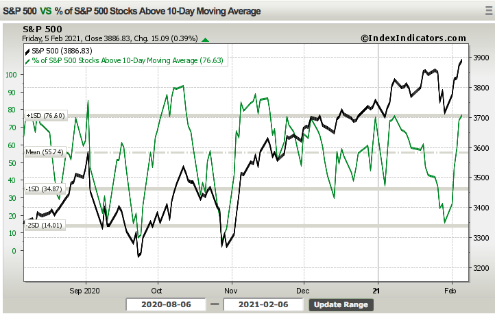
… we can see that it has rebounded off of the prior week’s low, as the buyers came in quickly to bid up stocks. Folks, this is another clear message the market is disseminating, don’t miss it even if the pundits are calling for a 10%+ correction on a weekly basis. The risk appetite is still bullish, despite some of the more exuberant levels of sentiment mean reverting in recent weeks; price and breadth speak volumes. See what I did there with the price, breadth, volumes… you can’t make this stuff up folks 😉 !
Another breadth indicator I like to refer to, especially after a sharp pullback and reflex rally to new highs is the percentage of stocks that are making new 52-week highs.

While this breadth indicator also rebounded nicely, it didn’t get to levels that might might expect. Only 8% of stocks made 52-week highs this past week. Having said that, the previous analysis regarding so many stocks had actually declined from there highs by 10%+, and we have an understanding as to why fewer stocks are hitting 52-week highs after a weekly rise of ~4.65 percent. Many stocks that have corrected 10%+ still have a ways to go before making 52-week highs again. Case in point, Apple Inc. (AAPL). I bet that one hit home? After rising to $144 per share recently, the stock has since dropped, after Q1 2021 ER results, to a low of ~$130 per share. It has since rebounded to $137 per share, but like many other stocks it has room to rise in order to achieve a new 52-week high. On to our next chart!
Who doesn’t like a good breakout > successful retest > leave em’ in the dust chart? The following chart of the Value Line Geometric Index is a great example of such a technical achievement.
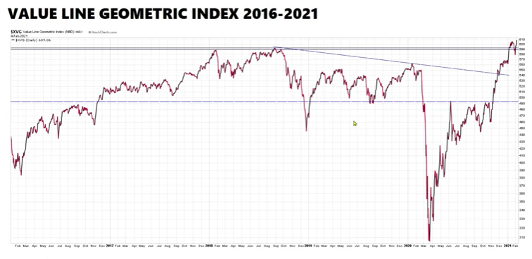
This is another indication of the strength of the uptrend that goes overlooked by many market participants and quacking ducks. And yes, we’ve all heard the excuses as to why the ducks were quacking when the market was being led off the lows from March by a handful of names and now everything is seemingly rising, to excuse the new bull market and label it a bubble by the quacking ducks. It seems to me, the ducks are always quacking. So one more set of charts before we get into economic data and earnings.
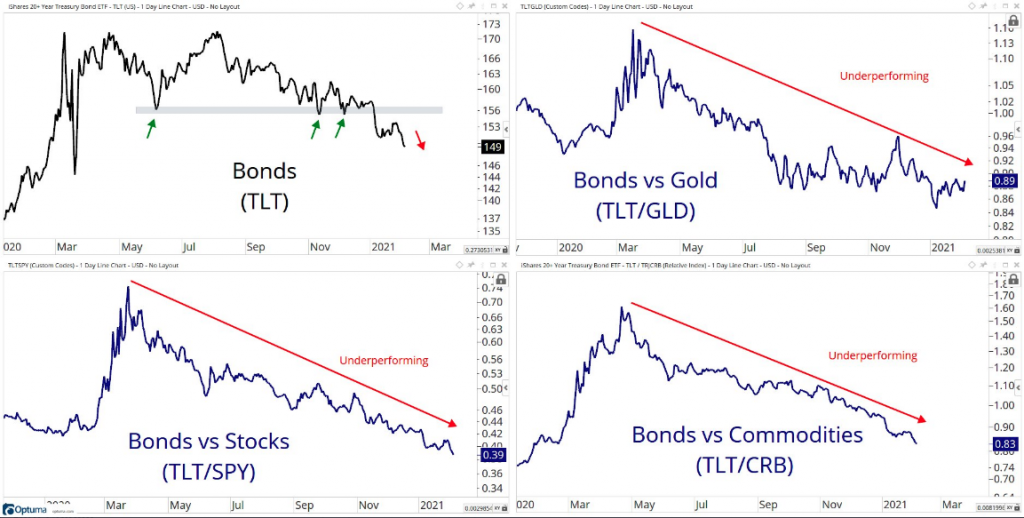
Risk appetite is real folks, safe haven bonds have been seemingly out-of-business since March 2020. Is this really where you want to invest your capital? Relative to just about every other asset class, bonds are losing value. The talking heads on CNBC continue to suggest and even warn that rising yields (bond prices and yields work inversely, yields go up as prices go down: selling bonds) will deal a heavy dosage of reality to risk appetite sooner or later. AND THIS MAY BE TRUE!!! But it will LIKELY ONLY BE A TEMPORARY PAUSE! The reality is that the directional performance of yields makes no difference to stocks, as identified by the Bank of America relative performance chart below:
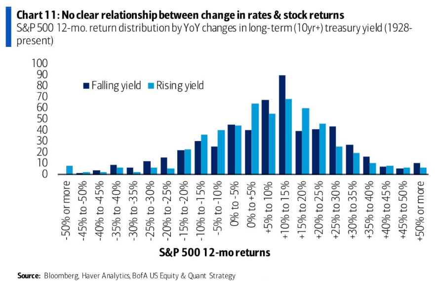
So do I think a temporary pause can happen in the S&P 500 if the 10-yr. Treasury yield gets above 1.25% or 1.35%? Yes, I do? But so long as earnings are still up-trending, investors will still buy stocks. I’m not adverse to a stock market that consolidates for time more so than price. That’s precisely what just happened in the first 5 trading weeks of 2021. The S&P 500 consolidated for time before achieving yet another new, all-time high.
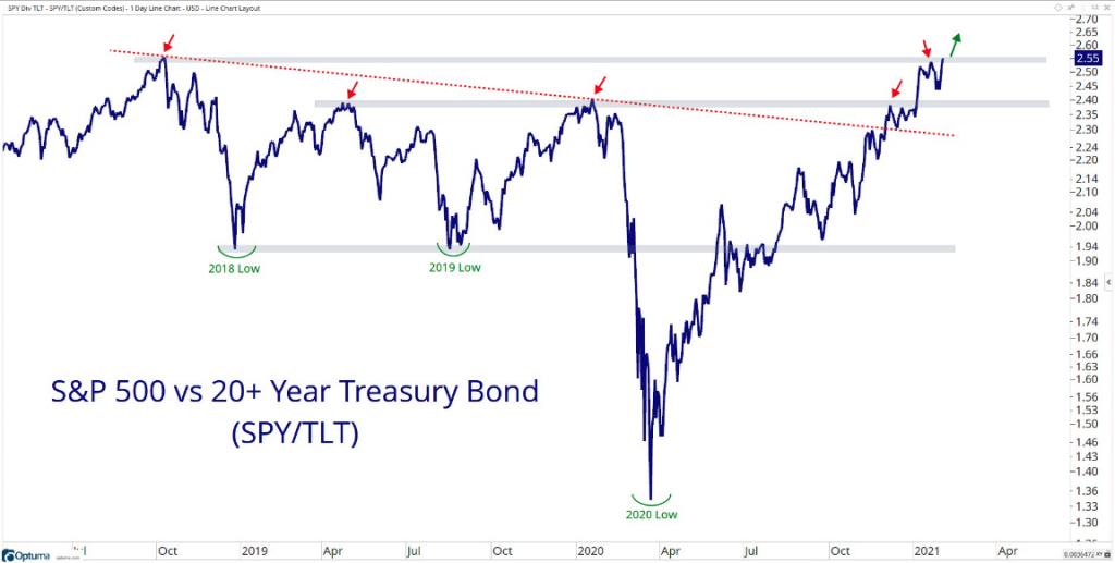
The chart above (Grant Hawkridge, London-based) is another great representation of risk appetite since the March 2020 cyclical bear market lows. The relative performance of stocks:bonds has come to a significant point in time whereby it has finally achieved the 2018 highs. A break above this resistance level and, well, don’t be surprised if the permabears and quacking ducks get louder!
Economic Data Overiview
I’m going to reiterate what we’ve offered with respect to economic data coverage since December of 2020:
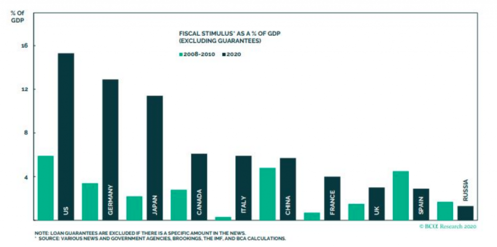
“Prior to the New Year, realizing a New President and new fiscal package would lend support if not provide a bridge to herd immunity from the virus, we recognized that the economic data would hit a soft patch and reemerge with gusto. As such, we have limited the amount of economic data coverage, as the fiscal relief would prove more than enough and find consumption rising once again from the soft patch late last year. The chart below recognizes the amount of fiscal relief around the world, aimed at fighting the adverse affects from the pandemic. The chart doesn’t even reflect the January 2021 fiscal relief package passed. Now, i’ll attempt to briefly offer some points of interest on the recent economic data before delving into earnings season results, which are of greater investor importance.”
Finom Group is not asking anybody to appreciate the national deficit increasing by leaps and bounds in 2020 any more than we are asking the individual investor to appreciate the void of political will for recessions and bear markets. Having said that, what we prefer as investors is not how we should allocate capital. This is the political will and national deficit trend we have, and a such, this is how the market responds to such variables, outlining how we would best position investing capital in order to achieve our goals.
This graphic from Bespoke Investment Group below says as much about “recovery” here in the U.S. and around the globe, as any other chart I can offer pertaining to the economy.
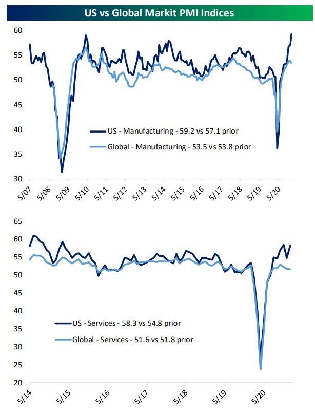
The performance of the global manufacturing sector remained solid at the start of 2021 despite more COVID issues. Although the J.P. Morgan Global Manufacturing PMI eased to 53.5 in January, down from 53.8 in December, it remains at one of its highest levels over the past three years.
European results were generally improved sequentially and better than expected, while Spain slipped back into contraction. Overall confidence in the business outlook improved to a three-year high in January within the Eurozone.
Chinese data is coming off a record high in November and remains in expansionary territory. Japan’s report showed a modest decline for the month indicative of a pause after their rebound. India posted the strongest improvement in the health of its manufacturing sector in three months.
What we are witnessing is a rebound that has paused and is slightly off its rebound highs. However, let’s not lose sight of the fact that this data remains in the range of where economic activity has operated for the last 10+ years. Add in the fact that economies are still not fully open and this recovery is astonishing. Service and Manufacturing activity at these levels is a PRIMARY reason global stock market trade at the levels they are today.
It’s a bit odd to see another strong ISM services report this past week, but even with that segment of the economy “handicap-abled”, it rose to levels we usually don’t see until the peak of an economic cycle. A survey of top business leaders at non-manufacturing companies such as banks, hospitals and home builders rose to a two-year high of 58.7% from a revised 57.7% in the prior month, the Institute for Supply Management said Wednesday.

WHAT RESPONDENTS ARE SAYING
- “Many of our restaurant locations remain completely shut down to on-site dining. We remain optimistic about business trends beyond April/May 2021. [We] have a very challenging few months to go.” (Accommodation & Food Services)
- “Orders for new business have picked up. Labor is still the major impediment to the business.” (Construction)
- “Seasonal reduction of activity due to winter break from campus activity.” (Educational Services)
- “Start of 2021 on track with a positive outlook.” (Finance & Insurance)
- “Increased number of COVID-19 patients has forced the cancellation of elective surgeries. Bed capacity limited.” (Health Care & Social Assistance)
- “The copper shortage is slowing deliveries of key network equipment.” (Information)
- “Still working under COVID-19 restrictions and uncertain political climate.” (Mining)
- “Overall, everything continues to be more optimistic; however, we are still seeing impacts from suppliers that are being affected by limiting staff due to COVID-19 restrictions.” (Other Services)
- “Post-holidays spending is up. Many capital projects and expenditures are coming to fruition.” (Public Administration)
- “Business outlook for 2021 looks better. Companies are optimistic that conditions will start improving by the end of the second quarter.” (Retail Trade)
- “Business outlook for 2021 is positive with projects and capital investments moving forward. Target financial objectives have been obtained.” (Utilities)
- Good start to the year; business has promising growth. Market conditions are still affected by logistics issues, both domestic and international. Also, prices for raw material prices and freight are increasing up, by 4 percent to 13 percent.” (Wholesale Trade)
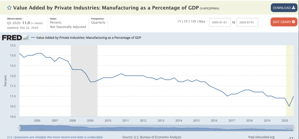
As I’ve said many a time before, the obstacles laid in front of the service industry, rendering it at ~64% capacity, has found much of the consumer wallet aimed at goods rather than services. Seeing the service sector surveys at these levels should be analyzed better for it’s forward-looking value more so than actual present conditions. Remember, these surveys are considered soft data. Moreover, once the economy fully reopens, one should expect the economic conditions that find consumer services of greater demand than consumer goods manufactured in the United States. A history of manufacturing in the United States, as a percentage of GDP, tells a long and detailed story of how the U.S. economy has increasingly favored services over manufacturing goods locally.
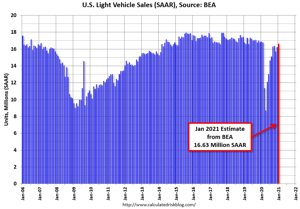
Auto sales estimates were released this past week. The BEA released their estimate of light vehicle sales for January this morning. The BEA estimates sales of 16.63 million SAAR in January 2021 (Seasonally Adjusted Annual Rate), up 2.5% from the December sales rate, and down 1.5% from January 2020. This was above the consensus estimate of 16.3 million SAAR.

Since April, sales have increased, but are still down on a year-over-year basis.
The first Friday of a new month is typically jobs and employment week. Private sector employment increased by 174,000 jobs from December to January according to the January according to the December ADP National Employment Report. The report, which is derived from ADP’s actual payroll data, measures the change in total Nonfarm private employment each month on a seasonally-adjusted basis.
The results came in far higher than economists expectations at roughly 50,000 for the month of January. This better-than-expected result found firms boosting their projections for the monthly Nonfarm payroll number released Friday.
- Goldman on NFP: “we boosted our Nonfarm payroll forecast by 75k to +200k ahead of tomorrow’s release”
- Merrill on January NFP: “We expect nonfarm payrolls to grow by 200k in January after declining 140k in December. While we expect further job gains, we expect the unemployment rate to remain sticky at 6.7% as more workers reentered the labor force.”
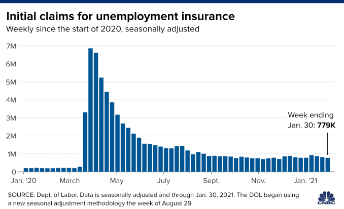
Unfortunately, the enthusiasm, underscored by the ADP payroll report, was not met with a similar outperformance. Firstly, however, let’s briefly take a look at weekly jobless claims before jumping into a review of the NFP data.
First-time claims for unemployment insurance totaled 779,000 for the week ended Jan. 30, the Labor Department reported Thursday. That was below the 830,000 estimate from economists surveyed by Dow Jones. The reading was the lowest since November 28, 2020, as reported by CNBC.
Continuing claims also continued to drift lower, falling 193,000 from the previous reporting week to 4.6 million. The pandemic-era peak for continuing claims was 24.9 million in early May. Continuing claims data runs a week behind first-time claims.
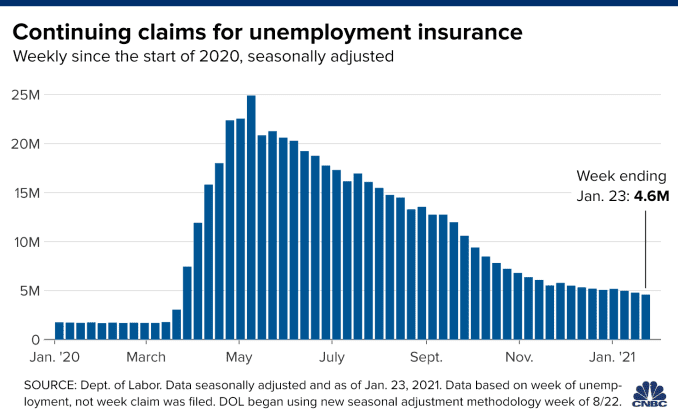
In addition, the total of those receiving benefits fell sharply, dropping by nearly half a million to 17.8 million. That reflects a continuing decline of those getting benefits under pandemic-related programs that were slightly offset by those on extended benefits.

So while we saw some modest improvements in the employment data leading up to Friday’s release of the January Nonfarm payroll report, the data proved less than ideal depending on which side of the fence you fall. Are you a glass half empty type of person, or glass half full?
Job growth returned in January, with Nonfarm payrolls increasing by 49,000 while the unemployment rate fell to 6.3%, the Labor Department said Friday. November’s increase of 336,000 was also revised down to show a gain of 264,000. December’s numbers overall were worse than initially reported, with the month posting a loss of 227,000 from the initial estimate of 140,000.
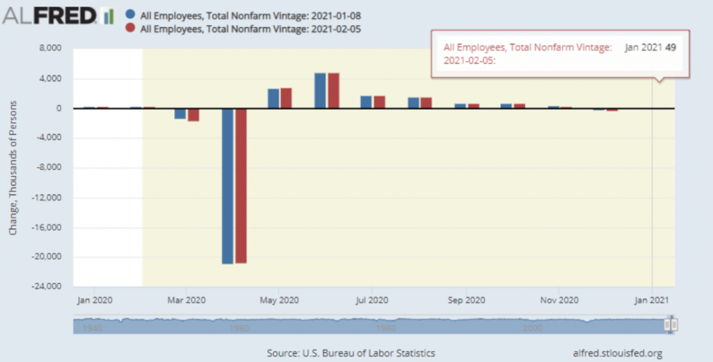
The sharp drop in the unemployment came as the labor force participation rate edged lower to 61.4% and 406,000 workers left the labor force. However, a more encompassing measure of unemployment that includes discouraged workers and those holding part-time positions for economic reasons also fell, dropping to 11.1% from 11.7% in December.
Just over 10 million remain unemployed, 4.3 million more than a year ago though the number decreased by 606,000 in January. Companies slashed jobs in March and April to combat the Covid-19 pandemic, and most sectors remain below their pre-pandemic levels.
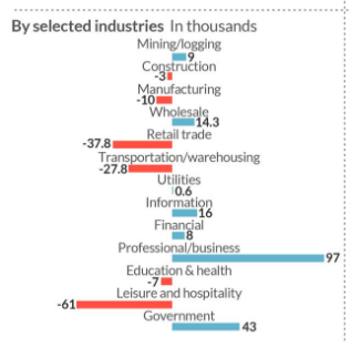
The damage has been particularly acute in the hospitality industry, as governments across the country have forced hotels, bars and restaurants either to close or operate at reduced capacity to halt the coronavirus spread. The hospitality sector lost another 61,000 jobs in the months after suffering a downwardly revised exodus of 536,000 in December.
While there are many puts-n-takes from the latest round of employment data, let’s not lose sight of the big picture and something the stock market has largely already calculated. Recall from our early January Research Report the following:
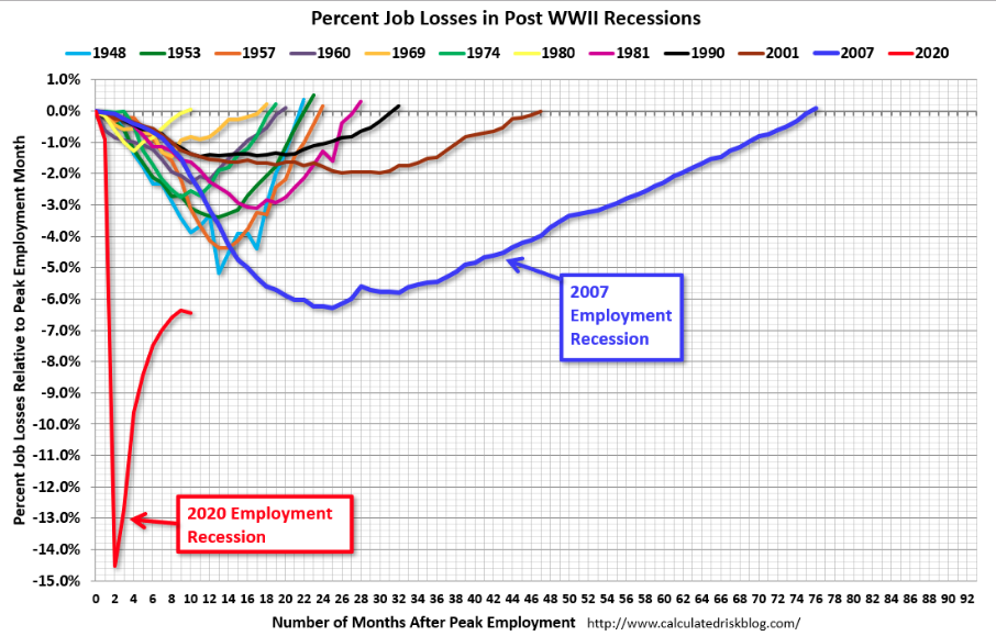
“Undoubtedly, the latest round of labor and employment data is being affected by the additional economic restrictions imposed over the lsat 6-7 weeks, across the nation. Nonetheless, the chart of percent job losses for each recession since WWII suggests that this is actually the fastest employment recovery since that time period. The jobs will come back, per the chart, they always do and it is just a matter of “by when”.
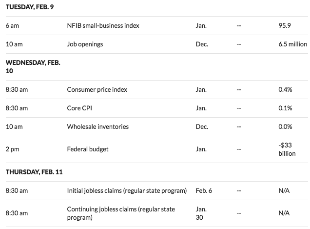
For the upcoming week, here is a look at the economic data docket from MarketWatch. It’s a very light week with no significant economic releases due out on Monday.
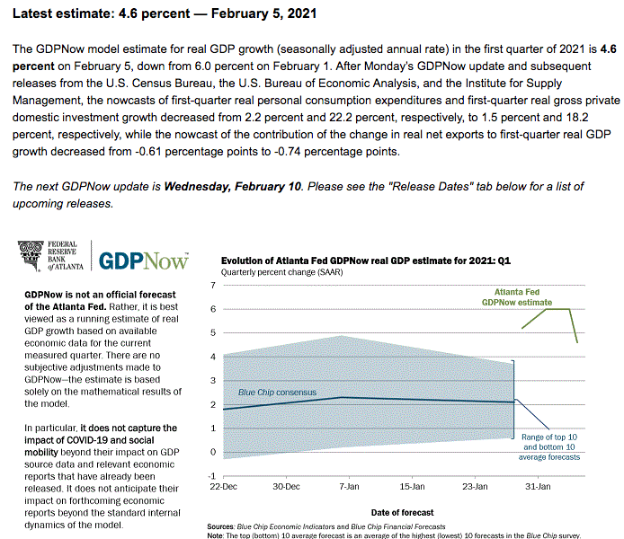
In the realm of GDP tracking for the Q1 2020 period, we would expect a continued margin of error amongst the models to come from a combination of unique headwinds (regional economic restrictions/COVID) and tailwinds (fiscal/monetary policies). Nonetheless, here is the latest look at the more widely followed Atlanta Fed GDPNow tracking model:
Another, now more popularly referenced economic activity tracker is the Weekly Economic Index introduced by the New York Federal Reserve Bank.
- The Weekly Economic Index (WEI) is an index of 10 daily and weekly indicators of real economic activity, scaled to align with the four-quarter GDP growth rate.
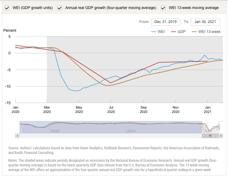
In both economic activity trackers, we can identify a slowing of sequential economic activity in the early parts of Q1 2021.
Let’s Talk About Earn-Ings Baby, Let’s Talk About You and Me
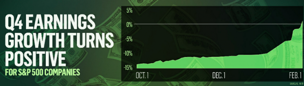
Let’s talk about all the good things, and the bad things that, can, be, let’s talk about se… earnings! Name that tune! And group! Earnings have turned positive folks! That’s right. As of this past week, we are now seeing YoY earnings growth for the Q4 2020 period. The Q4 earnings growth rate has turned positive, buoyed by huge beats from AMZN and GOOGL this past week. At the start of the year, analysts were expecting a ~10% drop in Q4 earnings, but my how things have changed!
As Finom Group has offered for months now, “We expect upwardly revised Q4 EPS to give way to FY2020 EPS with a $140 handle.” The realization of this outlook is now at-hand. Last week, FactSet was tracking Q4 2020 EPS as follows:
“After 2 full weeks of earnings season, and as I estimated, FactSet has continued to positively revise their tracking model. As of today, the S&P 500 is reporting a year-over-year decline in earnings of -2.3%, compared to a year-over-year decline in earnings of -4.8% last week and a year-over-year decline in earnings of -9.3% at the end of the fourth quarter.”
Fast-forward to the end of a highly anticipated earnings week and the positively revised FactSet tracking model now expresses earnings growth for the Q4 2020 period. The blended earnings growth rate for the fourth quarter is 1.7% today, compared to a year-over-year decline in earnings of -2.4% last week and a year-over-year decline in earnings of -9.3% at the end of the fourth quarter. Positive earnings surprises reported by companies in the Consumer Discretionary and Communication Services sectors were the top contributors to the improvement in overall earnings for the index during the past week. Positive earnings surprises reported by companies in the Financials, Information Technology, and Communication Services sectors have been the top contributors to the overall increase in earnings since the end of the fourth quarter.
Insight/2021/02.2021/02.05.2021_EI/S%26P%20500%20Earnings%20Growth%20Q4%202020.png?width=920&name=S%26P%20500%20Earnings%20Growth%20Q4%202020.png)
In terms of revenues, 79% of S&P 500 companies have reported actual revenues above estimates, which is above the five-year average of 62 percent. Due to the number and magnitude of these revenue surprises, the blended revenue growth rate for the fourth quarter is higher now relative to the end of last week and relative to the end of the fourth quarter. As of today, the S&P 500 is reporting year-over-year growth in revenues of 2.7%, compared to year-over-year growth in revenues of 1.6% last week and year-over-year growth in earnings of 0.1% at the end of the fourth quarter.
Insight/2021/02.2021/02.05.2021_EI/S%26P%20500%20Revenue%20Growth%20Q4%202020.png?width=920&name=S%26P%20500%20Revenue%20Growth%20Q4%202020.png)
So this is great news right? Stocks should be climbing after such strong quarterly top and bottom line outperformance, right? Firstly, remember that the market is a forward-discounting mechanism. That which is being reported in the way of earnings is likely already baked into individual and overall market prices.
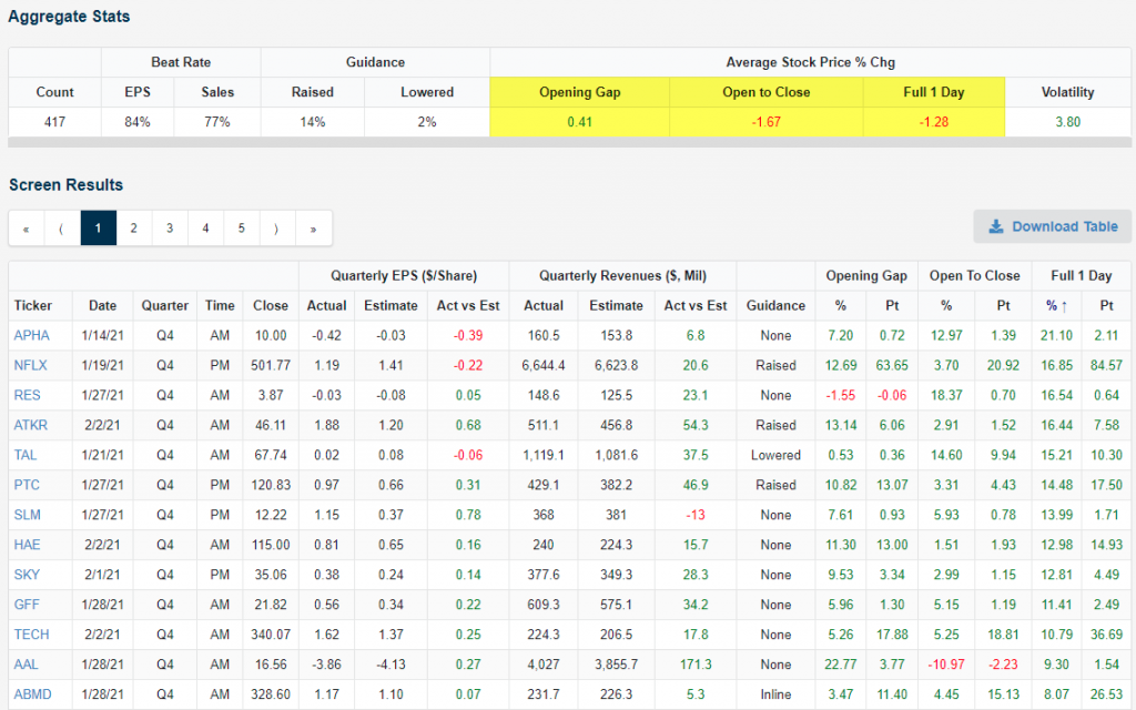
On average, stocks that have reported have gained 0.41% at their first open of trading after their earnings release. This means stocks are initially reacting positively to the earnings news. From the open to the close of trading after the initial gap higher, though, stocks that have reported have averaged a decline of 1.67 percent. Combining the opening gap and the open to close move, the average full one-day change for stocks reporting earnings stands at -1.28% this season. That’s a pretty bad number that’s indicative of a “sell the news” reaction.
The snapshot below, from Bespoke, also shows the stocks that have reacted the most positively to their earnings reports so far this season. Pot-stock company Aphria (APHA) has seen the best reaction of any company to report so far with a one-day gain of 21.1 percent. As it stands now, Netflix (NFLX) has seen the second-best reaction to earnings with its 1-day gain of 16.85% on January 20th (it reported after the close on 1/19).
When I think of earnings season reactions what I mainly consider are the overall results and not the immediate reaction to the results. What I desire to see as an investor are on-trend results that display improving corporate conditions. As long as I see that, my bullish thesis remains intact and any downside or “sell the news” reaction is deemed opportunity. As always, with respect to looking ahead, FactSet offers it’s earnings and sales outlook below:
Earnings: S&P 500 Reporting Earnings Decline of -11% for CY 2020
- For all of 2020, S&P 500 companies are reporting a decline in earnings of -11.4% and a decline in revenue of -1.1%.
- For Q1 2021, analysts are projecting earnings growth of 21.0% and revenue growth of 5.6%.
- For Q2 2021, analysts are projecting earnings growth of 49.4% and revenue growth of 15.6%.
- For Q3 2021, analysts are projecting earnings growth of 16.7% and revenue growth of 9.3%.
- For Q4 2021, analysts are projecting earnings growth of 14.0% and revenue growth of 6.7%.
- For CY 2021, analysts are projecting earnings growth of 23.4% and revenue growth of 9.0%.
Even though the consensus analyst estimate has not yet caught up to Finom Group’s FY2020 forecast, Dr. Ed Yardeni has with his latest update (YRI Forecast).
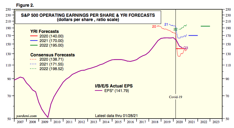
In looking at FY2021 Consensus and YRI forecasts, I will continue to promote the thesis that these forecasts are far too low and not representing some of the significant tailwinds pushing the economy forward in the back half of 2021. I would be of the opinion, just as the market understood estimates to have been overly pessimistic in 2020, the market understands the FY2021 estimates to be too low once again.
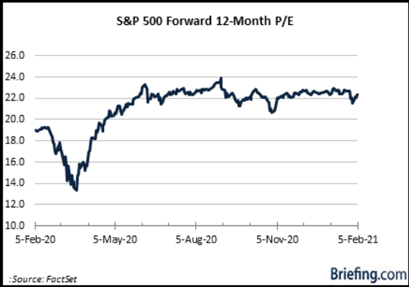
Given the element of time, as earnings prove-out, even the P/E has come in a bit of late, as expected. The forward 12-month P/E ratio for the S&P 500 is 22.0. This P/E ratio is above the 5-year average (17.6) and above the 10-year average (15.8).
And please don’t get the “Prince” upset regarding valuations and a P/E, which is still near dotcom levels for the S&P 500. One must recognize the structural shift in the economy that lends to a compositional shift in S&P 500 sectoral earnings and cash flows.
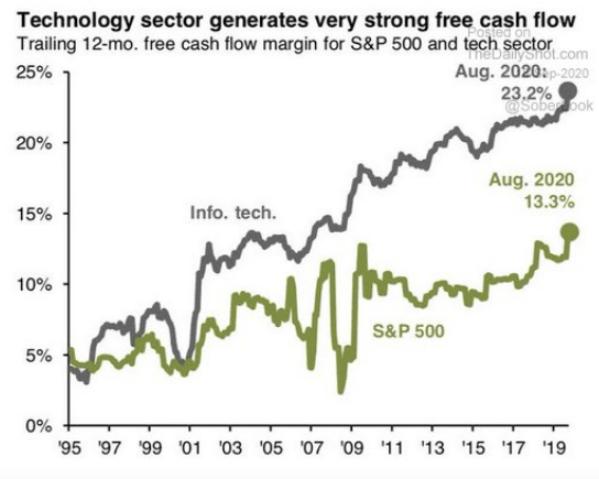
- Free cash flow strength is the strongest investor impulse.
- S&P Technology Sector Free Cash Flow/Share has compounded at 13%/year since 1990.
- Growth is still Tech and Tech is still growth, and yes Tech is also safety given its ability to generate strong free cash flow even through a pandemic period.
Yes, if one blindfolds themselves to the aforementioned factual representations as well as to the understanding of the S&P 500’s most heavily weighted sectors…
… they can continue to promote the bubble market thesis. They can also hope the facts will revert to fiction. But like my Pops used to say, “Son, you can hope in one hand and take a crap in the other, and see which one gets filled first.” Pearls from the King!
Weekly Wrap-Up
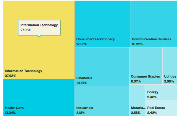
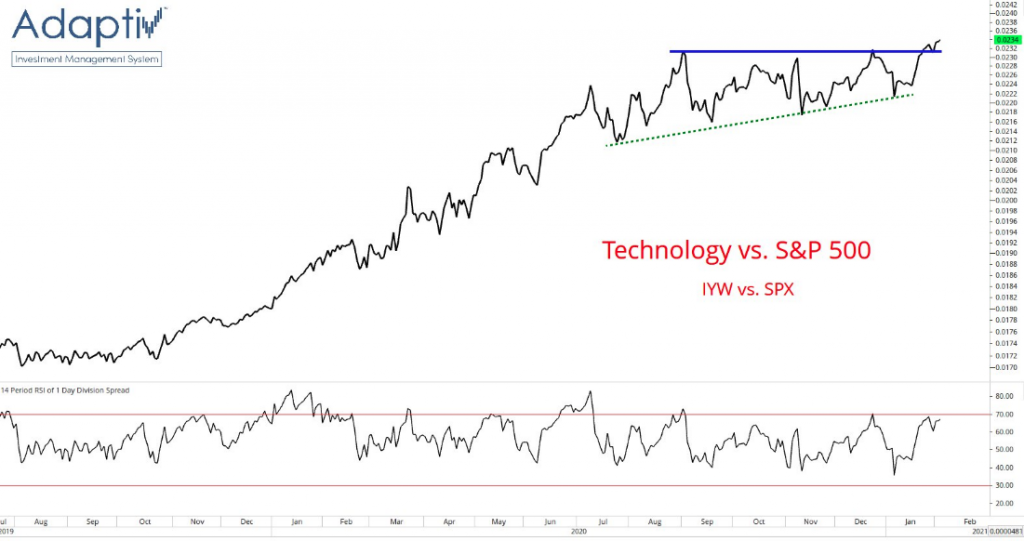
As we round out our weekly analysis, it’s no secret that the bigger contributors to the overall market and Technology sector/s have been consolidating for several months. Through earnings season, however, we’ve begun to see another healthy rotation back into Technology stocks. As offered by The Chart Report coverage, we can see such a potential relative performance breakout in the Technology sector. The top holdings in IYW include Apple, Microsoft, Google, Facebook, and NVIDIA. Tech is beginning to reassert its leadership. This is a bullish development for the broader market considering Technology is the largest sector of the S&P 500, representing more than 27% of the index.
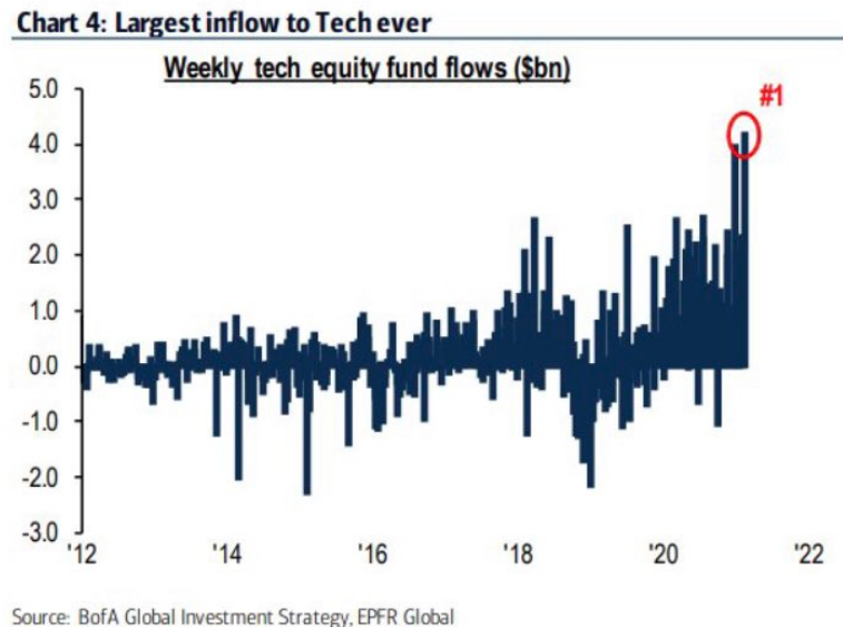
Digging into another aspect of price action, fund flows reported by Bank of America PB identify an exceptional support for technology recently and as some of the key components within the Technology sector have reported exceptional Q4 2020 results.
The tech-heavy Nasdaq has also delivered new all-time highs recently and with an extraordinary number of stocks rising within the index. As offered in the chart below from Troy Bombardia of bullmarkets.co, Nasdaq up Issues Ratio exceeded 74% for 2 days in a row recently.
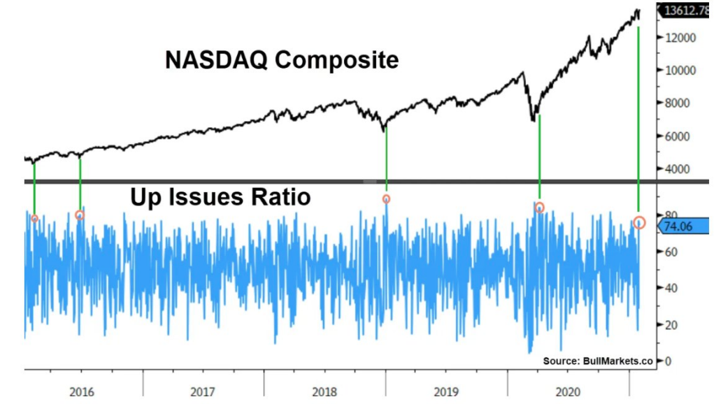
Historically, this almost always led to more gains for stocks over the next 3 -12 months.
- NASDAQ up an average of:
- +5.5% 3 months later
- +12% 6 months later
- +15% 9 months later
- +19.4% 12 months later
I don’t know about you, but those PROBABILITIES resemble strength and momentum, something technology and the Nasdaq have come to resemble more so than it’s peer indices based on structural index components. And why not…The combined annual revenue of the 4 largest U.S. companies, weighted in the index, has surpassed $1 trillion for the first time…
- Apple (AAPL): $294 billion
- Microsoft (MSFT): $153 billion
- Amazon (AMZN): $386 billion
- Google (GOOGL): $183 billion
That’s larger than the GDP of all but 16 countries. Their combined market cap of $7.2 trillion is over 22x higher than where it was at the lows on March 9, 2009 ($326 billion). I’m not in the business of fighting against such titans of industry, which is why I own AAPL in the Golden Capital Portfolio.

As we progress through 2021, investors are likely to be confronted with doom and gloom narratives, which are likely to be coupled by “bubble” narratives. I come across these narratives, literally, on a daily basis and as depicted below.
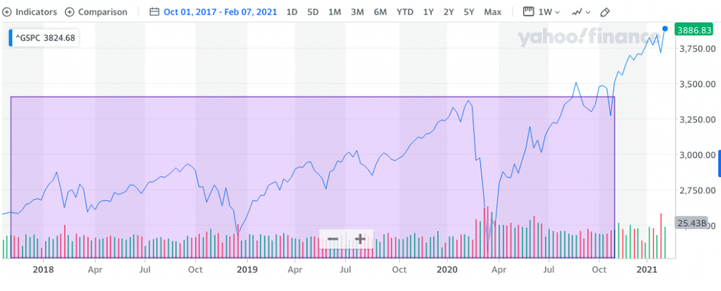
I think the price action, to the upside, over the last 10-months (74% rally) finds many investors/traders losing sight of the bigger picture, the last 3+ years. Taking historical examples of bubbles like the Nikkei in 1989, Nasdaq in 2000 or commodities in 2008, and several other bubbles in broad asset classes that appear to be quite similar, assets tend to quadruple (~300% return) in a period of ~3 years. If one looks at the performance of the S&P 500 over the last ~3 years, it is up a bit over 30%, and it would not fit the profile of a broad asset bubble. This is especially true given the amount of fiscal and monetary easing in that time period and given that many value and cyclical stocks are actually down over the past 3 years. Some might argue the market has barely even broken out, let alone be found for bubble-like qualities. (SPX chart from late 2017 to present)
The trend has been a friend of the bulls, and sword that slices through bearish commentary for months now. The trend has been supported and validated by strong breadth and sector rotations in perpetuity. Having said that, let’s look at what breadth may identify in the way of forward-looking returns in the latest study/data from Troy Bombardia, but this time by way of the S&P 500. As we have heard many times in recent months, the S&P 500 is overbought, overextended and overheated.
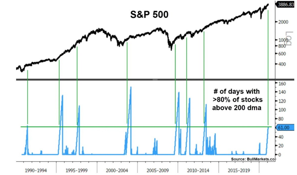
The S&P 500 just witnessed 61 consecutive days with more than 80% of its stocks above their 200-DMA. Historically, this consistently led to more gains for the S&P 500 on every time frame.
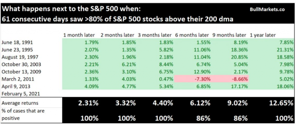
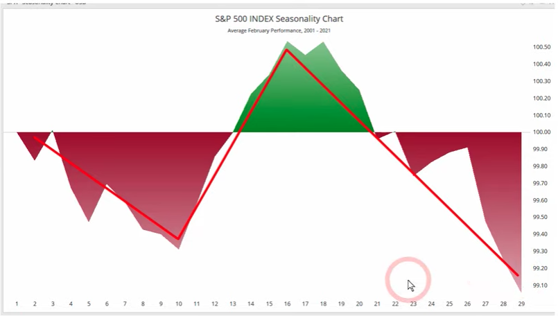
Is that another 12-month, double-digit return on average we see in the study above. We’ve demonstrated a goodly amount of studies over the past quarter (TOY Barometer) which point to such probabilities and this just adds to the pile, so to speak. While everyone has turned their attention to the month of February and seasonal headwinds that malign the market’s performance in February, let’s continue to look out toward the distant horizon. (February SPX 2001-2020, Arthur Hill)
The new cyclical bull market, within a secular bull market, is going to lose and leave many investors behind. I have learned over 22 years of investing that it really doesn’t pay to be a “top caller”. Many try, and just about everyone fails and resorts to claims of market manipulation or adopting a hatred of the Fed. The history of top callers litters Wall Street research firms, blogs, Twitter, StockTwits and investment sites. The bottom line for an investor/trader is that if you have the underlying trend right, you have the keys to the kingdom. So says Prince Akeem!
Remain flexible, open-minded and expect bumps in the road as we travel through 2021. Trade safely-er 😉


