
Another day on Wall Street meant another day of equity market gains, while Bonds also continue to rally and with yields moving ever-lower. It seems a paradox and concerning to many, but as Quantitative Easing manipulates the otherwise normal correlation between stocks and bonds, a new normal may be developing. I hesitate to herald such a new paradigm, as most investors/traders would highlight that the bond market is the “smart money”, and eventually equities will have a day of reckoning before a new paradigm is recognized as fact rather than speculation. Nonetheless, here we are and here we have been with equities performing an art of Market Symmetry that should also be understood as a truism of markets.
Finom Group’s chief market technician Wayne Nelson wrote about Market Symmetry principles in 2019, highlighting it’s recognizable place as a market truism. If you don’t believe the market has a “wash, rinse, repeat” nature to it, you have to read this article folks!
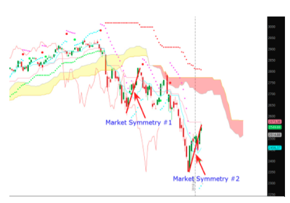
Enter: Market Symmetry
“And then there’s Market Symmetry. The theory that buy and sell patterns repeat themselves. It is a little known, yet incredibly powerful aspect of Technical Analysis and is indisputable when looked at with an objective perspective.“
And why is this so relevant today, you might be asking? The following chart identifies a bit of unfinished business for which the market and/or investors demand completion of sorts. You’ve likely heard the phrase, “all gaps get filled”. This is not just a truism of markets, but an aspect of Market Symmetry highlighted in Nelson’s article. As a rule of thumb, yes, more than 90% of markets gap in price do eventually get filled. Think of it as the market revisiting the scene of a crime. The crime is the unfinished business or the gap created from one price to the next getting filled with daily advances or declines back and through said gap.
The following chart is an older S&P 500 chart, from the June 2020 period. Off to the left side of the V-formation, it shows a gap in price created back in February 2020.
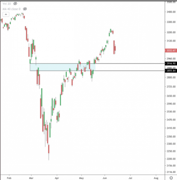
In the chart above, all gaps to the upside have been filled but for one at 3,328. If Market Symmetry and/or the unfinished business of markets is to be completed, one can make the argument that the S&P 500 will eventually fill this gap. In a new regime of algorithmic trading, we can also expect such gaps to be filled more quickly than in past regimes as fund managers of size and scale code such algorithms to execute orders up to and around the defined price levels. And yes, there remain two open gaps, identified in the above chart, that remain open at 2,955 and 2,863. It serves to figure that these gaps will eventually get filled or they will become the less than 10% of gaps that don’t get filled.
The market had the opportunity to fill those gaps to the downside. The last time the market offered a chance to fill the downside gap was on 6/15/2020, when the S&P 500 dropped intraday and down to 2,965. The benchmark indexed bounced from there and really hasn’t looked back since, largely remaining above its 200-DMA.
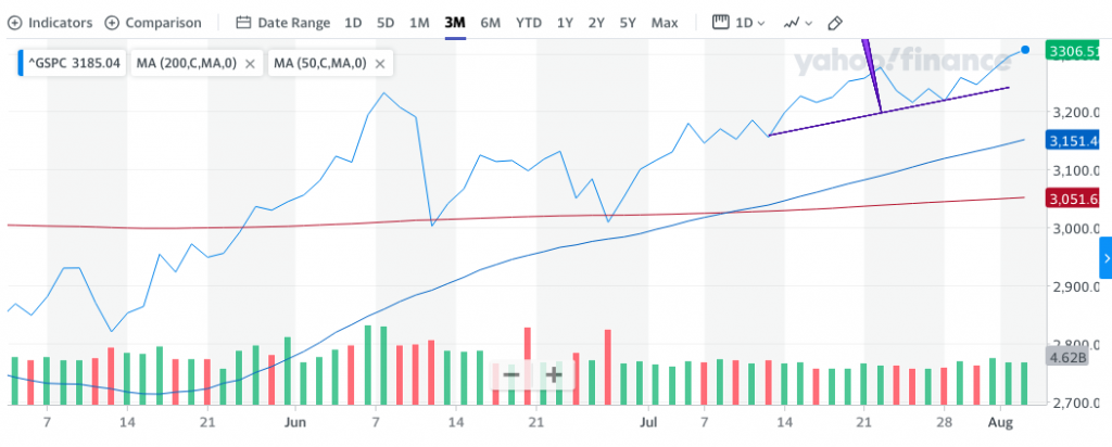
The S&P 500 chart above identifies the 200-DMA (red line) providing support for the benchmark index throughout June, as Market Symmetry was expressed on two separate occasions. Also identified in the chart is a rather sizable gap between the benchmark index and where the upward sloping 50-DMA resides. At roughly 2 std. deviations above its 50-DMA, the S&P 500 is arguably at a level where it usually attempts some degree of consolidation and tests the support of the moving average. Investors like to lock-in profits, they simply need an excuse to do so. A consequential macro or geopolitical headline has offered such an excuse for investors in the past.
Market Symmetry and/or consolidation of gains is frequently the excuse for which analysts and strategists often offer alerts for investors to consider. Mike Wilson of Morgan Stanley and Charlie McElligott of Nomura have been offering such consolidation of gains for some time now. These two strategists for their respective firms and clients have been of the worst forecasters over the last couple of years to be perfectly honest and with evidenced chronicling. This does not presume they will continue to hold this distinction, but facts are facts. With that being said, let’s travel back to May of 2020, where both were calling for markets to pullback: (See below from our former article)
- Sell in May and go away, right? Nomura’s managing director of cross-asset macro strategy, Charlie McElligott, is on the go-away side. He expects that the next few months will deliver lots of bad corporate and economic news.
“I think for retail investors who probably missed that rally last month and are scratching their heads on why we rallied, the danger is now they try to chase, and think the rally has more legs from here, because much of the macro hedge fund space is really setting up for a move lower again,” McElligott told MarketWatch in an interview.
Those funds have made their equity money and are looking at safer shores like gold, notes McElligott. The Financial Times notes the same.
In a separate note to clients, he said, “We are now in the ‘already squeezed the reasons for optimism out of the toothpaste tube’ phase and into ‘the hard part 2.0.” Those “reasons” include unprecedented stimulus, an inevitable curve flattening in U.S. cases and deaths, reopening plans and optimism over Remdesivir clinical trials.
Summer could bring “hard economic data collapsing like we’ve never seen before, terrible corporate guidance, stories of pending bankruptcies,” and a second wave of layoffs that will hit the white-collar sector, warned McElligott. Rising trade-war rhetoric from the White House as a presidential election campaign heats up could present more risk, he added.
“That’s why I think folks are getting ready to hit the wall again, with this idea we’ve moved out of stabilization and now we’re back into the harsh reality of what this is,” without having a Federal Reserve boost and no more stimulus checks until things get a lot worse.”
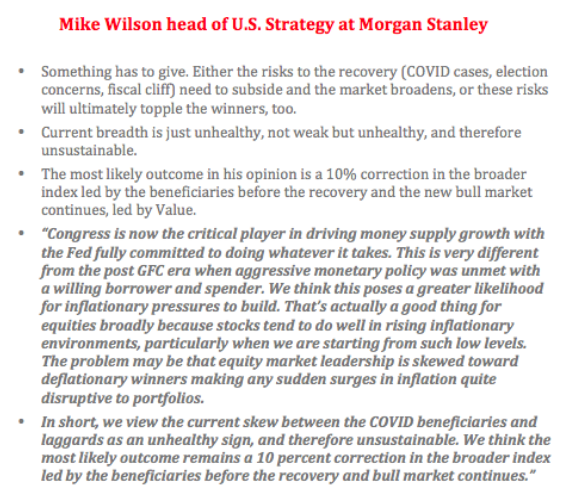
- Mike Wilson, chief U.S. equity strategist at Morgan Stanley, sees a 10% correction potentially playing out near-term, but expects that 2,650 level on the S&P 500 will be “vigorously defended.”
“In the end, we believe this will be the pause that refreshes, and necessary for the higher prices we expect later this year,” Wilson told clients.
With respect to the calls for a pullback by both strategists, neither prediction came to pass. Simply put, the market continued to travel higher throughout May, into early June and before consolidating, but well above the levels indicated by both strategists. Mike Wilson has continued to beat the “pullback drum” since that time, but with a higher consolidation are price target. My how price changes produce changes in strategist targets, no?
Back on July 13th, Mike Wilson once again called for a pullback to the 2,800-2,850 area.
“In the past few weeks we have heard more comparisons to 1999. The similarities are numerous, but so are the differences. We do not think the US equity market is about to enter a narrow 1999 type blow-off move led by the Nasdaq. Instead, we believe the correction that began in early June is likely not over and has potential downside to 2800-2850 on the S&P 500. Once the correction is over, we expect a broadening of performance and leadership, with most sectors and stocks doing well in this new bull market.”
The calls for a market pullback and expression of Market Symmetry, as such a pullback would fill the downside gaps to the target zones, has not come to pass. I don’t disagree with Wilson’s sentiment. In fact, I would be of the opinion that such consolidation of market gains over the last 4 months would prove healthy for a new bull market. Nonetheless, Wilson nor I make the market rules. With that being offered, Wilson has not stopped beating his pullback drum.
It remains to be seen if this pullback call exacts a 10% pullback, which would take the S&P 500 down to 3,000 or so. Again, such a pullback would likely prove normal and healthy for a new bull market. One of the issues with these pullback calls that has been exonerated in the analysis by both aforementioned analysts is the historical data surrounding YIELD. This has historically proven of the greatest consideration amongst the investor community.
As you can see from the top table below, when the S&P 500’s dividend yield initially breaches 0.25% or more above the 10-year treasury yield, the median return in the next year is 24% and the median return in the next 2 years is 45 percent. Only in 2015 did stocks fall in the next year, which proved to be the first rate hike of the economic expansion cycle.
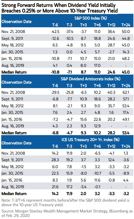
The table shows what happens to the S&P 500, also, 3 and 6 months out from when it’s dividend is above the 10-year yield. The table identifies another aspect of Market Symmetry in that human behavior is extremely consistent. Where yield can be captured, investors will flock. It’s been 3 months since May 6th, when this table was originally offered and indeed the S&P 500 has gained more than the median 8.7% offered via the historic study of yields. As such, one can’t blame strategist from heralding pullbacks to one degree or another. But if you hadn’t heeded the historic data and attempted to fight the uptrend over the last 3 months… you’re not doing it right!
Analysts and strategists have a tough job. As a former sell-side analysts I speak from experience. One of the more recent studies of Market Symmetry surrounds the natural order of market volatility. Entering the tail-end of the summer months and heading into the fall months, volatility is expected to rise. Is this what history also suggests?
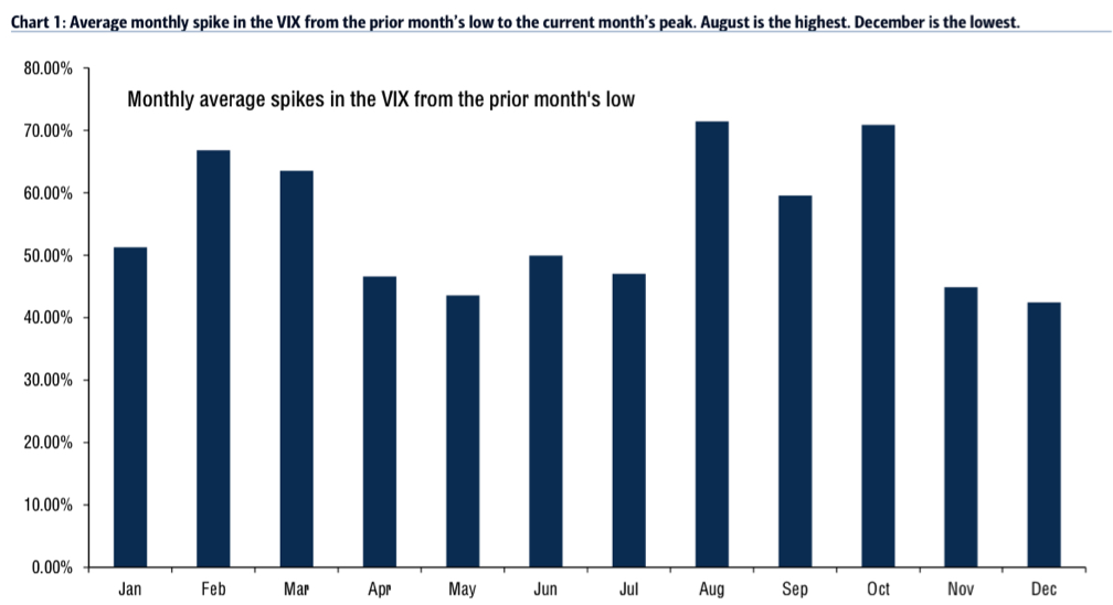
The BofA chart above offers itself as an eye-opener for market participants. It identifies that the average monthly spike in the VIX from the prior months LOW to the current month’s peak is greatest in the month of August. Given the facts before us, that doesn’t bode well for investors now does it? Well, let’s just see about that shall we?
Firstly, we’ll just look at a few statistics for August S&P 500 returns in an attempt to view the forest for the trees. Volatility is a tree; the S&P 500 returns for the month of August are the forest.
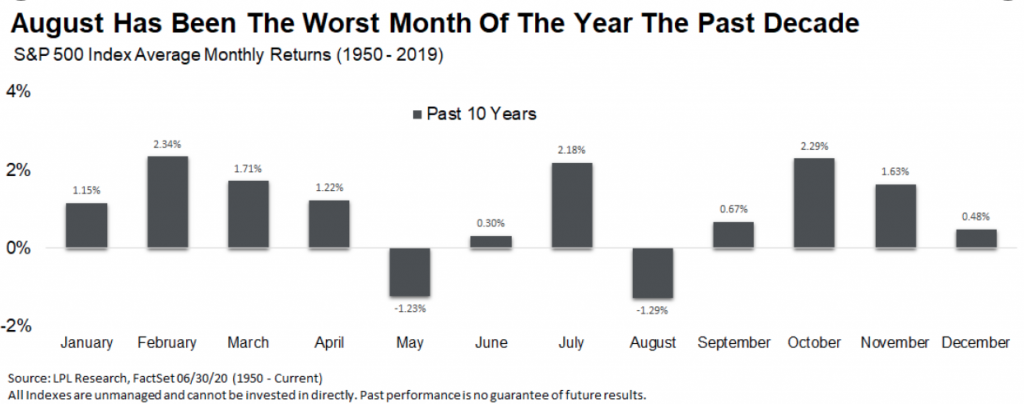
Well that doesn’t look so good now does it? August, the worst month of the year for the S&P 500 over the past decade. But… this is an election year, so let’s take our data further back and see what August typically offers during election years.
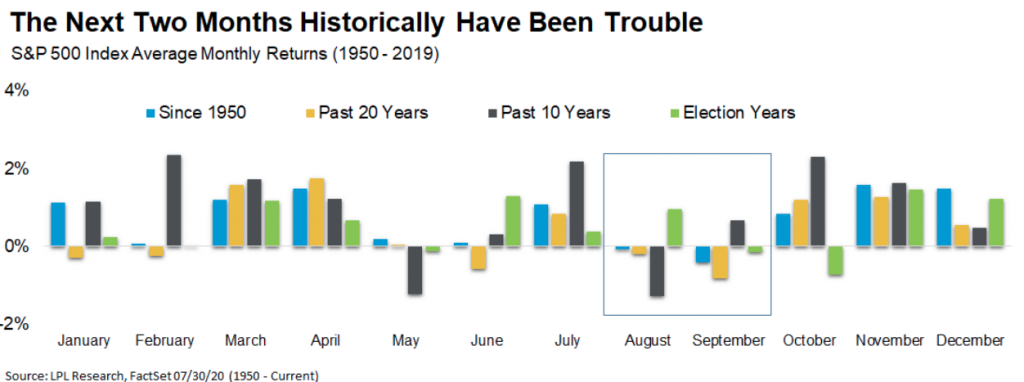
Based on the LPL Financial chart above, the August-September time frame have been troubled months for market returns. August, however, has been positive more often than not during election years and 2020 is an election year. In recognizing the election year data, it is important to recognize that in 2016, the last election cycle, the S&P 500 was down during the month of August. Thus far, the market is up in the early part of August! Some more August statistics I’ve researched for market returns in the month of August are noted below:
- In digging into August seasonality…
- Worst month of year for SPX, COMPQ.
- August is 2nd worst month of year for DJIA.
- Down last election cycle 2016
- SPX up Aug. 2012, 2014, and 2018
- Last bear market 2009, up 3.3%
So maybe it will prove out that last bullet point there, where prior bear markets produce positive monthly returns in August? Based on all the angles for August we’ve covered by way of the historic data, I would be of the opinion that risk/reward at current market levels should be the main focus for traders near-term. Investors, no worries; look for “buy the dip” opportunities.
In speaking to the risk/reward consideration, the table and SPX data are relevant for determining risk/reward going forward. (Table offered previously in mid-July)
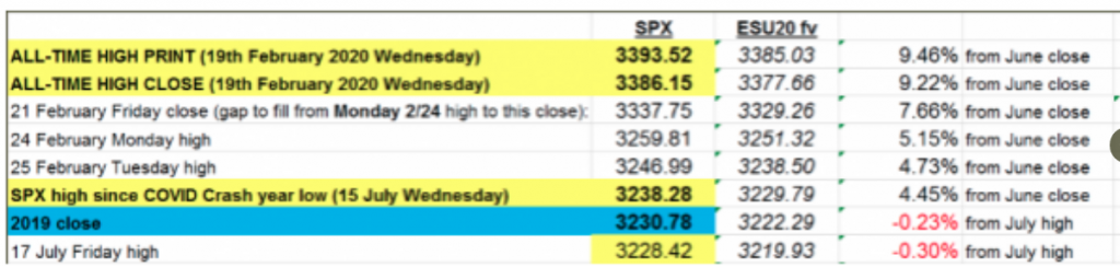
If you believe the all-time high is a near-term probability for the market, the risk/reward proves limited upside potential. The S&P 500 trend is strong and found with it’s highest closing level since the pre-pandemic period. With that being said, at 3,306 as of this Wednesday, that would put the index within 3% of its former all-time high. That’s your potential reward near-term as an investor and given the algorithmic nature of the market. What are you willing to risk should a revisiting of the former high prove the market’s mandate? It’s a fair question I think investors are approaching with caution.
Now that we’ve exhausted our look at the forest, let’s revisit the individual volatility tree. We’ve seen volatility decay alongside the market’s 4-month+ and 1,100+ point rally off the March 23rd lows. Where were we ahead of that March 23rd low?

I think the screenshot of our March 22nd headline title for our weekly Research Report to clients says it all. This was the second consecutive 20% or better market correction bottom that we’ve called. Feel free to read the report to subscribers back in March! (subscription needed)
As noted earlier, BofA depicts the average monthly VIX spike from July low VIX reading to August as being of the greatest magnitude of any month. Do you know what you’re able to do with such data… NOTHING, absolutely NOTHING! Such a data point doesn’t tell you where the VIX had been from an absolute level nor where the absolute level was in the month of August. When it comes to such additional points of interest, I think the mean or average VIX monthly close is most relevant as it offers such levels and data points of interest that can better aid investor expectations and even positioning. The chart of monthly VIX mean levels dating all the way back to 1990 offers such data.
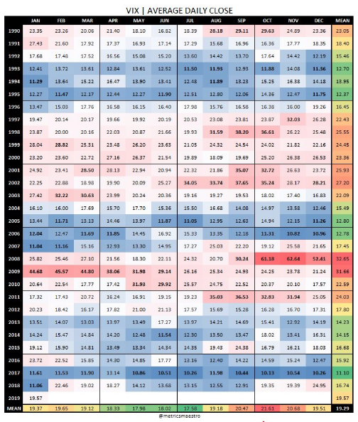
The data is presented in a heat map form. This also helps to discover the VIX regime strength or weakness heading into August. In other words: Is the VIX moving from a higher reading to a lower reading in August or visa versa? The data presented from BofA, also doesn’t help to recognize that due to less than a handful of years, both the month of August and October are greatly impacted by severe market downturns or severely depressed VIX levels going into those months, from the previous month. By looking at the heat map and if you go back to VIX origins, there are 4 culprit years 1998, 2011, 2015 & 2017 that skew the data for which the mean is most reliable in terms of August VIX expectations. Just 4 years create the outsized August VIX gains from the previous month, with 29 years of data compiled. And here is POTENTIALLY the more important and identifiable data points from the monthly VIX heat map above:
- If the VIX monthly mean was above 20 heading into August, only 2 times found the VIX higher in the month of August, 1997 and 1999. It hasn’t happened since.
- July mean was above 25 VIX.
- August historically holds the 6th best/worst VIX mean of all months.
- In other words, historically its held a 50/50 chance of having a better than average mean, higher or lower. It’s a perfect middle of the road month.
Already in the month of August, the VIX has proven to express its lowest closing level since February 21, 2020 and before the pandemic crisis came into full swing (closed below 24). This is something that was recently noted in a tweet from Chris Ciovacco as well.
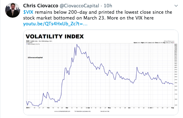
What does the first VIX close below 24 in 113 days tell us about the potential for S&P 500 returns you might be asking? Don’t you just love historic data, especially when the market does align human behavior for past precedence? The table below identifies past streaks for when the VIX “traded” above 24 and finally closed below this level, and what forward returns for the S&P 500 delivered after such an occurrence in the VIX.
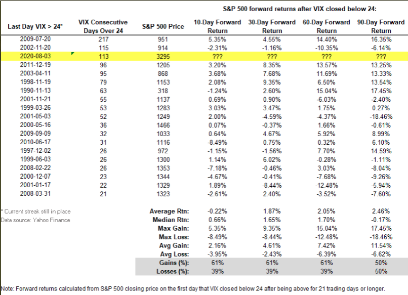
You’ll notice the 10-day forward returns were scant on average and median levels, but improved thereafter. Most recognizable in the chart above is that this proved the 3rd longest streak in history for which the VIX traded above 24, before closing below the level. Additionally, the last time this happened was in 2009, for which the S&P 500 found a bear market bottom in march and a V-shaped recovery thereafter. Sound familiar… March, thereafter? In looking at a VIX 2009 chart, we can see that in 2020, the VIX has traveled a precisely similar path.
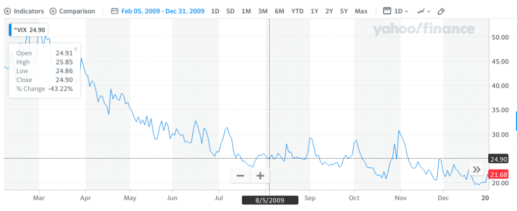
In fact, and based on 2020’s 3rd place (VIX above 24 streak) finish in the table above, the VIX is slightly outperforming the 2009 analogue depicted in the chart. If anything, we might anticipate the VIX trading sideways to slightly higher near-term and before ultimately moving lower into Q4 2020, if the 2009 continues to hold true. The macro picture has unique circumstances that may guide investor sentiment and risk appetite, but circumstances are always unique, it’s investor behavior that proves more consistent as shown in all the data above.
I’ve certainly offered investors and traders a good deal of information and analysis to consider as we traverse and trade through August. In short, there remain headwinds for investors/traders to consider, most notably the ongoing fiscal relief package negotiations and COVID-19 vaccine trials, as investors anticipate a vaccine by year’s end and a near-term relief package resolution and deliverance to the American people. Long-term opportunity still suggests the market is performing as it should, with the best returns coming during an earnings decline and recession-to-economic recovery phase. Seems disconnected on the surface and given the bountiful negative headlines, but again, the facts and historic data don’t lie.
We either ignore facts or don’t have the facts! Be in the know folks, be in the know! Trade with us daily/weekly and benefit from our daily, live Trading Room community by upgrading your membership at finomgroup.com


