While Finom Group does not offer a full-scale Research Report this particular weekend, we do have some thoughts to outline and through the following charts. The question investors have on their minds, after an 8% Nasdaq (COMPQ) correction, 10% Russell 2000 (RUT) correction, and recent 4% pullback in the S&P 500 (SPX)… then watching all major indices rally in the final 2 days of trading this past week is… “What comes next?”
Below is the updated chart on the S&P 500, 2009/2010 analogue relative to the 2020/2021 period. The current S&P 500 drawdown as of last week’s close was -1.68% starting from a peak on May 7th.
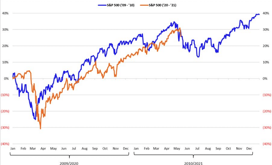
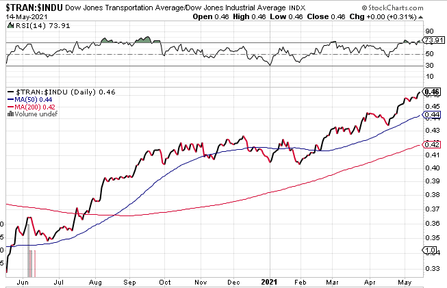
I expected the pullback to be in the -5% to -8% range; through Wednesday (5/12) it had been only -4.0 percent. While there has been a strong 2-day bounce, it is still a little too early to declare the pull back over. Either way, seasonality is probably playing the bigger impact on markets than the actual fear of rising inflation. Now let’s take a look at a couple of charts that inform of Dow Theory:
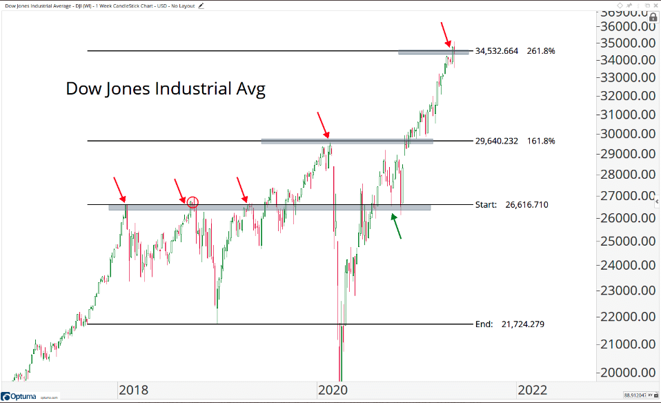
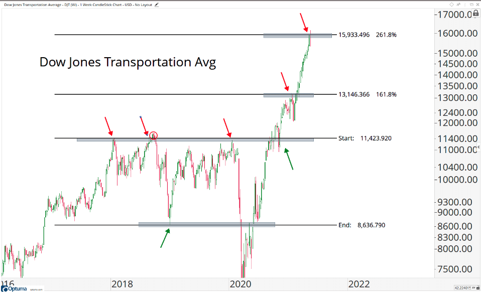
As we can see in the above charts, both the Dow Jones Industrial Average and the Dow Jones Transports have achieved their respective 261.8% Fibonacci expansion levels. With the upside objectives achieved in arguably the 2 most important stock market indexes, the question becomes whether or not now is the time to press new aggressive longs? Finom Group has been long through our MasterMind Options trade alert in Dow Industrial Average ETF (DIA) and issued a trade alert this past week to take some profits on this trade idea.
Having said that, here is a chart of leadership with respect to DIA vs. DJT. Dow Jones Transports continues to outperform the Dow Jones Industrial Average itself. This is likely a byproduct of the pandemic and post pandemic period that has become that much more reliant on spending on goods more so than services. Goods demand more shipping and transporting of course.
Given the aforementioned, Transports may hold up well relative to the Dow itself. Here is some historical data via Schaeffer on Dow Theory when Transports are outperforming Industrials as they are this year.
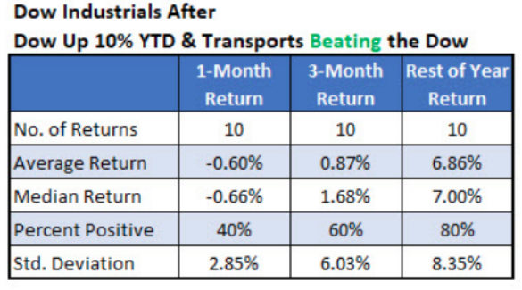
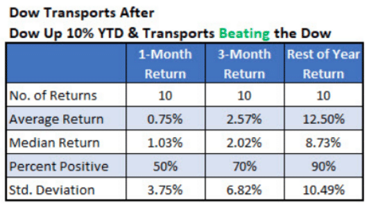
Even though we could experience some volatility near-term, this looks bullish longer-term and with Dow Jones Transports outperforming the Dow going forward. The Golden Capital Portfolio is long the Dow and owns several stocks that reside in the Dow, including Wal-Mart (WMT), Apple (AAPL), Caterpillar (CAT), and Boeing (BA). Now let’s get into some Technology and the growth part of the markets via the Nasdaq and it’s likeness.
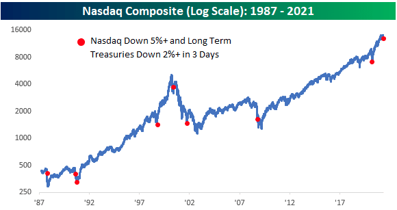
Two areas of financial markets that don’t like inflation are U.S. Treasuries and growth stocks, and in the first 3 days of this week, the Nasdaq was down 5% while long-term U.S. Treasuries were down over 2 percent. It’s not often that you see declines this large at the same time. What happens next? The average 12-month return after 8 occurrences for NDX/TNX… 31.8 percent. If we Ex-2000 the returns jump to 38.9 percent.
There continues to be a strong performance attached to the reopening/cyclical parts of the market that are less impacted by rising rates and/or inflation. It’s one of the reasons the Dow and even the small-cap Russell 2000 (IWM) have performed so well over the last 7 months. The Russell is still undergoing a consolidation period that may soon find its way to the Dow, but until it does it is just speculation, based on the weight of the evidence.
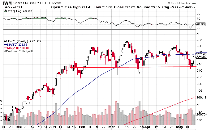
The small-cap ETF (IWM) identifies a clear line of support going back to January 2021. This past week that support was successfully tested once again, and where the bulls defended well. The next test will be to see when the IWM rises back above the 50-DMA, somewhat akin to the next achievement the Nasdaq will need to accomplish. It’s rare to see this level of small-cap outperformance compared to the Nasdaq.
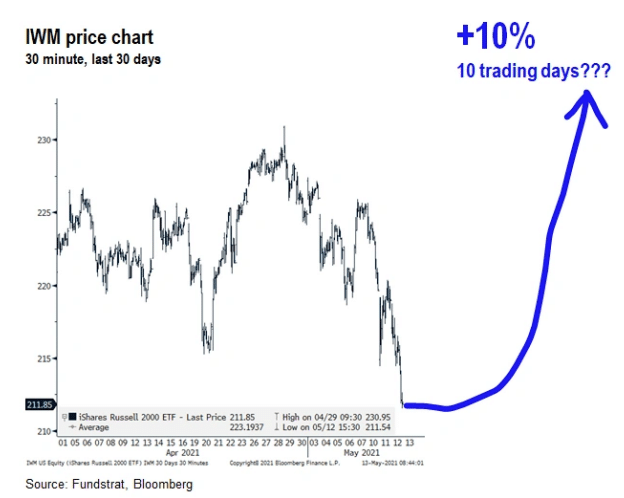
While we can’t rule out upside or downside in the near-term for the small caps, one strategists is of the opinion that the next 10 days will result in a massive move for the IWM, Fundstrat’s Tome Lee.
“STRATEGY: Tradeable low in place, with multiple factors explaining why IWM could rally ~10% over the next two weeks.
We think IWM is set for a possible surge higher over the next 10 days. This is a high-risk and tactical call. So we are not saying “bet the farm” but it is a “back up the truck moment”
- IWM/SPY DeMark ’13’ = strong signal IWM/SPY daily DeMark count registered the ’13’ (purple 13). This is a sign of exhaustion of trend. This is relative to S&P 500.
- So this is a sign that small-caps should start outperforming
- Small-caps are an epicenter proxy, so this is a positive sign for Cyclicals
- This mirrors the ’13’ seen on XLE/SPY on 4/23/2021
It’s hard to argue with the logic offered by Tom Lee above, and the highest put/call ratio YTD paired with the VIX’s substantial 2-day rally certainly felt like a capitulatory move for the major indices. It remains to be seen if Lee’s call for IWM comes to fruition, as the rally in equities also came on the heels of falling yields. The banks and financials shrugged of yields falling, which has had a tendency to halt the sector’s upward momentum. The IWM’s second most heavily weight sector is…
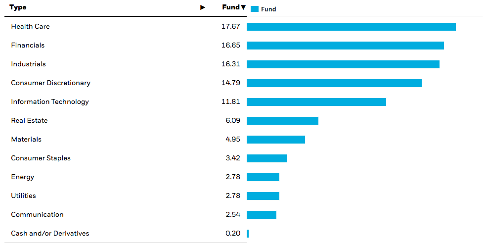
… with the yield curve steepening as quickly as it has since the start of the year, and to the degree it has (~150 bps), the heavily weighted Industrials and Financials within the IWM (IWM sector weighting chart above) have helped sustain IWM’s outperformance for the last 7 months or so and when compared to the Nasdaq/Growth/Tech. If we narrow our analysis down to looking at Financials relative to Technology i.e. Nasdaq/Growth/Tech, here is also what we discover in the chart below:
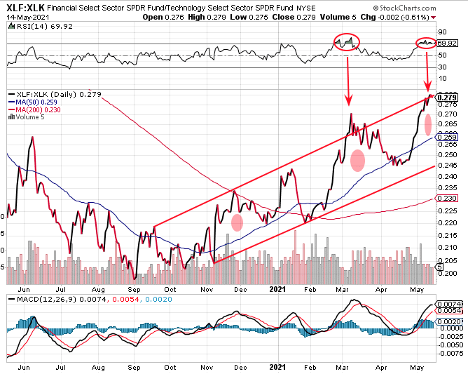
It’s clear that since November 2020, Financials have outperformed Technology in much the same way the Russell has outperformed the Nasdaq or IWM has outperformed the Nasdaq 100 (QQQ). Having said that, we can also identify a few more talking and potential trading points from the relative ratio performance chart above:
- The 14-day Relative Strength Index (top panel) has become overheated. A reading above 70, as circled in the chart, defines the RSI achieving overheated conditions. Each time this has happened in the recent past, a reversal of the relative ratio performance has commenced. In other words, Technology had begun a period of outperforming Financials.
- The performance ratio has also recently reached more than 2 std. above the 50-DMA, highlighted by the shaded circles. This has also resulted in a reversal of the trend’s performance.
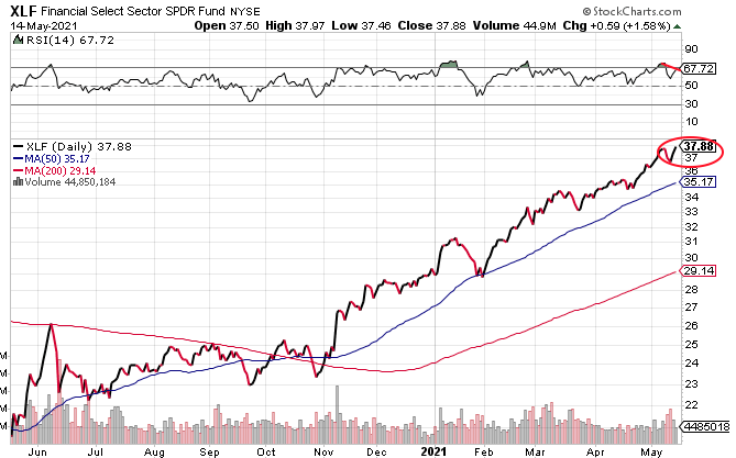
If we isolate the Financials (XLF), we can see that the ETF has closed at another all-time high this past week. The closing high also occurred with what appears to be the signs of weaker relative strength than the previous closing high i.e. a bearish momentum divergence. The absolute level of RSI is still strong, so it remains to be seen if this bearish divergence plays a role in future price action for the XLF.
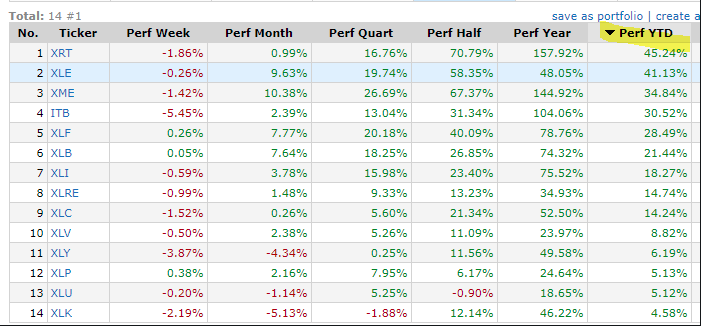
On a YTD basis, cyclical sectors have greatly outperformed growth-oriented sectors, including Technology. In fact, Technology is the worst performing sector on a YTD basis. Who would have ever thought? Underperformance, sure, but worst performer?
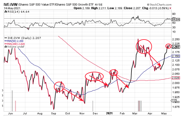
The chart above analyzes the performance of the Value ETF (IVE) relative to the Growth ETF (IVW). Much like the XLF:XLK, this relative performance ratio has shown strength since November 2020. That seems to be when investors shifted style-positioning in the market, based on the belief that the greatest yield would be found in cyclicals/value since growth had already priced in an economic recovery and lacked greater yield for the foreseeable future.
A closer look at the chart above, however, reveals periods of undulation. Each time the ratio has a sharp rise, it then trades sideways or undulates for a few weeks before reversing. If we consider that Financials had become overheated, are the second most heavily weighted sector within the small-cap ETF, showing bearish strength/momentum divergence with price, and are already up some 28.50% YTD, is this really “value” and where the greatest yield can be found near-term? Or, or has Technology/Growth become a greater “value”? There may be yet another option to choose from: Will the coming weeks resume the “everything rally?”
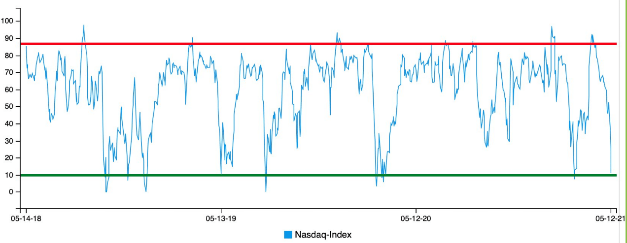
The Nasdaq Bullish Percent Index has been anything but bullish recently and for a good portion of 2021.

There is a whole lot of upside potential and limited downside potential based on the 1-year chart above. The BPCOMPQ made a new low for 2021 before the most recently rally in the index. This lower-low came even without the index correcting to the same or greater degree than that which it corrected in February. We would suggest this speaks to just how bearish sentiment has become with respect to Growth/Tech of late. Finom Group discussed the Nasdaq Daily Sentiment Index in last week’s State of the Market, as follows:
- Nasdaq daily sentiment index (DSI) reached the March 4, 2021 low on Wednesday May 12, 2021.
- The last 3 years are shown in the graph above.
- What we care mostly about, however, is how the index performs after the DSI falls below 60 for the first time in at least 3 months.
- Here are the results, based on a recent study from Troy Bombardia:
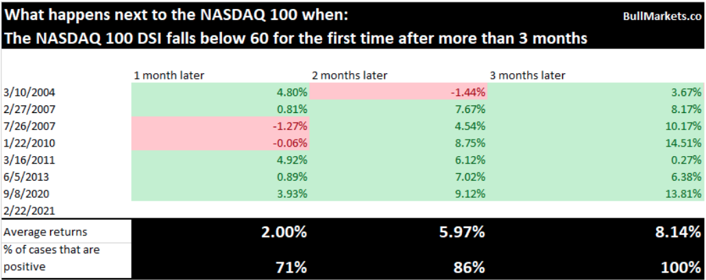
- While we didn’t see the Nasdaq higher from February to early March, the 2-month period offers a greater positivity rate and potential average return after this sentiment signal fires, 86% and 5.97% respectively.
- Nasdaq rallied more than 12% from mid-March through April.
Based on the Nasdaq DSI study offered above, the 3-month signal would fire if the DSI is below 60 on May 22nd again. Additionally, and seeing how well the signal worked as the Nasdaq rallied 12% from mid-March through April, if your bullish on Nasdaq/Growth/Tech, maybe some near-term weakness isn’t so bad and provides a strong opportunity near-term should the sentiment worsen this week. Taking some additional historical data into consideration, however, is the chart below from Urban Carmel:
The Nasdaq has now been down 4 weeks in a row, which is not that unusual. Surprisingly, however, it has only been down a 5th week in a row twice since 03/09; in 2011 and 2012 (6 and 7 wks, respectively). Current selloff is 8% vs. roughly 10% in those other 2 instances. The odds are clearly not in favor of another down week in the coming trading week for the Nasdaq, but that is just what history is informing.
But what about rising yields, won’t that be a problem for the Nasdaq’s historical data referenced above? If we’ve said it once we’ve said it a thousand times: “Yields and the Nasdaq have no direct relationship, as history dictates.”
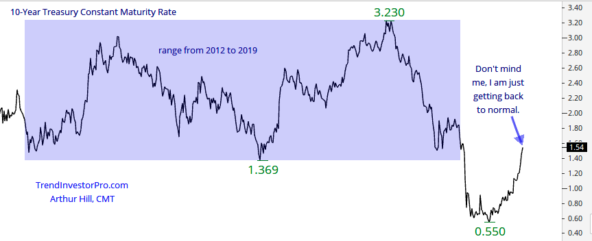
As Arthur hill suggests, yields have simply been normalizing to project the strength of the economic recovery. Just as the equity market shouldn’t have tumbled 34% in 2020 due to the pandemic and has since rebounded, it’s probable that is what yields are/have been doing now that a true understanding for an economic recovery is underway. Now, take a look at the chart below and there is a clear and irrefutable recognition of our statement that yields and Nasdaq/Tech/QQQ have no real relationship:
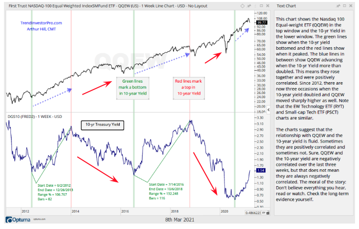
- The top panel is the equal weight QQQ/tech. In other words it includes FANMAG and all the tech/consumer discretionary heavyweights, but places them at the same weighting as the mid and small-cap names in the QQQ ETF.
- The bottom panel is the TNX/10-yr. yield. Notice anything?
- When the 10-yr. yield rises, QQQEW rises. When TNX dips, sometimes QQQEW does, but that depends on the magnitude of the dip.
- The red arrows in the chart above identify a continued rise in QQQEW even as TNX moves “lower for longer” periods. In other words, there’s not really a correlation; tech is rising most of the time regardless of what TNX is doing.
When we study the chart analysis from Arthur Hill, what we can surmise is that this year’s Nasdaq/Growth/Tech/QQQ underperformance is more an issue of relative earnings growth that may have already been priced into FANMAG/Tech/Growth in 2020. If there is greater earnings strength potential to be realized elsewhere, that is simply where investors are flocking to, until that potential earnings growth is priced in and realized earnings growth is discovered. Very little of this has to do with yields rising, and it’s more about earnings growth. If you still don’t believe the data and technicals above, however, here is a bit more to chew on that is related to yields and/or the yield curve itself.
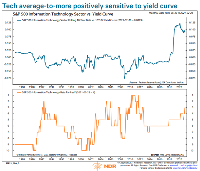
- The reality is that Tech (biggest Growth sector) benefits more than average from a steepening yield curve. It has been in the top 6 for most of the last decade, obviously behind Financials.
- So if you’re still asking, after the yield curve has steepened to its greatest level (142bps) since 2015, why isn’t Growth/Tech en vogue, once again it’s about earnings growth potential in the here and now.
- If it were about yields and/or the yield curve, Growth would be performing much better.
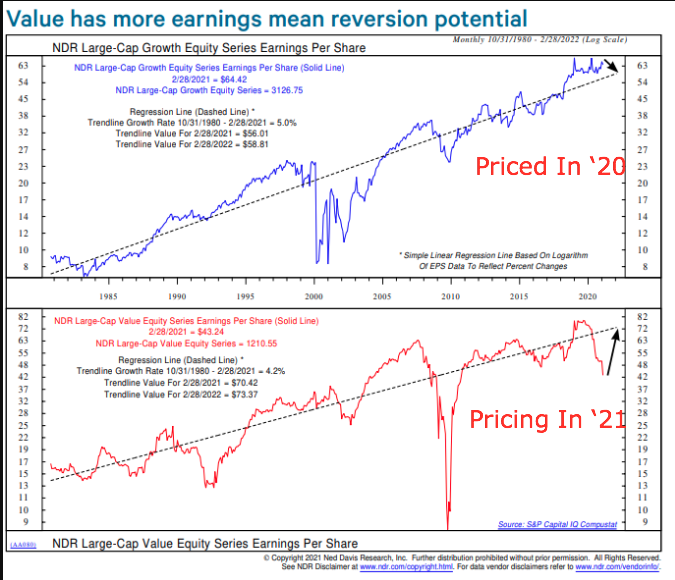
- The EPS recovery in 2021 should be the fastest since 2010, and it’s driven by Value, as shown in the chart above.
- The Ned Davis Research Growth index’s EPS is 15% above trend line, while Value is 38% below and indicating more upside/mean reversion potential.
- Growth has already priced in EPS recovery in 2020 while Value has been pricing in EPS recovery in 2021. In this context, Growth has still been leading the recovery and now leading consolidation phase.
The media has beaten the drum in stating that Growth/Tech/Nasdaq perform worse when rates/yields are rising, which based on the weight of the evidence simply isn’t true. If you needed more evidence, just go back to the 1998-1999 period, when Growth/Tech/Nasdaq rocketed higher.
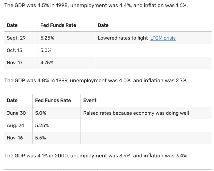
As shown in the screenshot of the history of Fed Funds Rate, from November 1998 through November 1999 the FOMC raised Fed Funds Rate by .75 basis, points. The 10-year yield also rose 200 bps from January 1998 through December 1999. Last, but certainly not least, the inflation rate more than doubled from 1998 through 1999. Sorry, but the whole nonsense about rates and/or inflation hindering the Nasdaq/Growth/Tech trade has never held water. Maybe the Nasdaq is simply doing what it did in 1998, which was a healthy pause before a massive outperformance when compared to its peer indices? (see chart below)
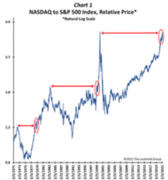
The undulation seen in the chart before the elevator higher is also seen in the breakout here earlier in 2021.
We began this narrative by asking the question, “What comes next?” Even after careful analysis, we can honestly say that the odds remain in favor of a multi-style and index rise near-term, but nothing is guaranteed. Finom Group’s S&P 500 price target for 2021 has been and remains 4,325. With earnings continuing to track higher week-after-week…
… investors would be well positioned buying dips, even if those dips are in the unloved Nasdaq/Growth/Tech areas of the market. This is where the majority of earnings are found and over time the market has always found a way to fall in love with where the earnings are created.
One final word on the whole buy the dip narrative that we don’t hear ANYTHING about, which may also play into the inflation narrative in just a few short months:
- The American Rescue Plan temporarily expands the child tax credit for 2021. First, it allows 17-year-old children to qualify for the credit. Second, it increases the credit to $3,000 per child ($3,600 per child under age 6) for many families. Third, it makes the credit fully refundable and removes the $2,500 earnings floor. Fourth, it requires half of the credit to be paid in advance by having the IRS send periodic payments to families from July 2021 to December 2021.
What do you think the average family is going to do with those childcare tax credits when they start receiving these payments come July. I spend $5,200 on daycare annually for my 3 year old son. While I won’t qualify for these benefits, millions of families across the country will. That’s a lot of disposable income they will have, as the tax credits will supplant a families income that would otherwise go to paying for childcare. And you wonder why the S&P 500 hasn’t corrected but for only 5% or so in all of 2021? Details, it’s all in the details folks!