To study the history of market behaviors and/or performance puts the average investor at an advantage, when compared to the “lone wolf” approach to investing. The markets are more dedicated to disseminating human behavior than they are price discovery potentials. While circumstances are seemingly always different/unique, human behavior proves the one most constant variable in the financial markets.
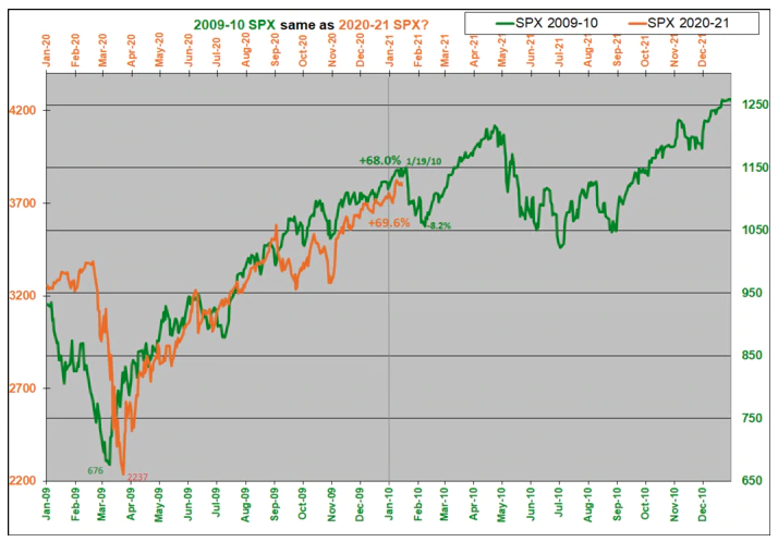
A lot of investors/traders learned this truism about financial markets just this past year, some for their betterment… and some, not so much as they fought against market history… against human behavior/s! Behold, the 2009/202 -2010/2021 analogue!
- So Please click the link to review the latest Special Edition of State of the Market
Wayne Whaley was a quant before quants existed. He has a math background and has been managing money since the late 1980’s.
Whaley’s goal was to identify what he called the “kingpin of seasonal barometers.” He stated:
“I implored my computer to take a few seconds to exhaustively study S&P performance over every time period of the year and determine which time frame’s behavior was proprietor of the highest correlation coefficient relative to the following year’s performance.”
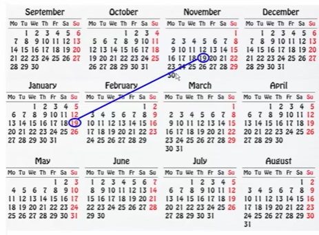
What he found was there was a high correlation between the S&P 500’s returns between November 19th and the following January 19th and the S&P’s performance the 12 months following January 19. And since the 2-month period straddled the turn of the year (TOY) and the gift giving season, he called it the TOY Barometer.
Specifically, the period studied is November 20 – January 19 (if Nov 20 is on a weekend, use the Monday after the weekend, and if Jan 19 is on a weekend, use the Friday before).
**Whaley considered the price-only return (no dividends).
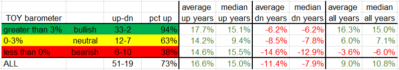
If the return during this 2-month period was greater than 3%, a bullish signal was given, and the market was very likely to do well over the following 12 months. If the return was 0-3%, the signal was considered neutral, and results were somewhat random and in line with what is considered average. And if the return was negative, a bearish signal was given, and returns tended to be very poor.
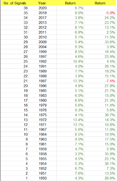
Since 1950, there have been 36 bullish signals (including 2020), 19 neutral signals and 16 bearish signals. Let’s look at each signal group.
Bullish Signals
The 35 completed bullish signals have led to gains 33 times the following 12 months. The losses were in 1987, the year of one of the biggest single-day crashes in history, and 2018, that year that included a 20% drop during the fourth quarter.
The average and median gains of the 12 months following the bullish signals were 17.7% and 15.1%. This isn’t much better than the “all years” stats, but the win rate (94%) is much higher than the “all years” win rate (77%).
- As it stands, this week will mark the completion of the TOY Barometer signal on Tuesday January 19.
- Since November 19, 2020, the S&P 500 is up 5.62%, as indicated in the chart below:
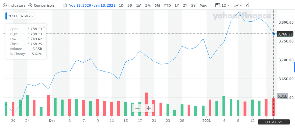
- It would appear as though another Bullish TOY signal will fire, unless the S&P 500 manages a 2.62% drop on Tuesday.
- Anything can happen, but at present, this type of 1-day drop appears less probable.
- Below are the statistics and definition of the TOY neutral and bearish signals.
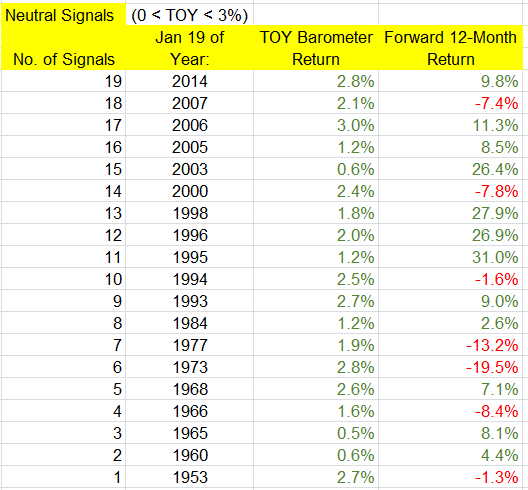
Neutral Signals
There have been 19 neutral signals. The following year was positive 12 times (63%), compared to 77% win rate for “all years.” The overall average and median returns were 6.0% and 7.1 percent. But among the “up” years, the average and median gains were 14.4% and 9.4%, while the “down” years’ average and median losses were -8.5% and -7.8 percent. There were several big up years (1995, 1996, 1998, 2003), and two big down years (1973, 1977), so even if there is a neutral signal, there’s still a decent chance the following 12 months will venture far from its January 19 print.
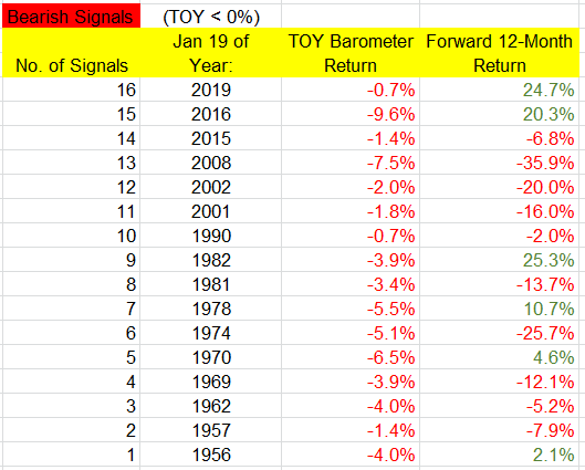
Bearish Signals
There have been 16 bearish signals. Only 6 (38%) of the following years posted a gain while 10 posted losses, and 6 of those 10 posted double digit losses. The overall average and median returns were -3.6% and -6.0%. The “up” years posted average and median gains of 14.6% and 15.5%, while the “down” years posted average and median losses of -14.6% and -12.9%. So despite the low win rate, when the market does well, it has the ability to do very well, as was the case this past year.
In summary, most notable, and yes this table is a little confusing, is the following: When a bullish signal is in play, odds heavily favor solid gains over the following 12 months, but when there’s a bearish signal, odds favor a down year with a relatively big loss. But regardless of the signal, “up” years tend to be very good.
Another Whaley Gem: Whaley Breadth Thrust
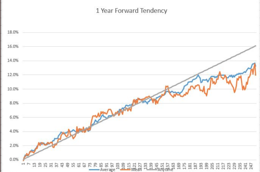
In 2020, the S&P 500 put up 2 Whaley 10-day 2:1 breadth thrusts, 4 months apart from each other. Defining Whaley Breadth Thrust:
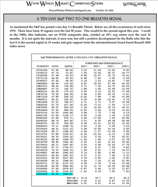
- In the furthest column to the right we see the positive market return rate is 36-3, for an average return of +13.5%, twelve months out since 1970, so this goes in the good omen category.
- Do keep in mind, the S&P 500 has already risen some 16% since November, after the signal, but the 12 month performance does not considered intra-year drawdowns, so do keep that in mind.
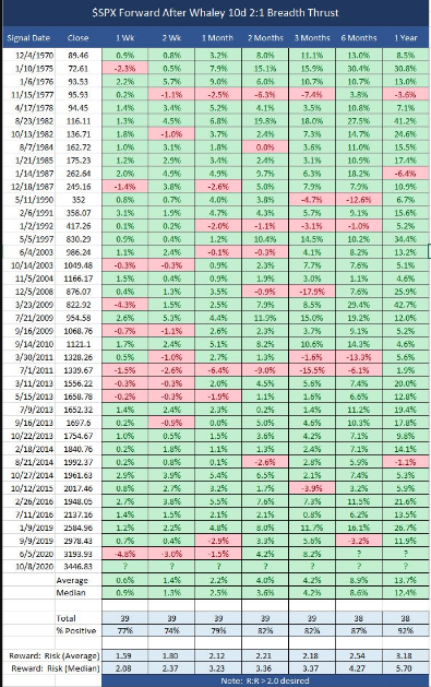
- Below is another chart, offering the same Whaley Breadth Thrust information and more:
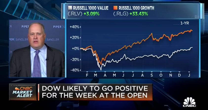
Market Correction Hawks
Piper Sandler’s chief market strategist Craig Johnson has been calling for a test of the S&P 500’s key 200-DMA since November 2020, outlined in Finom Group’s article below:
“The call for a 200-DMA test from the benchmark index by Craig Johnson wasn’t out of line with many strategists at the time and given that the market had already corrected some 9 percent. I encourage readers to review Johnson’s commentary from this CNBC guest spot on September 24th.
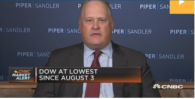
What happened the following week, leading up to the election was a nearly 400 point, 6-day market rally that seemingly culminated with a Pfizer Phase III vaccine trial data dissemination. The point of this exercise is to identify how even Wall Street strategist fall prey to price action, when there better judgement may desire to be contrarian to said price action. Had an investor been waiting for the S&P 500 to fall all the way to 3,100s… short-term considerations often fail investors, but they are often highlighted in the media for the sake of filling up programming hours.“
Again, that was in early November and the market has only traveled higher since and by roughly 16 percent. Imagine missing a 16% rally! Remember, the average annual return dating back to the 1920s is roughly 7.5 percent. Craig Johnson’s call, which is the same as Morgan Stanley’s monthly 10% correction call, is just an example of contrarian positioning that often demands patience and can find investors missing significant market upside.
What’s more troubling, from my perspective, is that such strategists/analysts continue to offer the same calls month-after-month, and regardless of markets’ trend, amongst many variables. Craig Johnson marched out on CNBC just this past week, and once again with markets under pressure, to reiterate his market correction call.
A couple of reasons Johnson continues to beat the correction call drum are as follows:
- Rates rising typically prove a headwind for equities
- **First year of a New Presidential year historically delivers a 5.8% return**
- Also, see a drawdown of roughly 16% over the first year of a New Presidential year, which would indeed take the SPX down to the 200-DMA. How coincidental?
A “blue wave” came out of the recent election, which tends to bode well for the market, historically speaking. In fact, this is the ninth new Democratic President since 1900 to bring with them both the House and the Senate. Why so many blue waves?
- 10 of the last 11 recessions occurred under a Republican administration.
Historically speaking, stocks do quite well that first year with a blue wave, up nearly 12% on average. As shown in the LPL Chart, when a new Democratic President has brought with them the House and Senate, stocks gained that first year of their new presidency 6 of 8 times.

Here is yet another way of looking at a new presidency with respect to market performance going forward, by QuantifiableEdges . This study eliminated inaugurations of Presidents that weren’t elected (Ford in ’74, Johnson in ’63, Truman in ’45, and Coolidge in ‘23). The same sense of excitement isn’t generally generated by a replacement president as by a newly elected president. The remaining presidents and their inaugurations can be found in the table below.
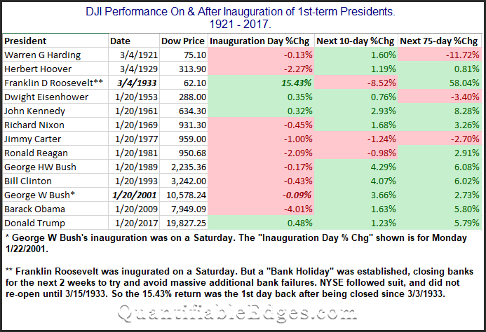
- First, we found it interesting that the wonderful speeches and overall positive vibes surrounding a new president did NOT translate to a strong Inauguration Day performance.
- You could throw out Roosevelt and G.W. Bush here, since the market was not open on the days they were inaugurated.
- S&P 500 rose the last inauguration day for President Trump, but fell sharply on President Obama’s inauguration day.
Looking out over the next 10 and 75 days the market did often seem to embrace the new hope that comes along with a new administration. Harding in 1921 is the only one on the list that saw the market more than 3.5% lower 75 days out. Meanwhile, there were 6 instances where the market was more than 3.5% higher.
Global Equity Market Rally
Noted below are the charts for the All Country World Index’s and relative ratio with the S&P 500 as well as the Global 100 Index that was issued in the latest State of the Market from Finom Group. Upgrade today to receive these key macro-markets each week.
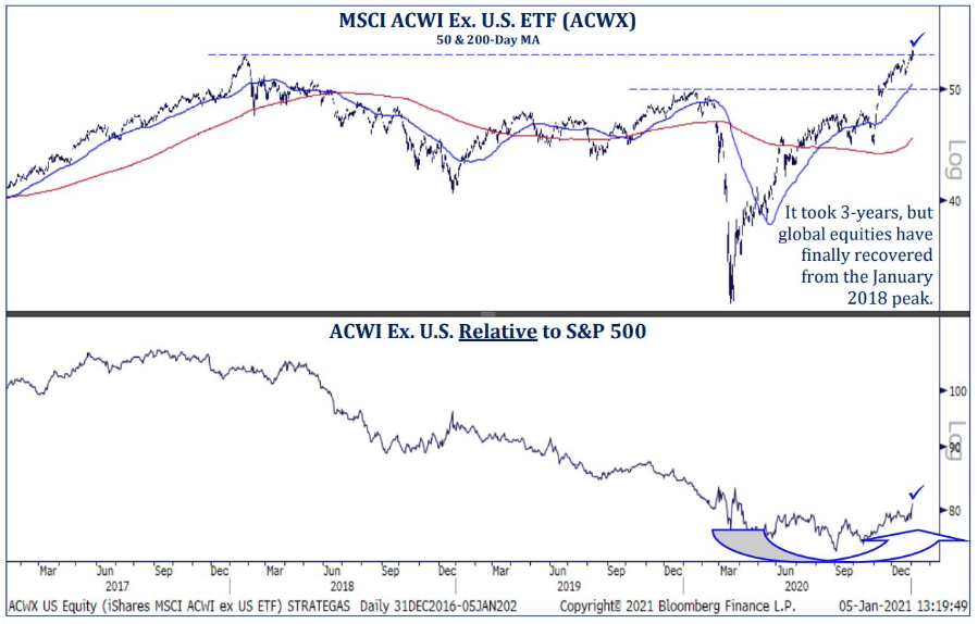
- All Country World Index vs. S&P 500 has turned nicely higher after a 3-year-long downtrend.
- Think it would be hard to overstate how important a development this is.
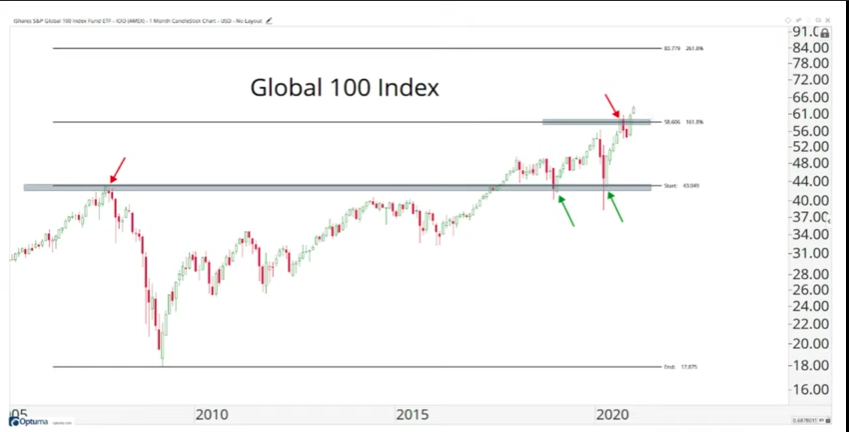
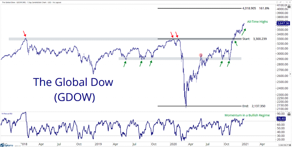
The most recent move in the Global Dow also continues to confirm the record level performance in U.S. equity markets. What is also recognized in the chart of the Global Dow below is that momentum (bottom panel) remains in a bullish regime. Any pullbacks in global equities are likely to prove buying opportunities given such momentum.
So let’s look at the German DAX equity index that hit an all-time high on 12/28/2020 from a historical data perspective. Keep in mind the DAX also hit a high on January 7, 2021, but the historic data offered by Nautilus Research was generated from the prior high in 2020.
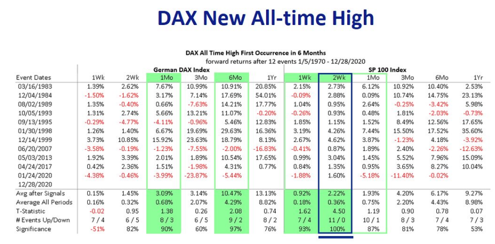
First question we always ask ourselves when reviewing historic data is whether or not the sample size is sufficient to draw out probabilities. At 12 occurrences, the sample size is more than sufficient (minimum 5). What we want to know is what new record highs in the DAX has historically foreshadowed for the S&P 500.
- As we study the data set above we can see that the average 1-month return after the DAX has a record high the S&P 500 return is 1.93%up 87% of the time!
- The 3-month return average is 4.2% and the 12-month return average is 9.27%, but only a 53% positive rate.
- The 1, 3, and 6-month return average and positive return rate are quite strong.
This Just Happened!
When the S&P 500 closes 2 weeks ago at an ATH and then puts a red “inside week” on the board this past week.
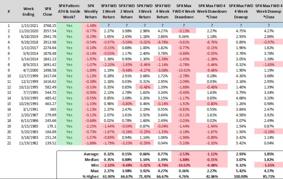
- Study from another quant/CMT Steve Deppe out of San Diego California
- S&P 500 fell 1.5% last week after closing at all-time high the previous week
- Forward returns over next month are largely positive on average, with positive % rate 61% or better!
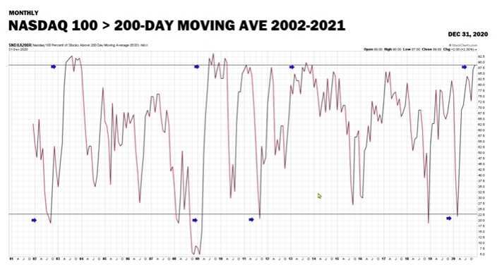
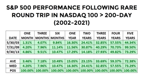
- Percentage of stocks trading below 200DMA in Nasdaq drops below 24% and rises to above 85%.
- Happened 3 times before going back to 2002.
- Stock market higher going out 5 years in every single case.
- Singal study from Chris Ciovacco