
Remember when simply getting back to 3,000 on the S&P 500 (SPX) would have been a victory for the bulls. Well, that was about 500 points ago, and below where the benchmark index is ready to start Wednesday’s trading session. After the fastest bear market in history, with a nearly 35% drop in March, the S&P 500 has had its greatest rally in history. In order to achieve this feat of strength, the new bull market has achieved monthly gains in each of the last 5 months.
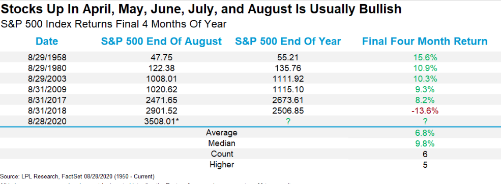
As shown in the chart above from LPL Financial, gains beget gains. For many investors/traders who have assumed the gravy train of positive equity returns is about to end, the historic data suggests very much to the contrary. Even if we look at shorter time frames, history suggests the 5-month long rally for equities should have sustainable momentum. It may not come without a drawdown here and there, but the historic data is a truth teller of sorts. (table from Steve Deppe)
At the bottom of the table, we can discern that across all durations, the average S&P 500 return post a 5-month long winning streak, is positive. The red on the screen does denote that certain years were found with negative returns, however, which reinforces the need to remain open-minded to a wide variety of outcomes. Know the probabilities is your advantage when evaluating the potential risk vs. reward.
While the trend in equities has befuddled and unnerved a great many permabears, the relentless rally has found bullish investors reaping the rewards of long-term thinking. Markets travel higher over time, it’s just that simple. Index and sector funds make it easier to invest than ever before and find low liquidity environments extending rallies beyond where most think they should end. Nonetheless, this rally has now found a former tailwind, a lesser benefit as the rally becomes greatly extended/overheated.
The S&P 500’s dividend yield, after proving a tailwind in March, is now at its lowest point in nearly 15 years
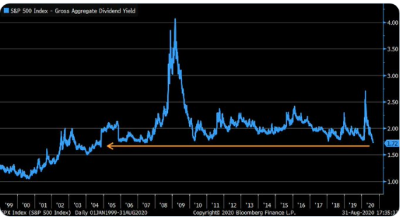
As recently as March, and during times of market panic amongst investors, the dividend yield of the benchmark index proved a lure of investor appetite. Since then the dividend yield has been falling sharply from levels last seen during GFC. The chart of the SPX dividend yield not only speaks to relative attractiveness for equities, but how high the index has traveled since March.
- S&P 500 total returns by month for 2020: Jan 0.0%, Feb -8.2%, Mar -12.4%, Apr +12.8%, May +4.8%, June +2.0%, July +5.6%, Aug +7.2% Jan — Mar -20%, Apr — Aug. +37%, YTD now +10%.
While August was supposed to be a lackluster month for equities, it proved to be anything but, and much to our expectation. No, we didn’t think we’d see this kind of return, but we did anticipate and trade the strength.
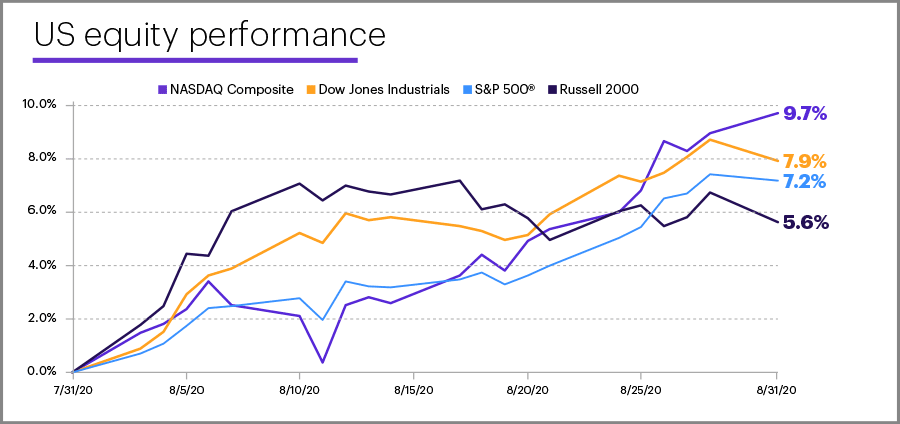
The S&P 500 recouped the last few points of its COVID sell-off to hit new all-time highs, marking the best August for the benchmark in more than 30 years. The Dow Jones (DJIA) got back into positive territory year-to-date for the first time since February, and the Nasdaq Composite (COMPQ) extended its record-setting run.
What may be particularly interesting about the rally is that many people refuse to recognize that the speed of the rally is in large part a product of how ridiculously bearish their own predictions were in March. When you set the bar at Doomsday/End of Times, the change in expectations is severe & pricing adjusts accordingly. In this sense, narratives do indeed matter.
The momentum in August has already carried into September, with a positive first day of trading for the month. September 1, 2020 was the best first trading day of September for the S&P 500 (+0.75%) since 2010 in fact. In gauging the probable returns for September, we can see that historically, it’s been a toss up.
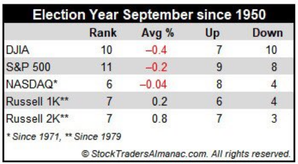
- Last 17 Septembers in election years: 9 up and 8 down.
One of the rarities of most rapid market recoveries and/or advances is “great breadth”. She’s a bull alright, but breadth will not likely satisfy the permabears and even the most ardent bulls. Having said that, higher market concentration doesn’t always allow for strong or overtly great market breadth. Given the highly concentrated market and cap weightings amongst certain sectors (Information Technology), should we expect greater breadth divergences to occur. A breadth divergence is simply the index going in one direction (up of late) and breadth going in the opposite direction to one degree or another. The most recent example identifies such an occurrence.
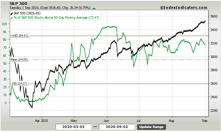
The percent of stocks trading above their 50-DMA retreated on Tuesday, even as the S&P 500 rose. It doesn’t alter the story of recent action much, but wouldn’t it stand to reason that breadth divergences would naturally occur more often given ultra-concentrated indexes? Five stocks are half of Nasdaq 100 now also. As such we should expect on days when the index is up, breadth has a greater probability of being negative.
In further developing the subject of market breadth, while most bull markets end with narrowing breadth, that condition can persist for a very long time. This chart shows persistent negative breadth during the second half of the 1990s, despite a three-fold increase in the market.
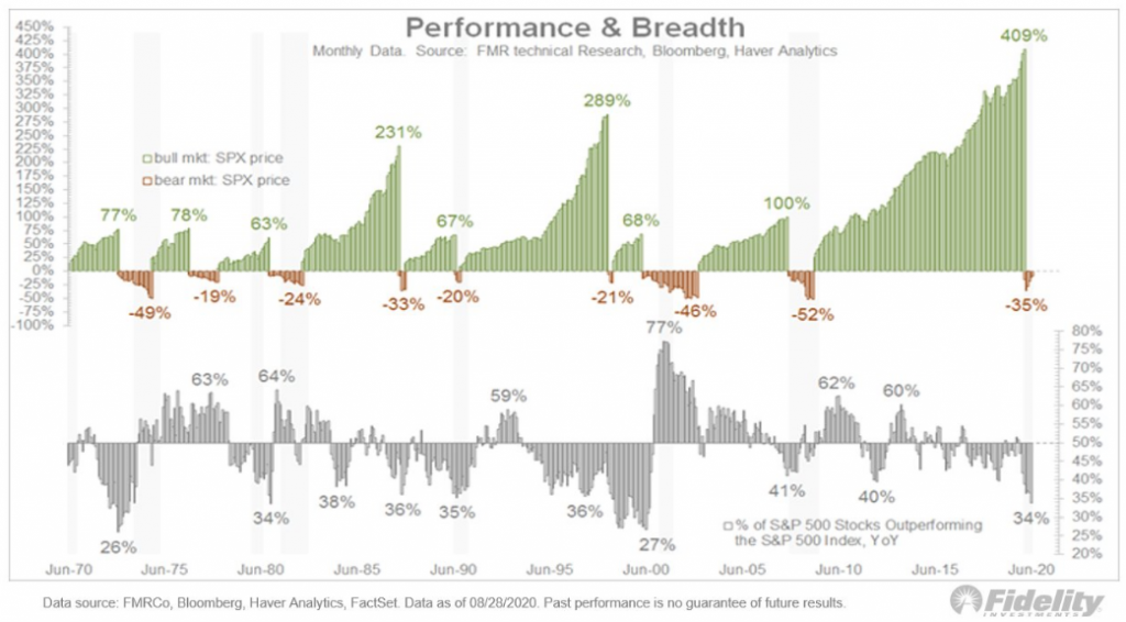
While we’re not fans of all the “party like it’s 1999” market comparisons, the chart identifies various cycles of negative market breadth that still accompany substantial and long periods of market gains. In speaking of the highly concentrated markets and information technology sector, let’s elaborate further by asking ourselves if the market concentration and performance today is comparable to history?
Top 5 Performance Following Major Lows

In the joint history of the S&P 500 and NASDAQ, there is no other five-month period when the S&P 500 was up more than 50% and the NASDAQ was up more than 65%. Whether these recent all-time highs will be followed with more of the same, represent “double-tops,” or something in between is yet to be seen. That said, it would be in keeping with history for at least some short-term consolidation, which could simply take the form of a rotation away from the concentrated leadership areas vs. something more sinister. Most historical studies of similar periods of concentration show a tendency for flat-to-lower stock prices short-term; but higher prices longer-term. This is in keeping with the historic studies previously offered in the tables above.
The Information Technology (IT) sector has led U.S. large-cap equity returns to date in 2020 and for the past decade. Not surprisingly, many investors have been attracted to high-quality IT companies with outsized growth prospects (during times of economic strength and weakness). However, some are concerned that valuations have become stretched, and comparisons have been made to the infamous “dot-com” bubble of 1999-2000.
While there may be a handful of IT stocks that have gotten too far ahead of fundamentals, we believe that the sector as a whole remains reasonably priced. Strong balance sheets and digital-economy growth stemming from “shelter at home” directives have been supportive of 2020 revenue, earnings, and returns. In fact, consensus earnings estimates now call for the sector’s 2020 earnings growth to be positive, compared to the formerly forecasted 20% earnings decline for the S&P 500 Index this year.
Typically, many investors may be willing to pay a premium for growth stocks when growth is scarce. Surging demand has been met with falling supply as the number of U.S. large-cap companies that have consistently produced high growth rates has decreased over the decades. This supply/demand imbalance is one factor that likely has supported higher sector prices and valuations.
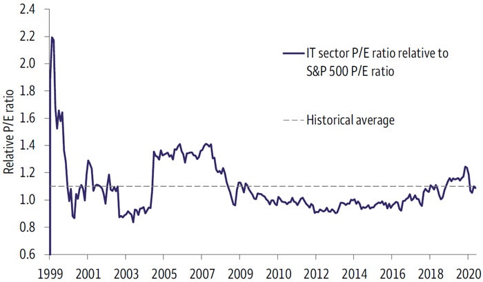
While valuation metrics recently have risen, they have moved in line with those of the S&P 500 Index. During the late 1990s, valuations for the IT sector were significantly higher than they are today on an absolute basis, and they were higher than S&P 500 Index valuations on a relative basis. For example, the forward price/earnings (P/E) multiple for the IT sector was 57X on December 31, 1999 (versus 28X today). The price-to-cash flow ratio, another important way to value a company’s operations, tells a similar story.
Table 1. S&P 500 Information Technology sector comparison
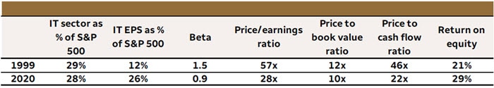
We can take the dot-com bubble comparison a step further. There is greater earnings stability for IT companies today than when compared to the dot-com era. This has translated into lower stock-price volatility. The sector recently has demonstrated much less cyclicality (measured by Beta to the S&P 500 Index) than in 1999. Return on equity also has improved dramatically, showing how efficient the sector has been at generating profits.
While IT sector earnings have grown by more than 500% over the past 20 years, the sector’s P/E multiple now is half of what it was in 1999. The sector’s P/E relative to that of the S&P 500 Index is just above 1.0 today. This compares with more than 2x in 1999 (Chart 1). Although there are several stocks with lofty valuations, 46% of the sector’s constituents trade at a forward P/E ratio that is below the S&P 500 P/E median. Finally, the earnings yield (inverse of P/E) is at 3.0% today—double that of 1999—and it looks relatively attractive when compared to a 10-year Treasury yield that is below 1.0%.
Historical S&P 500 IT sector P/E ratio relative to S&P 500 Index P/E ratio
There are many differences between 1999 and the present, but that means little in the face of a surging, relentless market rally that has been heralded as detached from the economic realities. With that being said, using index valuations as a means to assess the market and capital investment decision making has often been found foolish. Here’s something recently offered by Tony Dwyer, lead equity strategist at Canaccord Genuity:
“We’re withdrawing SPX targets because there is no precedent to how high valuations can go.
I still think this is a long-running expansion backed by a Fed intent on staying accommodating indefinitely. Expect corrections much like those starting in late 2009. But I’m opting out of the index-target game.“
Moreover, while such chants of market/economy disconnect will rage on, it’s most important for investors to recognize that the economy and market do not always reflect each other’s strengths and/or weaknesses. There isn’t really a disconnect between the market and economy, and the following chart identifies this perspective:
After an economic shock such as the self-induced, 2020 pandemic recession or the 2008 Financial Crisis, there will be naysayers and worries about what the market is doing vs. how the economy is performing. The same fears were highlighted in the media back in 2009 as they are being highlighted today. The following article and rhetoric surfaced just after the rally was underway in 2009:
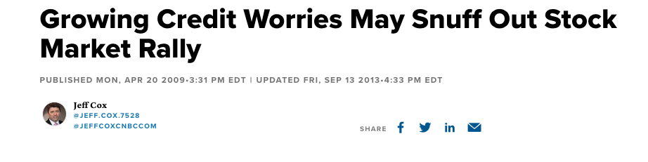
“I’m not willing to say the worst is over from a credit-loss perspective,” Mutascio said. “I think the rally in the last several weeks on the thought that we’re going to have a ‘V’-shaped recovery and credit quality is going to be fine, I think is a bit misleading.
“We think we’re going to see a bit of a pullback, but I don’t know that we’re going to retest the lows that we saw on March 9.”
As it turned out, 2009 did produce a V-shaped recovery, much like the one we have had in 2020. History doesn’t just rhyme, it has a way of repeating because even though the circumstances surrounding this market recovery cycle are different (it’s different every time), human behavior doesn’t change all that much, if at all! The market is often times a simplistic expression of human behavior/engagement. It’s why despite the record rally since March 2020, there are still pockets of market concerns given the magnitude and ferocity of the new bull market. For months, and we do mean months, investors have clamored about the low Equity Put/Call ratio. To date, it hasn’t meant anything and with the market rallying significantly since March. After a big advance for the S&P 500 in May, the put/call ratio dropped handsomely and Bay Crest Partners’ analyst Jonathan Krinsky offered the following table on the put/call ratio, as it relates to future S&P 500 returns.
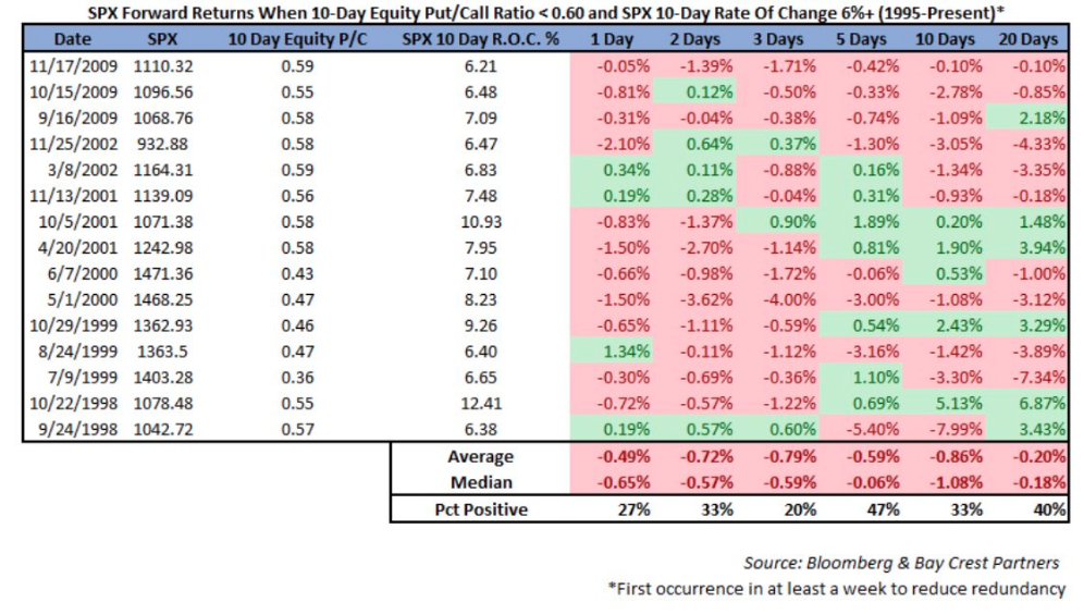
- There’s a lot of red from the expected returns going out a month (20 trading days).
- The S&P 500 didn’t live up to this particular study of historic data
As Finom Group offered in May and in speaking to the put/call ratio, we didn’t feel it would be prudent to use the put/call ratio as a means for capital allocation/decision making. In fact, we thought it would prove a poor judge of where the market was likely heading. Nonetheless, Jonathan Krinsky who is often a guest on CNBC, offered like foreboding about the put/call ratio in early July:

We all know what has happened since July for the major averages, even with a sustained low put/call ratio. The fact is that we have seen sustained, low put/call ratios in the past. It happened in 2009 and for a more extended period in the late ’90s.
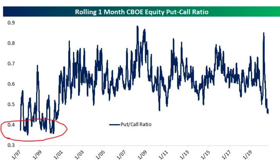
The chart above from Bespoke Investment Group identifies a collapsing put-call ratio. This is not any kind of prediction, but look how long it stayed anchored at even lower levels in the late-’90s.
We can’t predict the future of markets as investors, but the good news remains that we don’t have to perform such futile exercises. Investors simply need to understand the probable outcomes, based on the data at-hand. We can’t deny that most indicators we monitor suggest the market is overheated and/or overextended, but such conditions can persist for longer than we can rationalize.
One of my greatest learned lessons of markets over the years:
“Just because I want it to be so, my analysis says it should be so, doesn’t mean it will be so. Price/trend rules; fighting it because of the aforementioned is a young, egotistical man’s game that costs much and profits little.”
Fighting the market is not in anybody’s best interest. Fighting the Federal Reserve is a sure fire way of failing as an investor. The Fed, despite popular proposals, has virtually unlimited bullets when aiming to support economic growth by way of its dual mandate; maximum employment and price stability. By moving quickly in late March, the FOMC successfully averted a credit crisis, provided financial market stability and facilitated USD funding increases. More recently, the Fed adjusted the means for which it will implement monetary policy going forward.
- The Fed’s new strategy: In addition to its shift on inflation, the Fed tweaked its long-term labor market goals, doubling down on its commitment to achieving full employment. Market watchers will be looking for more clarity around the central bank’s plans, including guidance on inflation, unemployment, and asset purchases, at the next Federal Open Market Committee meeting on September 16.
Be it central bank support or a near-term belief that a vaccine will be approved by year’s end, the market has enough support to maintain it’s upward bias. Having said that, we shouldn’t discount the normal, expected pullbacks that allow for cash to be pulled off of the sidelines and into the market. Above and beyond these potential market supports, earnings-earnings-earnings…
The Q2 2020 earnings seasons is all but over with greater than 98% of S&P 500 companies having reported through last week. Earnings are the “mother’s milk” of markets, as Larry Kudlow would say. Coming into the Q2 reporting season, FactSet consensus analysts’ estimate was for a decline of -44% in YoY EPS for the S&P 500. What actually happened was far better. FactSet now expects Q2 2020 EPS to have declined by less than -33 percent.
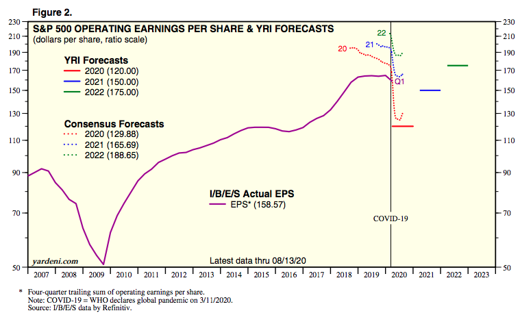
- The FY2020 EPS consensus estimate has improved from $124.79 in the previous week to $129.88 as of this past week.
- What if Q3 EPS estimates prove too low?
- Will we see another $5 increase in the FY2020 EPS consensus estimates?
- Is that why the markets continue to climb?
- Q2 earnings were down 31.8% from the same quarter in 2019, but this was not as bad as Q1 2009’s -35.4% decline (the bookend for the prior point).
- That Q2 2020 wasn’t as bad as Q1 2009 comes down to less-bad revenue declines. Q2 2020’s top line comparison was -8.7%; Q1 2009’s was -11.5%.
Corporate profits have proved more resilient than feared, both because giant, secular-growth companies account for an outsize portion of S&P 500 earning power and because there has been no painful reckoning of massive bankruptcies.
Leuthold Group’s Jim Paulsen shows the apparent low point in S&P 500 profit margins this year is vastly higher than the troughs of prior recessions.
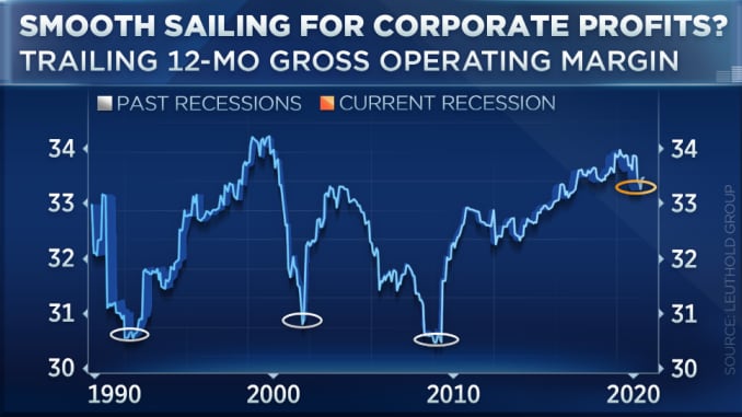
As unfashionable as it may be to defend the S&P 500’s current record levels using fundamental analysis, the cyclical analyst suggests there is a case to be made. Second quarter earnings results were far better than expected, and companies are/will be adjusting their cost structures to improve their profit picture further over the next 4 quarters. Wall Street analysts are playing it safe, as they always do, neither taking their 2H 2020 or 2021 numbers higher just yet. But the market knows and is discounting the probabilities of raised expectations going forward, justifying the rally to-date as earnings in 2021 have a defined opportunity to eclipse the 2019 high. Using this perspective, equities can keep rallying as long as investors believe analysts are behind the curve, both in raising their 2020/2021 earnings estimates and price targets. As much as the COVID Crisis is “different”, in this one respect it is the same as every other cycle we’ve covered back to the 1990s.
One of the reasons analysts and strategists may prove late in revising their EPS outlook as well as price targets is due to the declining dollar. The U.S. dollar was lower in August as it has now been for 5 straight months. This current losing streak is the longest for the U.S. Dollar Index since the 6-month period ending in August 2017. Before that only longer streak was a ten-month streak ending in May 2003. Between those two streaks, there were three other five-month losing streaks. In the history of the U.S. Dollar Index, there have only been a total of nine streaks that were longer and eight streaks that were as long. With the Dollar Index already down pretty sharply to kick off September, a six-month losing streak could certainly be in the cards. Better buy those imported goods while you can still afford them!

The significant decline in the dollar is another reason for optimism about future earnings growth as more than 45% of S&P 500 revenues are garnered overseas and will be positively impacted by the weaker dollar.
Does any of the aforementioned discount the probabilities of near-term market consolidation? No, no, no! What it does is inform as to what to do when the market consolidates. Just last week the S&P 500 was trading some 13% above it’s 200-DMA
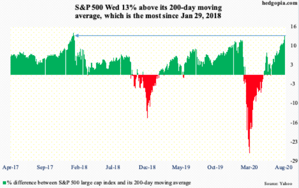
- As of Wednesday, SPX was 400 points above its 200-DMA
- The most extended ever. This is a bit deceptive, though.
- On a percentage basis, index currently 13% above the average, which is the most extended only since late Jan ’18.
- FWIW, selloff began soon afterwards back then.
With the first trading day of September in the book, the S&P 500 is even further away from it’s 200-DMA, on the heels of stronger than expected economic data releases Tuesday.
The Institute for Supply Management’s August reading on the manufacturing sector showed a third straight month of accelerating expansionary activity. The headline index rose to 56 compared to expectations of 54.8 and 54.2 in July. That is now the highest level of the index since November of 2018 when it read 58.8. (Bespoke Investment Group)

Breadth across each of the individual components of the report continues to be solid with just about every index higher month over month. The only two indices to fall were both for inventories. The index for Employment along with these indices for Business Inventories and Customer Inventories are also the only ones that remain in contraction as has been the case for the past few months. Employment has been on the rise over the past few months, so it’s not all bad though. Additionally, the declines in inventories may not necessarily be a bad thing as it coincides with strong demand and rising production, meaning strong demand is likely drawing on inventories rather than supply issues.

Demand is extremely robust. Consistent with solid readings for New Orders across regional Federal Reserve manufacturing surveys, the ISM’s reading on New Orders has consistently risen over the past few months and is now around the top 5% of all historical readings going back to 1948. The 6.1 point increase to 67.6 leaves the index at its highest level since the final months of 2003/January of 2004. Prior to that, you have to go all the way back to 1983 to find a time that New Orders were this strong. That is an enormous turnaround compared to where things stood as recently as April when the index was at its low of 27.1; in fact, it is the most the index has risen in four months on record (second chart below). The 40.5 point rise in New Orders in that time surpasses a 39.5 point increase that went from June to October of 1980.

While the market has seemingly put the pandemic behind it, the economy still has a long road ahead of it. Some analysts worry the disconnect between the two could put stocks at risk of correction, or at least, signals the market may be running low on steam. We’ll continue to monitor economic indicators like jobless claims, consumer spending, inflation, GDP, and infection stats to gauge progress.
In the meantime, here are some themes to consider for the weeks ahead:
- Vax finish line: Some analysts point to the red-hot vaccine race as one reason for the market’s optimism. Nearly all the big pharma and biotech names are taking shots at the goal, and with 33 candidates in clinical trials and nine in the late stages,3 it appears we may be nearing the finish line. That said, the market could take any type of setback hard. Not to mention, the availability of a vaccine is just the beginning of the end of the coronavirus.
- Volatility season: September starts a historically volatile period for the market, and with the November election approaching, there’s the potential for short-term disruptions ahead. Ignore the noise and keep decisions aligned with individual timelines, long-term goals, and risk tolerance.
- Credit markets are signaling smoother sailing ahead. Yield curve remains stable, possibly steepening ahead. Dip buying remains an optimal strategy, absent material disruptions to the economy.


