
After a 20+ point gain and new bear-to-bull market high for the S&P 500 on Monday, the benchmark index tacked on another 5 points Tuesday. During the 2-day rally it didn’t prove all unicorns and rainbows. On Monday, the biggest issue most investors highlighted was that the rally came with poor market breadth. On Tuesday, the 5 point rally and closing price of 3,257 proved to be 20 points under the intraday high of 3,277. There’s always something to critique and find fault with in the markets, but at the end of the day price is truth as they say.
With respect to price and breadth on Monday, there were more decliners than advancers, which usually doesn’t portend well for the market near-term and as shown in the table below:
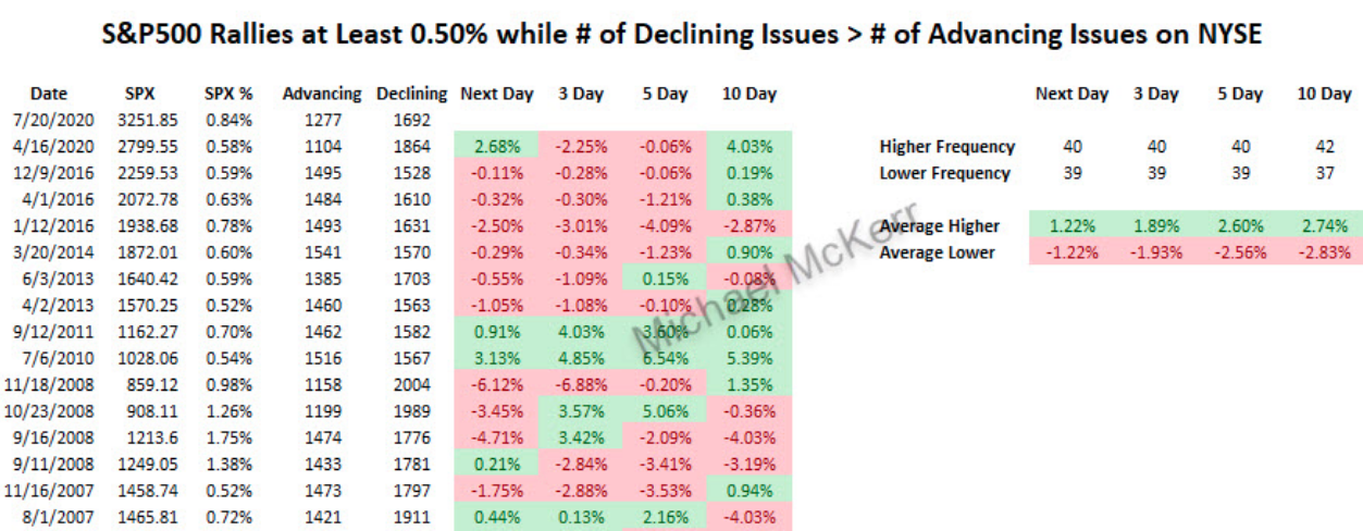
While history is a good guide of potential outcomes in the future, using like statistics, it is not a guarantee. Although the benchmark index was up some .8% on Monday and NYSE declining stocks outpaced advancing stocks, the market still found higher prices the next trading day, not in keeping with most occasions and using such criterion. Three days later the market is more often in the red than in the green using the same data, as shown in the chart above. So we’ll see how things play out, knowing that this is just one variable in vast see of market variables. Speaking of advancers vs. decliners…
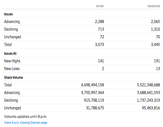
Tuesday’s market action was met with much better breadth for the NYSE and Nasdaq (NDX). As we can see from the table below, the advancing stocks outpaced declining stocks for the NYSE by more than 3 to 1 and almost 2 to 1 for the Nasdaq.
And while breadth was considerably stronger on Tuesday than it was on Monday, equity futures are pointed sharply lower on Wednesday. Pick you poison on why the market ebbs and flows the way it does for any given day, but we would urge investors to recognize that one day does not make for a trend and the market tends to trend higher over time regardless of the strength or weakness of individual breadth metrics, for which there are also a great many to analyze.
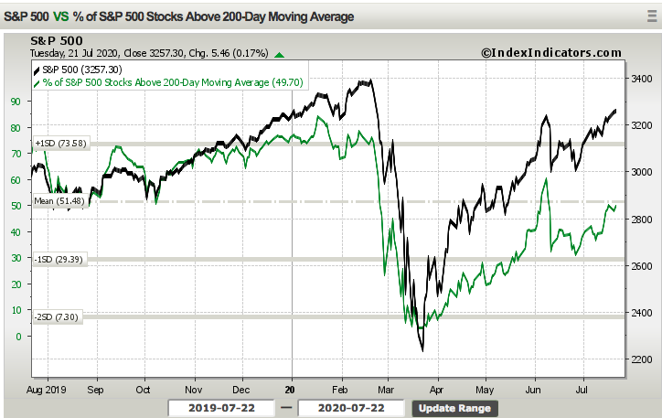
The number of S&P 500 stocks trading above their 200-DMA remains nearly 50%, over the first two trading days of the week. While this breadth metric has shown improvement for weeks and even months off the lows back in March, it is but one breadth metric. If truth be told, bad breadth is useful at price lows (a washout), but in real-time, it is a minefield of false signals at price highs. There are better signals available than market breadth and if prices are at/near highs you’re better off buying weakness than focusing too intently on breadth. This is especially true during periods after market bottoms, after significant breadth thrusts and with substantial monetary and fiscal policy support mechanisms in place.
Speaking of such fiscal policy mechanisms, we’re getting that much closer to a fiscal cliff of sorts and with the unemployment insurance benefits expiring, as part of the Cares Act, on July 31, 2020. It remains to be seen WHEN the House and Senate take up a vote to extend aspects of the Cares Act through year-end. The rhetoric and negotiations are already ramping between the two legislative branches, which is usually the precursor to actual face-to-face negotiations and consensus findings that lead to a vote.
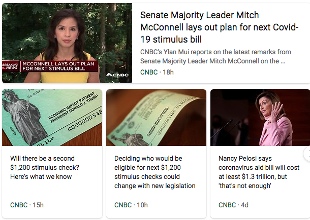
“I envision that this bill doesn’t get done by the end of July,” House Minority Leader Kevin McCarthy, R-Calif., told CNBC’s “Squawk Box.” He said he expects Congress to approve legislation “probably in the first week of August.”
If Minority Leader Kevin McCarthy proves accurate in forecasting the next round of fiscal relief to pass in the first week of August, I would anticipate the equity market to reflect disappointment with a potential pullback. Opinions will vary among the masses of legislative members, however, and McCarthy’s opinion on the matter is but just one.
On a call with House Democrats on Tuesday, House Speaker Nancy Pelosi said she hopes the parties “can resolve our differences and have a bill by the end of next week.” Treasury Secretary Steven Mnuchin separately told reporters on Tuesday that he hopes to strike a deal on legislation by the end of next week. See, opinions, hopes and/or desires to strike a deal and by when are varied, but understood to favor a deal sooner rather than later. As an investor, the best course of action is not to focus on when the deal will get done and how to position for potential market turmoil should a deal not be achieved by the end of July, but rather, have a game plan that considers buying a potential dip as a DEAL WILL GET DONE! Far too many times, investors position for a market pullback, by shorting the market (SPY) and yet the worst case outcome doesn’t come to fruition and the market simply trends higher. This is market timing at its worst, as losses from such positioning accrue. It’s simply easier to have appropriate expectations, using all the information we have at hand, remaining flexible to a wide variety of outcomes for which dip buying is proven the optimal approach to uncertainty.
Beyond the uncertainty surrounding the next Cares Act, which has proven to support consumer spending and income loss since the pandemic’s genesis in the United States, monetary policy by way of QE 4 remains a supportive economic mechanism. But first, let’s take a look at the size of the Cares Act that is still at work and has not yet proven exhausted.
GOLDMAN: “Under our fiscal policy assumptions—which include a Phase 4 package of $550bn—disposable personal income is likely to register slightly positive growth this year .. This should keep the adverse multiplier effects more limited than in past cycles.” (Hatzius)
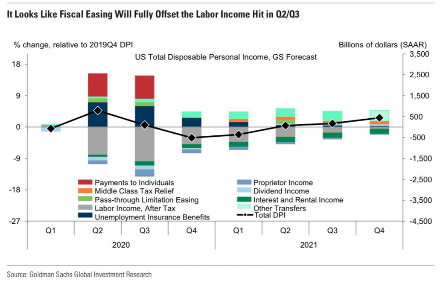
In the chart above, the key metric we’re looking at/for is the disposable personal income, as denoted by Goldman Sachs chief economists Jan Hatzius. This metric is highlighted by the black diamond scaling higher from one quarter to the next and throughout the year. With sizable unemployment insurance benefits, the flow through to disposable income has found a sharp bounce back in consumer spending in May and June, which was seen recently in the strength of retail sales. Retail sales grew in June on both a MoM basis and YoY basis, to many economists’ surprise. The Goldman Sachs chart analysis above, however, proved a good guide for consumer spending and retail sales. You have to give Goldman’s Jan Hatzius a lot of credit. He was one of the first sell-side economists to identify how powerful the stimulus was in terms of replacing lost household income.
Monetary policy implementation can be viewed against the backdrop of the monthly POMO schedule.
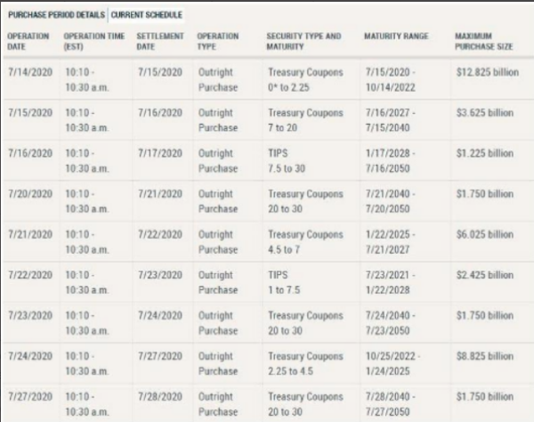
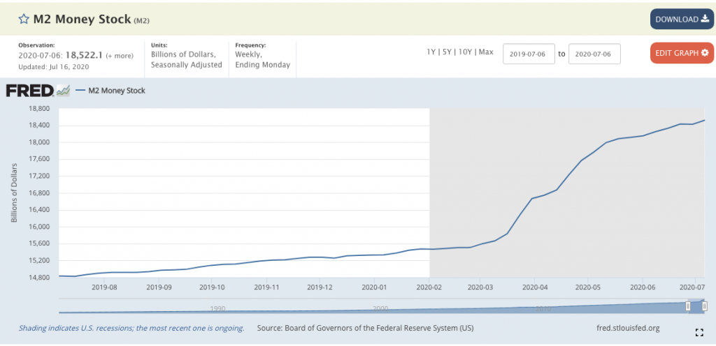
Permanent open market operations (POMO) refers to when a central bank consistently uses the open market to buy and sell securities in order to adjust the money supply. It has been one of the tools used by the Federal Reserve to implement monetary policy and influence the American economy. It’s very clear from the M2 supply increase in the chart below, that the Fed has been hard at work implementing QE4, in order to create more stable economic conditions.
On Tuesday, the POMO operation commenced at roughly 10:05 a.m. and ended at approximately 10:25 a.m. EST. The will continue POMO activity through month-end, with the next biggest purchases/swaps taking place on Thursday and to the tune of over $8bn.
As we await the markets’ opening on Wednesday, futures remain under pressure, as investors prepare for one of two outcomes: S&P 500 traveling up to 3,300 or a pullback of sorts. Morgan Stanley’s chief equity strategist Mike Wilson is of the opinion that the market has been in a correction since the June 8th highs. Hard to appreciate that opinion since the S&P 500 has recently made a higher high, but I digress and offer his notes as follows:
“As stated in our Mid Year Outlook last month, we think the correction that began in early June has downside to 2800 on the S&P 500. It should trough if the next fiscal stimulus bill is passed, which we think should coincide with more evidence that the fatality risk from the virus may be fading alongside more constructive data on potential vaccines.”
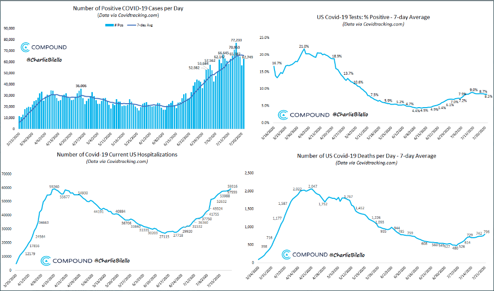
The good news on the mortality front is that while total deaths have risen, given the infection rate has risen since the reopening of the economy, the mortality rate has been nearly cut in half. The stock market has recognized this to be the most important measure from a litany of COVID-19 metrics, which are delivered daily. As long as the mortality rate remains low and/or downtrending, the equity market is recognizing the “less bad” situation and ability to bridge the gap between the rising infection rate and the vaccine to come.
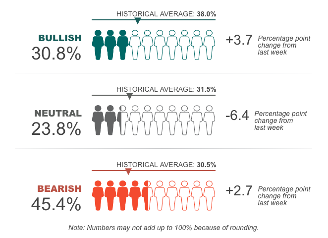
Regardless of one’s individual opinion of the market and the seemingly disconnected price action when juxtaposed with the economic situation afoot, equity market sentiment has been mixed and highly dependent of which measure of sentiment one views. The AAII survey has proven a poor gauge of sentiment as the bullish sentiment remains below the historic average and the bearish sentiment above its historic average.
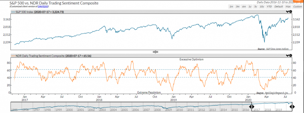
Having said that, and with the S&P 500 only 140+ points away from a record high, the Daily Trading Sentiment composite has reached excessive optimism. Is excessive optimism a troubling sign of things to come? One my propose this is suggestive of investor greed.
There’s obviously only one way to determine whether or not excessive optimism is “historically” signs of frothiness in the market and signaling a potential problem. Here’s a closer look at the market’s performance data when it reaches these levels.
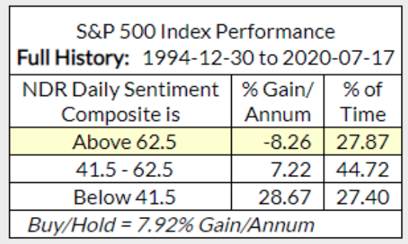
Two takeaways from the data suggest:
- The Daily Sentiment Composite actually has room to run to the upside
- The market is higher more often than it is not.
- Again, this is but one of many ways to view investor sentiment over time.
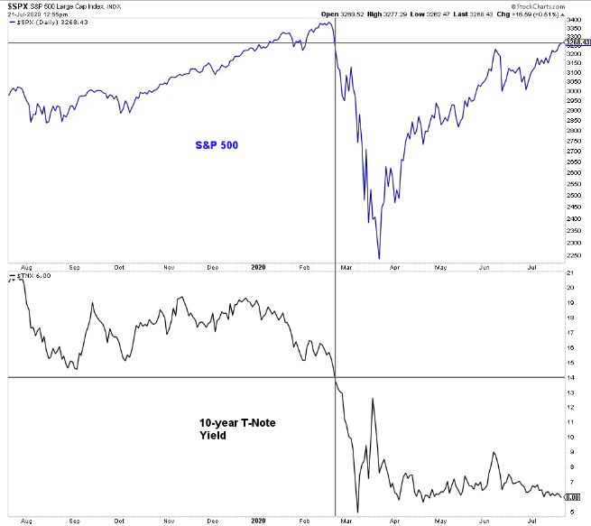
In addition to sentiment proving a mixed bag along the total move higher from the bear market lows – to-date, something else has occurred which investors are likely taking notice. The last time S&P 500 traded at its current level (February), the yield on the 10-year Treasury was at 1.4 percent. Today the yield is slipping below 0.6 percent. The chart below compares the two assets:
One could easily make the argument that Treasuries will find it difficult to rise with QE 4 implemented, but a contingency of the investor community will still align low yields as a signal of economic strength or weakness.
Last week we saw huge gains in retail sales and industrial production, suggesting the economy is humming along. Yet, some of the more real-time economic data like consumer confidence, electricity use, travel, and restaurant reservations are showing weakness. Overall, this is what we expected: The second half of 2020 won’t deliver a huge V-shaped recovery, but instead more of a swoosh-shaped recovery. This means the initial surge off the March lows will be the easy part and the final parts of the economy’s growth will be much more difficult. Initial jobless claims remain stubbornly, but understandably, high given the uneven economic recovery that has since developed with pausing of the reopening and even certain areas of economic activity halted once again.
As we trek through the week, earnings season continues to scale. The end of the Financial sector reporting season usually marks the beginning of the Information Technology reporting season. Come Wednesday, all eyes will be on the high-flying Tesla (TSLA) and Microsoft (MSFT) after the closing bell.

How momentum stocks and mega-cap tech stocks react to their respective earnings reports will prove a key “tell” on investor sentiment, given the high valuations and heavy concentration of investor positioning with such names. The top 5 S&P 500 stocks are nearly as big as 5 cyclical sectors in terms of % of market cap. Momentum in these stocks has slowed a bit of late, but the momentum since the March lows has pushed the forward P/E (bottom panel) to extremes.
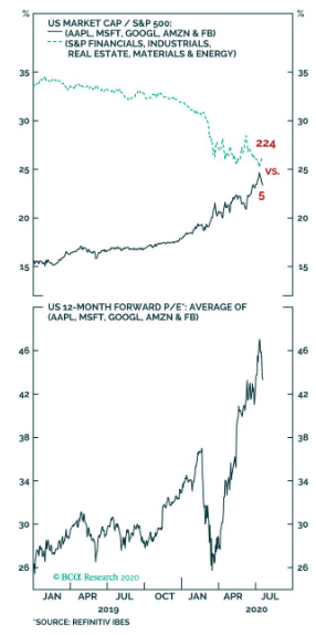
It’s such momentum over such a short period of time, combined with stretched multiples that has many on Wall Street comparing these stocks and their valuations to the dotcom era bubble. I’ve never found the term bubble to be appropriate for the equity market. We should all recognize the term was established only during the dotcom era as a means to generate fear amongst investors, given high valuations of the time. But the same was true of the period from the 1600s Tulip mania up to the dotcom era. There are always pockets of outsized growth and valuations in any market, but it was only characterized as a bubble since the dotcom era. Denoting something is a bubble offers the probability of said bubble to do what? Pop, that’s right! What can be done about a popped bubble, nothing. It’s broken, unfixable. This is something that would be able to drive fear into the hearts’ of investors. The reality is the market is more like a tire; it can inflate and deflate from time to time, but it can’t pop and render itself unfixable. That kind of logic, however, will not find you favor amongst the Twitterati!
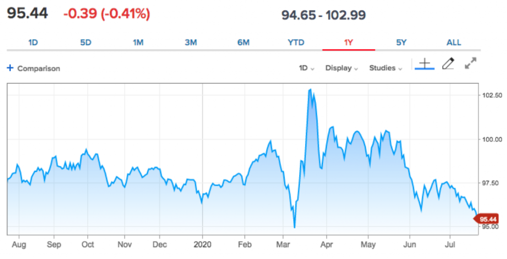
Moreover, and as we look forward to the mega-cap tech earnings, one other aspect of the market we may need to find favor with is the weakening U.S. dollar. The dollar has been weakening for several weeks now and recently threatened to break below $95 on Tuesday.
Here is how Natalliance recognizes the weakening dollar:
NATALLIANCE: The dollar “is getting slammed, .. In our opinion, interest rates have nothing to do with [it]. .. It is all about the health of one’s country, and we are way behind in curbing the covid virus … We can’t see how rates and equities won’t react to this.”
Quick detraction from Natalliance’s commentary and correlated causation for the weaker dollar. While the stated opinions are just that, opinions, I would have just one question to throw out there: Where is the vaccine expected to come from? Is it a U.S. biotech firm? This is not to dismiss the potential for the market to have some kind of reaction to the weakening dollar, but to suggest that the country from where the vaccine to the virus is likely to develop is finding a weakening of its currency as a reaction to the present state of the epidemic… doesn’t seem logical now does it?
In my opinion, a weaker dollar can prove to have an equity market reactive function, but longer-term, a weaker dollar is beneficial to multinational S&P 500 companies. Such companies generate some 45% of their revenues overseas. With a strong dollar over the last 3 years, the DXY has proven a substantial headwind for profits as those revenues suffer from the forex exchange rate. A weaker dollar could prove a tailwind for multinational companies in the back half of the year and should the DXY stay below $97.50 on average.
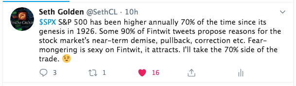
Like I said earlier folks, there’s always something to worry about in the markets. It’s almost never unicorns and rainbows, expect for 2017 😉 ! Either way there is one very important statistic to keep in mind if you’re an active or even passive long-term investor… (see tweet below)
The market is a structure and function of long-term earnings growth. One way or the other, the structure evolves to reflect higher prices over time. It’s the only way it works folks. As such, are you really afraid of a pullback or are you excited to put more capital to work when the market pulls back?


