The S&P 500 (SPX) weekly expected move was $72/points last week, but it blew past that once again and for the 5th time in the last 10 weeks. The market is proving less efficient here in the 4th quarter than in any of the previous quarters of the calendar year. What does this mean? In the most simplistic terms it means the market is not pricing risk efficiently, as 5 of the last 10 weeks have found the S&P 500 weekly expected move breached for the week. For the upcoming trading week, the S&P 500 weekly expected move is $80/points.
The past week was one of the worst of 2018, with the Dow (DJIA) down 4.5% at 24,388, and the Nasdaq (NDX) down nearly 5%, at 6,969. The S&P 500 was down 4.6% at 2,633, just 2 points above its November low. It’s no coincidence that the S&P 500 finished where it did and it’s current level should serve as further evidence for the extreme amount of technical/algorithmic trading that is driving the market. The S&P suffered its worst week since March and the third worst of the year.
Sam Stovall, chief investment strategist at CFRA said the market often touches a low point in mid-December, before taking off into year-end, but it’s not clear this year whether the market will right itself for much a year-end rally. The S&P is sending some negative technical signals, and its chart formed a “death cross,” a technical pattern that suggests a bearish change in trend.
“The real question is are we headed for a global recession. That’s what I think the problem is, and I think that because the trade issue is so uncertain. That could end up being a pretty influential catalyst,” said Stovall. “Everyone keeps saying they’re worried about a recession in 2020. What if it ends up being 2019? On average, the S&P 500 tops out seven months before a recession. I don’t think we’re heading for a recession. I’m thinking this is a correction that will right itself, but until we get to breakeven the jury is still out.”
The Ugly Correction
The market, for a lack of better phrasing, has gotten quite ugly. Buyers are absent and even record level buybacks aren’t proving enough to overcome the relentless selling programs. Oh sure, buyers show up for a brief period and shorts are forced to cover for the moment on favorable global trade headlines, but it simply isn’t proving a lasting practice given that a trade truce is not a resolution; it is simply kicking the can down the road. Nonetheless, while individual stocks may be in bear market territory; the market is still in a corrective zone identified in the following S&P 500 chart that we published on Friday. The market correction from the September all-time high is now in its 11th week.
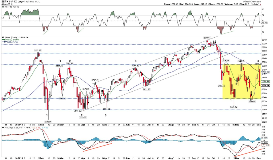
The corrective zone is pretty well defined and highlighted in the yellow box. The upper end of the zone serves as resistance at the 2,800 level and the bottom end of the zone is well defined with support having been established at the November lows of 2,631. The problem for the bulls is where we finished the week, at the lower end of the zone.
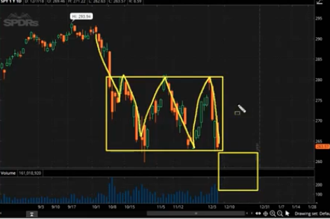
Another way that we can visualize the possible outcome for the market near-term is with the following screen shot of the Spiders (SPY). It’s pretty similar to the highlighted S&P 500 box of course, but emphasizes the possibility of breaking out of the box, to the downside.
Unfortunately, this is the market we have as investors and traders and as such we need to consider the greater probability of another leg lower. Here is what we offered on Friday to readers in our latest daily market dispatch:
Volatility Tea Leaves
A couple of unique aspects to the recent correction have presented themselves to long-term investors. The first is that the correction is largely one that has been driven by technical trading. Algorithmic triggers have been in abundance. Triggers can range anywhere from index levels/targets to keywords being mentioned in the media for a predetermined quantity of mentions. We can further identify the sell-off as being “algo-driven” due to volume indicators. As we noted earlier, there is a lack of participation during the corrective period and volumes are a good indicator of this phenomena.
As shown in the SPY screenshot below, Friday’s late afternoon volume was even lower than Thursday at only $30b (Thursday ended at $54b of volume). It’s rather shocking considering the 2.4% drop on Friday for the S&P 500. Some might suggest this is a positive indication for bulls to remain the course. After all that’s the lowest volume posted for a 2%+ drop day in the past 15 years. The Spiders (SPY) volume is way below panic levels and nowhere near “Volmageddon” from February, that outsized candle stick.

The second unique aspect of this correction is that it has largely occurred with minimal increases in volatility. The table below identifies exactly this point (table offered by Matt Thompson).
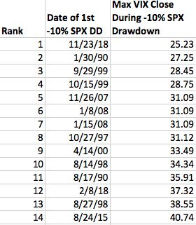
The table represents every S&P 500 correction (first close -10% from ATH) since ‘90 ranked by max VIX close during the correction. As of Friday’s S&P 500 close, we just had the lowest maximum VIX close during an S&P 500 correction in VIX history. But it may not be over yet. Having said that, the VIX’s response to the correction has been nothing short of amazing, but also reason for further concern.
One of the main reasons Finom Group believes the corrective period is algo-driven and absent true sellers and buyers is based on what we’re seeing in the volatility complex. Buyers are essentially on strike and frankly speaking, you need both sellers and buyers participating during a correction period in order to express the normal rise in volatility, as measured by the VIX, during a corrective period. Additionally, take a look at the SKEW Index, which measures tail risk being priced into the market via S&P 500 out-of-the-money options.

The SKEW Index is ridiculously low, suggesting there is no systemic risk being priced for the corrective period since it began in October. It’s stupidly low to be more blunt and indicating either the SKEW is not proving an indication of tail risk, structurally or humans aren’t at play for this correction.
So here’s what’s going on through the lens of the volatility complex and why premium sellers haven’t performed well during the correction and why the risk has only heightened for the exercise of selling premium. HV10, which is pretty much a historic volatility reading of the present state of realized volatility, is higher than the VIX/IV, as indicated in the screenshot below.

The current reading of the VIX is 23% while HV10/realized volatility in the S&P 500 has been/is 27 percent. What this indicates is that there is more volatility in the market moves than the VIX is giving credit. The VIX suppression may be coming to an end if, we want to stress if, the market does take a leg lower and break out of the boxes noted above. Why? Well if we manage to break the box, this may finally force bulls to capitulate lower, exacerbate the correction that would bring about more volatility and ultimately give rise or bring back premia for which premium sellers would also come back to the market. Simply put, volatility could finally shoot up more dramatically and above 30. We’d be happy to be proven wrong.
Economic Data
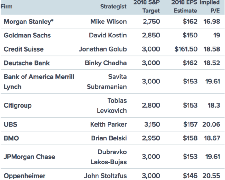
The economy is continuing to perform at an above average pace, despite the stock market’s performance of late. Additionally, analysts’ price targets for the S&P 500 during 2019 are all higher than the current price of the S&P 500.
While the media, investors and analysts are fretting over the stock market, inverting yield curves, oil prices and trade spats, nobody is of the opinion a recession is imminent or set to occur in 2019. Most of the economic data is congruent with a continuation of the current economic expansion cycle. The latest jobs data served to underscore the belief in the expansion cycle and strength in the economy.
The economy created 155,000 new jobs in November to keep the unemployment rate at a 49-year low of 3.7 Percent. The number fell short of economists’ expectations of 198,00, according to CNBC.
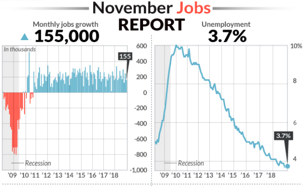
Wages are more of the focus in the payroll report since fears of inflation have crept into the market. The amount of money the average worker earns rose 6 cents to $27.35 an hour last month. The increase in pay over the past 12 months was unchanged at 3.1%, inline with expectations, but that’s the biggest advance since 2009.
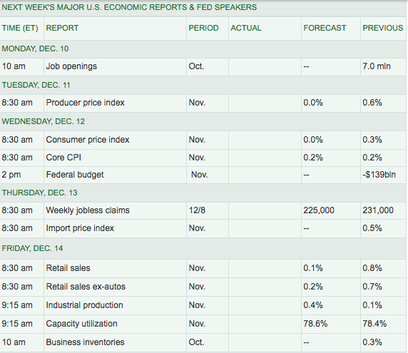
The U.S. has added an average of 206,000 jobs a month through the first 11 months of 2018, above the 182,000 pace during the same period last year. Moreover, the economy is on track to produce the most new jobs since 2015. For the week ahead, here is a look at the economic data to be reported, according to MarketWatch.
At present, most economic data suggests a steady economic pace of growth, shy of the housing sector of course. When we review the latest Q4 GDP estimate from the Atlanta Fed’s GDPNowcast model we can see gyrations in the forecast.
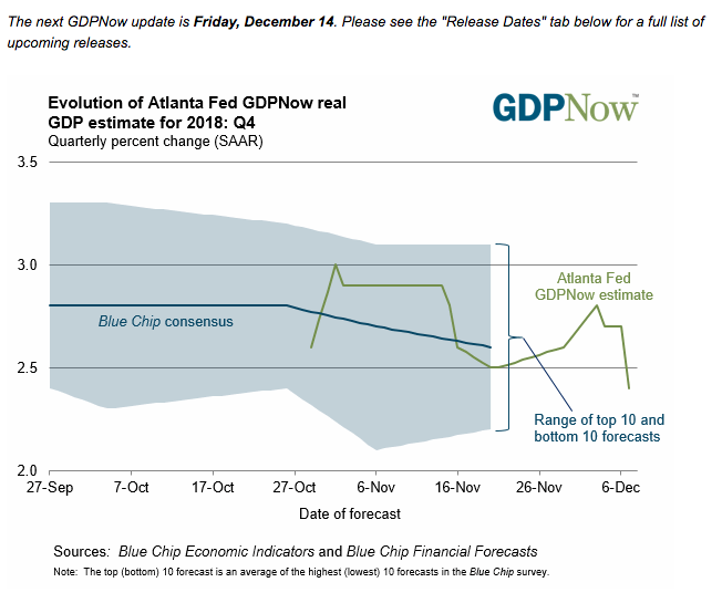
The forecast took a leap in late November but has since come back down to a forecast of 2.4% GDP in the Q4 2018 period. The Nowcast of fourth-quarter real final sales of domestic product growth decreased from 2.9% to 2.7% after the employment report from the U.S. Bureau of Labor Statistics. The Nowcast of the contribution of inventory investment to fourth-quarter real GDP growth decreased from -0.23 percentage points to -0.33 percentage points after the employment report and the wholesale trade release from the U.S. Census Bureau.
The End of the Bull?
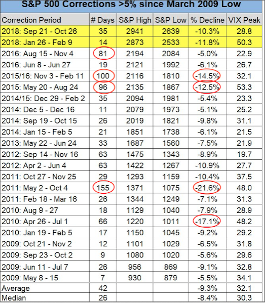
As it was during the February through April period, we are simply in a corrective phase. On average, the market has a correction of roughly 10% annually. It was only that we failed to achieve this average since 2016, that the current year’s market performance, expressing now 2 separate 10% corrections, has reinvigorated fears and given greater rise to the bear market narrative.
The correction is now in its 78th day. That’s long, but it is not the longest on record. Sincerely, we don’t know when this correction will end, but there have been 4 corrections both longer and deeper than the current one since the 2009 low (table from Charlie Bilello as of October 26).
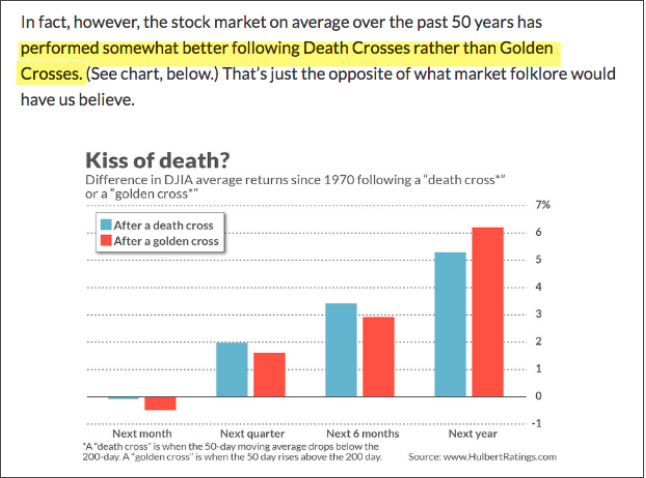
One more statistical point to reference seeing how the bearish sentiment is extreme for the typically bullish seasonal period. As mentioned earlier, the S&P 500 has just experienced a ‘death cross’; meaning the 50-dma has crossed below the 200-dma. Naturally, bears are jumping on this technical occurrence with all 4 paws. But what happens next, historically, may prove the bears wrongly exuberant? Normally, equities rise after such an occurence. In the 34 instances this has happened in the DJIA since 1970, equity’s performance over the next 3-6 months has not only been positive but better than after a ‘golden cross’ (from Mark Hulbert).
It’s a painful process for fund managers, active traders and investors to witness and go through, a market correction. We saw this earlier in the calendar year when “the end was near” became the dominant media coverage. It’s no different this time around with the media and permabears.
As shown in the analysts’ S&P 500 price targets, most analysts have targets substantially higher than where the market is currently. You’ll hear a lot of media pundits discuss that these targets are likely to be revised on EPS models being lowered if further tariffs are imposed on China, but earnings have proven throughout 2018 to be stronger even with the recently imposed tariffs on $250bn in Chinese exports. Moreover, the President seems keenly concerned over the recent declines in the stock market, hinting that his trade policy may lean more dovish if the market demands of it to become so. The 90-day trade truce for ongoing negotiations between the U.S. and China may prove to be extended that much further if an agreement or concessions can’t be reached within the deadline date.

“President Donald Trump has been consulting with his advisors to see if his trade policies are responsible for the volatility that has hammered markets in recent weeks, according to The Wall Street Journal.”
While the geopolitical risks remain elevated going into 2019, an earnings decline doesn’t seem to be on the horizon. Even with a modest 5% growth rate in S&P 500 EPS for 2019 that would push earnings up to and probably higher than $175 a share, assuming we end the 2018 with EPS of $165 or greater.

At present, the forward 12-month P/E ratio for the S&P 500 is 15.4. This P/E ratio is below the 5-year average (16.4), but above the 10-year average (14.6). That 10-year average is so low due to the existence of the 2008 Great Financial Crisis and subsequent market crash. If we use $175 per share for S&P 500 earnings and slap just a 15X P/E ratio on it, that would suggest the market goes absolutely nowhere from here, for 2019. A 16X P/E puts the market back at 2,800 and still lower than most analysts’ price targets. So where’s the bear market; it’s on television!
Nonetheless and as we mentioned before, fear and emotion are driving this market, nothing else. This really isn’t about the fundamentals of the economy or the market; it’s technicals and fear. But this fear is what we have to contend with until it subsides and the market is able to lift and sustain rallies.