Research Report Insight #1
Good stuff Edward and I urge our readers to review what Edward offered about TIME/DURATION and pair it with the following data:
We’ve been chatting up the Facebook (FB) chart with Finom Group members in the Trading Room over the past couple of weeks. I’ve posted several charts recently on Twitter, but in terms of the “beautiful bean footage” Edward previously referred to, by way of my recent tweet… The breakout in the wedge we see in the chart below was a clear signal for investors/traders. (March 20, 2021)
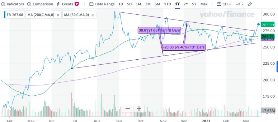
My thesis, prior to this bullish breakout was that the stock had been generating accumulation, and investors should take notice, traders should also look for a “rental”. While FB is a less than 1% holding in the Golden Capital Portfolio, I have been suggesting that our members accumulate on pullbacks. In our Trading Room on Friday, to pad the portfolio gains on the year, we did just that and bought the pullback. The trade alert for our members is depicted below; it delivered a quick intraday profit. We trade, we invest, we act locally on price action, but also consider the long-term implications for every trade alert

Research Report Insight #2
The Nasdaq itself has remained under pressure for weeks, much like Consumer Staples had in the past. Every attempt for the Nasdaq to rise back above its 50-DMA has been met with selling pressure. It’s actually a beautiful battle that has ensued over the last couple of weeks that now finds the Nasdaq sandwiched between its 50 (light purple) and 100-DMA (green), as depicted in the chart below:
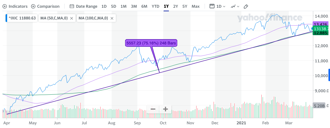
- 50-DMA: 13, 426.
- 100-DMA: 12,885.
- 1-yr trend line continues to prove support.
- Bullish objective: Get above 50-DMA.
- Bearish objective: Break below 100-DMA and 1-yr. trend line on closing basis.
At present, and to complete the trading week, I’m of the opinion that the impetus remains to buy the dips in the Nasdaq, QQQ and tech industries like semiconductors and/or software. I shy away from predicting what will happen in the week ahead, given the consistent rising yields vs. tech narrative. Having said that, we can look deeper at the probabilities by way of breadth and tech industries going into the final trading days of the quarter. Speaking of end of quarter rebalancing, kind of…

We know that there will be rotations that happen near and at the end of the quarter. As Mutual and Pension funds are forced to rebalance their portfolios, the rotations are becoming more understandable in Consumer Staples and possibly in the huge rally for the Nasdaq in the final trading hour on Friday. (Chart above from Daniel Cox)
Research Report Insight #3
I am of the opinion that Friday’s price action foreshadows the potential for 4,000 to be achieved before any more significant correction. Breadth strengthened last week for the index, which ultimately led price higher on Friday and for the week. Additionally, we hadn’t seen a strong daily close in…, well I can’t remember. Good thing we have a chart to help us with that definition:
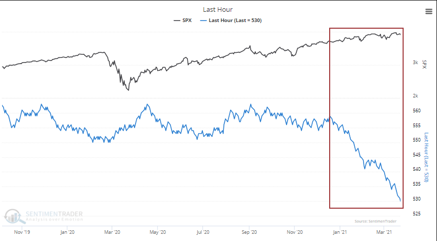
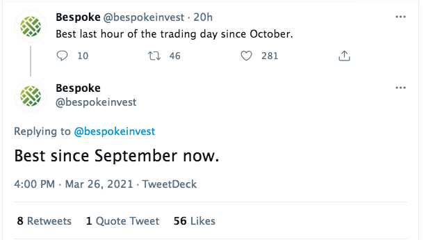
Over the past 3 months, a net 29 days have seen stocks fall during the last hour of trading (chart above). This is the biggest 3-month drop in the Cumulative Last Hour Indicator (created by @DeanChristians) since 1997. This past Friday’s final hour of trading was the best final hour of trading since September 2020, according to Bespoke Investment Group.
In my experience, such a change in market behavior doesn’t prove fleeting. It can, but more often than not it doesn’t prove fleeting. The bullish upswing in the final hour of trading Friday has a reasonably strong probability of continuation. Let’s, however, see if we can confirm the probability based on breadth indicators.
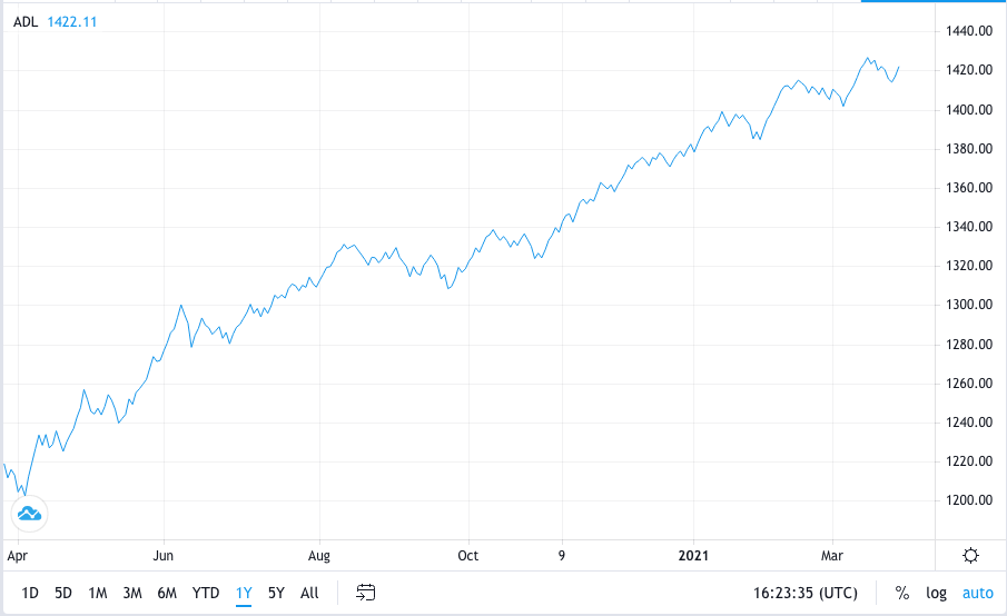
While I would like to say that the S&P 500 Cumulative A/D line hit a new all-time high on Friday, I can’t. It did take a notable swing higher, but given the recent trend in small caps and mid-caps, this proved to be the hinderance. Having said that, it’s clear that a new A/D high is not too far off and would only take some price action follow through in the coming week to validate a new high in the S&P 500, possibly even a 4,000 price achievement.
Research Report Insight #4
Nobody is perfect, least of all those so-called professional fund managers. This chart, using data from Standard and Poors illustrates the point.
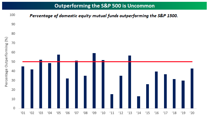
Going back to 2001, there have only been six years where more than half of all domestic equity mutual funds outperformed the S&P 1500, and there has never been a year where even 60% of them outperformed. At the other extreme, you have years like 2011 and 2014 where less than 20% of funds outperformed.
Research Report Insight #5
Like Existing home sales, inventory and weather proved a headwind for New home sales in February. New home sales for February were reported at 775,000 on a seasonally adjusted annual rate basis (SAAR). This is 18.2% below the revised January rate of 948,000, but is 8.2% above the February 2020 estimate of 716,000.Sales for the previous three months were revised up significantly. This was well below consensus expectations for February. Still, the last nine months saw the highest sales rates since 2006.
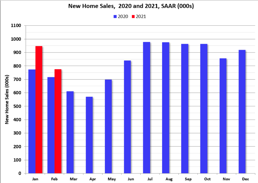
The inventory of completed homes for sale was at 40 thousand in February was just above the record low of 37 thousand in 2013 (when sales were much lower). That is about 0.6 months of completed supply. The inventory of new homes under construction, and not started, is about 4.2 months, close to normal. In terms of total home inventory…
Research Report Insight #6
Personal income dropped 7.1% in February, while spending fell 1.0%. These follow a revised 10.1% pop in January income after a 0.5% December gain. January spending was bumped up to a 3.4% rebound following the 0.6% December 2020 dip.
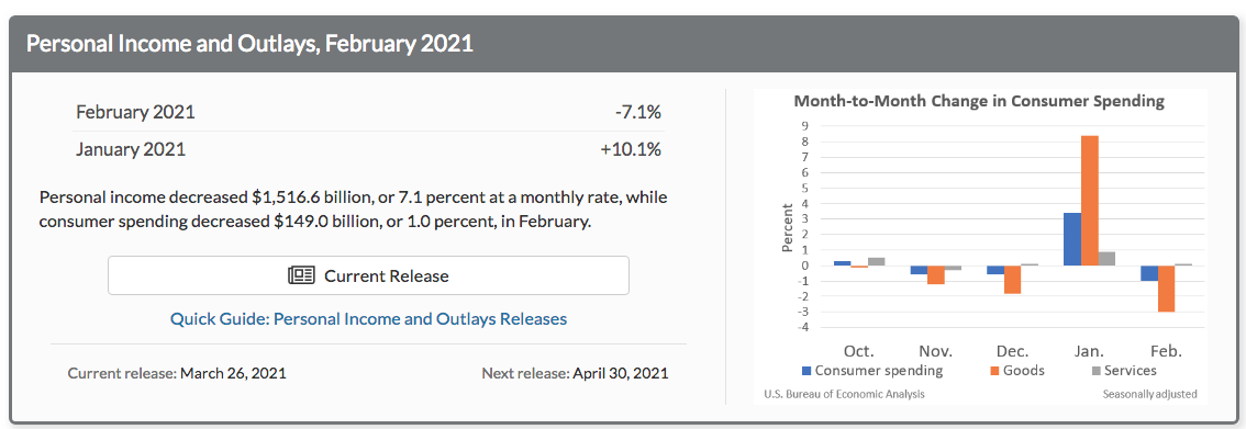
Big picture takeaway from the monthly PCE data is simple, the inflation that everyone fears is not showing up in the price or consumption data any more so than than to express the severe YoY depressed numbers from late February-March 2020. It’s just not there. The latest Headline PCE price index was up 0.23% month-over-month (MoM) and is up 1.55% year-over-year (YoY). Core PCE is now at 1.41%, below the Fed’s 2% target rate.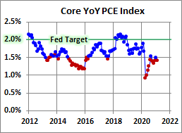
Research Report Insight #7
Just two weeks ago in our March 14th Research Report, here is what FY2021 estimates looked like:
“The latest, consensus analysts estimates for FY2021 EPS are as follows and nearly $6 per share higher than they were a mere 3 months ago:
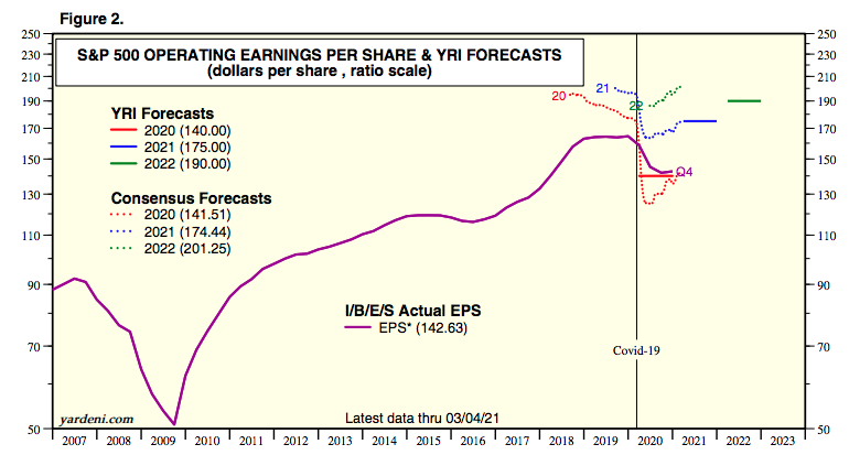
The S&P 500 EPS estimate for Q1 2021 has increased by 5.7% since December 31, 2020. The latest consensus EPS estimates for the full year are slated below. We’ll also take a look at positive EPS guidance in just a minute, second… what’s smaller than a second?
In just two short weeks, and with a few early Q1 2021 reports being delivered, the consensus FY2021 EPS has jumped $1.10 to $175.54 for the year.
Research Report Insight #8
Here is another example of having data that suggest a particular outcome. This comes to us from LPL Financial and a tweet from Ryan Detrick, the firms certified market technician (CMT). You can see at the bottom of the tweet and data where I’m interjecting also!
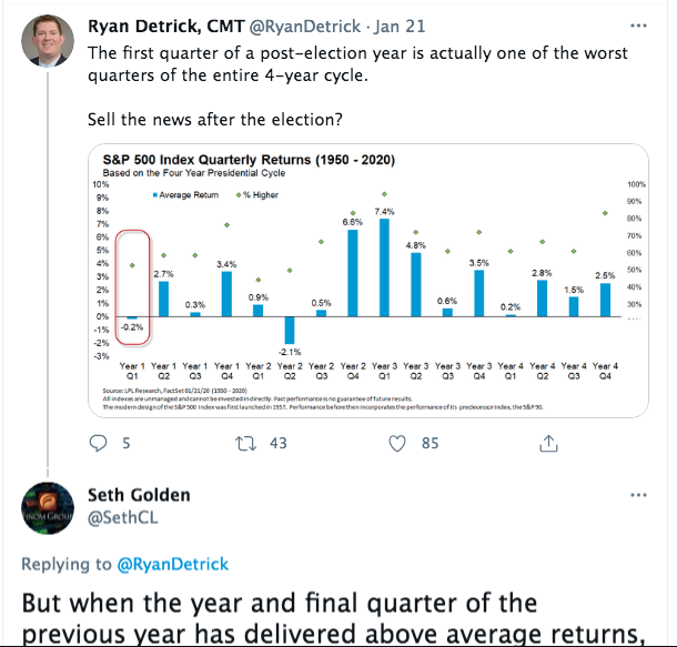
Ryan’s quantitative data shows the probability of negative Q1 returns after an election year, going all the way back to 1950. The question that I asked myself was, “Is this an all inclusive data set, does it really consider everything that happened in 2020’s S&P 500 price action, above and beyond just the fact that it was an election year.”
As we were ending 2020 and looking forward to 2021, we wanted to know what we could anticipate after an above average S&P 500 yearly return in 2020 occurred. The data below is what we disseminated to Finom Group members back in December of 2020: (please read the data before moving on)
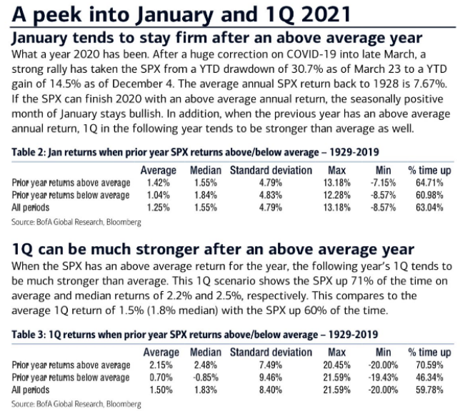
While the January 2021 above average return was not delivered, the market has made up for it ever since. The S&P 500 is up almost 6% year-to-date. Based on the data above, it suggest that after an above average return in the previous year, the following Q1 period can be much stronger (on average 2.15% Q1 return) than average. So far, this Q1 is not just above average but well above average, and laying waste to the LPL Financial data. As I’ve said many a time before, it’s not whether or not you have data, it’s whether or not you have the right data and the appropriate analysis of the data. So unless something unnatural occurs this coming week…
Research Report Insight #9
Another example of the same principle is found in the following graphic from Larry Williams of StockCharts.com. We tend to see these correlation-type charts proliferating in social media and even sell-side analysts’ weekly reports and/or notes. Most of the time, if an analysts say it is, we believe it to be.
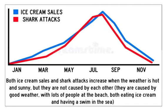
Ice cream sales are correlated to shark attacks? Now this is an extreme version of how to demonstrate that just because trends are alike, they are not necessarily correlated. Having said that, I hope in the future it forces you to look deeper, or interject as I did with the LPL Financial data previously mentioned. There’s usually more than meets the eye!