Another rough session on Wall Street Tuesday, which is otherwise known as “turn around Tuesday”. Unfortunately, there was no “turn around”, as crude oil continued its route to the downside on Tuesday, plumbing levels never experienced before. Additionally, this proved to be the worst Tuesday of the year for the market in 2020. The S&P 500 (SPX) fell just over 3% on Tuesday while the tech-heavy Nasdaq (NDX) led it’s peer indices lower, finishing the session down nearly 3.5% for the day. Ahead of the opening of trading on Wednesday, investors might be able to breathe a sigh of relief as equity futures are pointing to a higher open, but we wouldn’t take it for granted. (Charts/Tables from Bespoke Investment Group)
In terms of the continued declines in crude oil prices, the impact in market cap weighting has been rather sharp as well. With oil prices plunging, the Energy sector is now officially the smallest of the eleven major sectors in the S&P 1500, which is made up of large-caps, mid-caps, and small-caps. Energy makes up just 2.63% of the S&P 1500, which is 2 basis points lower than the next smallest sector, Materials. Real Estate and Utilities are the next smallest sectors with weightings of 3.41% and 3.49%, respectively.

With crude oil plunging ever lower since the onset of the New Year, prices at the pump have have also fallen, just not as much as crude oil. Looking at the chart below, the national average price of gasoline has had a close correlation to the price of crude oil, but looking a little closer, prices at the pump haven’t dropped nearly as much as the price of crude oil. For example, while crude oil prices are at their lowest levels since the 1990s, the national average price of a gallon of gas is still above where it was at the lows in 2016.
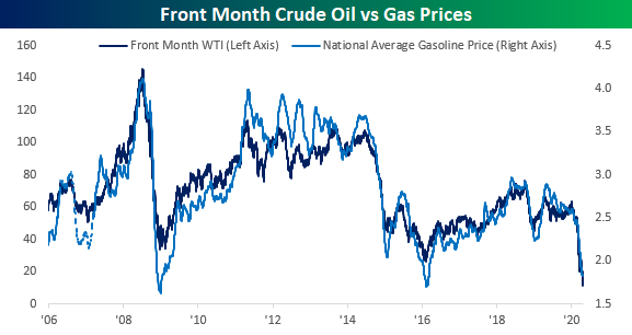
Going back to 2005, this is the first year that average gasoline prices have been below $2 per gallon at this time of year. Not only that but it also the first time that prices have been down on a YTD basis through 4/20 as well. Normally, prices at the pump are up over 15% YTD at this time of year, but due to the global pandemic, prices this year are down almost 30%.

Nearly 4 months into 2020 and COVID-19 has wreaked havoc on oil and energy prices, let alone the entirety of the global economy. Equity markets around the globe have mirrored the damage from COVID-19, although China’s markets have performed quite well to-date. China’s stock market experienced a sell-off on January 18, 2020, when the public first learned about its coronavirus outbreak. In the two weeks that followed, the MSCI China Index underperformed other emerging market countries.
As COVID-19 containment efforts progressed in China, its stock market recovered substantially, and as of April 15, it has outperformed all other emerging market countries year to date. Other countries, namely Brazil and Russia, for example, have been plagued by weak commodity demands and low oil prices and have since lagged the MSCI Emerging Market equities index.

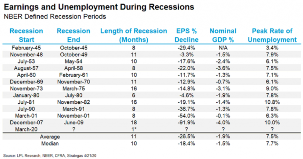
As the U.S. epidemic curve has greatly improved over the last 10 days and the economy looks to open in phases in the coming weeks, a recession has been unavoidable. What makes the current recession unique is that it was self-imposed as a measure to combat COVID-19. According to LPL Financial’s Ryan Detrick, the average recession lasts 11 months, sees EPS decline 28.5%, nominal GDP fall 1.9% and the unemployment rate peak at 7.5 percent. It is highly unlikely that any of these averages from typical recessions will prove a guide for the current recession, which is actually expected to be the shortest recession in history.
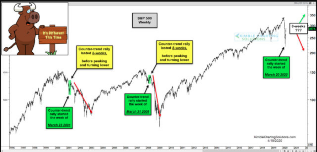
As we’ve said many a time in the past, so many oddities, unique circumstances and lack of precedence for what is taking place in the economy and society today. We hesitate to compare today’s recession and general societal abnormalities with that of the past, but we know it is unavoidable for many. In fact, what tends to breed comfort for the masses, is comparisons, categorization and characterization. It’s human nature to seek comfort and as such the comparisons are… unavoidable. And here’s the unfortunate aspect of comparisons and/or market analogues; they are not all performed equally, consistently and without flaws. One such video analysis that aimed to compare today’s bear market with that of 2008 caught our attention at Finom Group. The video has become quite popular and widely distributed in social media via the attractive click-bait image below and titled “S&P Repeating 2000 & 2007 Bear Market Rallies So Far! Different this time???“
The video is created by author and “technician” Chris Kimble of Kimble Charting and offers the following verbiage:
“During the 50% bear markets of 2000-2003 and 2007-2009, the S&P started quality counter-trend rallies very near the first week of spring (3/21).
If the S&P 500 is going to repeat the large bear markets of the past, would it be important to be aware of where counter-trend rallies started and ended? Yes!
The strong rally over the past month started right on schedule, as the low took place on 3/20, similar to the rallies in 2001 and 2008!!!
The counter-trend rallies in the bear markets mentioned above, both peaked 8-weeks? The trillion-dollar question a month after the 3/20/20 low is; Will it be different this time.“
For most of us, we’re already looking at the verbiage and seemingly confused. “Didn’t the low in 2020 come on 3/23/2020, not 3/20/2020?” But Kimble has 35K+ followers on Twitter, surely he can’t be wrong?
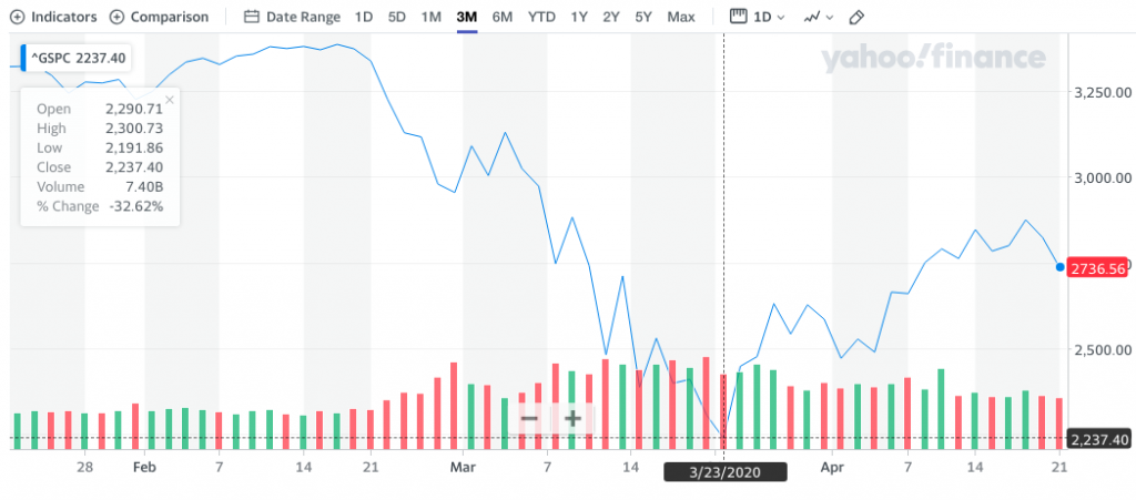
This was what first caught our attention, as it is undeniable that the bear market low was actually achieved on 3/23/2020, and not the date offered by Kimble. In reviewing the totality of the video, it is actually littered with errors, inaccurate dates and general understandings of qualified, certified market technicians. But to kind of narrow things down and for the sake of time concerning analogues and comparisons… (SPX low March 23, 2020 chart below, 2,191.86)
In Finom Group’s Trading Room, we discuss all that is taking place in the markets and economy daily, from 8:30 a.m. right up until the closing bell on Wall Street at 4:00 p.m. EST. During the trading session we are watching educational videos of like subject matter, helping our Premium and MasterMInd Options members decipher the probabilities for the market and economy going forward. Such videos reviewed and discussed daily certainly help in understanding these probabilities as well as help to define market risk.
As it pertains to the Chris Kimble video in question, when we watched the portion discussing the 2008 bear market, again, our curiosity was peaked. The context for the whole comparison is a matter of having just expressed a 57% countertrend rally in the bear market of 2020 vs. the countertrend rally of 50% in 2008. (See screenshot below)
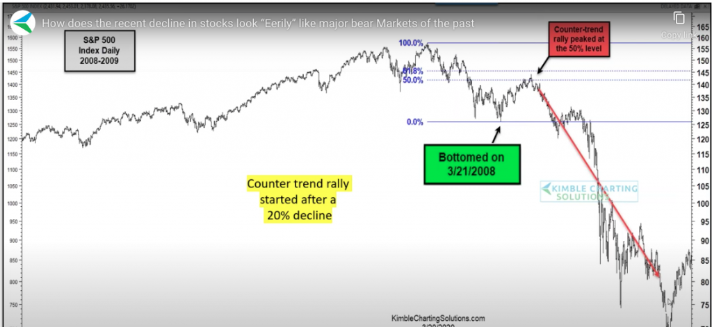
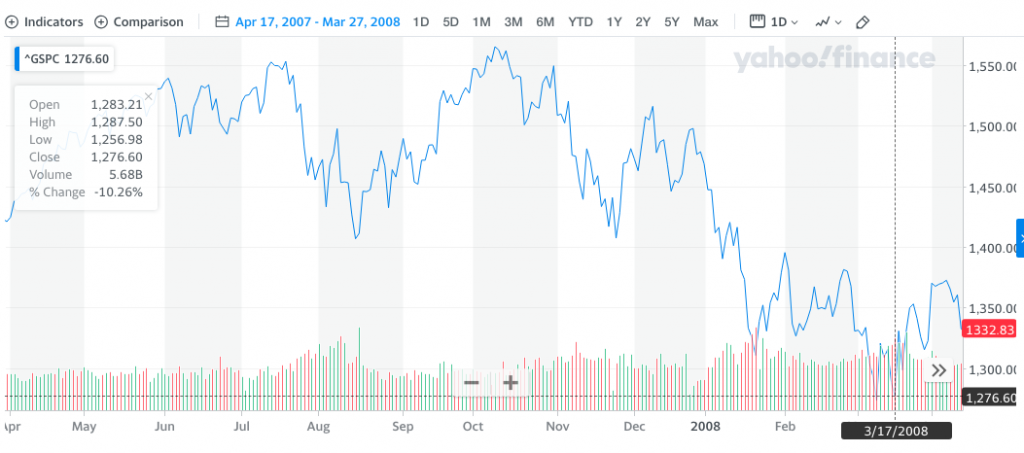
The screenshot from the video identifies the “bottom” for the first leg of the “bear market” countertrend rally as of 3/21/2008. But again, the date throws us for a loop as it is incorrect. The actual initial bottom took place on 3/17/2008 as shown in the chart of the S&P 500 for the time period below:
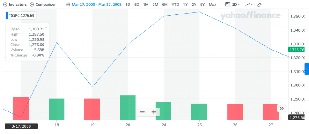
The market was actually already off to the races on 3/19/2008. And why, because the actual “technical bear market” low was on 3/17/2008, not the offered 3/21/2008 date offered by Kimble. And since you see that we’ve put “technical bear market” in quotations, it’s important when comparing one technical pattern to another to compare apples to apples for such an exercise of consequence. In 2020, we don’t have a technical bear market, we have an actual bear market. The S&P 500 has offered 2 technical bear markets, whereby there is a peak-to-trough 20% decline intraday, but not a closing price that distinguishes a technical bear market from that of an actual bear market. In 2011 and in 2018, the S&P 500 delivered technical bear markets, as it did in March of 2008.
As shown in the S&P 500 chart above, from 3/17/2008, the intraday low was 1,256, but the closing value was 1,276. The previous high value on the S&P 500 was 1,576 on 10/11/2007. In order for this to have been an actual bear market, the closing value would have had to be at least 1,262. In other words, we’re not comparing apples-to-apples and as such it is probably part of the reason that the countertrend rallies differed from 50% in 2008 and 57% in 2020.
Jurrien Tremmer of Fidelity identifies the differences in the 2008 bear market rallies and the actual apples-to-apples comparison with that of the 2020 bear market rally in the graph below:
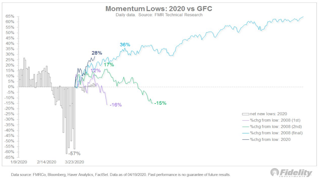
The reality is that there was not a 50% bear market rally until the final attempt, which proved the breakout, highlighted by the trend-line in blue (36% final rally).
The big takeaway here is that we just had a 57% retracement of the decline in 2020. Historically, when this has happened in a bear market, the lows have never been fully re-tested. The video offering by Chris Kimble, due to the narrating and faulty indicators/dates, suggest we could in fact see the S&P 500 not only re-test the lows but go much lower. None of the scrutiny offered here is to suggest that the S&P 500 can’t do so, but rather to distinguish why if it does, it wouldn’t be due to the offerings in the video, analogue analysis, as it has flaws identified.
The current economic and market environment remains quite uncertain, and try as many may, there is no true comparable to today. Volatility records have been set as the S&P 500 declined into bear market territory more quickly than any time in history and with a recession ensuing? Going into Wednesday’s trading session, the VIX and realized S&P 500 volatility remains elevated, begging of investors and traders to remain cautious.
A VIX Index measuring around 42 anticipates about 2.625% daily S&P 500 moves (closing basis). Currently the 1- and 3-month realized volatility levels for the S&P 500 are in the 60s. The narrative is one of ongoing volatility as opposed to episodic.

As you can see in the table below, for the past eight years, S&P 500 selloffs have been relatively muted. The averages DO NOT include the most recent decline, which skews all the calculations considerably. The “typical” selloff has been less than 11% over the course of about two months (calendar days) and the average peak VIX Index measure is ~30.

The COVID-19 crisis more than tripled the average selloff, occurred over about one month, and the VIX made an all-time closing high at 82.69 on March 16. Despite the sharpest rally in the broad market since 1933 where the S&P 500 advanced 28.2% in 17 days, the broad market remains in no-man’s land and volatility remains elevated.
Dean Curnutt and his colleagues at Macro Risk Advisors recently offered the following on the subject of markets and volatility:
“While it is not controversial to argue that the truly giant daily swings (three successive days of +/-9% moves in the SPX!) are behind us, we continue to experience regular flare ups that should keep the level of realized volatility in the SPX at a very healthy level. In turn, the VIX should stay elevated. The market has logically punted on evaluating the economic data statistics up to this point. Corporate profit data may be viewed in a similar light, although the performance of financials this week suggests otherwise. At some point, however, the market must assess the damage. This messy exercise will necessarily be fraught error, entangled with evaluating the efficacy of the fiscal and monetary response along with the moving target that is when and to what extent the economy can reopen. These matters will not be settled for an extended period of time and the market will tether itself reasonably soon to responding to new information. The VIX has spent more than a month north of 40. Only the GFC outstrips this with respect to implied volatility that was so elevated for so long (VIX was above 40 during the 3 month stretch of Oct, Nov, Dec.2008).”
In appreciating and analyzing what has taken place in the various markets over the last 8 weeks, it could be argued that the volatility and capitulation first showed itself in the treasury market. It moved from the treasury market to the equity market and now it appears to be encompassing the commodities market, via crude oil. Given these assumptions noted, it could be rationalized that we are finding a bottom in the price of crude, given the capitulatory moves over the last couple of trading days.
Moreoever, from a volatility perspective, the bond market doesn’t seem to be signaling exceptional levels of forward-looking concern now. The CBOE’s TYVIX Index, which is a constant measure of forward volatility expectations based on 10-year Treasury Note options, has declined more precipitously than the VIX Index. As of April 16, the TYVIX Index measured 6.46. The average for 10-year bond volatility going back 52 weeks is 5.25. The move in TYVIX may be a continuation of the first-mover indications for equity market volatility to come. Then again…
The Index moved from the 4.25 area in early February to its peaks of 16.39 in mid-March. It’s nearly back to the pre-COVID levels despite the yield curve remaining very near its lows (high prices). Again, it’s a testament to a $2.3 trillion dollar liquidity injection from the central bankers.

And since we’re talking about treasuries for a change, we can’t help but to recognize the very tight correlation between the long dated Treasury ETF (TLT) and the S&P 500 index ETF (SPY) as of late and over the long haul. One of our key considerations during the remarkable relief rally in 2020 is that bond prices remained bid. As we’ve stated in our Research Reports, for a more sustainable rally, we would like to see a flight from bonds into equities. Instead, during the relief rally we saw a bid in both equities and bonds, as noted in the following statistical data from DataTrek:
“The rally in US/global equities since the March 23rd lows has been impressive, but consider for a moment that the long dated (+20 year) US Treasury bond is also marginally higher since then.
- The S&P 500 was +28.2% from March 23rd.
- The TLT ETF (+20 year Treasuries) was +2.5% since March 23rd.
“Today we will expand the conversation and look at 90-day rolling returns to capture what history has to say about where Treasuries may go over the next 4-5 calendar months (we use trading days in our work).
- Since 2002, the average 90-day price return on TLT has been 1.4% in terms of price movement (we’re excluding coupon payments and focusing on price return only).
- The standard deviation of that mean is 7.5 points, which means any 90-day return between -21.1% and +23.9% is solidly in the meaty part of the curve.
- The graph supports that math: there are only 6 instances where 90-day returns touched/went through +20% and only one -20% occurrence.
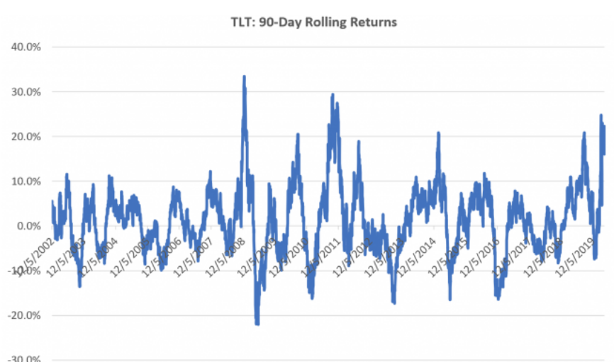
As of today’s close, we’re at a 22.0% 90-day return:
- It is very close indeed to a 3-standard deviation return.
- The only notably higher readings this year was for the 90 days ending March 9th (24.8%) and March 23rd (23.0%), the day of the lows for equities.
- You have to go back to December 2011 to find higher trailing 90-day Treasury bond returns than we’ve just experienced in March/April 2020.
Here’s what has happened when we’ve been in a similar spot before:
History shows 4 instances since 2002 when Treasuries got close to/exceeded a 20% 90-day return for just a brief period. Here are those dates and forward 30- and 90- day price returns
- August 26, 2010: 30-day forward return: -3.9%. 90-day return: -13.7%
- July 26, 2010: 30-day forward return: -5.3%. 90-day return: -4.2%
- January 28, 2015: 30-day forward return: -7.1%. 90-day return: -14.1%
- August 28, 2019: 30-day forward return: -3.8%. 90-day return: -6.9%
- Averages: 30-day forward return of -4.0%, 90-day return of -9.7%
History also has 2 examples when 90-day Treasury returns blasted through 20% rather than stopping there:
- December 2008: on 12/1, trailing 90-day returns hit 20.2% and bonds continued to rally another 11.8% through 12/19. Trailing 90-day returns peaked on that day at 33.4%.
- August – November 2011: after first hitting a 20.1% trailing return on 8/17, long dated Treasuries rallied another 8.3% over the next 30 days. 90 days later after the first +20% day, however, Treasuries were 20.0% lower.
The message from this: to hold long dated Treasuries here you have to be absolutely certain the COVID-19 Crisis is going to have another wave of impacts on the US/global economy and investor confidence beyond what we’ve seen to date. In that environment we could, as in December 2008 (Financial Crisis) or late 2011 (Greek Debt Crisis) see further gains. But history says you need that sort of damage to get a follow-on move from here.
Equity futures are still higher ahead of the opening bell on Wednesday and Finom Group remains cautiously optimistic on the market going forward and through earnings season. Over the next 6-9 months, we anticipate higher equity market values, given a variety of factors and variables considered. One of those factors remains the ongoing and never-ending hunt for yield.
On March 23rd the difference between the S&P 500’s dividend yield and that of the 10-Year Treasury was around 1.915 percentage points; the most in the past half century. Today the spread has narrowed a bit to 1.59 percentage points, but as shown below, that still remains wider than anything we’ve seen over the last 50 years.

With the risk free premium dramatically fallen since 2019 and into 2020, the hunt for yield is increasingly paramount among institutional fund managers. Keeping this in mind, J.P. Morgan’s Marko Kolanovic argues that the S&P 500 could see new record highs in the first half of 2021. Forecasts are not guarantees and constantly revised, so keep that in mind as we offer the commentary from Kolanovic’s recent report below:
Market and Volatility Commentary: S&P 500 back to highs? Quantifying Fed impact on the multiple; Sunshine – a factor in reducing COVID-19 spread. Tue Apr 21 2020
“After the Fed introduced the first wave of monetary easing, we expressed our view that the S&P 500 will reach its previous highs in the second half of 2021. This was based on our analysis of the pandemic and market structure (flows, positioning, and liquidity). Following the second wave of monetary measures, which included a backstop for certain credit assets, we shifted our forecast that the previous highs are likely to happen in the first half of 2021. Below we provide some methodology and analysis behind our view.”