Equity markets fell on Tuesday with the S&P 500 (SPX) halting an 8-day winning streak. The Dow Jones Industrial Average (DJIA) led its peer indices to the downside with a 190-point slide and on the heels of Boeing (BA) slashing its FY19 forecast. Additionally, investors revisited global growth fears after the International Monetary Fund (IMF) lowered its global growth forecast for 2019.
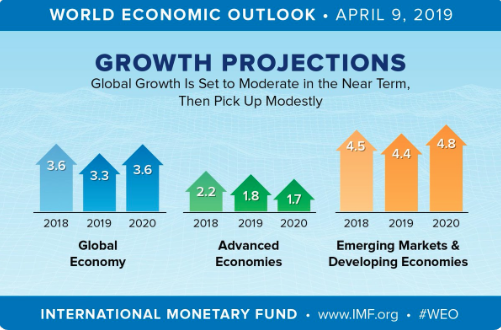
For the third time in six months, the International Monetary Fund has cut its global economic forecast. The IMF now sees global growth of 3.3% this year — down two-tenths from January, and four-tenths from October — followed by 3.6% growth in 2019. The IMF cut its U.S. growth estimate for 2019 by two-tenths to 2.3%, its euro area forecast by three-tenths to 1.3% and its Canadian forecast by four-tenths to 1.5%, among other changes.
With equities under pressure Tuesday and bonds catching a bid higher once again, investors were confronted with “top calling” amongst market participants whom have consistently berated the market’s strong rally back from the Christmas Eve 2018 lows. CNBC’s Mad Money host Jim Cramer tackled some of the key concerns offered by market pundits and the general tone of the market heading into earnings season.
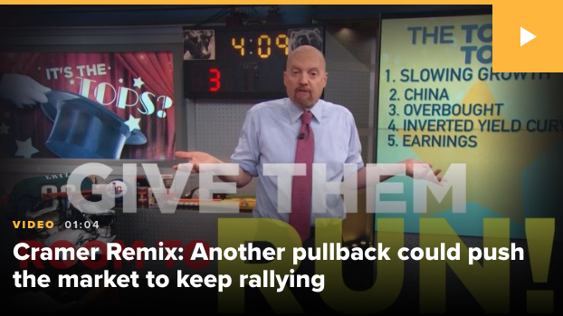
In offering investors 10 key reasons as to why the market has not likely hit its peak, Cramer also suggested that another pullback like the one that happened on Tuesday would actually be a net positive, as it would remove some of the frothiness in the market.
“Let’s just say they have plenty of room to rally if they beat the numbers,” the “Mad Money” host said. “Today removed a lot of the froth that I don’t like. One more pullback like this before the big banks start reporting on Friday and I think we’re gonna be in very good shape.”
Finom Group remains of the opinion the market has more upside in 2019, but not with the market moving higher in a straight line. Fits and starts will prevail. As such, constructing a shopping list of companies would advantage investors and/or ETFs they desire to buy should a technical market retracement take hold in the coming weeks.
While talks surrounding recession risks seem to elevate when global growth forecast combine with a global equity sell-off, it’s important for investors to rationalize the rhetoric of the day. Recessionary conditions are still not showing up in the data, but certainly slowing growth has been presented. Moving from a period of above trend-growth to inline, trend-growth is something many economists have anticipated. In other words, don’t be surprised by weakening economic data, but not necessarily weak economic data. The difference in verbiage may seem immaterial, but it can be the difference in how one deciphers the economic data and thus deploys investment capital.
A common cry of those who fear the current economic expansion cycle is that it is one with extreme consumer and corporate debt. While the level/quantity of debt is certainly at its highest point in history on the whole, servicing the debt is a whole other consideration. The following chart from Deutsche Bank is an extrapolation of the latest consumer credit report from the New York Federal Reserve.
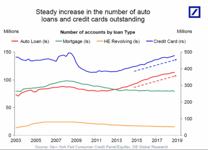
It looks like a rather unfriendly chart if your bullish on the economy and further feeds the bearish narrative that the economy is inflated, and inflated BY debt. Recall, however, that the other part of the debt narrative rarely catches the media’s eye or gains traction in social media. There’s nothing sexy about household debt to income ratios that are favorable. And that’s exactly the situation that we have to look at with respect to debt service. With increasing consumer debt levels, is that increasing debt serviceable? The following charts from Goldman Sachs identify that not only is the debt serviceable…
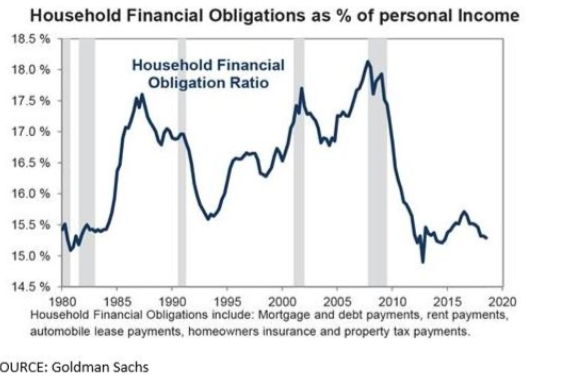
But household balance sheets are in their best conditions in decades according to Goldman Sachs and the New York Federal Reserve statistics. The grey shaded areas within the chart identify recessions. As we mentioned earlier in this narrative, we continue to see economic data come in that is absent recessionary conditions. In a consumer driven economy, the consumer has all the tools at their disposal to continue the economic expansion.
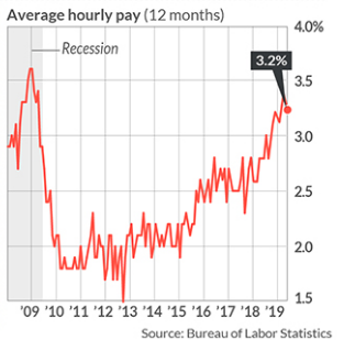
What’s the cause of these astoundingly strong consumer/household balance sheet conditions? For one thing, a strong labor market over the last decade that has found wages growing at their fastest pace in nearly a decade, boosting the denominator of the household balance sheet equation.
Of course, the 2017 tax reform legislation has also put more earned dollars into the consumer’s coffers on a monthly basis. One last point to make with respect to debt is very simple and undeniable: Debt only goes in one direction long-term, higher. That is a fundamental, structural component of the U.S. economic system. Given the facts at-hand, it’s more relevant to define the strength or weakness of the economy along the lines of debt serviceability.
With Tuesday’s market turmoil, to the extent it can be characterized as such, volatility rose sharply. The VIX rose nearly 10% on the day, from 13.10 to 14.28. The Volatility of Volatility Index or VVIX rose nearly 8%, underperforming the VIX while showing market participants buying protection heading into earnings season.
What we’ve seen from both the VIX and VVIX in 2019 has been fleeting bouts of volatility, characterized by sharp moves higher in implied volatility followed by an abrupt halt and decay in market volatility. VIX futures have also mirrored such moves. With respect to trading volatility as an asset class, Finom Group’s Seth Golden often suggests that those who trade the volatility complex should recognize that volatility moves in regimes, from high regimes to low regimes and vice versa.
In 2017, the VIX was found to express the most complacent implied volatility regime in history and with the VIX hitting an all-time record low level. As such, it also found VIX Futures Term Structure at its steepest level since leveraged VIX –Exchange Traded Products began trading in 2009. The following chart from Matt Thompson identifies the different shape of the VIX Futures Term Structure curve, which is usually upward sloping and signifies the future expectations of implied volatility in the market.
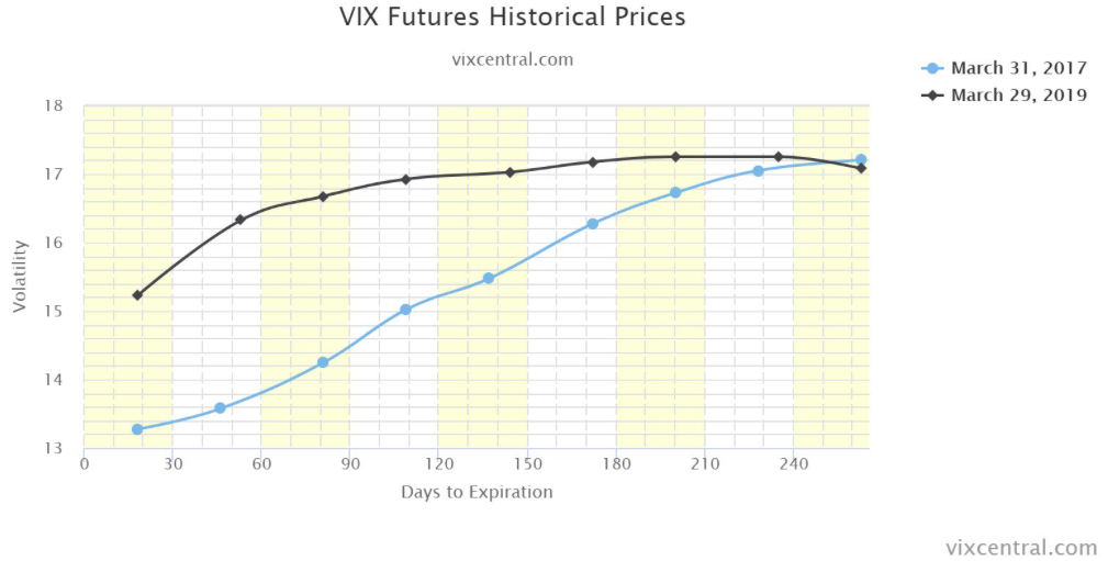
The chart identifies the Q1 2017 period and Q1 2019 period. As one can clearly see, the flatness of the curve today is likely a representation of investor concerns for a higher volatility regime that correlates to an extended economic expansion cycle, a tighter labor market that induces wage inflation, global growth slowdown angst, rate of change for EPS and geopolitical tensions.
Given the relative flatness of VIX Futures Term Structure in 2019, we are forced to also forecast that contango can be fleeting and/or become easily curtailed when implied volatility is on the rise. This is a key takeaway with regards to the short volatility trade.
The length of the economic expansion cycle will continue to develop concerns amongst investors, as it proves elongated and one of the longest in history without a recession. In speaking about economic conditions, we continue to monitor all aspects of daily and weekly economic data releases. Yesterday’s release of the JOLTS data proved as expected.
In the Finom Group Trading Room with subscribers, we discussed with members the desire to see the JOLTS results come down, but to remain above 7mm. That’s exactly what was delivered. In the BLS Survey, the number of job openings fell to 7.1 million from 7.6 million on the last business day of February. Over the month, hires and separations were little changed at 5.7 million and 5.6 million, respectively. Within separations, the quits rate was unchanged at 2.3% and the layoffs and discharges rate was little changed at 1.2 percent.
The number of quits was little changed in February at 3.5 million. The quits rate was 2.3 percent. The quits level was little changed for total private and for government.
The following graph shows job openings (yellow line), hires (dark blue), Layoff, Discharges and other (red column), and Quits (light blue column) from the JOLTS.
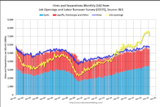
Note that hires (dark blue) and total separations (red and light blue columns stacked) are pretty close each month. This is a measure of labor market turnover. When the blue line is above the 2 stacked columns, the economy is adding net jobs and when it is below the columns, the economy is losing jobs. The latest data from the BLS supports a growing labor market and economy, but also supports a trend-growth forecast for the economy.
Heading into the trading session on Wednesday, equity futures are somewhat rebounding, but with caution. In fact, most investors are likely sidelined until the banks begin reporting on Friday morning. With this in mind, it’s no wonder volume has been extremely light of late.
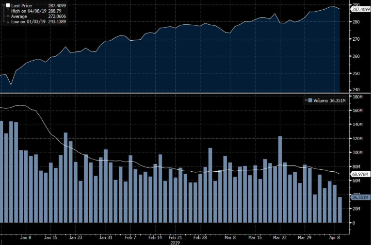
As shown in the chart above, 5 of the 8 lowest volume days of the year for SPY have occurred in the last 8 trading sessions. Today’s trading activity will likely continue to be light as investors will await the latest Consumer Price Index (CPI) and FOMC meeting minutes from March, later in the afternoon.
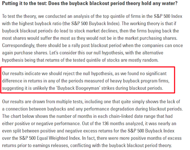
With earnings season ahead, buybacks will be increasingly lighter, but as Finom Group has demonstrated in the past, the infamous chart below is a complete farce with respect to how blackout periods work and what affect they have on the overall market.
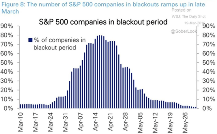
In fact, Wes Gray of Alphaarchitect.com performed a study on the affect of blackout periods on the market just last year. His findings were that they have almost no impact on the market. (See below)
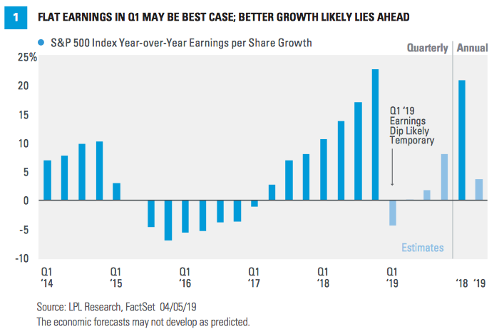
In carefully curating information surrounding earnings expectations for the Q1 period, we are now able to offer the latest forecasts and insights for the Q1 earnings season from LPL Financial. With most firms expecting Q1 earnings to have declined by 2-4.5% on a YOY basis, LPL Financial puts into greater context the rationale behind such forecasts.
Marking the one-year anniversary of the tax reform earnings boost, in the first quarter of 2018, has made the annual comparison more difficult, as shown in Figure 1. We expect roughly flat earnings for the quarter, but the streak of seven straight quarters of earnings growth could come to an end.
- In the first quarter of 2019, oil prices averaged $54.90, 11% below the $61.45 average in the year-ago quarter. Energy sector earnings are expected to fall nearly 20% versus the year-ago quarter. Because of its bigger weight in the index, the technology sector’s expected 10.6% drop in earnings is a bigger contributor to the overall decline.
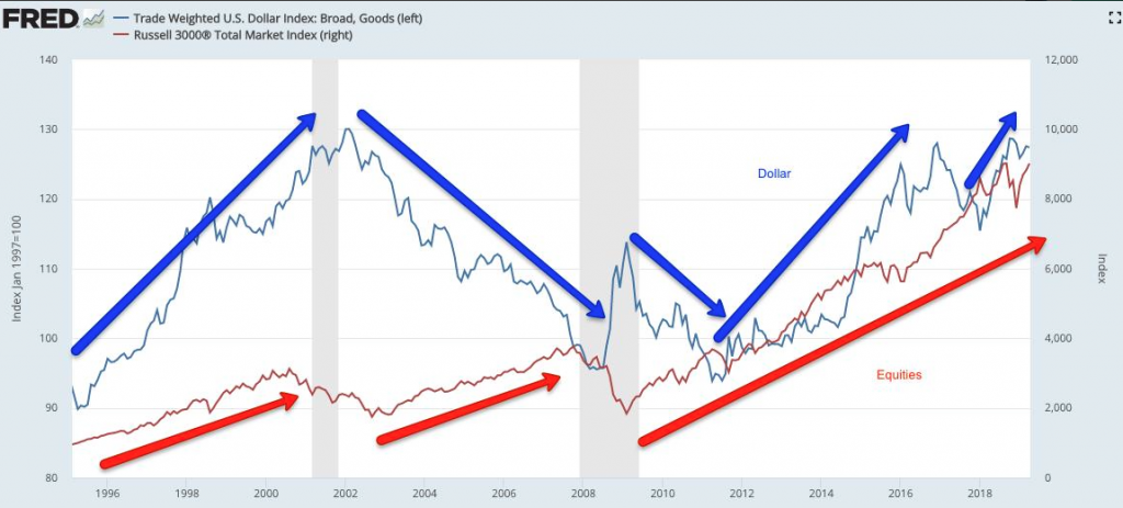
- The average price of the U.S. Dollar Index in the first quarter was 7% above year-ago levels. As a result, currency may cut 1–2 percentage points out of S&P 500 earnings for the quarter (roughly 40% of S&P 500 companies’ profits come from outside the U.S.). Even if the dollar stays where it is now, the drag would continue for at least the next couple of quarters. While the dollar is a drag now, we expect its latest rally to reverse and potentially contribute to earnings growth later this year.
- Some small drags—such as currency, commodity prices, tax adjustments, etc.—may lead to modest margin contraction. But stable wage growth, productivity gains, and still-low interest costs should help limit the amount of margin contraction and support positive earnings surprises.
“Beyond the first quarter, the earnings picture looks quite a bit better. We expect the S&P 500 to generate mid-single-digit earnings growth in 2019 and see the first quarter as a trough in growth.
Though economic growth is likely to slow from last year’s pace, we see enough growth ahead to drive another year of record profits, supported by fiscal stimulus, robust manufacturing output, healthy labor markets, and resolution of the U.S.-China trade dispute. Our forecast for S&P 500 earnings per share in 2019 remains $172.50, representing a little over 6% growth.”
While Finom Group tends to agree and has found similar analysis and forecasting when compared to LPL Financial, the U.S. Dollar strength is a notable likeness and noted headwind… for S&P 500 sales. But with respect to equities, it simply hasn’t played out that way historically if we only look at the comparison of the Dollar strength and the equity market. (See chart below)