
We kicked-off the trading week with another round of sector rotation whereby the broader indexes further decoupled in price action. The Dow Jones Industrial Average found industrials and consumer stocks in retreat, resulting in the index shedding some 180 points on the day. The broader S&P 500 index fell roughly 10 points or .35%, also with consumer discretionary, retail and consumer staple stocks faltering. The tech-heavy Nasdaq, after being the only major index that was lower on the whole of last week, was up slightly on the day as FAANG stocks lead the index higher.
The markets have been expressing strong sector rotations since the spring months and post the February-March correction period. There has been little correlation in the market since the spring, which is also proving an obstacle for driving fear into the market, as measured by the VIX, despite the many geopolitical risks that have arisen. We can firstly see the S&P market correlation in the following chart:
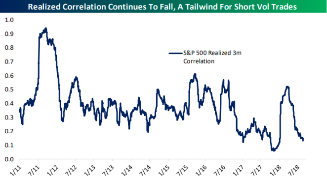
As it was in 2017 and in early 2018, the lack of fear and increased sector rotations produce great market dispersion. We can see this visually in the following VIX chart as well, from Thrasher Analytics:
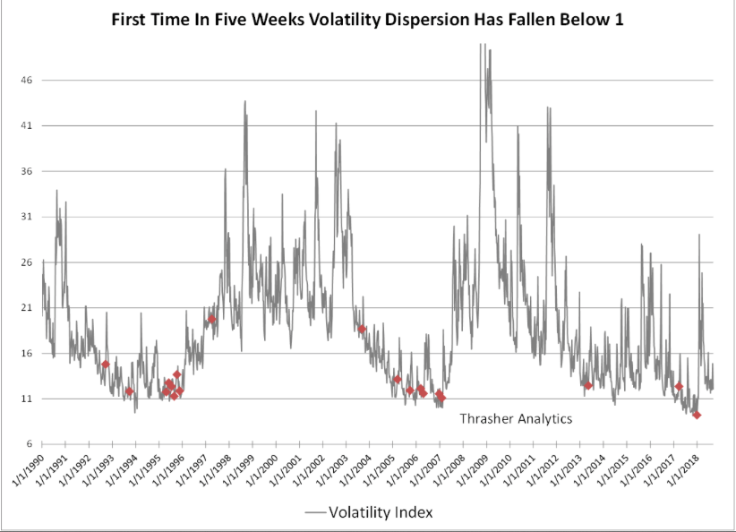
“The chart above shows when the weekly dispersion of the VIX has fallen below 1 for the first time in five weeks, a level that as of today we’re very close to breaking under. What immediately stands out to me is that this narrowing in weekly dispersion was one of the early warning signs before the massive spike in February. That’s not to say we will see a repeat of the February spike, but it does lend itself to the idea that complacency has flooded the volatility market as it did earlier this year. Before January, we didn’t see weekly dispersion narrow like this outside of 2017 and 2013 and before then we’d have to go back to 2007 when the VIX put in an ultimate low before the GFC.”
More so than any other volatility indicator, the VIX weekly dispersion indicator has proven an effective warning signal, when coupled with other metrics that include SKEW Index and VVIX readings. At present, both SKEW and VVIX are not expressing a warning signal that aligns with VIX weekly dispersion, but on any given day both can explode as is the case for most aspects of the VIX complex.
What’s most important to recognize from the subject matter is that adverse/negative reactions from the VIX complex are most exaggerated from “newness” and when markets better correlate. The VIX complex of indicators and readings often overreact to new fears or fears that have not been raised for long periods of time. Wage inflation fears from the January Nonfarm Payrolls report was a fear that hadn’t been contemplated for some time and when the metric came in much hotter than anticipated, dispersion gave way to correlation, the VIX rose dramatically and equity indexes fell in unison. When equity markets, sectors and/or indexes begin to reconnect or better correlate, the VIX and equity markets can move dramatically more than expected. As is always the case, volatility traders should store this in their resource bank for future use.
In speaking of market signals or market warning signs, we’ve seen a lot of discussion about the Hindenburg Omen lately. Named after the German dirigible that notoriously exploded in 1937, the Hindenburg Omen is formulated to predict market crashes, or severe downturns, by synthesizing data, including 52-week highs and lows as well stock moving averages on the New York Stock Exchange. It was created by Jim Miekka, a blind mathematician, marksman and teacher, who died about four years ago. Miekka claimed that his indicator had been an accurate predictor of every market crash since 1987 on. It did not!
Before we discuss the Hindenburg Omen warning signal, it’s likely important to denote Finom Group’s negative bias pertaining to technical analysis and/or breadth indicators. We find such analysis useless for long-term investors and often an imperfect science littered with impediments for investors. With that said, we’ll try to stick to the facts and historic precedence when discussing the Hindenburg Omen.
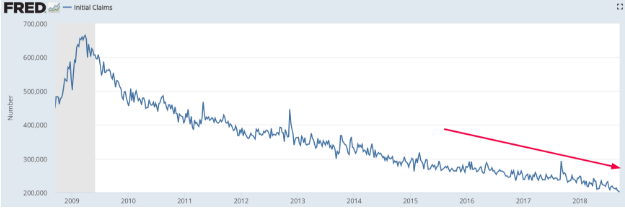
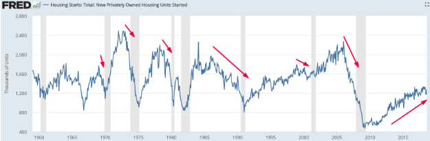
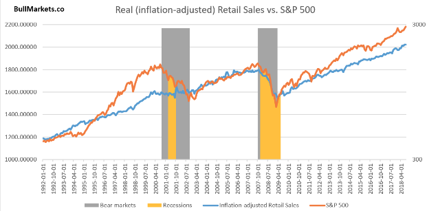
In general, markets follow the economy as the economy produces profits, which lead to rising stock market prices. The economy is on solid footing, growing at an accelerated YOY pace even. All Leading Economic Indicators are rising, while jobless claims are trending lower. In a consumer driven economy, the labor market, housing and retail sales reign supreme in the economic data-verse.
The aforementioned data supports the fundamental backdrop of the stock market’s rise since the Great Financial Crisis. But technicals can prove troubling from time-to-time and even as the long-term trajectory proves favorable, based on the fundamentals. The Hindenberg Omen is one such technical signal that indicates weakening market “breadth”. One of the major flaws in the Hindenberg Omen, according to Finom Group’s chief market strategist Seth Golden, is that it looks for >2.8% of stocks making 52 week highs and 52 week lows. This is quite simply too small a number to extrapolate a broad market impact.
A jump in the number of stocks hitting 52-week lows and highs on the New York Stock Exchange has been a key feature, among others, used to calculate the bearish pattern. On Sept. 11, for example, there were 121 new 52-week lows put in on the NYSE, compared with 95 highs, despite healthy gains in the major market indexes. It is often believed that a market’s propensity to produce more new lows than new highs suggests that market breadth is deteriorating, which can also be interpreted as a warning signal for stocks.
We’ve seen only a few Hindenberg Omen’s and the track record for the breadth indicator is, at best, 50/50 proven effective. Prominent technical analyst Tom McClellan told MarketWatch’s Tomi Kilgore back in 2014 when another Omen appeared that “there are far more Hindenburg signals than there are scary declines.”
McClellan told MarketWatch on Friday that he has seen a cluster of 7 Hindenburg instances in which 52-week highs and 52-week lows were more than 2.8% of the total of advancers plus declining shares and as shown in the chart below:
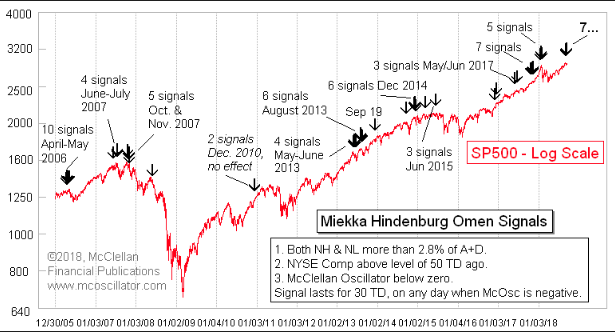
As shown in McClellan’s chart, failed Hindenberg Omen’s occur often. McClellan suggests that clusters “matter more than individual signals.” However, he said “they are not a guarantee that trouble has to come, just a warning that things are getting hinky in a way that has mattered before.”
The most recent Hindenburg Omens, prior to this month, occurred in July and November of 2017. Both obviously failed as the market soared thereafter. Each occurrence is noted below for their characteristics and previous like occurrence that DID result in market declines.
Failed Hindenburg Omens: July 31, 2017
There were 8 Hindenburg Omens in 30 days. Before, this had only happened in:
- 1990
- 1993
- 1999
- 2007
Failed Hindenburg Omens: November 15, 2017
There was a major cluster of Hindenburg Omens while >30% of stocks were below their 200-DMA. Before, this had only happened in:
- July 1998
- December 1999
- July 2007
As is often the case, technical analysis and/or market breadth indictors are not perfect exercises or perfect scientific studies. Price action tends to dominate and the price action is underlined by strong economic and corporate fundamentals presently. In earnest, we’d also have to offer that price action can be dictated by mechanical trading that has proliferated post the Great Financial Crisis and through quants and algorithmic programmed trading. Passive investing instruments such as ETFs also lend themselves to extended market trends that tend to proliferate the failures of indicators.
With some of the indicator and warning signal talk behind us, the markets are looking to rebound from yesterday’s price action. Equity markets are poised to open higher in the U.S. as the Fed kicks-off its 2-day policy meeting that is expected to end with a .25 bps rate hike and corresponding press conference. Rate hike fears are widely overblown, as the Fed is hiking rates from relatively historic low-levels.
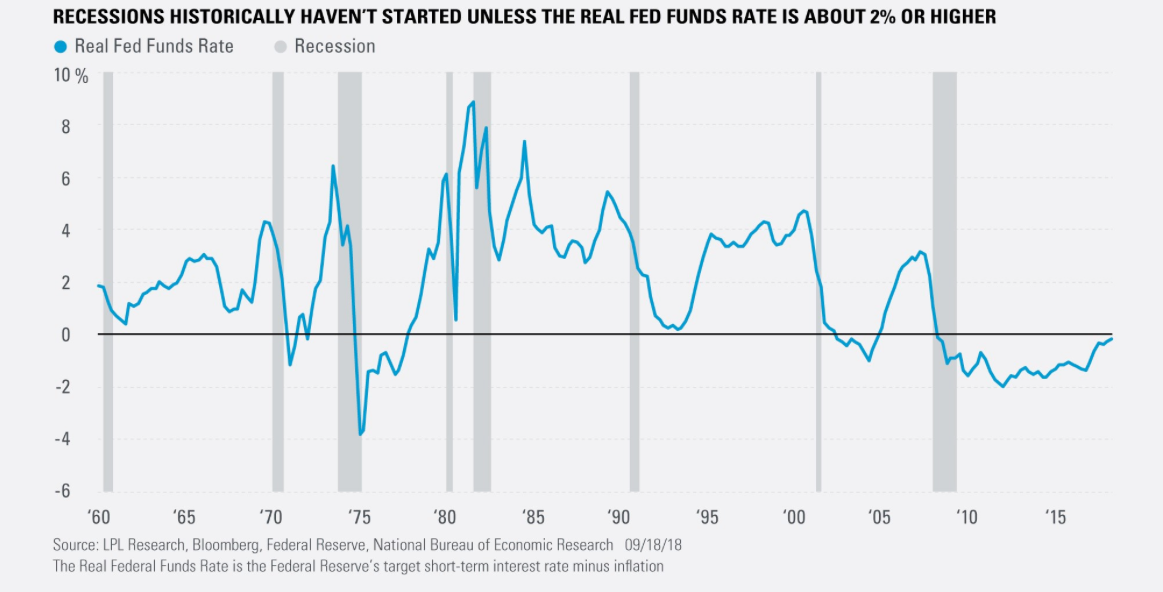
Additionally, the real Fed Funds rate is near zero (2% inflation and ~2% fed funds rate) and at levels not seen since the 1970’s. Simply put, the Fed has a long way to go before actual inflation crimps consumer spending, retail sales and impedes economic progress. Having said that, the economic cycle will likely stall out and retreat before the Fed is able to achieve inflationary rate conditions, which is also the case in most every economic cycle, as the Fed is unable to stimulate the long end of the yield curve to the extent it achieves the former cyclical yield-high on the 10-year Treasury note.


