
Welcome to another trading week. In appreciation for all of our Basic Membership level participants and daily readers of finomgroup.com content, we offer the following excerpts from within our weekly Research Report. Our weekly Research Report is extremely detailed and has proven to help guide investors and traders during all types of market conditions with thoughtful insights and analysis, graphs, studies, and historical data. We encourage our readers to upgrade to our Contributor Membership level ($14.99/monthly, cancel anytime) to receive our weekly Research Report and State of the Market videos. Have a great trading week and take a look at some of the materials from within this week’s Research Report…
Research Report Excerpt #1
So how has the S&P 500 (SPX) performed during August’s monthly Op/EX historically? Glad you asked!
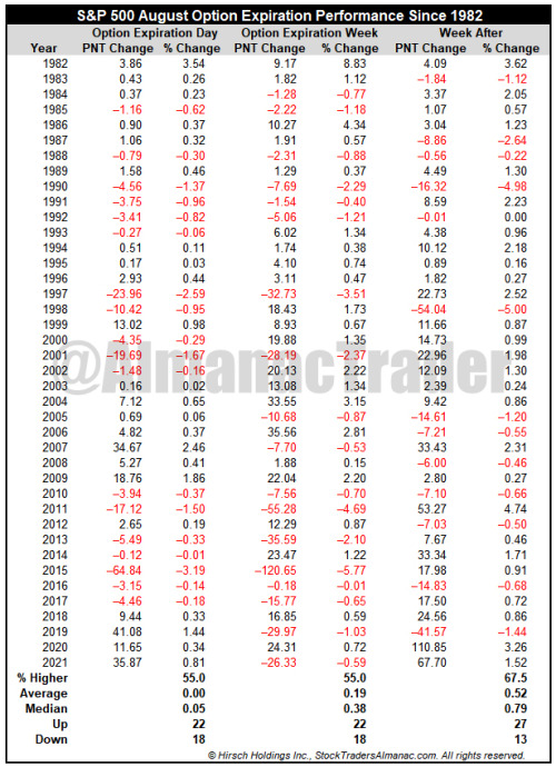
As shown in the table above, also from The Almanac Trader, the S&P 500 has been only slightly higher and only a slight majority of the time during monthly Op/EX week.
Research Report Excerpt #2
With the S&P 500 having fallen just under 3% from its YTD closing high, we also remind investors that a weak start to August, historically, has proven a boon for investors through year-end.
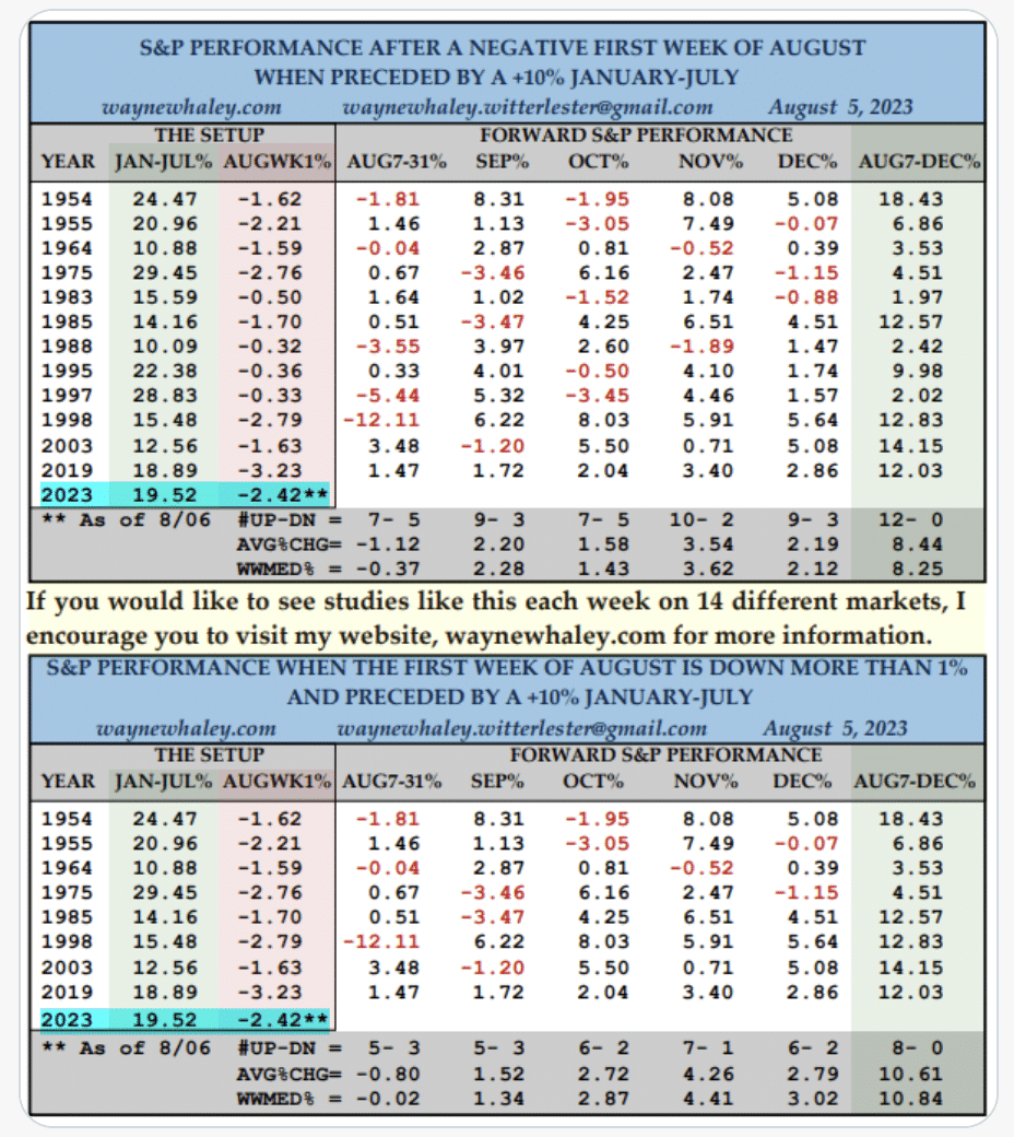
In the Wayne Whaley study above, we see some promising results when the January – July period found the S&P 500 gaining more than +10%… AND the first week of August was down more than 1 percent.
Research Report Excerpt #3
Speaking of analyzing markets, expressing discipline, and feel… At the end of June (1H 2023), I eliminated all remaining holdings of Apple Inc. (AAPL) within the Golden Capital Portfolio:
“One stock that is no longer in the Portfolio is Apple Inc. (AAPL). Only holdings of 1% or greater are outlined as core holdings. After nearly 2-years of ownership and achieving our objective with AAPL, we felt it was time to move the profits elsewhere. Apple is now a $3trn. market-cap and most heavily weighted stock in the S&P 500, carrying the largest single-stock weighting in the index history. Apple is a great company. Our decision to accept the full-reward the stock has delivered was a reward over risk decision. One piece of data that helped facilitate our decision-making process is outlined in the below chart and data from Ned Davis Research:
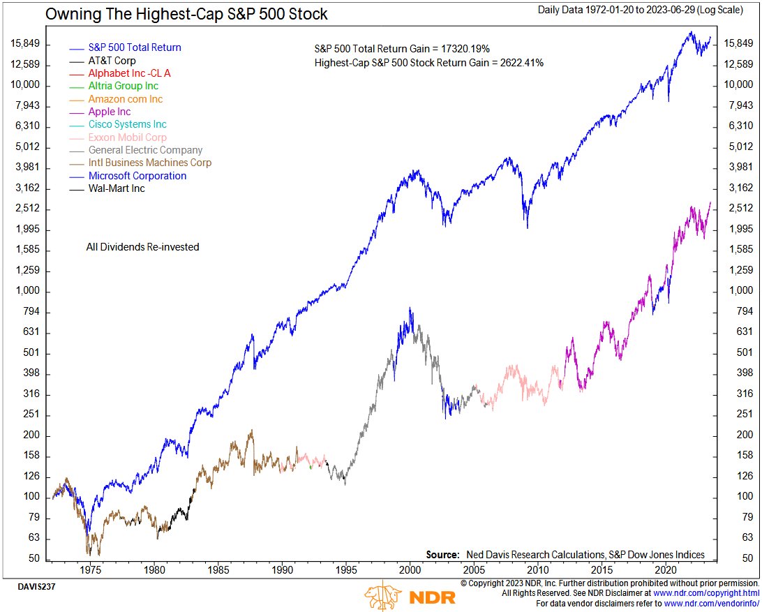
Once a company became the highest cap-weighted stock in the S&P 500, did it pay to own it rather than the S&P 500 index itself? This analysis (since 1972) shows the answer is no. The S&P 500 returned more than 6.6x more than the highest cap-weighted stock. So far, the data has not held up against the Apple rise to-date, but we suspect it will in due time. Either way, we invested in Apple’s fundamentals nearly 2 years ago, and more than achieved our profit objective with the stock over the stated time period.
Research Report Excerpt #4
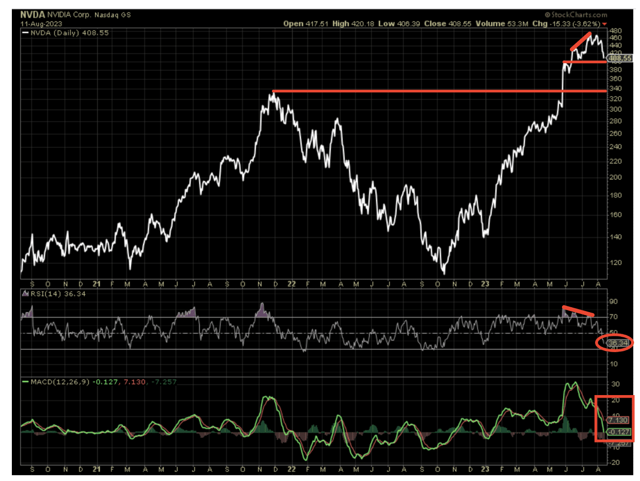
As Nvidia (NVDA) goes…so goes the Semiconductors? This is often the case. The daily, 3-year chart shows that NVDA peaked at the same time as SMH back in December 2021. We know what has transpired since. During the Q1 earnings reporting season, Nvidia raised guidance to the extent never seen for a large-cap Growth stock in history. The response to the upwardly revised guidance is recognized in the share price rising to new all-time highs, above the December 2021 peak recognized by the lower horizontal trend line in red. In my opinion, unless the company has some kind of negative EPS revision (seems highly unlikely), I would not anticipate the share price filling the open gap down to the former December 2021 highs, as the reason for the gap higher was fundamentally sound. Having said that, I would think the upper, horizontal trend line gets tested for support ($399s). This is a level that likely proved limiting for additional buyers once NVDA got above the $400 level. We can validate that statement with the “bearish” RSI divergence (middle panel) relative to price.
Research Report Excerpt #5
We do not currently see oversold conditions expressed at the index levels, and even with the more grossly consolidating Nasdaq as of Friday, the Nasdaq’s McClellan Oscillator ticked slightly higher than the previous day.
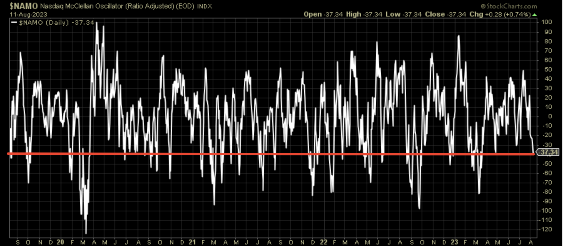
There have been many occasions where the Nasdaq McClellan Oscillator becomes more oversold than the current reading, be it a bear or bull market.
Research Report Excerpt #6
Many of the fears concerning a recession have proven to center on the Manufacturing sector. Beyond manufacturing, we’ve simply witnessed the economy produce a series of industry specific rolling recessions.
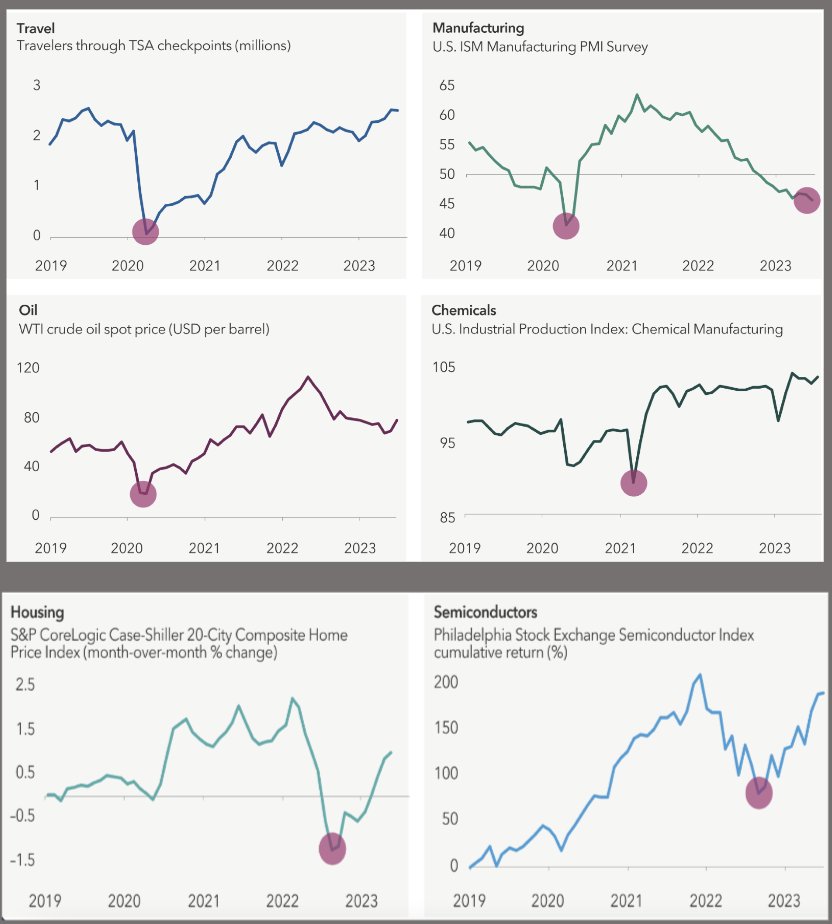
Different industries have found themself in contraction at different points in time since Covid, as depicted in the charts above. It is very difficult to achieve a broad-based economic recession when the sum of the parts are not working in unison , but rather doing their own thing.
Research Report Excerpt #7
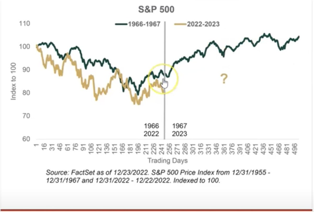
- In 1966, the S&P 500 fell 22% starting January, bottoming in October 1966, just like 2022.
- The Fed hiked rates continuously in 1966, as inflation soared with a WAR raging in Vietnam.
- Does all of this sound familiar?
- Additionally, all this was happening during a Midterm election year, like 2022.
- After gaining 6% in Q4 stocks soared 24% in 1967.
- The S&P 500 gained 7% in Q4 2022 by the way.
It may be hard to tell exactly where 2023 is to-date, with respect to the 1967 bull market analogue, but rest assured that the analogue is holding up very well.

As was the case in 1967, the market declined the first 2 weeks of August, which has been the case in 2023. The main difference between 1967 and 2023, is the peak returns from January – July have been roughly 4% better in 2023.
Research Report Excerpt #8
Neil Dutta at Renaissance Macro Research noted that household balance sheets are in fine shape, as household debt to income fell to nearly 86% in Q2, the lowest level since Q4 2021. Neil surmises that it is incomes, not debt, that are the main drivers of consumption lately.
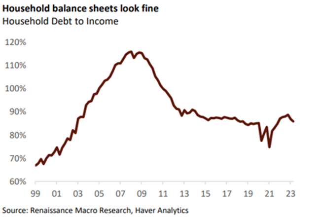
There in lay the beauty, regardless of the former inflation boom beast!
Research Report Excerpt #9
The following chart from Macro Markets Daily and table from J.P. Morgan aim to identify ISM New orders minus inventories, led by 3 months and layover with the actual ISM Manufacturing Index itself.
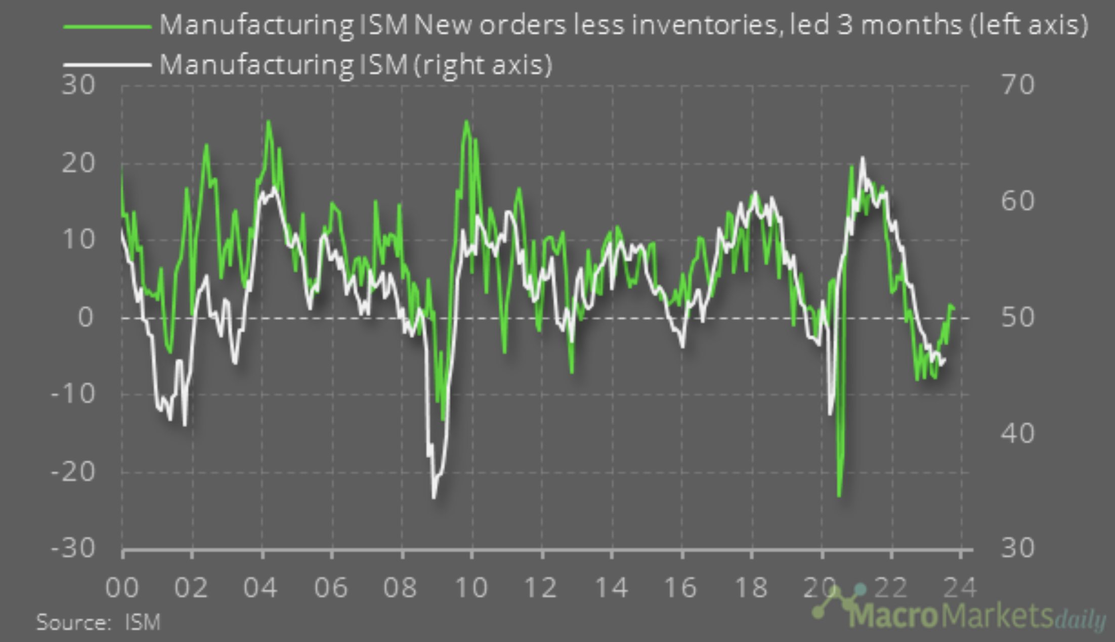
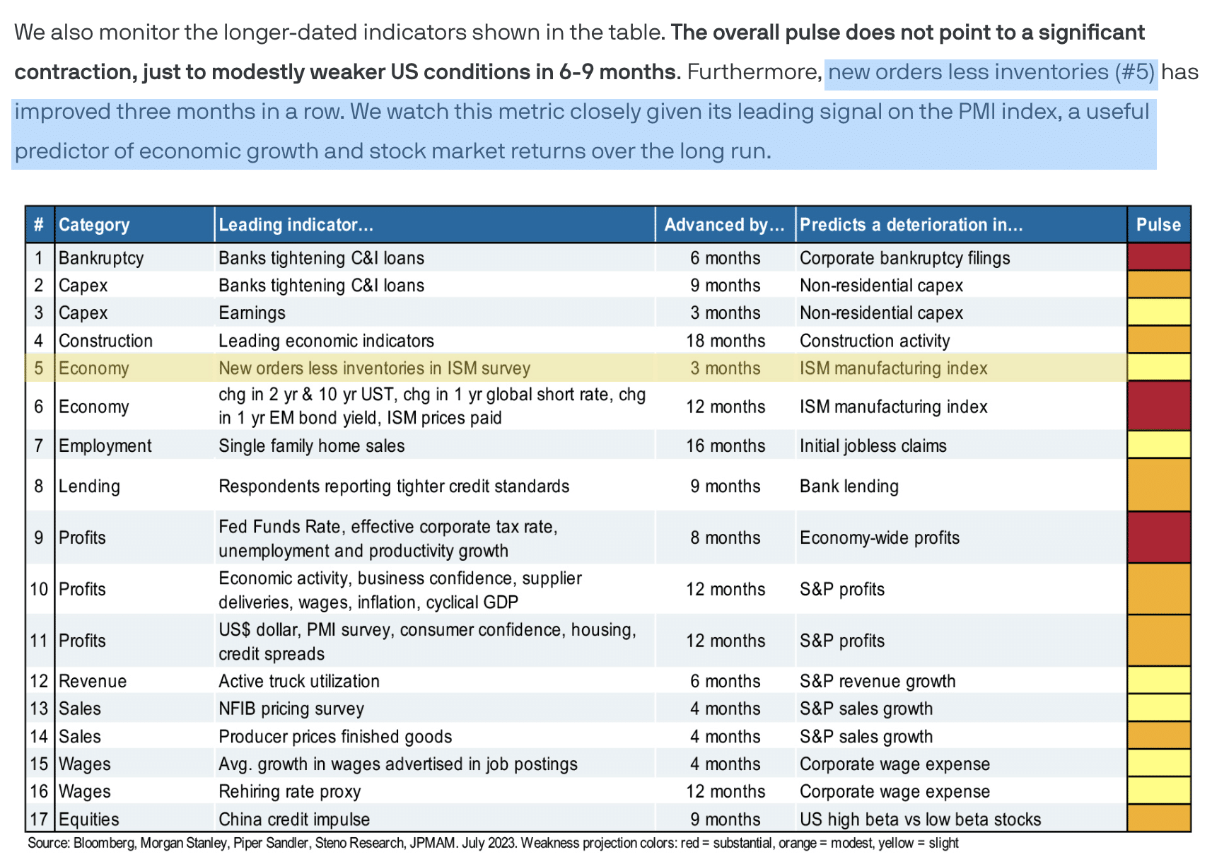
What is clearly outlined in the chart and table is that New orders less inventories is a leading indicator of the ISM Manufacturing index. We’ve seen 3 straight months whereby New orders less inventories has been moving higher. Since the ISM moved into contraction territory in 2022, there have been 2 periods where it trough and then upticked, but thereafter found a lower-low. The latest uptick in the ISM, based on a more supportive trend in Durable Goods orders as well as the New orders less inventories metric, suggests the recent uptick could become a trend. Given the weight of the evidence outlined above, my outlook would be for the ISM to get back to 50 by year-end (absent exogenous shock).


