
Wall Street rallied sharply on Monday, with both the S&P 500 and the Nasdaq closing at records for a second straight session and the Dow Jones Industrial Average exiting its longest stint in correction territory since 1961. Before Monday, the benchmark index had failed to trade 10% above the closing low of 23,533.20 hit on March 23, but could do so with a close at 25,886.52 or higher. It entered correction territory on Feb. 8, when it fell 10% from a record high set on Jan. 26, 2018. The Dow closed up 1% at 26,049, also retaking the 26,000 level for the first time since Feb. 2.
As the market was in rally mode Monday, internal data suggested some signs of panic-like buying in the major indexes. The Nasdaq Arms Index, a volume weighted breadth measure, fell to 0.393 in trade at around 3:50 p.m. Eastern. The Arms Index tends to decline below 1.000 when the broader market rises, as the intensity of buyers of advancing stocks increases relative to the intensity of sellers of declining stocks. Many investors see Arms readings below 0.500 as implying panic-like activity.
Monday’s market gains came on the heels of a new trade deal between the U.S. and Mexico. There are presently few details on the deal reached and President Trump said that trade talks with Canada would begin soon. Given the improved trade sentiment delivered via yesterday’s headlines, investors are now poised for further market gains near term. Having said that, two cautionary themes are making the rounds in various media television outlets and publications. One of those themes centers on equity margin debt levels while the other centers on the flattening and likelihood of a yield curve inversion. Both themes are highlighted as bearish market indicators.
Earlier this quarter (July 3rd), Finom Group reported on the ridiculous notion that margin debt signals or warns of a pending market crash. In the article titled Corporate Buybacks, Margin Debt & Digging Deeper, we analyzed this premise for its ridiculousness and as follows:
“According to FINRA, the Financial Industry Regulatory Authority, investor margin debt reached a new high of $669 billion in May. The latest debt level is up 2.6% month-over-month. By and large, margin debt tends to march higher as investor participation rates increase and capital dedicated to the market increases, all the while as investors/traders borrow to speculate on rising stock prices. As such, corporate buybacks aren’t the only thing holding up the market as the corporate sector has little to do with equity margin debt, this is on the back of you and me.”
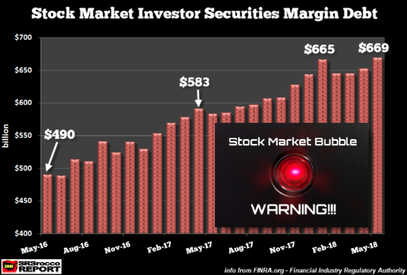
Finom Group’s dissemination and under the hood analysis was in effort to refute an article by Steve St. Angelo titled Companies buying back their own shares is the only thing keeping the stock market afloat right now, which delivered the chart above. The margin debt data from FINRA was dated through May 2018. As we all know at this point, the market has not crashed and, in fact, reached an all-time record high level. Now let’s review the following chart.
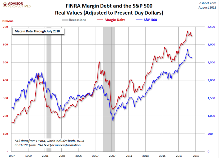
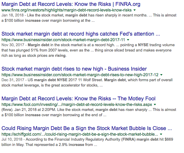
As one can see, margin debt generally marches higher, with bouts of pullbacks along the way. Any market participant laying claim to a pending crash based on margin debt data is simply conflating market data that is inconsequential to how and why investor’s participate in the equity market and what generally proves a market driving force. Suggesting that margin debt is causation for a market decline or crash is a very unfounded and unsubstantiated notion. Margin debt in a rising equity market is natural, as it should always be seeking greater investor participation over time. It’s why there is always proliferating headlines quarter after quarter that denote margin debt achieving all-time high levels as shown in the screen shot below.
It is generally only during a bear market that margin debt finds itself in sustained decline, also depicted in the chart above from previous bear markets and/or economic recessions. The latest debt level is up 0.9% month-over-month. The July data gives us an additional sense of recent investor behavior.
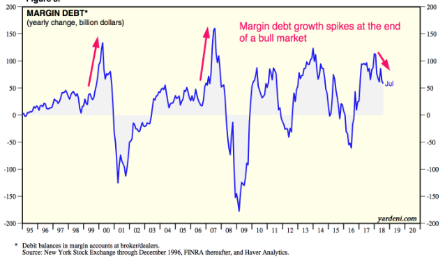
In addition to the recent data, what we have come to better understand over the last several decades and bull markets turning bear markets is that the YOY percent change in margin debt is most important. The percent change tends to spike towards the end of an equities bull market. Yet another chart showing the percent change YOY. Based on the chart below, the bull market is not showing such a spike that would lead one to believe the bull market is ending near term. But again, we don’t rely on margin debt as causation of market crash in the first place.
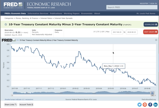
And then there is the notion of yield curve inverting as an indicator of a pending market decline. The differential between the 2-year Treasury and the 10-year Treasury is at the lowest level since 2007. An inversion takes place when short-term bond yields actually go higher than long-term bonds. Historically, an inverted yield curve has been a stellar predictor of recessions.
We give more credence to this notion based on history, but also recognize that there can be a great period of time from once the yield curve inverts until the market enters bear market territory. In fact, the market tends to trend higher on average and over the next 12-24 months.
One of the reasons investors HAVE TO pay attention to the subject matter of yield curve inversion is very simple: Everyone else is! Check out the chart below, which identifies the search results for 10yr/2yr spreads over time.
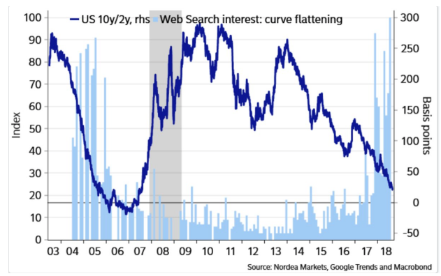
The last time there was this much chatter and such great activity around searches related to the yield curve was during the run-up to the last recession. Again, everyone is paying attention to it and the likelihood of an inversion post the next Fed rate hike is extremely high. The Fed is expected to boost the Fed Fund rate by .25 bps in September and with spreads at less than .20bps between the 10s/2s, the yield curve will likely invert thereafter.
Ryan Detrick of LPL Financial recently crunched some numbers to see what has happened in the past when the yield curve inverts.
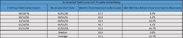
“An inverted yield curve isn’t this end-all sell signal,” Detrick determined. “We aren’t ignoring this potentially troublesome sign, but it doesn’t appear to be the major warning many make it out to be.”
In addition to the supporting chart and sentiment provided by Ryan Detrick, Bull Market.co’s founder Troy Bombardia has offered the following YouTube video that validates Detrick’s chart and sentiment.
A flattening yield curve is of much greater consequence to investor sentiment than is margin debt in the viewpoint of Finom Group. With equity markets surging to new highs and a potential yield curve inversion on the horizon, investors might prepare for a market pullback in the coming weeks. We see ample hedging in the S&P 500 options market presently and out to October, which also aligns with the potential for heightened market volatility out 30-60 days. As we mentioned in our most recent research report and given the state of the market rally to new record level highs, investors might use the data and analysis at-hand to rebalance their respective portfolios.


