
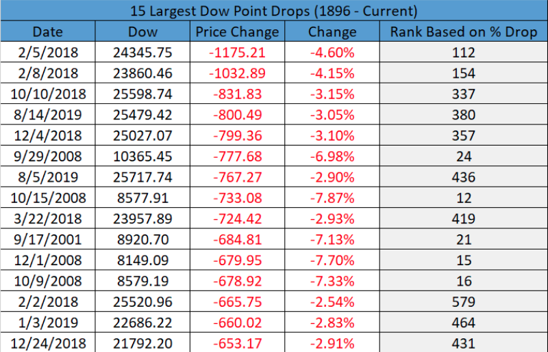
“It’s all fun and games until someone gets hurt.” We all remember hearing that as kids, but that mainly concerned horseplay and wrestling with our peers and/siblings. Today and in the financial markets, it can mean something very different. Many an investor were hurt after Wednesdays greater than 3% plunge in the major averages and with the Nasdaq (NDX) falling a whopping 242 points on the day. But the Nasdaq didn’t lead the decline as the Dow Jones Industrial Average (DJIA) fell some 3.05% or 800+ points. The S&P 500 (SPX) slightly outperformed its peers falling 2.93% or 85+ points. In terms of the Dow’s 800+ point drop, it proved the 15 largest point drop in history.
And why, why was their such pain in the markets on Wednesday. Finom Group had been discussing with members the strong probability of a bond yield curve inversion over the last couple weeks and since the FOMC rate cut did not prove to steepen the yield curve. In addition to this forecasting, we presumed such an event would also trigger algorithmic trades that would discard rationale in favor of key word triggers and the programmed event, spurring a bout of equity market selling pressure. It proved the bond market volatility that would spill over into the equity markets, that may have yet to find capitulation and bears monitoring further.
The bond yield curve inversion is typically considered an indicator of a future recession and according to many an investor and economist, starts the clock. And while the market sold off Wednesday with the yield curve inverting for the first time since 2007, typically the market has a strong rally after the inversion takes place. Jonathan Golub, chief U.S. equity strategist at Credit Suisse offered such notes in this regards.
“While an inversion has preceded each recession over the past 50 years, the lead time is extremely inconsistent. Historically, an inverted yield curve has been accompanied by a variety of other ominous economic signals including layoffs and credit deterioration.”
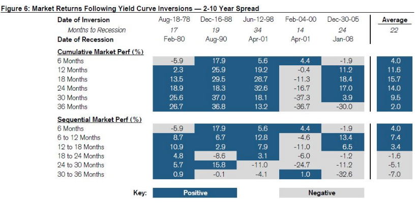
According to the Credit Suisse chart above, usually stocks have 18 months of gains following inversion of the 2-10 spread until returns start to turn negative. So why all the selling pressure on Wall Street? Clearly one day does not tell us what may come near-term.
The market rallies more than 15% on average in the 18 months following the inversion. A recession hits in 22 months after the inversion, according to Credit Suisse. Sequential losses can start to add up after 18 months, Golub’s analysis showed.
Finom Group urges investors to consider that each firm has their own statistical data and it largely depends on where they begin and end their study and collection of data. Recall that J.P. Morgan Chase also outlined their studies on yield curve inversion, timeline before a recession occurs and more. Where Credit Suisse’s data suggests 22 months before a recession, J.P. Morgan’s data suggests a recession occurs, on average in just 14 months. This is because the J.P. Morgan includes 1968 and 1973 in their study while the initial inversion dates also vary thereafter from that offered by Credit Suisse.
I guess the point is, nobody seems to have perfect data and perspectives vary as to when recessions start. Go figure, right!
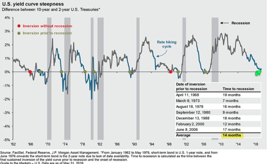
“The BofAML US Economics team suggests that recession risks are rising. The 3-month T-Bill vs the 10-year T-Note curve has already inverted and the risk is that the 2s10s curve inverts as well,” BofA technical strategist Stephen Suttmeier wrote.
“Sometimes the S&P 500 peaks within two to three months of a 2s10s inversion but it can take one to two years for an S&P 500 peak after an inversion,” he added, noting that a 2-10 inversion has preceded the most recent seven recession as well as nine of the last 12.
While the financial world remains fascinated and captivated by the yield curve inversion and with many suggesting the yield curve may not represent or herald a recession as it seemed to in the past… If indeed the reasons for the current yield curve inversion are unique to this expansion cycle, why are we leaning on historic data for the sake of forecasting probabilities for market and economic activity? Kind of a contradiction right?
The saying that “this time is different” is one that makes a great many market participants cringe. It’s not because it has no factual representation, but because of superstitious beliefs. It’s the “jinx” few desire to have looming overhead of an otherwise strong bull market and/or expansion cycle. The reality, however, is every bull market and expansion cycle is different, with unique variables that serve to either elongate or curtail the length of such cycles. Quantitative Easing is just one such variable that makes these cycles different and/or unique amongst the many. But before we get to another variable that serves to underline recession risks ahead, here is one notable market bull discussing the yield curve inversion as a bullish signal for equities.
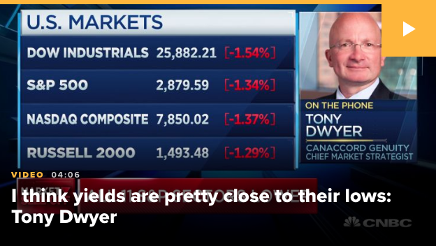
Tony Dwyer, analyst at Canaccord Genuity, suggests the current inversion is a “Buy signal” for equities and a probable bottoming in bond yields.
“A curve inversion is an intermediate-term buy signal. The initial inversion of the 2-/10-year UST yield curve works with a lag … Our still-positive core fundamental thesis continues to suggest any weakness should prove limited and temporary and provide a more attractive entry point for a move toward our 2020 target of 3,350.
The drop in global interest rates that has come with the weaker global data should cause a rebound in economic activity as we head toward year end. There is no sign in our credit metrics that indicates a shutdown in money availability that would make the lower rates less impactful for forward growth expectations.”
So what else is so vastly different about this expansion cycle that may serve to prove the bond yield curve is less effective, if not impotent, with regards to heralding a recession? Keep in mind, it’s not that an inversion is the cause of a future recession, but rather a contributing factor as it affects lending profitability and credit market activities.
The U.S. economy is driven by consumption, consumer spending activities. Nearly 70% of GDP is comprised of consumer activity. The U.S. economy is largely import based and not export based, which is underscored by services and not manufacturing, like most industrialized nations such as Germany and China. For these reasons, it’s clear to see why the U.S. economy is more insulated from global economic pressures when compared to other industrialized regions. It’s not immune, but insulated. Having said that all the aforementioned variables force us to reflect on whom is driving consumption! It’s the consumer or households as we define it in financial terms.
When we look at household spending “capabilities” and general quality of the household budget, we come to find extreme strength in the household balance sheet. One of the best ways to gauge the strength or weakness of the household balance sheet is through the governments Household Financial Obligations as a percent of Disposable Personal Income data/index.
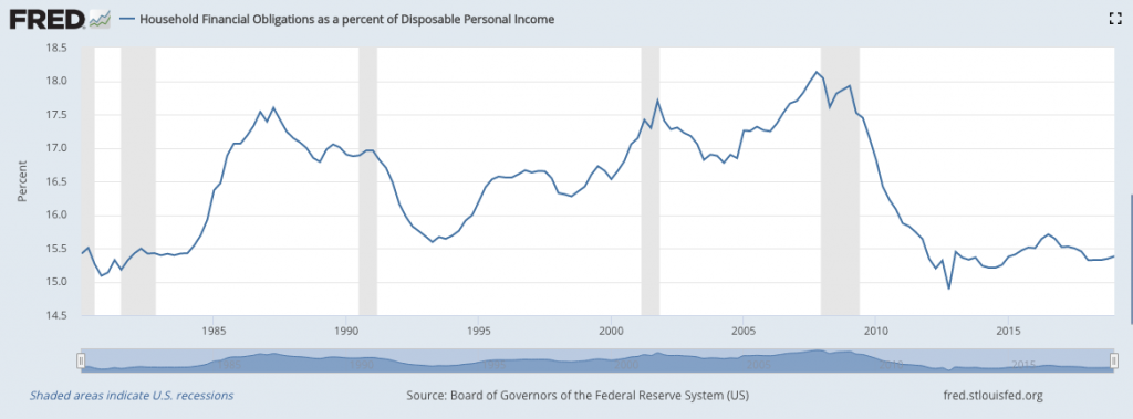
As we can clearly see in the chart, disposable incomes are in their best shape since the late 1970s and early 1980s. We can also see that the last time the yield curve inverted, 2006, disposable incomes were extremely poor. One more time, extremely poor and completely opposite of where they are today. In fact, through the entirety of the prior 2002-2007 expansion cycle, disposable income levels were dramatically in opposition of the current expansion cycle. One more time, “this time is different”.
Another way in which we can see that this time is different from previous economic conditions whereby the yield curve inverted is by reviewing household leverage. Household leveraging used to be the biggest swing factor driving corporate profits, but that hasn’t been the case in this expansion cycle. Household’s have been uniquely disciplined in both their leverage and spending habits compared to anytime in the modern era. Net leverage as a percentage of GDP is extremely low compared to past economic cycles.
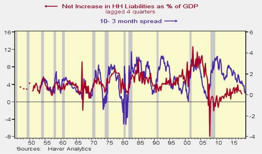
When we look at HH liabilities, in the chart above and against treasury spreads, we are forced to understand government deficits have played the largest role in the longest expansion cycle ever and with regards to corporate profit growth.
Here is HH borrowing overlaid against corporate profits. For the first time ever, U.S. households have NOT played a pivotal role in the domestic or global business cycle.
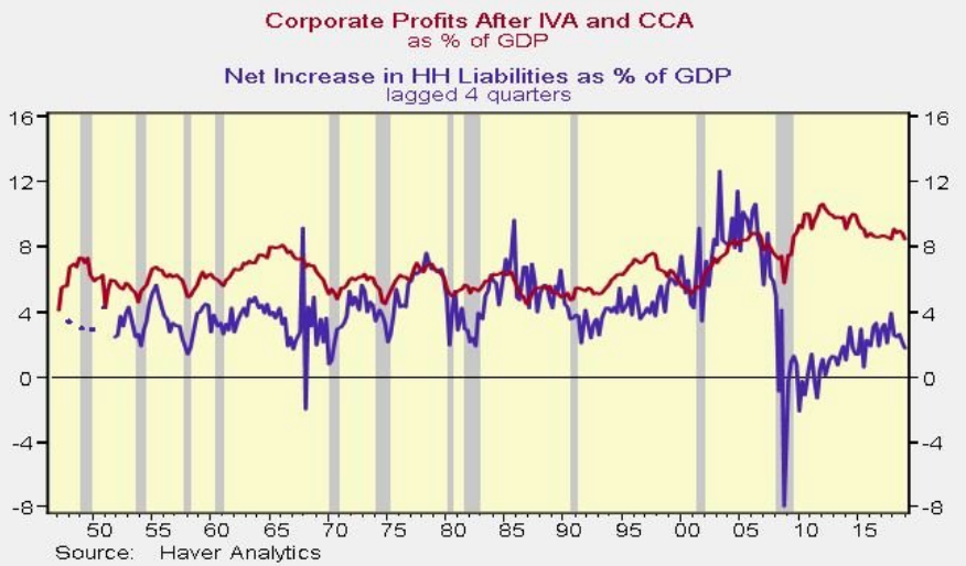
Did we mention that this time is different? And to these factual depictions, we can also assume that based on the health of the household balance sheet any presumed future recession would prove mild and more easily reversed. But so what right, bond yields continue to fall and fear still rules the day in the financial markets, despite the facts.
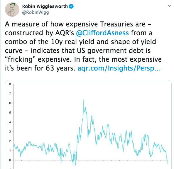
The bond market rally is extremely overbought and possibly the most overbought in history. The U.S. 10-year treasury yields typically travel closely with the longer term nominal growth rate/GDP, but lately a major divergence has presented itself as depicted in the following chart. A bottoming process may very well be formulating based on this divergence.
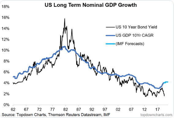
In fact, U.S. government debt is extraordinarily expensive. It is the most expensive it’s been for 63 years.
To kind of put a pin in the bond market and yield curve inversion conversation, the biggest problem is fear and the self-fulfilling prophecy that can take hold of investors and bleed into consumption. Recessions can be self-fulfilling prophecies of market sentiment. As we saw in December 2018, the threats of a government shutdown coupled with a 20% equity market drawdown found its way to curtailing consumer spending, retail sales and overall Q4 GDP, which was only 1.1% after revisions. As stated by LPL Financial in a recent blog note, “It’s a curious time for global fixed income right now, and Treasury yields have been weighed down by intense global buying pressure amid ultra-low sovereign debt yields elsewhere. Because of this, we think the yield curve’s shape has been driven more by technical factors than domestic economic weakness.”
As we move to focus on Thursday’s market headlines we see some increased negative sentiment on Wall Street with equity futures having turned from sharply higher to sharply lower. The headline serving to underscore this turn in sentiment in the wee hours of the early moving came from China. The nation vowed to take steps to counter U.S. tariffs, rattling global equity markets and sending Dow futures plummeting.
The Hong Kong government announced plans to implement stimulus measures to help its sagging economy. The government also cut its growth forecast to potentially flat for the rest of the year, down from the already anemic 0.5% growth it was expecting.

The headlines come just a day after rather abysmal industrial activity/output data out of China hit the tape. Industrial output growth slowed markedly to 4.8% in July from a year earlier, data from the National Bureau of Statistics showed, lower than the most bearish forecast in a Reuters poll and the weakest pace since February 2002. Analysts had forecast it would slow to 5.8%, from June’s 6.3%. Washington had sharply raised some tariffs in May.
“China’s economy needs more stimulus because the headwinds are pretty strong and today’s data is much weaker than consensus,” said Larry Hu, head of Greater China economics at Macquarie Group in Hong Kong.
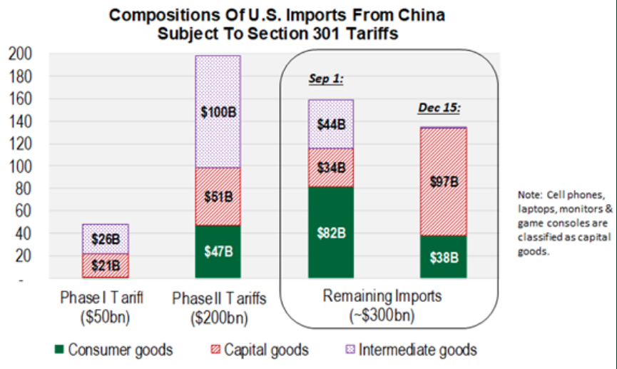
It’s clear that China is punching back, as it aims to offset existing tariffs and those threatened further by the Trump Administration. Least we not dismiss that although the White House Administration has announced/proposed a delay in the September 1st tariffs, the delay is not on all outlined goods to be tariffs, just most. The tariff delay still leaves lots of consumer goods subject to the September 1st levy, roughly $80bn of the $160bn going into effect on September 1st are consumer goods.
So what’s next for the equity markets as Beijing hits back at the White House Administration in efforts to spur economic growth and curtail the impact of tariffs, while the U.S. equity markets have fallen some 6.5% from peak to trough? Well, earnings and economic data are certainly going to steal some of the limelight captured by trade headlines and the yield curve inversion. Today’s economic calendar is loaded.
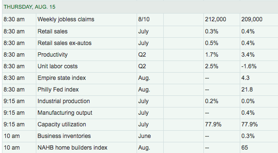
Retail sales are the biggest economic data point of focus today, likely to be followed by regional manufacturing indexes. The desire amongst most market participants is likely to find that retail sales continue to show a divergence from slowing in the manufacturing sector, which has been the case throughout 2019.
In addition to the economic data highlights, investors will be able to see just how strong or weak the quarter was for the largest retailer in the world, Wal-Mart (WMT). The world’s leading retailer is set to reprot results ahead of the opening bell and a day after an abysmal report from department store retailer Macy’s (M). Macy’s missed estimates on the bottom line.
Macy’s posted sharply weaker-than-expected second quarter earnings Wednesday, and trimmed its full-year profit guidance, as inventory clearance and markdown moves ate into its bottom line.
Macy’s said diluted earnings for the three months ending in July came in at 28 cents per share, down 47.2% from the same period last year and well shy of the Street consensus forecast of 45 cents per share. Group revenues held up well, however, and were largely flat to last year, and in-line with analysts’ estimates, at $5.546 billion.
As many of Finom Group’s members are aware, Seth Golden has been bearish on Macy’s fundamental business operations since 2016. He outlined his $17.50 price target back in January of this year, discussing his thesis live on TDNetwork.
He also pre-warned investors on StockTwits, reiterating his price target in a tweet prior to the earnings release as shown in the screenshot below:

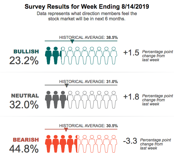
As we review the current market conditions and look forward to the final 2 trading days of the week, two near-term issues are front of mind regarding sentiment and key technical levels in the market. Investor sentiment is still rather poor, even if slightly improved from the previous week, according to the latest AAII survey. Bullish sentiment has improved, but remains well below the historic average. Bearish sentiment has weakened, but remains well above the historic average.
With bond yields continuing to draw lower and the 30-year Treasury now at record low levels (below 2%), equity futures are increasingly under pressure ahead of the key economic data. The S&P 500 finished Wednesday’s trading session in the middle of its 100 and 200-DMA.
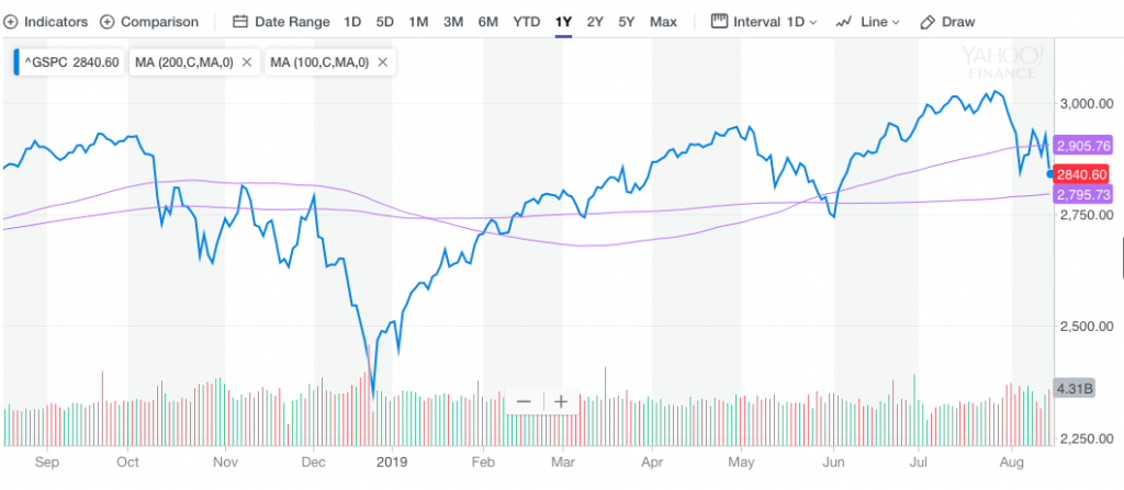
The next line in the sand for the S&P 500 has a strong probability of being hit at the 2,795 to the downside should selling pressure persist. Usually, this provides some level of market support and an initial bounce. We would look at this for an opportunity to trade this balance while rebalancing one’s portfolio.
Our last consideration is with regards to market liquidity that must remain front of mind given the economic uncertainty surrounding the global economy and abnormal fund flow activity year-to-date. As J.P. Morgan Chase recently denotes, illiquidity is problematic even by the dire standards of August.
Measures of market depth in U.S. equities, Treasuries and currencies relative to the rest of the year have fallen below the average since 2010, the bank’s research shows. It’s a sign that market players have diminished capacity to absorb the trade-driven mania sweeping assets.
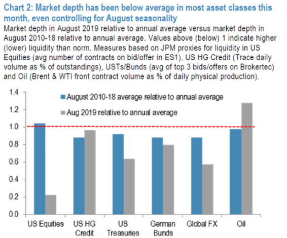
“Even by August standards, when market depth tends to decline and volatility to rise, this month is delivering numerous unusual events and milestones,” strategists led by John Normand wrote in an Aug. 9 note.


