Welcome to another trading week. In appreciation to all of our Basic membership level participants and daily readers of finomgroup.com content, we offer the following excerpts from our Weekly Research Report. Our weekly report is extremely detailed and has proven to help guide investors and traders during all types of market conditions with thoughtful insights and analysis, graphs, studies, and historical data/analogues. We encourage our readers to upgrade to our Contributor membership level to receive our Weekly Research Report and State of the Market Videos and take advantage of this ongoing promotional event today! With that have a great trading week, be in touch and take a look at some of the materials in this weekend’s published Research Report!

Research Report Excerpts #1
With that being said, let’s take a look at some charts, levels, market internals/breadth and the like!
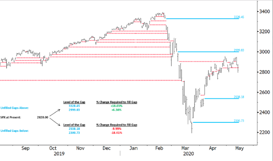
The chart of the S&P 500 above identifies, you guessed it, Mr. Wayne Nelson’s (Finom Group resident CMT) infamous GAP ZONES that usually get filled at some point. In the Finom Group Trading Room, Wayne often discusses the reality of gaps and how in-tune with such zones the market aims to resolve, for better and/or for worse. The “for the better” GAP ZONEs currently reside at 2,999 and 3,328. These have a probability of being filled at 99.99 percent. How can we suggest such a probability you might instinctively be asking merely based on the sheer number? The answer isn’t as complex as one might think, but demonstrated throughout history: The stock market rises over time. It rises for a variety of reasons, but some of the most important reasons align with market structure and earnings growth.
Unfortunately, there are 2 open GAP ZONES that remain to the downside at 2,538 and 2,300. Due to market symmetry and the fact that some 90% of gaps achieve fulfillment eventually, we have to remain open to the possibility of market weakness in order to resolve these open gaps. If asked, “What do you think the probabilities are of filling these gaps to the downside this year are Seth”, I would have to suggest they remain elevated. The probability is likely greater than 50%, but how much more I could only speculate. Remember, most strategists and analysts are still of the opinion that a 10% market correction is likely and/or warranted given valuations. Some quick math, however, finds that a 10% correction would not completely fill that first gap-level to the downside. It would require another 1% or so. But now you can imagine what it would take to fill the GAP ZONE down to 2,300, which would be a more demoralizing outcome for investors. (Graphic from Wednesday’s close, below)
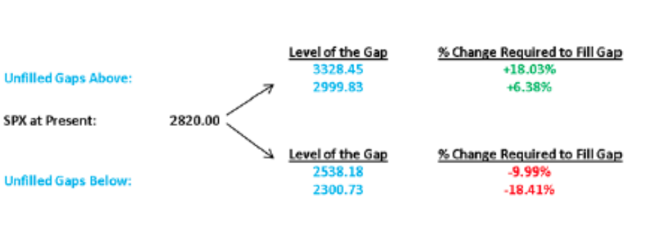
The GAP ZONES demand cataloguing for investors, as markets do appreciate revisiting the “scene of the crime” so to speak. Algorithms are often coded with such zones in mind and re-tuned when markets are “on the verge” of a large move in either direction.
Research Report Excerpt #2
According to the SentimenTrader’s Jason Goepfert, top-heavy is not a good thing.
“The top 5 stocks in the S&P 500 have accounted for 24% of the S&P’s total point gain since the March 23 low. When the top 5 account for more than 20%, the S&P’s average return 3 months later was -9.2%, vs +9.5% when they made up less than 20%.“
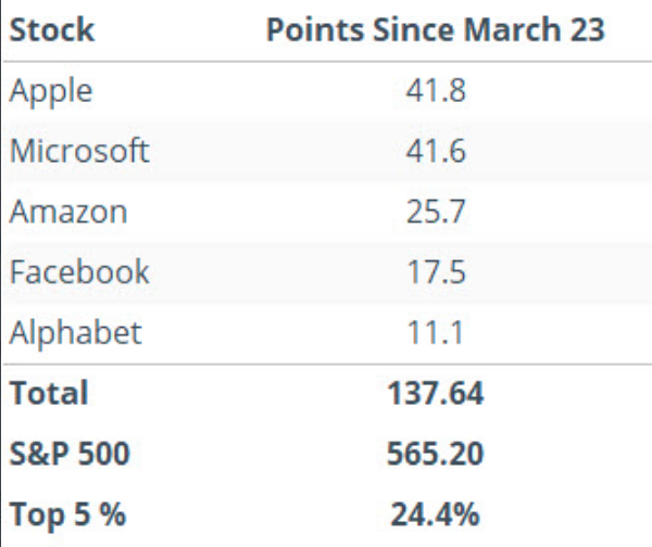
The underlying message here is that breadth is weak, the market is benefitting from the current structure, but could falter due to that same structure. If these stocks falter over the coming 3-month period, which is perfectly aligned with the Q2 earnings season deliveries, the broader basket of stocks may not have enough strength to pick up the pieces. Having said that, we are forced to recognize that the historical data provided by Goepfert has never found the balance sheets with such sales and profit performances in the past and during bear markets/recessions. Recall from Friday’s State of the Market video the following:
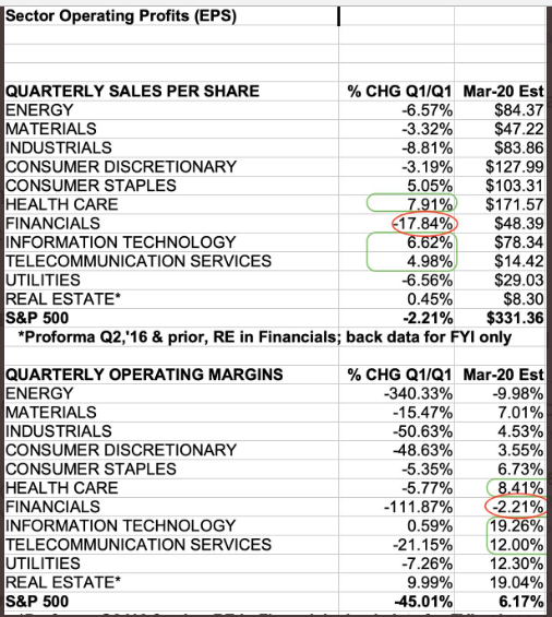
- You can see in the following chart that these sectors: Information Technology, Communication Services and Health Care, now constitute over half of the S&P 500’s market cap.
Research Report Excerpt #3
Before moving on, we’ve also been highlighting TRIN readings of late. Here’s a chart of TRIN to end the week. As a reminder…:
- Arms Index or TRIN = (advancing issues / declining issues) / (composite volume of advancing issues / composite volume of declining issues). Generally, an Arms/TRIN of < than 1.00 indicates buying demand; > 1.00 indicates selling pressure.
- So when we look at the closing value of TRIN from Friday, here is what we find: (buying demand)
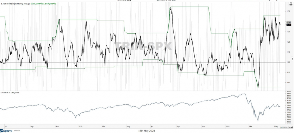
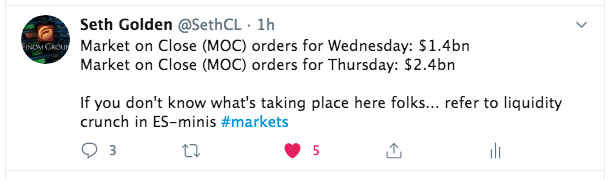
TRIN (top panel, SPX bottom panel) rose sharply this past week, recognizing selling volume had advanced. But of potential significance, the top was lower than the 2 previous tops. As we have discussed in the Finom Group Trading Room and throughout the relief rally/bottoming process, the “buy the dip” activity has proven robust enough to maintain the recent 5-week trading range. This is what we want to see as a distinguishing factor between the market breakdown in March and the protracted bottoming phase of a bear market. Even on large percentage down days during the bottoming process, we’ve witnessed investors/traders greatly reduce the drawdown in the morning hours or toward the closing bell. Some of the dip-buying activity was captured in my recent Tweet:
Research Report Excerpt #4
The unemployment level is currently above 14% and will likely see the 20%ile before the recession is over, and done with and as determined by the NBER. As it pertains to the market, typically the S&P 500 bottoms in advance of the peak in some of the labor and employment data, more specifically jobless claims.
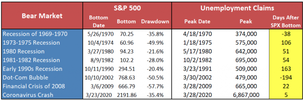
From the table above, the 2002 peak in jobless claims came well before the market bottom, partly due to the China SARS developing issues and the 9-11 attacks. Jobless claims did rise in 2002, but the peak happened first and the fiscal relief didn’t come until 2003. In the present Coronavirus-led recession, fiscal and monetary policy relief have already been administered and jobless claims are likely still peaking, but declining in the total of new claims filed each week.
Research Report Excerpt #5
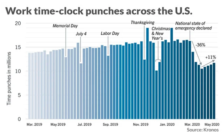
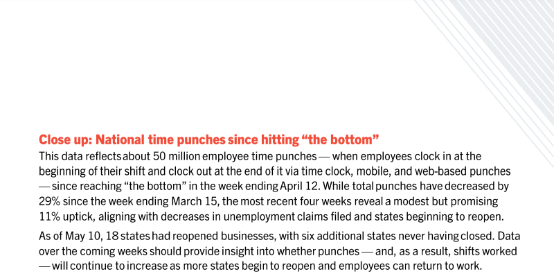
One way that we can keep track of the increase in the labor force getting back to work outside of the jobless claims, JOLTS survey and monthly Nonfarm Payroll report is through the Kronos Work Time Clock Punches tracker. The newly compiled data from Kronos shows that basically an entire shift of work in a three-shift workday got wiped out during the first month of the pandemic. Time-punches sank a jaw-dropping 36 percent. In a normal week, time punches rarely rise or fall more than 1% to 2 percent.
“This suggests people are starting to return to work as states open up, but they are not returning real quickly,” said Dave Gilbertson, vice president of HCM strategy and operations at Kronos.
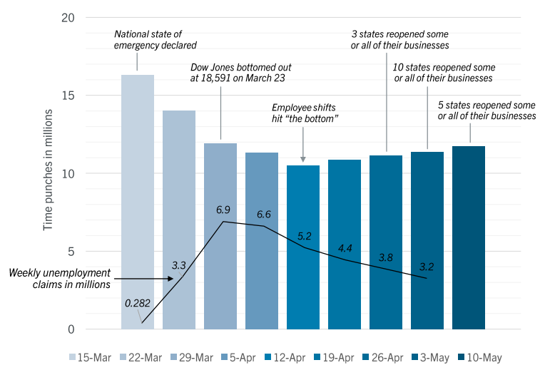
If there’s any good news, employees are returning back to work. But slowly. Time punches are still down 28% as of mid-April.
Research Report Excerpt #6
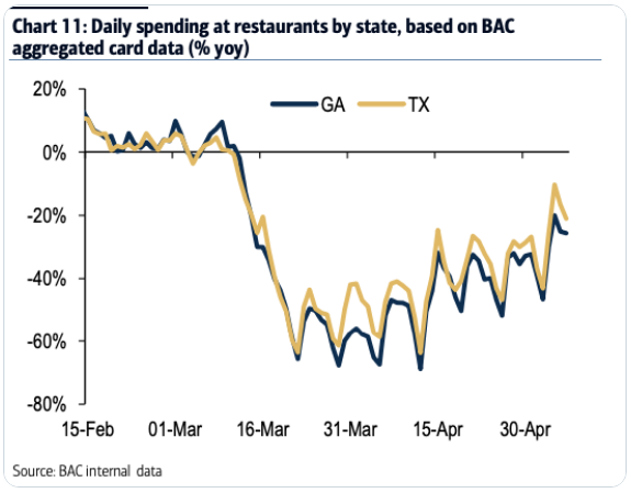
In the meantime, anecdotal credit card spending data suggests that reopening the economy is the only logical step forward as it pertains to the resumption of growth via consumer spending. There’s Georgia again!
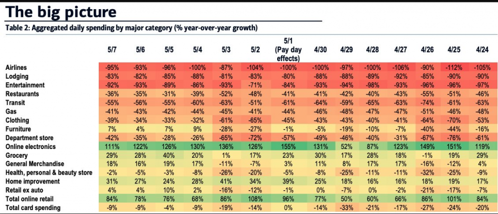
In terms of nationwide spending data by category and daily since late April, Bank of America presents the following table. Once again, online retail and grocery are one of the very few positive growth categories across the board.
The fiscal Cares Act has been built as a bridge to the other side of the pandemic. Relief checks were largely received in the month of April. How consumers have been spending that money is reflected in the April monthly retail sales report and accounted for in a recent study from economists.
Research Report Excerpt #7
Since the index was recently right at that 61.8% level, let’s look at that Fibonacci retracement first (table below). Again, looking at 20% pullbacks, these are S&P 500 returns after the index gets to within 2% of the level, given that it has been under that level for at least ten straight trading days. Now compare the returns after those signals to the recovery returns mentioned above.

There’s no reason to fear the nearby 61.8% retracement level, according to the data. The short-term results are almost identical to typical returns during the recovery. Looking out a month, there’s a little bit of bullishness to the returns after these signals; the S&P 500 averages a 2% return after a month with 74% of the returns positive. Typically, during these recoveries, you would get a 1.3% return with 66% of the returns positive a month out.
Research Report Excerpt #8
Over the course of the previous bull market cycle, corporate buybacks remained the biggest buyer in the equity market. But here is what you need to know as a long-term investor in the benchmark index ETF. It doesn’t matter who’s buying; what matters is what the level of supply is going forward.
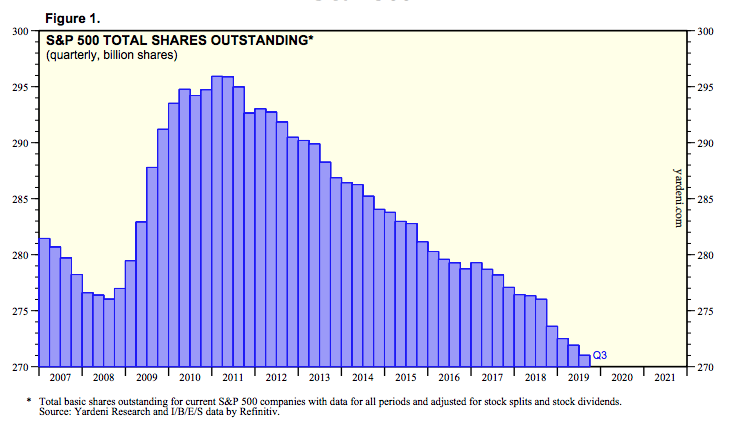
The number of shares in the S&P 500 will likely only continue to decline in the years to come, only to be offset intermittently with a bear market such as the one we have today, which added supply.
As an investor, you are holding an asset that is increasingly found with limited and even declining supply over time.
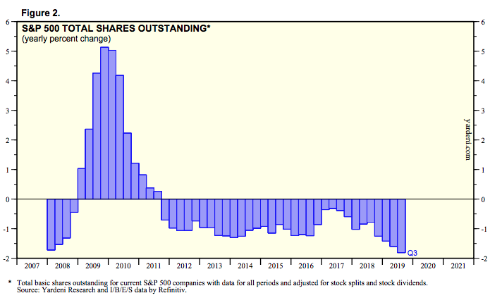
The pace of the declining share count had accelerated in in the last couple of years, peaking in Q3 2019 according to the latest data from Refinitiv. This supply issue is also part of the overall market structure whereby the Fed’s monetary stimulus programs are producing increasing dollars for a decreasing supply of risk assets.
Regardless of your near-term outlook, it is probably a good idea to expect the longer-term road to normalization to be a bumpy one. There are any number of potholes such as another wave of the virus (especially now that the country is rushing to reopening), delays in the development of a vaccine, the contagion caused by oil’s crash and a new phase of the trade war with China that is catching the media’s hyperbolic narratives.
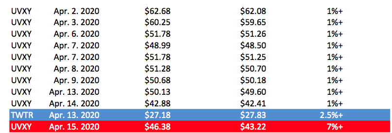
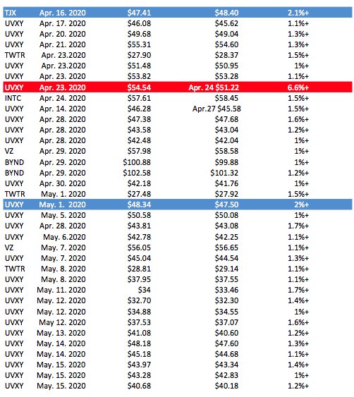
Trading Recap Since April
After postponing official Trade Alerts for Finom Group Premium and Master Mind Options members through all of March, we restarted our official Trade Alerts in April and since. (See issued and completed Trade Alerts below)